Easily make Flutter apps responsive. Automatically adapt UI to different screen sizes. Responsiveness made simple. Demo: https://gallery.codelessly.com/flutterwebsites/minimal/

Overview

Screenshots

Responsive Framework

Flutter Responsive Pub release GitHub Release Date GitHub issues GitHub top language GitHub code size in bytes Awesome Flutter Libraries.io for GitHub License

Screenshots

Responsiveness made simple

Responsive Framework adapts your UI to different screen sizes automatically. Create your UI once and have it display pixel perfect on mobile, tablet, and desktop!

The Problem

Supporting multiple display sizes often means recreating the same layout multiple times. Under the traditional Bootstrap approach, building responsive UI is time consuming, frustrating and repetitive. Furthermore, getting everything pixel perfect is near impossible and simple edits take hours.

Screenshots

The Solution

Use Responsive Framework to automatically scale your UI.

ResponsiveBreakpoint.autoScale(600);

Demo

Minimal Website

A demo website built with the Responsive Framework. View Code

Flutter Website

The flutter.dev website recreated in Flutter. View Code

Quick Start

Pub release

Import this library into your project:

responsive_framework: ^latest_version

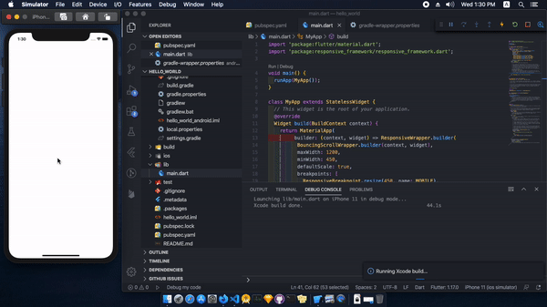
Add ResponsiveWrapper.builder to your MaterialApp or CupertinoApp.

class MyApp extends StatelessWidget {
  @override
  Widget build(BuildContext context) {
    return MaterialApp(
      builder: (context, widget) => ResponsiveWrapper.builder(
          child,
          maxWidth: 1200,
          minWidth: 480,
          defaultScale: true,
          breakpoints: [
            ResponsiveBreakpoint.resize(480, name: MOBILE),
            ResponsiveBreakpoint.autoScale(800, name: TABLET),
            ResponsiveBreakpoint.resize(1000, name: DESKTOP),
          ],
          background: Container(color: Color(0xFFF5F5F5))),
      initialRoute: "/",
    );
  }
}

That's it!

AutoScale

Screenshots

AutoScale shrinks and expands your layout proportionally, preserving the exact look of your UI. This eliminates the need to manually adapt layouts to mobile, tablet, and desktop.

ResponsiveBreakpoint.autoScale(600);

Flutter's default behavior is resize which Responsive Framework respects. AutoScale is off by default and can be enabled at breakpoints by setting autoScale to true.

Breakpoints

Screenshots

Breakpoints control responsive behavior at different screen sizes.

ResponsiveWrapper(
    child,
    breakpoints: [
        ResponsiveBreakpoint.resize(600, name: MOBILE),
        ResponsiveBreakpoint.autoScale(800, name: TABLET),
        ResponsiveBreakpoint.autoScale(1200, name: DESKTOP),
    ],
)

Breakpoints give you fine-grained control over how your UI displays.

Introductory Concepts

These concepts helps you start using the Responsive Framework and build an responsive app quickly.

Scale vs Resize

Flutter's default behavior is to resize your layout when the screen dimensions change. Resizing a layout stretches it in the direction of an unconstrained width or height. Any constrained dimension stays fixed which is why mobile app UIs look tiny on desktop. The following example illustrates the difference between resizing and scaling.

Screenshots

An AppBar widget looks correct on a phone. When viewed on a desktop however, the AppBar is too short and the title looks too small. Here is what happens under each behavior:

  1. Resizing (default) - the AppBar's width is double.infinity so it stretches to fill the available width. The Toolbar height is fixed and stays 56dp.
  2. Scaling - the AppBar's width stretches to fill the available width. The height scales proportionally using an aspect ratio automatically calculated from the nearest ResponsiveBreakpoint. As the width increases, the height increases proportionally.

When scaled, the AppBar looks correct on desktop, up to a certain size. Once the screen becomes too wide, the AppBar starts to appear too large. This is where breakpoints come in.

Breakpoint Configuration

To adapt to a wide variety of screen sizes, set breakpoints to control responsive behavior.

ResponsiveWrapper(
    child,
    maxWidth: 1200,
    minWidth: 480,
    defaultScale: true,
    breakpoints: [
        ResponsiveBreakpoint.resize(480, name: MOBILE),
        ResponsiveBreakpoint.autoScale(800, name: TABLET),
        ResponsiveBreakpoint.resize(1000, name: DESKTOP),
        ResponsiveBreakpoint.autoScale(2460, name: '4K'),
    ],
)

An arbitrary number of breakpoints can be set. Resizing/scaling behavior can be mixed and matched.

  • below 480: resize on small screens to avoid cramp and overflow errors.
  • 480-800: resize on phones for native widget sizes.
  • 800-1000: scale on tablets to avoid elements appearing too small.
  • 1000+: resize on desktops to use available space.
  • 2460+: scale on extra large 4K displays so text is still legible and widgets are not spaced too far apart.

About

Responsive Framework was created out of a desire for a better way to manage responsiveness. The ability to automatically adapt UI to different sizes opens up a world of possibilities. Here at Codelessly, we're building a Flutter app UI and website builder, development tools, and UI templates to increase productivity. If that sounds interesting, you'll want to subscribe to updates below 😎

Responsive Framework is licensed under Zero-Clause BSD and released as Emailware. If you like this project or it helped you, please subscribe to updates. Although it is not required, you might miss the goodies we share!

Badges 🏆

Now you can proudly display the time and headache saved by using Responsive Framework with a supporter's badge.

Pub release

[![Flutter Responsive](https://img.shields.io/badge/flutter-responsive-brightgreen.svg?style=flat-square)](https://github.com/Codelessly/ResponsiveFramework)

Built Responsive

<a href="https://github.com/Codelessly/ResponsiveFramework">
  <img alt="Built Responsive"
       src="https://raw.githubusercontent.com/Codelessly/ResponsiveFramework/master/packages/Built%20Responsive%20Badge.png"/>
</a>

Built with Responsive Framework

<a href="https://github.com/Codelessly/ResponsiveFramework">
  <img alt="Built with Responsive Framework"
       src="https://raw.githubusercontent.com/Codelessly/ResponsiveFramework/master/packages/Built%20with%20Responsive%20Badge.png"/>
</a>

Contributors ❤️

Design:

Development:

Sponsor: Codelessly - Flutter App UI and Website Builder

Codelessly Email Codelessly Website Codelessly Twitter Codelessly GitHub

Flutter is a game-changing technology that will revolutionize not just development, but software itself. A big thank you to the Flutter team for building such an amazing platform 💙

Flutter

License

BSD Zero Clause License

Copyright © 2020 Codelessly

Permission to use, copy, modify, and/or distribute this software for any
purpose with or without fee is hereby granted.

THE SOFTWARE IS PROVIDED "AS IS" AND THE AUTHOR DISCLAIMS ALL WARRANTIES WITH
REGARD TO THIS SOFTWARE INCLUDING ALL IMPLIED WARRANTIES OF MERCHANTABILITY
AND FITNESS. IN NO EVENT SHALL THE AUTHOR BE LIABLE FOR ANY SPECIAL, DIRECT,
INDIRECT, OR CONSEQUENTIAL DAMAGES OR ANY DAMAGES WHATSOEVER RESULTING FROM
LOSS OF USE, DATA OR PROFITS, WHETHER IN AN ACTION OF CONTRACT, NEGLIGENCE OR
OTHER TORTIOUS ACTION, ARISING OUT OF OR IN CONNECTION WITH THE USE OR
PERFORMANCE OF THIS SOFTWARE.
Comments
  • Landscape mode and responsive framework

    Landscape mode and responsive framework

    Intro

    This framework works flawlessly for small screen devices, but when you turn your device into landscape mode the situation also becomes upside down.

    The Problem

    Although this is able to hand my approximately 450x850 mobile, but when I turn it in landscape mode then all the ui elements are too big and some are even overflowing cause of the less dpi in small screen but that's not the case in portrait mode.

    You can also try this on the recreated flutter website, when you turn your phone with any resolution into landscape mode then everything becomes too big to handle event the bottomNavigationBar also doesnt respect the small screen.

    It seems like it doesn't respect nor recognize small screens in landscape mode cause it thinks that the width is higher so that is true in landscape but it should also consider that the height is low in landscape mode cause the resolution becomes 850x450(in my small screen case)

    Suggestion / Possible Solution

    Give us the option to specify other properties for landscape mode or by default respect landscape mode cause even if the width is high in it but the height is very low in that mode, or it should understand landscape mode by itself by checking the aspect ratio which is my case is approx 2:1 in landscape mode.

    Enough Talk, Show me your code

    This is the code of my builder inside MaterialApp

    builder: (context, widget) => ResponsiveWrapper.builder(
      BouncingScrollWrapper.builder(context, widget),
      minWidth: 450,
      defaultScale: true,
      breakpoints: [
        ResponsiveBreakpoint.resize(500, name: MOBILE),
        ResponsiveBreakpoint.autoScale(800, name: TABLET),
        ResponsiveBreakpoint.autoScale(1000, name: TABLET),
        ResponsiveBreakpoint.resize(1200, name: DESKTOP),
        ResponsiveBreakpoint.autoScale(2460, name: "4K"),
      ],
    ),
    
    opened by prateekmedia 49
  • Text Fields hidden behind the Keyboard

    Text Fields hidden behind the Keyboard

    Hi,

    Let me start by saying this is an awesome plugin which am now using for all of my future projects! Amazing work there!

    Now going back to the issue, I am working on an app which has a lot of text fields. I have notices that then the keypad opens about the amount of screen resizing (by Scaffold) which happens with the plugin is way less than what it does without the plugin. This is causing issue for me as the TextFields which is at the bottom of the screen is being covered by the keypad and there is no way to see what are we typing.

    Here is my responsive configuration:

    MaterialApp( builder: (context, widget) => ResponsiveWrapper.builder( BouncingScrollWrapper.builder(context, widget), maxWidth: 2200, minWidth: 480, defaultScale: true, breakpoints: [ ResponsiveBreakpoint.resize(480, name: MOBILE), ResponsiveBreakpoint.resize(800, name: TABLET), ResponsiveBreakpoint.autoScale(1000, name: DESKTOP), ], ),

    Here are the images for reference:

    Screenshot_20200717_123450 Screenshot_20200717_123457

    Please have a look and let me know how this can be fixed!

    Regards, Rajdeep Barad

    opened by rsbthebest 30
  • MediaQuery.of() The method 'dependOnInheritedWidgetOfExactType' was called on null.

    MediaQuery.of() The method 'dependOnInheritedWidgetOfExactType' was called on null.

    I'm unfortunately not able to reproduce this error, and the stack trace from our logs is short and unhelpful, but I'm seeing this error pop up in our app at an alarmingly high rate. I call the ResponsiveWrapper.builder inside of the onGenerateRoute callback in MaterialApp so I can't figure out when the BuildContext would be null. Have you seen this issue before or know a direction to look? Like I said it's running flawlessly in all of my testing and I cannot reproduce.

    Non-fatal Exception: FlutterError
    NoSuchMethodError: The method 'dependOnInheritedWidgetOfExactType' was called on null. Receiver: null Tried calling: dependOnInheritedWidgetOfExactType(). Error thrown Instance of 'ErrorDescription'.
    Non-fatal Exception: FlutterError
    
    0  ???                            0x0 of + 814 (media_query.dart:814)
    1  ???                            0x0 getDevicePixelRatio + 151 (responsive_wrapper.dart:151)
    2  ???                            0x0 setDimensions + 395 (responsive_wrapper.dart:395)
    3  ???                            0x0 <fn> + 454 (responsive_wrapper.dart:454)
    4  ???                            0x0 _invokeFrameCallback + 1117 (binding.dart:1117)
    5  ???                            0x0 handleDrawFrame + 1063 (binding.dart:1063)
    6  ???                            0x0 _handleDrawFrame + 971 (binding.dart:971)
    
    opened by SpencerLindemuth 14
  • Material You Warning

    Material You Warning

    When I updated to flutter 3 , and started to use material you in my app , I got that warning from the framework so please update it as fast as possible , It's very important to me /C:/src/flutter/.pub-cache/hosted/pub.dartlang.org/responsive_framework-0.1.7/lib/responsive_wrapper.dart:623:20: Warning: Operand of null-aware operation '!' has type 'WidgetsBinding' which excludes null.

    opened by MezoPeeta 11
  • Black screen on startup

    Black screen on startup

    I don't know this is bug or not

    import 'package:flutter/material.dart';
    import 'package:responsive_framework/responsive_framework.dart';
    
    void main() {
      runApp(MyApp());
    }
    
    class MyApp extends StatelessWidget {
      // This widget is the root of your application.
      @override
      Widget build(BuildContext context) {
        return MaterialApp(
             builder: (context, widget) => ResponsiveWrapper.builder(
              BouncingScrollWrapper.builder(context, widget),
              maxWidth: 1200,
              minWidth: 450,
              defaultScale: true,
              breakpoints: [
                ResponsiveBreakpoint.resize(450, name: MOBILE),
                ResponsiveBreakpoint.autoScale(800, name: TABLET),
                ResponsiveBreakpoint.autoScale(1000, name: TABLET),
                ResponsiveBreakpoint.resize(1200, name: DESKTOP),
                ResponsiveBreakpoint.autoScale(2460, name: "4K"),
              ],
              background: Container(color: Color(0xFFF5F5F5))),
          title: 'Flutter Demo',
          theme: ThemeData(
            // This is the theme of your application.
            //
            // Try running your application with "flutter run". You'll see the
            // application has a blue toolbar. Then, without quitting the app, try
            // changing the primarySwatch below to Colors.green and then invoke
            // "hot reload" (press "r" in the console where you ran "flutter run",
            // or simply save your changes to "hot reload" in a Flutter IDE).
            // Notice that the counter didn't reset back to zero; the application
            // is not restarted.
            primarySwatch: Colors.blue,
            // This makes the visual density adapt to the platform that you run
            // the app on. For desktop platforms, the controls will be smaller and
            // closer together (more dense) than on mobile platforms.
            visualDensity: VisualDensity.adaptivePlatformDensity,
          ),
          home: MyHomePage(title: 'Flutter Demo Home Page'),
        );
      }
    }
    
    class MyHomePage extends StatefulWidget {
      MyHomePage({Key key, this.title}) : super(key: key);
    
      // This widget is the home page of your application. It is stateful, meaning
      // that it has a State object (defined below) that contains fields that affect
      // how it looks.
    
      // This class is the configuration for the state. It holds the values (in this
      // case the title) provided by the parent (in this case the App widget) and
      // used by the build method of the State. Fields in a Widget subclass are
      // always marked "final".
    
      final String title;
    
      @override
      _MyHomePageState createState() => _MyHomePageState();
    }
    
    class _MyHomePageState extends State<MyHomePage> {
      int _counter = 0;
    
      void _incrementCounter() {
        setState(() {
          // This call to setState tells the Flutter framework that something has
          // changed in this State, which causes it to rerun the build method below
          // so that the display can reflect the updated values. If we changed
          // _counter without calling setState(), then the build method would not be
          // called again, and so nothing would appear to happen.
          _counter++;
        });
      }
    
      @override
      Widget build(BuildContext context) {
        // This method is rerun every time setState is called, for instance as done
        // by the _incrementCounter method above.
        //
        // The Flutter framework has been optimized to make rerunning build methods
        // fast, so that you can just rebuild anything that needs updating rather
        // than having to individually change instances of widgets.
        return Scaffold(
          appBar: AppBar(
            // Here we take the value from the MyHomePage object that was created by
            // the App.build method, and use it to set our appbar title.
            title: Text(widget.title),
          ),
          body: Center(
            // Center is a layout widget. It takes a single child and positions it
            // in the middle of the parent.
            child: Column(
              // Column is also a layout widget. It takes a list of children and
              // arranges them vertically. By default, it sizes itself to fit its
              // children horizontally, and tries to be as tall as its parent.
              //
              // Invoke "debug painting" (press "p" in the console, choose the
              // "Toggle Debug Paint" action from the Flutter Inspector in Android
              // Studio, or the "Toggle Debug Paint" command in Visual Studio Code)
              // to see the wireframe for each widget.
              //
              // Column has various properties to control how it sizes itself and
              // how it positions its children. Here we use mainAxisAlignment to
              // center the children vertically; the main axis here is the vertical
              // axis because Columns are vertical (the cross axis would be
              // horizontal).
              mainAxisAlignment: MainAxisAlignment.center,
              children: <Widget>[
                Text(
                  'You have pushed the button this many times:',
                ),
                Text(
                  '$_counter',
                  style: Theme.of(context).textTheme.headline4,
                ),
              ],
            ),
          ),
          floatingActionButton: FloatingActionButton(
            onPressed: _incrementCounter,
            tooltip: 'Increment',
            child: Icon(Icons.add),
          ), // This trailing comma makes auto-formatting nicer for build methods.
        );
      }
    }


    ezgif com-video-to-gif

    opened by vinukn335 11
  • Added useShortestSide property

    Added useShortestSide property

    I present my layouts in quite a personalized way, with overlays and popups using navigation and other tricks to avoid limitations of flutter and this library, so i use MediaQuery and max/min sizes to present a layout that uses heavily the shortest side of the screen in either landscape or portrait since i handle those cases internally.

    The landscape breakpoints that this library provides are not fit for my use, and i would add a useShortestSide property that the user could try if they are in my position.

    If you enable this property you don't need landscapeBreakpoints since all the breakpoints will be calculated on the normal breakpoints based on the shortest side, which might be the height or the width based on the rotation or screen size in the case of web.

    It's optional for those who are comfortable with just letting this library do their job.

    opened by elMuso 10
  • Modal Bottom sheet doesn't resize correctly

    Modal Bottom sheet doesn't resize correctly

    If I use a modal bottom sheet like below,

    await showModalBottomSheet(
          context: context,
          shape: RoundedRectangleBorder(
            borderRadius: BorderRadius.vertical(top: Radius.circular(25.0))
          ),
          backgroundColor: Colors.transparent,
          builder: (BuildContext context) {
            return ResponsiveWrapper.builder(
                 Container(),
                 breakpoints: [...]
           );
    );
    

    The content becomes centered instead of aligning top like it does normally. Also I use bottom sheets with inputs which I float above the on screen keyboard using isScrollControlled = true to enable it to take up more than 50% of the screen, but with the ResponsiveWrapper it covers the entire screen and centers the child. I think this is because ResponsiveWrapper.builder technically returns a Stack with alignment:center but is there a way to keep the native flutter experience here of top aligning and shrinkwrapping height in modalBottomSheet?

    Here are some photo examples: Without responsive builder the bottom sheet wraps content noKeyboard

    Without responsive and with the keyboard open it hovers just over the keyboard (because isScrollControlled = true) and wraps content withKeyboard

    With responsive builder it expands to cover the entire screen withoutKeyboardResponsive withKeyboardResponsive

    opened by SpencerLindemuth 10
  • Error being thrown with the new version of the package 0.1.2

    Error being thrown with the new version of the package 0.1.2

    hi @searchy2

    with the new version that supports landscape responsiveness, im getting an error thats being thrown by flutter itself.

    i know its the plugin causing the error because when i comment out the code for responsive framework, the error goes away

    the error is:

    
    The following StateError was thrown during a scheduler callback:
    Bad state: No element
    
    When the exception was thrown, this was the stack:
    #0      ListIterable.firstWhere (dart:_internal/iterable.dart:107:5)
    #1      _ResponsiveWrapperState.getActiveBreakpointSegment
    (package:responsive_framework/responsive_wrapper.dart:537:10)
    #2      _ResponsiveWrapperState.getScreenWidth
    (package:responsive_framework/responsive_wrapper.dart:233:31)
    #3      _ResponsiveWrapperState.setDimensions
    (package:responsive_framework/responsive_wrapper.dart:499:19)
    #4      _ResponsiveWrapperState.initState.<anonymous closure>
    (package:responsive_framework/responsive_wrapper.dart:581:7)
    #5      SchedulerBinding._invokeFrameCallback
    (package:flutter/src/scheduler/binding.dart:1144:15)
    #6      SchedulerBinding.handleDrawFrame
    (package:flutter/src/scheduler/binding.dart:1090:9)
    #7      SchedulerBinding.scheduleWarmUpFrame.<anonymous closure>
    (package:flutter/src/scheduler/binding.dart:865:7)
    (elided 11 frames from class _RawReceivePortImpl, class _Timer, dart:async, and
    dart:async-patch)


    please check

    opened by fdarsot 8
  • backgroundColor should be a widget instead of Color

    backgroundColor should be a widget instead of Color

    ======== Exception caught by widgets library =======================================================
    The following _TypeError was thrown building ResponsiveWrapper(dirty, state: _ResponsiveWrapperState#c9032):
    type 'Color' is not a subtype of type 'Widget'
    
    The relevant error-causing widget was: 
      ResponsiveWrapper file:///Users/huteri/flutter/.pub-cache/hosted/pub.dartlang.org/responsive_framework-0.0.14/lib/responsive_wrapper.dart:119:12
    When the exception was thrown, this was the stack: 
    #0      _ResponsiveWrapperState.build (package:responsive_framework/responsive_wrapper.dart:484:5)
    #1      StatefulElement.build (package:flutter/src/widgets/framework.dart:4744:28)
    #2      ComponentElement.performRebuild (package:flutter/src/widgets/framework.dart:4627:15)
    #3      StatefulElement.performRebuild (package:flutter/src/widgets/framework.dart:4800:11)
    #4      Element.rebuild (package:flutter/src/widgets/framework.dart:4343:5)
    ...
    ====================================================================================================
    
     /// First frame initialization default background color.
      /// Because layout initialization is delayed by 1 frame,
      /// a solid background color is displayed instead.
      /// Default white.
      final Color backgroundColor;
    

    Used here as widget instead of color

    return (screenWidth ==
                0) // Initialization check. Window measurements not available until postFrameCallback.
            ? (widget.backgroundColor ??
                Container(
                    color: Color(
                        0xFFFFFFFF))) // First frame empty background color or default white.
            : InheritedResponsiveWrapper(
    
    opened by huteri 8
  • Scale MediaQuery view insets to account for scaled height and width

    Scale MediaQuery view insets to account for scaled height and width

    MediaQuery view insets return the values from the unscaled screen resolution so when you scale the screen size, the size of the media query becomes disproportionate. As scaledSize increases MediaQuery view insets move elements a smaller and smaller amount.

    opened by SpencerLindemuth 8
  • Alignment top center pulls dialogs up

    Alignment top center pulls dialogs up

    I'm using a very narrow testing scope so this may have some severe unintended consequences, but in ResponsiveWrapper, is there a reason the Stack that wraps the resized widget aligns top center and not center? If you use the showDialog method with a SimpleDialog child, it floats to the top when used with a ResponsiveWrapper instead of the native center float. Changing the stack alignment fixes the issue and I don't see any other consequences but again I have a pretty narrow scope.

    Here's the code in question in responsive_wrapper.dart starting on line 457

      @override
      Widget build(BuildContext context) {
        return (screenWidth ==
                0) // Initialization check. Window measurements not available until postFrameCallback.
            ? (widget.backgroundColor ??
                Container(
                    color: Color(
                        0xFFFFFFFF))) // First frame empty background color or default white.
            : InheritedResponsiveWrapper(
                data: ResponsiveWrapperData.fromResponsiveWrapper(this),
                child: Stack(
                 ***alignment: Alignment.topCenter,***
                  children: [
                    widget.background ?? SizedBox.shrink(),
                    MediaQuery(
                      data: calculateMediaQueryData(),
                      child: SizedBox(
                        width: screenWidth,
                        child: FittedBox(
                          fit: BoxFit.fitWidth,
                          alignment: Alignment.topCenter,
                          child: Container(
                            width: scaledWidth,
                            height: (widget.shrinkWrap == true &&
                                    widget.mediaQueryData == null)
                                ? null
                                : scaledHeight,
                            // Shrink wrap height if no MediaQueryData is passed.
                            alignment: Alignment.center,
                            child: widget.child,
                          ),
                        ),
                      ),
                    ),
                  ],
                ),
              );
      }
    

    Changing to Alignment.center works like expected. Let me know if you have any feedback on this!

    opened by SpencerLindemuth 6
  • How to show drawer on mobile and tablet and not on desktop?

    How to show drawer on mobile and tablet and not on desktop?

    Hi,

    I got headache last 2 days for working responsive_framework. I download all the example that shows in pub.dev and couldn't make it to work correctly.

    In flutter.dev examples the drawer is not working on web. iOS version didn't run. I still believe is better than others but I am having difficulty to grasp the drawer section.

    Web version I need to show open drawer (or similar) menu but on mobile and tablet I need to show menu icon so user can press and open the side menu. How to I do that? Where I can get working examples for this?

    Kind Regards

    opened by NTMS2017 1
  • [Question] What would be the best way to configure the theme?

    [Question] What would be the best way to configure the theme?

    Hello,

    I'm giving this framework a try, so far I think it's amazing, however, I'm missing the Theme property on the ResponsiveWrapper object. Currently using the ResponsiveWrapper.builder constructor, but can't find any parameter for the ThemeData.

    opened by MdeBruin93 1
  • Using Flutter Inspector > Toggle select widget mode will restart the app

    Using Flutter Inspector > Toggle select widget mode will restart the app

    I've noticed in my app with ResponsiveFramework that whenever I click on Flutter Inspector > Toggle select widget mode it will route me back to the first screen. There is no error of any kind. When I remove ResponsiveFramework everything works.

    I can say that problem might be in wrappers in MaterialApp build because my other wrapper behaves

    I also have a few wrappers in MaterialApp builder method and noticed they work in a weird way with RespnsiveFramework. I guess inspector also works as a wrapper.

    To recreate:

    1. Run the example project in Chrome
    2. Click on some button to push any page
    3. Click on Flutter Inspector > Toggle select widget mode

    Expected: Toggle select widget mode is active

    Actual: The screen is reset to first screen.

    opened by itsJoKr 2
  • Failure Testing on Android Emulator Fold-out

    Failure Testing on Android Emulator Fold-out

    I used this code:

    return ResponsiveWrapper.builder(
      ClampingScrollWrapper.builder(context, Mechanism(child!)),
      landscapePlatforms: [ResponsiveTargetPlatform.android, ResponsiveTargetPlatform.iOS],
      minWidth: 340,
      defaultScaleFactor: 1.0,
      defaultScale: true,
      breakpoints: const [
         ResponsiveBreakpoint.resize(340, scaleFactor: 1),
         ResponsiveBreakpoint.autoScale(390, scaleFactor: 1.14),
         ResponsiveBreakpoint.autoScale(550, scaleFactor: 1.2), //[Working] <- Nexus 10 [Portrait] 1.40 * 90
         ResponsiveBreakpoint.autoScale(610, scaleFactor: 1.6), //[Working] <- Rollable [Portrait] 2.01 * 80%
         ResponsiveBreakpoint.autoScale(840, scaleFactor: 1.2), //[FAILED] <- Fold-out [Portrait]
      ],
    );
    

    It works on Android tablet emulator

    SS - Responsive Framework 01

    But strangely, this doesn't work on Fold-out as seen on the attached image below! I also had changed the scaleFactor value into 0.8, 1.4 and 2.4; but all attempts don't change the size at all. It is always the same.

    SS - Responsive Framework 04

    opened by gOzaru 0
  • Avoid snap back widget to default size upon hitting resize breakpoints

    Avoid snap back widget to default size upon hitting resize breakpoints

    When a resize breakpoint is reached, the size of the widgets snaps back to the default size. This means if the breakpoint were at 800, the widget would be smaller at 800 than at 799. This doesn't seem desirable. How do we keep the widget the same non-default (larger) size at a resize breakpoint as just before it hits the breakpoint?

    opened by BenjiFarquhar 0
Releases(0.2.0)
Owner
Codelessly
Flutter App UI & Website Builder. Decrease development time in half with Codelessly™.
Codelessly
A Flutter package that builds a list view and notifies when the widgets are on screen.

inview_notifier_list A Flutter package that builds a ListView or CustomScrollView and notifies when the widgets are on screen within a provided area.

Vamsi Krishna 511 Dec 21, 2022
Build basic Flutter layouts and widgets with the help of Row, Column, Stack, Expanded, Container, ListView, and GridView in Flutter.

Build basic Flutter layouts and widgets with the help of Row, Column, Stack, Expanded, Container, ListView, and GridView in Flutter.

Johannes Milke 28 Mar 30, 2022
🔁 A custom refresh indicator for flutter.

Liquid Pull To Refresh A beautiful and custom refresh indicator for flutter highly inspired from Ramotion Pull Down to Refresh. Table of contents Inst

Ayush Agarwal 1.1k Dec 23, 2022
Flutter Infinite ListView - ListView with items that can be scrolled infinitely in both directions. Maintainer: @slightfoot

Flutter Infinite ListView ListView with items that can be scrolled infinitely in both directions. Quick Usage Replace your existing ListView with Infi

Flutter Community 257 Jan 8, 2023
scroll to index with fixed/variable row height inside Flutter scrollable widget

scroll-to-index This package provides the scroll to index mechanism for fixed/variable row height for Flutter scrollable widget. Getting Started In th

Quire 415 Jan 6, 2023
Flutter plugin that allows you to showcase your features on iOS and Android. 👌🔝🎉

ShowCaseView A Flutter package allows you to Showcase/Highlight your widgets step by step. It is inspired from Fluttery's Flutter challange. Preview I

Simform Solutions 1.1k Jan 7, 2023
Effortless property builder for composing maintainable Flutter UI

Niku Effortless property builder for composing maintainable Flutter UI Why Creating UI in Flutter is easy. Its declarative enables developers to contr

SaltyAom 218 Dec 30, 2022
Compare your design and current flutter layout.

pixel_perfect Put a semi-transparent image with the design over the top of the developed layout. It helps you to compare original design and current p

Kherel 45 Oct 24, 2022
This package allows you to draw dotted lines with Flutter. You can draw a beautiful dotted line.

This package allows you to draw dotted lines with Flutter. You can draw a beautiful dotted line.

Tushar Nikam 1 Feb 9, 2022
A flutter plugin for bluebooth ble device connect and control.

flutter_blue_elves A flutter plugin witch includes platform-specific implementation code for Android and/or iOS to connect and control bluetooth ble d

PineappleOilPrince 29 Dec 30, 2022
Device Preview For Flutter

Approximate how your app looks and performs on another device. Main features Preview any device from any device Change the device orientation Dynamic

null 3 May 14, 2022
NuConta Marketplace For Flutter

NuConta Marketplace telegram-cloud-document-1-5136388785566646724.mp4 Layout based in this drible project A Flutter project made using: Clean Dart tha

David Araujo 5 Nov 27, 2022
适用于 Flutter 的云片行为验证插件

flutter_yunpian_captcha 适用于 Flutter 的云片行为验证插件 屏幕截图 快速开始 安装 用法 获取 SDK 版本 初始化 SDK 开始验证 相关链接 许可证 屏幕截图 快速开始 安装 将此添加到包的 pubspec.yaml 文件中: dependencies: f

LeanFlutter 5 Mar 16, 2021
🎥 Movie app which is developed using flutter and powered by tmdb.

Fluttery Filmy ?? Movie app which is developed using flutter and powered by tmdb. Preview Screenshot Listing Screen Detail Screen What's next? Movies

Bhavik Makwana 197 Dec 28, 2022
A flutter plugin for Easily make Flutter apps responsive. Automatically adapt UI to different screen sizes. Responsiveness made simple.

A flutter plugin for Easily make Flutter apps responsive. Automatically adapt UI to different screen sizes. Responsiveness made simple.

Urmish Patel 191 Dec 29, 2022
Loading indicator GIFs. Material and Cupertino (Android and iOS) loading indicators in assorted sizes. Use as placeholders for loading remote image assets. Demo: https://gallery.codelessly.com/flutterwebsites/loadinggifs/

Loading GIFs High quality Android and iOS loading spinners. View Demo Loading GIFs is a collection of high fidelity loading animations in GIF format.

Codelessly 31 Dec 23, 2022
Tour guide App UI in Flutter Consist of Three Pages. First Screen is Splash Screen , Second is welcome screen routing to third Screen and Third screen consist of details , navigation, places, and responsive UI.

Tour Guide // Tourism App Ui in Flutter. Tour Guid App Ui in Flutter. Visit Website Features State Management Navigation Bar Responsive Design Hybrid

Habib ullah 2 Nov 14, 2022
With flutter tags you can create selectable or input tags that automatically adapt to the screen width

flutter_tags Create beautiful tags quickly and easily. Installing Add this to your package's pubspec.yaml file: dependencies: flutter_tags: "^0.4.9+

Antonino Di Natale 417 Dec 21, 2022
A CustomPaint example where we can draw with different colors and different stroke sizes

CustomPaint A CustomPaint example where we can draw with different colors and different stroke sizes. A Flutter application which runs on iOS, Android

Behruz Hurramov 0 Dec 27, 2021