Adaptive action sheet

A action bottom sheet that adapts to the platform (Android/iOS).
| iOS | Android |
|---|---|
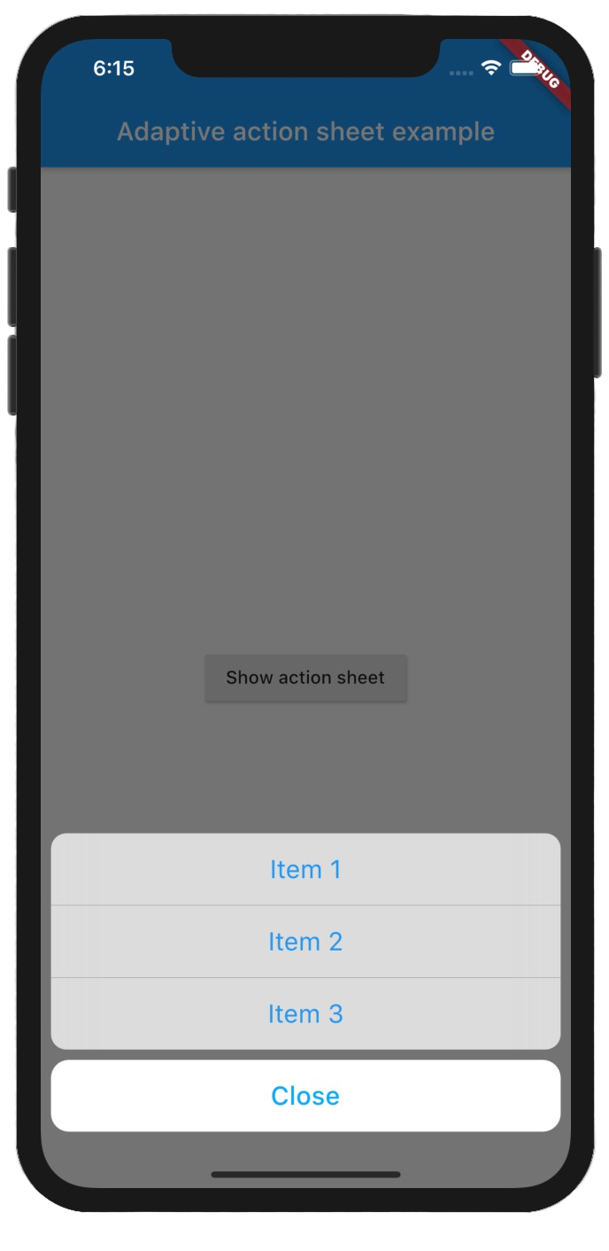 |
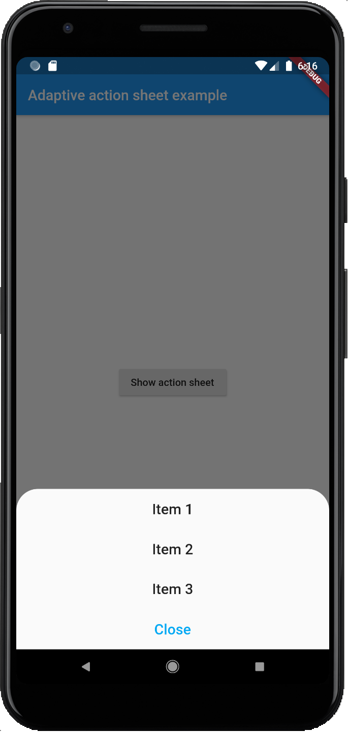 |
Getting Started
Add the package to your pubspec.yaml:
adaptive_action_sheet: ^2.0.0
In your dart file, import the library:
import 'package:adaptive_action_sheet/adaptive_action_sheet.dart';
Instead of using a showModalBottomSheet use showAdaptiveActionSheet Widget:
showAdaptiveActionSheet(
 context: context,
 title: const Text('Title'),
 androidBorderRadius: 30,
 actions: <BottomSheetAction>[
    BottomSheetAction(title: const Text('Item 1'), onPressed: () {}),
    BottomSheetAction(title: const Text('Item 2'), onPressed: () {}),
    BottomSheetAction(title: const Text('Item 3'), onPressed: () {}),
 ],
 cancelAction: CancelAction(title: const Text('Cancel')),// onPressed parameter is optional by default will dismiss the ActionSheet
);
Parameters:
showAdaptiveActionSheet:
actions: The Actions list that will appear on the ActionSheet. (required)cancelAction: The optional cancel button that show under the actions (grouped separately on iOS).title: The optional title widget that show above the actions.androidBorderRadius: The android border radius (default: 30).- The optional
backgroundColorandbarrierColorcan be passed in to customize the appearance and behavior of persistent material bottom sheets(Android only).
BottomSheetAction:
title: The primary content of the action sheet item. (required)onPressed: The callback that is called when the action item is tapped. (required)leading: A widget to display before the title. Typically an Icon widget. (optional)trailing: A widget to display after the title. Typically an Icon or a CircleAvatar widget. (optional)
CancelAction:
title: The primary content of the cancel action sheet item. (required)onPressed: The callback that is called when the action item is tapped.onPressedis optional by default will dismiss the Action Sheet.


 30 Dec 31, 2021
 3 Aug 18, 2022
 80 Sep 27, 2022
 4 Jan 26, 2020
 2 Oct 25, 2022
 6 Sep 18, 2022
 261 Jan 7, 2023
 45 Dec 29, 2022
 7 Oct 2, 2022
 0 Dec 27, 2021
 17 Sep 16, 2022
 198 Jan 5, 2023
 9 Oct 26, 2022
 11 Oct 10, 2022
 364 Dec 6, 2022
 314 Jan 9, 2023
 428 Dec 30, 2022
 1.3k Jan 4, 2023