Flutter Color Picker Wheel
Flutter Color Picker Wheel is an easy to use widget which can be heavily customized.
- You can use the WheelColorPicker directly by providing list of colors you want to include and animation configs.
- You can use the WheelColorPickerEntryContent and manage OverlayEntry yourself.
- This library provides some presets which make it even easier to use this component.
How to use
Add the dependency to your pubspec.yaml
flutter_color_picker_wheel: ^0.0.1
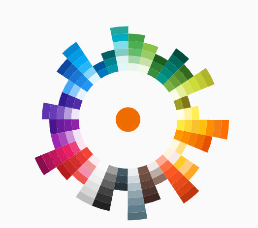
Showcase
 Fan Default Preset Fan Default Preset |
 Fan Simple Preset Fan Simple Preset |
 Sun Ray Default Sun Ray Default |
 Sun Ray Simple Sun Ray Simple |
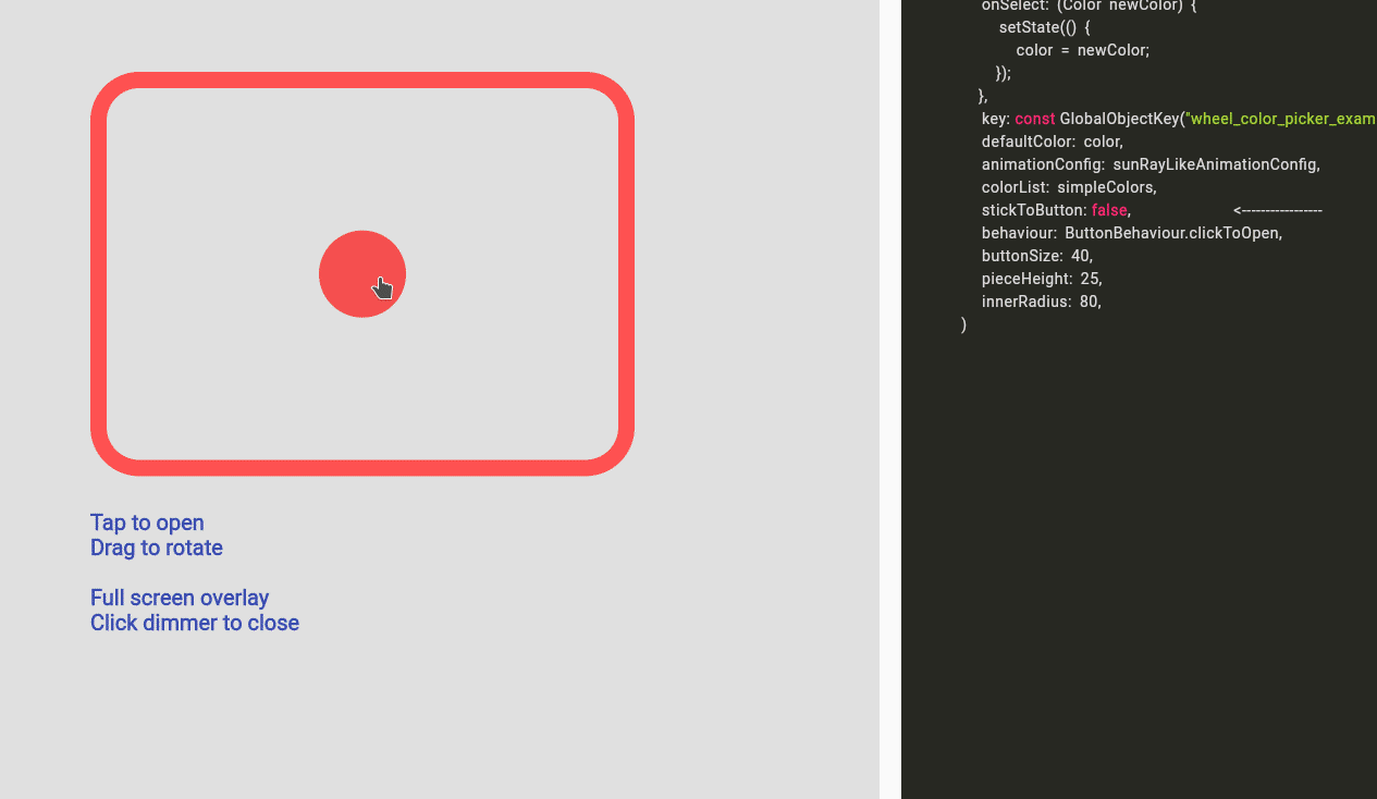 Detached Full Screen without Gap Detached Full Screen without Gap |
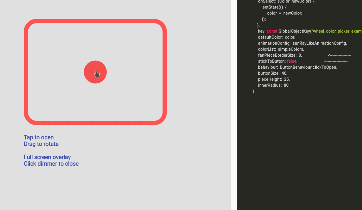 Detached Full Screen with Gap Detached Full Screen with Gap |
 Custom Color Set Custom Color Set |
 Custom Animation Custom Animation |
 Manage Your Own OverlayEntry Manage Your Own OverlayEntry |
Example Code
you can find more examples in the example path of this repository
Simple Usecase
import 'package:wheel_color_picker/wheel_color_picker.dart';
Color color; /// you want to initialize this color in the initState method
Widget myButton = WheelColorPicker(
onSelect: (Color newColor) {
setState(() {
color = newColor;
});
},
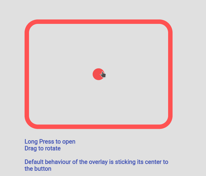
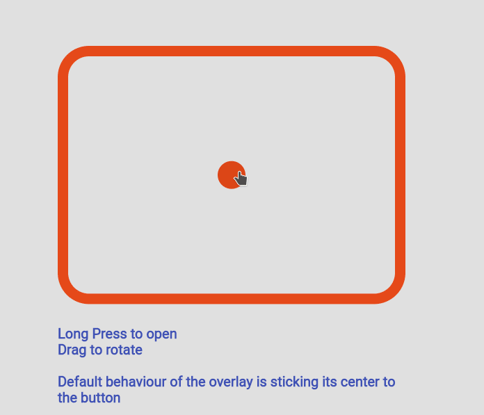
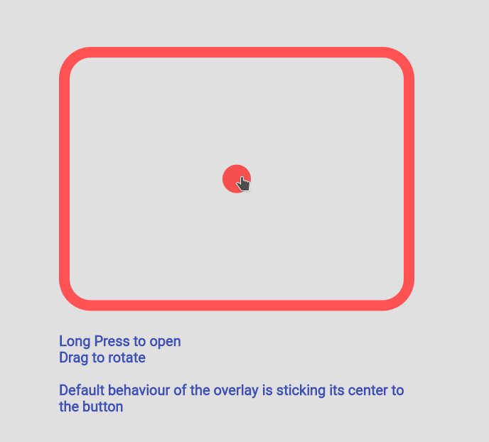
/// long press to open, another behaviour is clickToOpen to open
behaviour: ButtonBehaviour.longPressToOpen,
/// inital color
defaultColor: color,
/// fanLikeAnimationConfig is a preset, you can import this from the package
animationConfig: fanLikeAnimationConfig,
/// simpleColors is a preset, you can import this from the package
colorList: simpleColors,
/// size of the clickable button in the middle
buttonSize: 40,
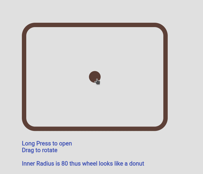
/// height of each piece (outerRadius - innerRadius of a piece)
pieceHeight: 25,
/// starting radius of the donut shaped wheel
innerRadius: 80,
);
Custom Color Set
WheelColorPicker(
	onSelect: (Color newColor) {
		setState(() {
			color = newColor;
		});
	},
	defaultColor: color,
	animationConfig: fanLikeAnimationConfig,
	colorList: const [
		[Colors.red, Colors.redAccent, Colors.deepOrange],
		[Colors.black26, Colors.black45, Colors.black87],
		[Colors.blue, Colors.blueAccent, Colors.blueGrey],
		[Colors.deepPurpleAccent, Colors.purpleAccent],
	],
	buttonSize: 40,
	pieceHeight: 15,
	innerRadius: 80,
);
Custom Animation
WheelColorPicker(
	onSelect: (Color newColor) {
	    setState(() {
			color = newColor;
		});
	},
	behaviour: ButtonBehaviour.clickToOpen,
	defaultColor: color,
	animationConfig: const FanAnimationConfig(
		animationDurationInMillisecond: 1000,
		rayAnimationConfig: RayAnimationConfig(
			curve: Curves.easeInQuad,
			enabled: false,
		),
		scaleAnimationConfig: ScaleAnimationConfig(
			curve: Curves.easeInOutCubic,
			enabled: true,
			animationStartDelay: 0,
			animationFinishDelay: 0.2,
		),
		opacityAnimationConfig: OpacityAnimationConfig(
			curve: Curves.linear,
			enabled: true,
			animationStartDelay: 0.2,
			animationFinishDelay: 0,
		),
		rotationAnimationConfig: RotationAnimationConfig(
			curve: Curves.easeInQuad,
			enabled: true,
			animationFinishDelay: 0.4
		)
	),
	colorList: defaultAvailableColors,
	buttonSize: 40,
	pieceHeight: 25,
	innerRadius: 80,
)
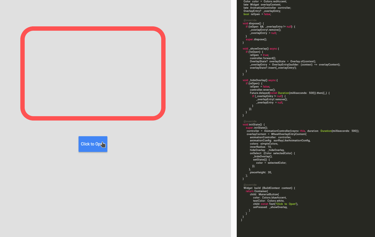
Using WheelColorPickerEntryContent

Note: This use case is a bit complicated.
If you decided to go this route there are several core ideas that you need to wrap your head around.
WheelOverlayEntryContentshould be generated only ONCE but not generated each build. You can have a new OverlayEntry, but you only need oneWheelOverlayEntryContent. This helps us to have a decent performance.- To stick the
WheelOverlayEntryContentto some component, you want to use LayerLink. SeeWheelColorPickeras an example - You need to provide
AnimationControllerto the Widget, thus you want to extend some ticker provider, eg.SingleTickerProviderStateMixin
Example:
class ExampleUseOverlayOnlyState extends State<ExampleUseOverlayOnly> with SingleTickerProviderStateMixin {
	Color color = Colors.redAccent;
	late Widget overlayContent;
	late AnimationController controller;
	OverlayEntry? _overlayEntry;
	bool isOpen = false;

	@override
    void dispose() {
		if (_overlayEntry != null) {
			_overlayEntry!.remove();
			_overlayEntry = null;
		}
		controller.dispose();
		super.dispose();
	}

	void _showOverlay() async {
		if (!isOpen) {
			isOpen = true;
			controller.forward();
			OverlayState? overlayState = Overlay.of(context);
			_overlayEntry = OverlayEntry(builder: (context) => overlayContent);
			overlayState?.insert(_overlayEntry!);
		}
	}

void _hideOverlay() async {
	if (isOpen) {
		isOpen = false;
		controller.reverse();
		Future.delayed(const Duration(milliseconds: 500)).then((_) {
			if (_overlayEntry != null) {
				_overlayEntry!.remove();
				_overlayEntry = null;
			}
		});
	}
}

@override
void initState() {
	super.initState();
	controller = AnimationController(vsync: this, duration:Duration(milliseconds: 500));
	overlayContent = WheelOverlayEntryContent(
		animationController: controller,
		animationConfig: sunRayLikeAnimationConfig,
		colors: simpleColors,
		innerRadius: 200,
		pieceHeight: 20,
		pieceBorderSize: 5,
		hideOverlay: _hideOverlay,
		onSelect: (Color selectedColor) {
			_hideOverlay();
			setState(() {
				color = selectedColor;
			});
		},
	);
}

@override
Widget build(BuildContext context) {
	return Container(
		padding: const EdgeInsets.all(150),
		child: Column(
			children:[
				Expanded(
					flex:12,
					child: Container(
						height: 500,
						width: 500,
						decoration: BoxDecoration(
							borderRadius: BorderRadius.circular(45),
							border: Border.all(
								width: 15,
								color: color
							)
						),
					)
				),
				const Expanded(flex:2, child: SizedBox()),
				Expanded(
					flex:2,
					child: MaterialButton(
						color: Colors.blueAccent,
						textColor: Colors.white,
						child: const Text("Click to Open"),
							onPressed: _showOverlay,
						)
					),
				]
			)
		);
	}
}


 46 Dec 29, 2022
 1.7k Jan 7, 2023
 8 Apr 15, 2022
 214 Dec 13, 2022
 5 Jul 29, 2022
 0 Oct 18, 2021
 114 Nov 16, 2022
 25 Dec 12, 2022
 35 Nov 4, 2022
 4 Dec 3, 2022