Add beautiful and trending tab indicators directly to your default Flutter TabBar

Overview

Add beautiful and trending tab indicators directly to your default Flutter TabBar.

Features 💚

  • Supports Android, iOS, Web
  • Can be directly added to the default TabBar
  • 3 different styles of TabIndicator
  • Highly customizable

Demo

Styles

DotIndicator

 /// Radius of the dot
  final double radius;

  /// Color of the dot
  final Color color;

  /// Distance from the center, if you the value is positive, the dot will be positioned below the tab's center
  /// if the value is negative, then dot will be positioned above the tab's center
  final double distanceFromCenter;

  /// [PagingStyle] determines if the indicator should be fill or stroke
  final PaintingStyle paintingStyle;

  /// StrokeWidth, used for [PaintingStyle.stroke]
  final double strokeWidth;

MaterialIndicator

  /// Height of the indicator. Defaults to 4
  final double height;

  /// Determines to location of the tab, [TabPosition.bottom] set to default.
  final TabPosition tabPosition;

  /// topRight radius of the indicator, default to 5.
  final double topRightRadius;

  /// topLeft radius of the indicator, default to 5.
  final double topLeftRadius;

  /// bottomRight radius of the indicator, default to 0.
  final double bottomRightRadius;

  /// bottomLeft radius of the indicator, default to 0
  final double bottomLeftRadius;

  /// Color of the indicator, default set to [Colors.black]
  final Color color;

  /// Horizontal padding of the indicator, default set 0
  final double horizontalPadding;

  /// [PagingStyle] determines if the indicator should be fill or stroke, default to fill
  final PaintingStyle paintingStyle;

  /// StrokeWidth, used for [PaintingStyle.stroke], default set to 2
  final double strokeWidth;

RectangularIndicator

/// topRight radius of the indicator, default to 5.
  final double topRightRadius;

  /// topLeft radius of the indicator, default to 5.
  final double topLeftRadius;

  /// bottomRight radius of the indicator, default to 0.
  final double bottomRightRadius;

  /// bottomLeft radius of the indicator, default to 0
  final double bottomLeftRadius;

  /// Color of the indicator, default set to [Colors.black]
  final Color color;

  /// Horizontal padding of the indicator, default set to 0
  final double horizontalPadding;

  /// Vertical padding of the indicator, default set to 0
  final double verticalPadding;

  /// [PagingStyle] determines if the indicator should be fill or stroke, default to fill
  final PaintingStyle paintingStyle;

  /// StrokeWidth, used for [PaintingStyle.stroke], default set to 0
  final double strokeWidth;

How to use

// Directly use inside yoru [TabBar]
TabBar(
  indicatorColor: Colors.green,
  tabs: [
    Tab(
      text: "Home",
    ),
    Tab(
      text: "Work",
    ),
    Tab(
      text: "Play",
    ),
  ],
  labelColor: Colors.black,
  // add it here
  indicator: DotIndicator(
    color: Colors.black,
    distanceFromCenter: 16,
    radius: 3,
    paintingStyle: PaintingStyle.fill,
  ),
),
You might also like...

Tabbed sliverlist - A simple flutter plugin to setup sliverlist with TabBar with minimal code.

Tabbed sliverlist - A simple flutter plugin to setup sliverlist with TabBar with minimal code.

tabbed_sliverlist A package to simplify initialization of TabBar with ListView builder implemented using sliverappbar and sliverlist. Scroll position

Jan 3, 2022

Github Trending app built with Flutter+Redux+Built(Immutable Data)

Github Trending app built with Flutter+Redux+Built(Immutable Data)

May 13, 2020

Flashy_tab_bar - One another nice animated tabbar

Flashy_tab_bar - One another nice animated tabbar

One another nice animated tabbar (Inspired by Cuberto) Getting Started Add the dependency at pubspec.yaml:

Nov 16, 2022

Library to create custom Toggle / Tab on your apps

Library to create custom Toggle / Tab on your apps

Flutter Tab Toggle A Beautiful and Simple Tab/Toggle switch widget. It can be fully customized with desired icons, width, colors, text, corner radius

Sep 6, 2022

Immich - Self-hosted Photo backup solution directly from your mobile phone

IMMICH Self-hosted Photo backup solution directly from your mobile phone. Note T

Dec 31, 2022

A customizable carousel slider widget in Flutter which supports inifinte scrolling, auto scrolling, custom child widget, custom animations and built-in indicators.

A customizable carousel slider widget in Flutter which supports inifinte scrolling, auto scrolling, custom child widget, custom animations and built-in indicators.

flutter_carousel_widget A customizable carousel slider widget in Flutter. Features Infinite Scroll Custom Child Widget Auto Play Horizontal and Vertic

Nov 26, 2022

Card-slider-flutter - Implementation of swipeable image cards with dot indicators

Card-slider-flutter - Implementation of swipeable image cards with dot indicators

card_slider A new Flutter project. Getting Started This project is a starting po

Sep 17, 2022

A package that offers various page indicators inlcuding a Flutter implementation of the Ink Page Indicator

A package that offers various page indicators inlcuding a Flutter implementation of the Ink Page Indicator

A package that offers various page indicators inlcuding a Flutter implementation of the Ink Page Indicator. See below for more examples.

Jan 6, 2022

A highly customisable and simple widget for having iOS 13 style tab bars.

cupertino_tabbar A highly customisable and simple widget for having iOS 13 style tab bars. It is highly recommended to read the documentation and run

Oct 31, 2022
Comments
  • Another exception was thrown: Padding must be less than half of the size of the tab

    Another exception was thrown: Padding must be less than half of the size of the tab

    Hey allo! Can someone help me! 
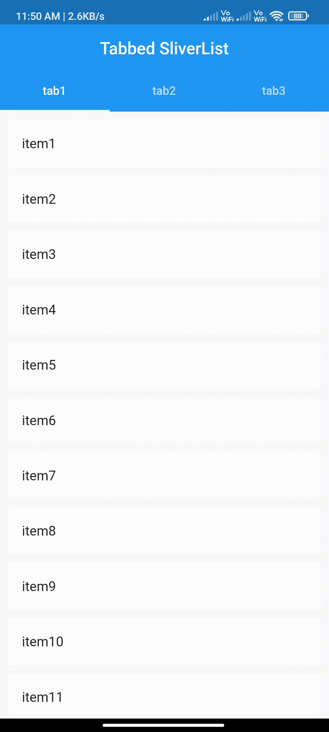
I wrap the tabBar in material widget.But i got this error: Another exception was thrown: Padding must be less than half of the size of the tab That is my dart code: `import 'package:badges/badges.dart'; import 'package:blurrycontainer/blurrycontainer.dart'; import 'package:flutter/material.dart'; import 'package:flutter_rating_bar/flutter_rating_bar.dart'; import 'package:font_awesome_flutter/font_awesome_flutter.dart'; import 'package:get/get.dart'; import 'package:google_fonts/google_fonts.dart'; import 'package:logger/logger.dart'; import 'package:madia/animations/slowFadeIn.dart'; import 'package:madia/components/comp_menu.dart'; import 'package:madia/models/restaurant.dart'; import 'package:madia/pages/restaurants/detailsmenu.dart'; import 'package:madia/values/values.dart'; import 'package:pigment/pigment.dart'; import 'package:transparent_image/transparent_image.dart'; import 'package:tab_indicator_styler/tab_indicator_styler.dart';

    class DetailsRestaurant extends StatefulWidget { DetailsRestaurant({Key key, this.restaurant}) : super(key: key); final Restaurant restaurant; @override _DetailsRestaurantState createState() => _DetailsRestaurantState(); }

    class _DetailsRestaurantState extends State with TickerProviderStateMixin { double prct_70 = Get.height * 70 / 100; double prct_40 = Get.height * 40 / 100; TabController tabcon; List nomcategorie = [ "Boisson", "Plat", "Chaud", "Desserts", "Pizza", 'Pate' ]; List listTab = [ Tab( text: "Plat", ), Tab( text: "Boisson", ), Tab( text: "Pate", ), Tab( text: "Dessert", ), // Tab( // child: Text( // 'Dessert', // style: GoogleFonts.sansita(), // ), // ) ]; Widget menuByCategories(String query) { widget.restaurant.menus.where((item) => (item['type'] as String) == query);

    return new ListView.builder(
      physics: BouncingScrollPhysics(),
      itemCount: widget.restaurant.menus.length,
      itemBuilder: (context, index) {
        Map<String, dynamic> menu = widget.restaurant.menus[index];
        return SlowFadeIn(
          index.ceilToDouble() - 0.5,
          GestureDetector(
            onTap: () {
              Get.to(DetailsMenu(menu: menu), transition: Transition.topLevel);
            },
            child: ListTile(
              isThreeLine: true,
              contentPadding: EdgeInsets.all(0),
              leading: LimitedBox(
                maxHeight: double.infinity,
                maxWidth: double.infinity,
                child: ClipRRect(
                    borderRadius: BorderRadius.circular(10),
                    child: FadeInImage.memoryNetwork(
                      placeholder: kTransparentImage,
                      image:
                          menu['imgsrc'] ?? 'https://via.placeholder.com/170',
                      fit: BoxFit.fill,
                    )),
              ),
              title: new Text(menu['nom']),
              subtitle: Column(
                crossAxisAlignment: CrossAxisAlignment.start,
                children: [Text(menu['description']), Text(menu['prix'])],
              ),
            ),
          ),
        );
      },
    );
    

    }

    @override void initState() { tabcon = TabController(length: 4, vsync: this, initialIndex: 0); super.initState(); }

    @override Widget build(BuildContext context) { return Scaffold( floatingActionButton: FloatingActionButton( backgroundColor: Colors.blue, onPressed: () { // Get.to(AddMenu()); Logger().w('lorfgfcg ${widget.restaurant.menus}'); }, child: Icon(Icons.add), ), body: CustomScrollView( physics: BouncingScrollPhysics(), slivers: [ SliverAppBar( backgroundColor: Colors.transparent, actions: [ IconButton( icon: Icon( Icons.favorite, color: Colors.white, size: 24.0, ), onPressed: null), IconButton( icon: Icon( Icons.more_vert, color: Colors.white, size: 24.0, ), onPressed: () {}) ], expandedHeight: 250.0, flexibleSpace: FlexibleSpaceBar( background: GestureDetector( child: Stack(children: [ SizedBox( width: double.infinity, height: double.infinity, child: Hero( tag: widget.restaurant.id, child: FadeInImage.memoryNetwork( placeholder: kTransparentImage, image: widget.restaurant.imgsrc, fit: BoxFit.cover), )), Align( alignment: Alignment(0, 0.9), child: FittedBox( // width: 200, // height: 50, fit: BoxFit.contain, child: BlurryContainer( padding: EdgeInsets.all(5), height: 45, blur: 6, borderRadius: BorderRadius.circular(20), child: SlowFadeIn( 1, Row( children: [ Icon(Icons.phone, color: AppColors.primaryColor), Text( '${widget.restaurant.contact['telephone']}', style: GoogleFonts.sansita(color: Colors.white), ), VerticalDivider(color: Colors.white), Icon(Icons.mail_outline, color: AppColors.primaryColor), Text( '${widget.restaurant.contact['email']}', style: GoogleFonts.sansita(color: Colors.white), ), ], ), ), ), ), ), ]), ), ), ), SliverToBoxAdapter( child: Container( color: AppColors.thirdColor, height: 800, child: Column( children: [ SingleChildScrollView( scrollDirection: Axis.horizontal, padding: EdgeInsets.all(5), child: SlowFadeIn( 1.3, Text(widget.restaurant.nom, textAlign: TextAlign.center, style: GoogleFonts.sansita(fontSize: 35)), ), ), SingleChildScrollView( scrollDirection: Axis.horizontal, padding: EdgeInsets.all(5), child: SlowFadeIn( 1.3, Text(widget.restaurant.adresse.toString(), textAlign: TextAlign.center, style: GoogleFonts.sansita( fontSize: 15, color: Colors.black12)), ), ), SlowFadeIn( 1.5, RatingBar( itemSize: 20, initialRating: 3, ignoreGestures: true, minRating: 1, direction: Axis.horizontal, allowHalfRating: true, itemCount: 5, itemPadding: EdgeInsets.symmetric(horizontal: 4.0), itemBuilder: (context, _) => Icon( Icons.star, color: Colors.amber, ), onRatingUpdate: (rating) { print(rating); }, ), ), Padding( padding: const EdgeInsets.symmetric(vertical: 15), child: SlowFadeIn( 1.8, Row( mainAxisAlignment: MainAxisAlignment.center, children: [ Badge( elevation: 0, badgeColor: Colors.white, shape: BadgeShape.square, borderRadius: 20, toAnimate: false, badgeContent: Row( children: [ FaIcon( FontAwesomeIcons.locationArrow, color: Pigment.fromString("#FC6A57"), size: 15, ), Text( " 12 min", style: GoogleFonts.roboto( color: Pigment.fromString("#FC6A57")), ) ], ), ), Badge( elevation: 0, badgeColor: Colors.white, shape: BadgeShape.square, borderRadius: 20, toAnimate: false, badgeContent: Row( children: [ FaIcon( FontAwesomeIcons.times, color: Pigment.fromString("#FC6A57"), size: 15, ), Text( " 12'", style: GoogleFonts.roboto( color: Pigment.fromString("#FC6A57")), ) ], ), ), ], ), ), ), Padding( padding: const EdgeInsets.symmetric(vertical: 10), child: Row( children: [ComponentMenu(menus: widget.restaurant.menus)], ), ), Material( child: TabBar( controller: tabcon, labelPadding: EdgeInsets.all(5), labelColor: AppColors.primaryColor, unselectedLabelColor: Colors.black, indicator: MaterialIndicator( height: 4, color: Colors.red, topLeftRadius: 8, bottomLeftRadius: 8, bottomRightRadius: 8, topRightRadius: 8, horizontalPadding: 50, tabPosition: TabPosition.bottom, ), tabs: [ Tab( text: "Epa", ), Tab( text: "Epa", ), Tab( text: "Epa", ), Tab( text: "Epa", ), // Tab( // child: Text( // 'Dessert', // style: GoogleFonts.sansita(), // ), // ) ], ), ), Expanded( child: TabBarView( controller: tabcon, physics: BouncingScrollPhysics(), children: [ Container(color: Colors.red), Container(color: Colors.black), Container(color: Colors.green), Container(color: Colors.yellow), ], ), ), ], ), ), ), ], ), ); } } `

    But i got always this error and on screen : just got blanc. i'm trying to put image

    opened by jeydi243 1
  • SetState inside the onTap argument of the TabBar stops the animation

    SetState inside the onTap argument of the TabBar stops the animation

    Hi,

    I'm using your package because it looks really good. Everything works fine, however I found an annoying problem. If you call SetState inside a Stateful Widget which uses TabBar with no indicator, the default animation works as expected. But if you use the RectangularIndicator from your package as a argument, it doesn't work with the setState callback. The animation doesn't occur at all, the indicator is only jumping from one tab to another.

    In most cases, I don't use TabBarView with the TabBar widget because I prefer to have more control over what is going on, and so I need to call setState. I'm sure I'm not the only dev who works without TabBarView.

    If you can't reproduce the problem, let me know I'll make a demo.

    opened by RobinLbt 1
  • a 1dp space line after of tab

    a 1dp space line after of tab

    image

    column(
    childen:[
    TabBar(
            controller: tabController,
            indicatorWeight: 0,
            indicatorPadding: EdgeInsets.all(0),
            indicator: RectangularIndicator(color: Color(0xff486F8D)),
            tabs: [TimeAndLocationTabBarItem(), TimeAndLocationTabBarItem(), TimeAndLocationTabBarItem()]),
    Container(
                  padding: EdgeInsets.all(0),
                  margin: EdgeInsets.all(0),
                  width: 200,
                  height: 200,
                  color: Color(0xff486F8D),
                  child: TabBarView(
                    controller: tabController,
                    children: [
                      Container(
                        width: 10,
                        height: 10,
                      ), Container(
                        width: 10,
                        height: 10,
                      ),
                      Container(
                        width: 10,
                        height: 10,
                      )
                    ],
                  ),
                )
    ]
    )
    
    opened by TomVista 1
Releases(V-1.0.0)
Owner
Adar
Has a very keen interest in Front-end, mobile applications & problem-solving. Currently working with Flutter :) And A Dota freak xD
Adar
A powerful official extension library of Tab/TabBar/TabView, which support to scroll ancestor or child Tabs when current is overscroll, and set scroll direction and cache extent.

extended_tabs Language: English | 中文įŽ€äŊ“ A powerful official extension library of Tab/TabBar/TabView, which support to scroll ancestor or child Tabs whe

FlutterCandies 185 Dec 13, 2022
A colorful TabBar Flutter library with color animating indicator where each tab has a color. (inspired by SmartNews app)

Flutter Colorful TabBar A colorful TabBar for Flutter where each tab has a color (inspired by SmartNews app). Getting Started Add this to your package

null 8 Jun 17, 2022
A customizable carousel slider for Flutter. Supports infinite sliding, custom indicators, and custom animations with many pre-built indicators and animations.

Flutter Carousel Slider A customizable carousel slider for flutter Screenshots Installing dependencies: flutter_carousel_slider: ^1.0.8 Demo Demo a

Udara Wanasinghe 23 Nov 6, 2022
Advanced & beautiful animations inspired by animate_do and Animate.css, every animation is a widget that contains default but customizable values 💙

animate_it An animation package inspired by animate_do and Animate.css. Since the original animate_do is not being maintained, I have decided to creat

Luke Moody 3 Oct 1, 2022
Flutter Image add drag sort, Image add drag sort, support click event, delete, add, long press drag sort.

flutter_image_add_drag_sort Flutter Image add drag sort, Image add drag sort, support click event, delete, add, long press drag sort, support video fi

null 5 Jun 23, 2020
Automatically generate profile picture with random first name and background color. But you can still provide pictures if you have them. As the default color, based on the name of the first letter. :fire: :fire: :fire:

FLUTTER PROFILE PICTURE Automatically generate profile picture with random first name and background color. But you can still provide pictures if you

Aditya Dharmawan Saputra 10 Dec 20, 2022
Find The Latest trending and upcoming movies and tv shows with MovieDB app. The app contains all info about movies and tv shows. find similar movies or shows, Browse all genres, video trailers, backdrops, logos, and posters.

MovieDB App Features. Dynamic Theming Search Functionality Onboarding-Screen Select favourite movie Home Screen Tranding movie Movies different catego

Ansh rathod 80 Dec 12, 2022
A replacement for Flutter's default SafeArea widget

ColorfulSafeArea A more customizable replacement for the SafeArea widget. It lets you set the color of your SafeArea without affecting the color of it

Ed 26 Nov 11, 2022
State Persistence - Persist state across app launches. By default this library store state as a local JSON file called `data.json` in the applications data directory. Maintainer: @slightfoot

State Persistence Persist state across app launches. By default this library store state as a local JSON file called data.json in the applications dat

Flutter Community 70 Sep 28, 2022
Dart package to get GitHub trending repositories and developers

github_trending A Dart library to get GitHub trending repositories and developers via github-trending-api. Installation Add github_trending as a depen

GitTouch 6 Oct 22, 2022