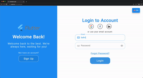
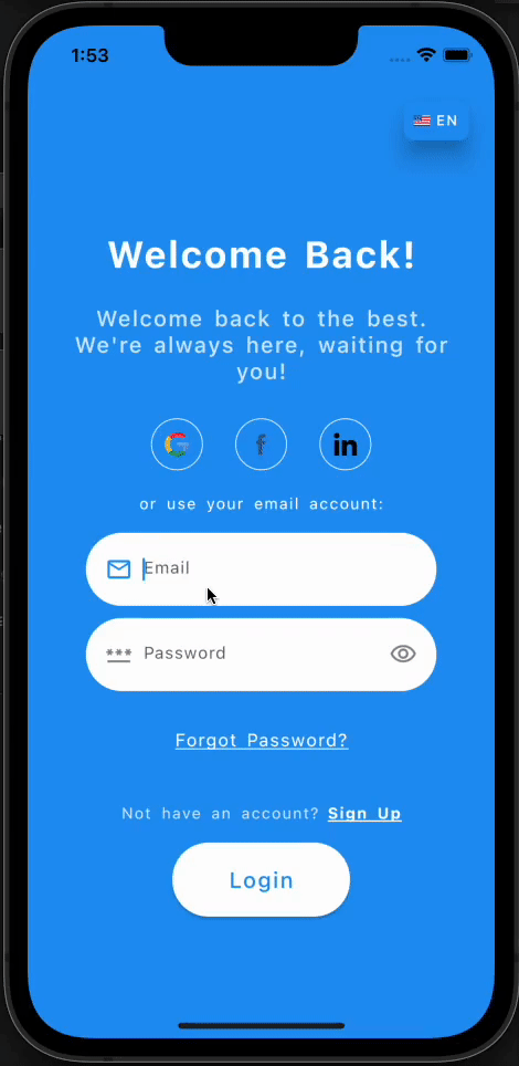
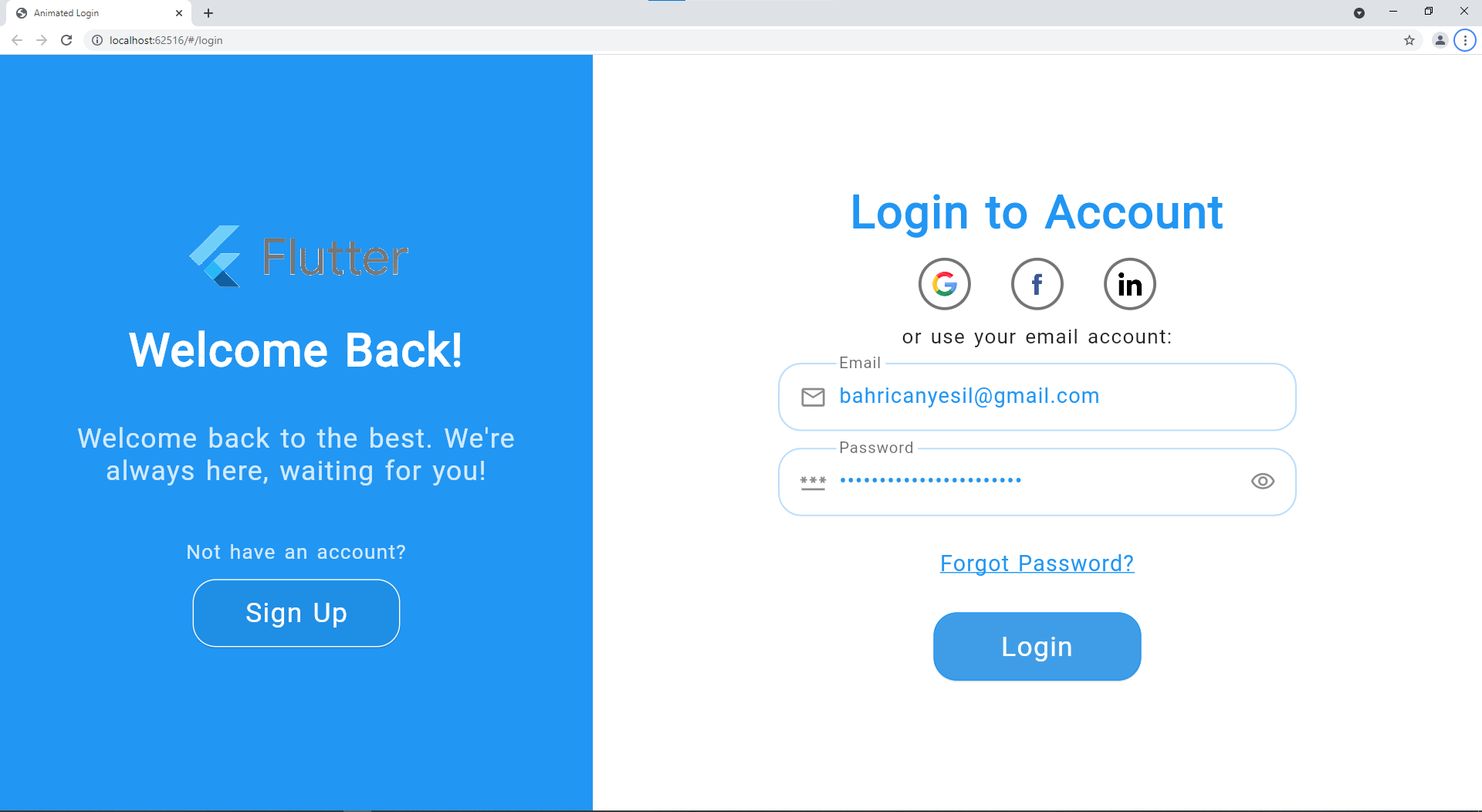
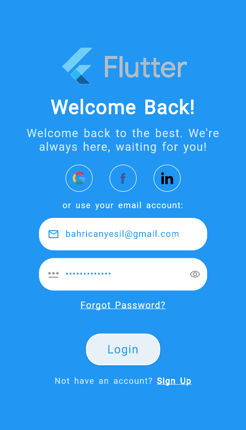
Animated Login for Flutter is a ready-made login/signup screen with soft and pleasant animations. It is fully responsible to be able to use on both web and mobile apps. You can welcome your users with this beautiful animated screen that gives functionality for both login and sign up.
Web View Example Video
Mobile View Example Video
Installation
You can follow the instructions for installation here
Reference
Property
Type
Description
onSignup
SignupCallback
Signup callback that will be called after signup button pressed.
onLogin
LoginCallback
Login callback that will be called after login button pressed.
Enum to determine which text form fields should be displayed in addition to the email and password fields: Name / Confirm Password / Both.
LoginTexts
Property
Type
Description
welcome
String
Welcome title in signUp mode for the informing part.
welcomeDescription
String
Welcome description in signUp mode for the informing part.
signUp
String
Action button text for sign up mode.
signUpFormTitle
String
Form title for sign up mode.
signUpUseEmail
String
Use email CTA for sign up mode.
welcomeBack
String
Welcome title in login mode for the informing part.
welcomeBackDescription
String
Welcome description in login mode for the informing part.
login
String
Action button text for login mode.
loginFormTitle
String
Form title for login mode.
loginUseEmail
String
Use email CTA for login mode.
forgotPassword
String
Forgot password text for login mode.
notHaveAnAccount
String
Text above the sign up button to direct users who don't have an account.
alreadyHaveAnAccount
String
Text above the login button to direct users who already have an account.
nameHint
String
Hint text for name [TextFormField]
emailHint
String
Hint text for email [TextFormField]
passwordHint
String
Hint text for password [TextFormField]
confirmPasswordHint
String
Hint text for confirm password [TextFormField]
passwordMatchingError
String
The error text for not matching password and confirm password inputs.
dialogButtonText
String
The button text of error dialog.
LoginTheme
Property
Type
Description
formTitleStyle
TextStyle
Text style for the title of form part.
welcomeTitleStyle
TextStyle
Text style for the title of welcome part.
welcomeDescriptionStyle
TextStyle
Text style for the description of welcome part.
changeActionStyle
TextStyle
Text style for the change action CTA of welcome part.
useEmailStyle
TextStyle
Text style for the use email text of form part.
forgotPasswordStyle
TextStyle
Text style for the forgot password CTA of form part.
hintTextStyle
TextStyle
Text style for hint texts in the text form fields.
errorTextStyle
TextStyle
Text style for error texts in the text form fields.
textFormStyle
TextStyle
Text style for input texts in the text form fields.
actionTextStyle
TextStyle
Text style for action button text in the form part.
changeActionTextStyle
TextStyle
Text style for change action button text in the welcome part.
textFormFieldDeco
InputDecoration
Input decoration for the text form fields.
nameIcon
Widget
Prefix widget for name text form field.
emailIcon
Widget
Prefix widget for email text form field.
passwordIcon
Widget
Prefix widget for password text form field.
formFieldElevation
double
Elevation for text form fields.
formFieldBackgroundColor
Color
Background color for text form fields.
formFieldShadowColor
Color
Shadow color for text form fields.
formFieldBorderRadius
BorderRadius
Border radius for text form fields.
formFieldSize
Size
Size of text form fields.
formFieldHoverColor
Color
Hover color for text form fields.
backgroundColor
Color
Background color of the login screen.
errorBorderColor
Color
Error border color for text form fields.
focusedErrorBorderColor
Color
Focused error border color for text form fields.
focusedBorderColor
Color
Focused border color for text form fields.
enabledBorderColor
Color
Enabled border color for text form fields.
enabledBorder
InputBorder
Enabled border for text form fields.
errorBorder
InputBorder
Error border for text form fields.
focusedErrorBorder
InputBorder
Focused error border for text form fields.
focusedBorder
InputBorder
Focused border for text form fields.
showFormFieldErrors
bool
Indicates whether the error messages should be displayed below the text form fields.
showLabelTexts
bool
Indicates whether the labels should be displayed above the text form fields.
socialLoginHoverColor
Color
Hover color for social login widgets.
socialLoginBorder
BorderSide
Border for social login widgets.
SocialLogin
Property
Type
Description
iconPath
String
Full asset path of the social platform logo.
callback
SocialLoginCallback
The callback will be called on click to logo of the social platform.
LoginData
Property
Type
Description
email
String
Email text the user entered to the email [TextFormField]
password
String
Password text the user entered to the password [TextFormField]
SignUpData
Property
Type
Description
name
String
Name text the user entered to the name [TextFormField]
email
String
Email text the user entered to the email [TextFormField]
password
String
Password text the user entered to the password [TextFormField]
confirmPassword
String
Confirm password text the user entered to the confirm password [TextFormField]
SignUpModes
Enum
Description
name
Only displays name text form field, not displays confirm password.
confirmPassword
Only displays confirm password form field, not name.
both
Displays both name and confirm password text form fields.
Sign up modes to determine which text form fields should be displayed.
Complete Example
You can see the complete example in the example folder with the example project. The video recordings for the example project are shown above via gifs.
import'package:flutter/material.dart';
import'package:animated_login/animated_login.dart';
classLoginScreenextendsStatelessWidget {
constLoginScreen({Key? key}) :super(key: key);
/// Simulates the multilanguage, you will implement your own logic. /// According to the current language, you can display a text message /// with the help of [LoginTexts] class.finalString langCode ='en';
@overrideWidgetbuild(BuildContext context) {
returnAnimatedLogin(
onLogin: onLogin,
onSignup: onSignup,
onForgotPassword: onForgotPassword,
formWidthRatio:60,
logo:'images/logo.gif',
// backgroundImage: 'images/background_image.jpg',
signUpMode:SignUpModes.both,
loginTheme: _loginTheme,
loginTexts: _loginTexts,
);
}
/// You can adjust the colors, text styles, button styles, borders /// according to your design preferences. /// You can also set some additional display options such as [showLabelTexts].LoginThemeget_loginTheme => LoginTheme(
// showLabelTexts: false,
backgroundColor:Colors.blue, // const Color(0xFF6666FF),
formFieldBackgroundColor:Colors.white,
changeActionTextStyle:constTextStyle(color:Colors.white),
);
LoginTextsget_loginTexts => LoginTexts(
nameHint: _username,
login: _login,
signUp: _signup,
);
/// You can adjust the texts in the screen according to the current language /// With the help of [LoginTexts], you can create a multilanguage scren.Stringget_username => langCode =='tr'?'Kullanıcı Adı':'Username';
Stringget_login => langCode =='tr'?'Giriş Yap':'Login';
Stringget_signup => langCode =='tr'?'Kayıt Ol':'Sign Up';
/// Login action that will be performed on click to action button in login mode.Future<String?>onLogin(LoginData loginData) async {
awaitFuture.delayed(constDuration(seconds:2));
print('Successfully logged in.');
returnnull;
}
/// Sign up action that will be performed on click to action button in sign up mode.Future<String?>onSignup(SignUpData loginData) async {
awaitFuture.delayed(constDuration(seconds:2));
print('Successfully signed up.');
returnnull;
}
/// Action that will be performed on click to "Forgot Password?" text/CTA. /// Probably you will navigate user to a page to create a new password after the verification.Future<String?>onForgotPassword(String email) async {
awaitFuture.delayed(constDuration(seconds:2));
print('Successfully navigated.');
returnnull;
}
}
Basic example with social login options and data checks
get _socialLogins =>
[ SocialLogin( callback: () async => socialLogin('Google'), iconPath: 'images/google.png'), SocialLogin( callback: () async => socialLogin('Facebook'), iconPath: 'images/facebook.png'), SocialLogin( callback: () async => socialLogin('Linkedin'), iconPath: 'images/linkedin.png'), ]; /// Login action that will be performed on click to action button in login mode. Future
onLogin(LoginData loginData) async { await Future.delayed(const Duration(seconds: 2)); print(""" Successfully logged in.\n Email: ${loginData.email}\n Password: ${loginData.password}"""); return null; } /// Sign up action that will be performed on click to action button in sign up mode. Future
onSignup(SignUpData signupData) async { await Future.delayed(const Duration(seconds: 2)); print(""" Successfully signed up.\n Username: ${signupData.name}\n Email: ${signupData.email}\n Password: ${signupData.password}\n Confirm Password: ${signupData.confirmPassword}"""); return null; } /// Action that will be performed on click to "Forgot Password?" text/CTA. /// Probably you will navigate user to a page to create a new password after the verification. Future
onForgotPassword(String email) async { await Future.delayed(const Duration(seconds: 2)); print('Successfully navigated. Email is $email'); return null; } /// Social login callback example. Future
socialLogin(String type) async { await Future.delayed(const Duration(seconds: 2)); print('Successfully logged in with $type.'); return null; } } ">
import'package:flutter/material.dart';
import'package:animated_login/animated_login.dart';
classLoginScreenextendsStatelessWidget {
constLoginScreen({Key? key}) :super(key: key);
/// Simulates the multilanguage, you will implement your own logic. /// According to the current language, you can display a text message /// with the help of [LoginTexts] class.finalString langCode ='en';
@overrideWidgetbuild(BuildContext context) {
returnAnimatedLogin(
onLogin: onLogin,
onSignup: onSignup,
onForgotPassword: onForgotPassword,
formWidthRatio:60,
logo:'images/logo.gif',
// backgroundImage: 'images/background_image.jpg',
signUpMode:SignUpModes.both,
socialLogins: _socialLogins,
loginTheme: _loginTheme,
loginTexts: _loginTexts,
);
}
/// You can adjust the colors, text styles, button styles, borders /// according to your design preferences. /// You can also set some additional display options such as [showLabelTexts].LoginThemeget_loginTheme => LoginTheme(
// showLabelTexts: false,
backgroundColor:Colors.blue, // const Color(0xFF6666FF),
formFieldBackgroundColor:Colors.white,
changeActionTextStyle:constTextStyle(color:Colors.white),
);
LoginTextsget_loginTexts => LoginTexts(
nameHint: _username,
login: _login,
signUp: _signup,
);
/// You can adjust the texts in the screen according to the current language /// With the help of [LoginTexts], you can create a multilanguage scren.Stringget_username => langCode =='tr'?'Kullanıcı Adı':'Username';
Stringget_login => langCode =='tr'?'Giriş Yap':'Login';
Stringget_signup => langCode =='tr'?'Kayıt Ol':'Sign Up';
/// Social login options, you should provide callback function and icon path. /// Icon paths should be the full path in the assets /// Don't forget to also add the icon folder to the "pubspec.yaml" file.List<SocialLogin>get_socialLogins => <SocialLogin>[
SocialLogin(
callback: () async=>socialLogin('Google'),
iconPath:'images/google.png'),
SocialLogin(
callback: () async=>socialLogin('Facebook'),
iconPath:'images/facebook.png'),
SocialLogin(
callback: () async=>socialLogin('Linkedin'),
iconPath:'images/linkedin.png'),
];
/// Login action that will be performed on click to action button in login mode.Future<String?>onLogin(LoginData loginData) async {
awaitFuture.delayed(constDuration(seconds:2));
print(""" Successfully logged in.\n Email: ${loginData.email}\n Password: ${loginData.password}""");
returnnull;
}
/// Sign up action that will be performed on click to action button in sign up mode.Future<String?>onSignup(SignUpData signupData) async {
awaitFuture.delayed(constDuration(seconds:2));
print(""" Successfully signed up.\n Username: ${signupData.name}\n Email: ${signupData.email}\n Password: ${signupData.password}\n Confirm Password: ${signupData.confirmPassword}""");
returnnull;
}
/// Action that will be performed on click to "Forgot Password?" text/CTA. /// Probably you will navigate user to a page to create a new password after the verification.Future<String?>onForgotPassword(String email) async {
awaitFuture.delayed(constDuration(seconds:2));
print('Successfully navigated. Email is $email');
returnnull;
}
/// Social login callback example.Future<String?>socialLogin(String type) async {
awaitFuture.delayed(constDuration(seconds:2));
print('Successfully logged in with $type.');
returnnull;
}
}
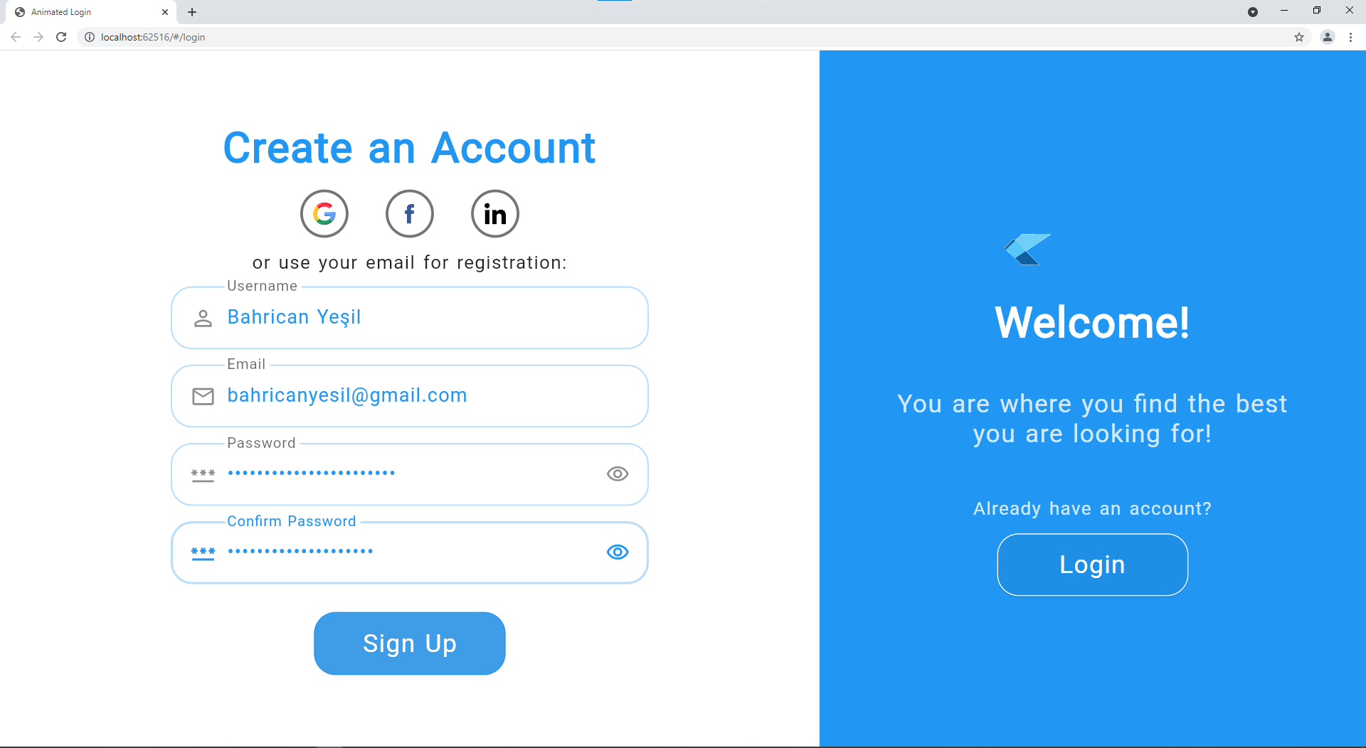
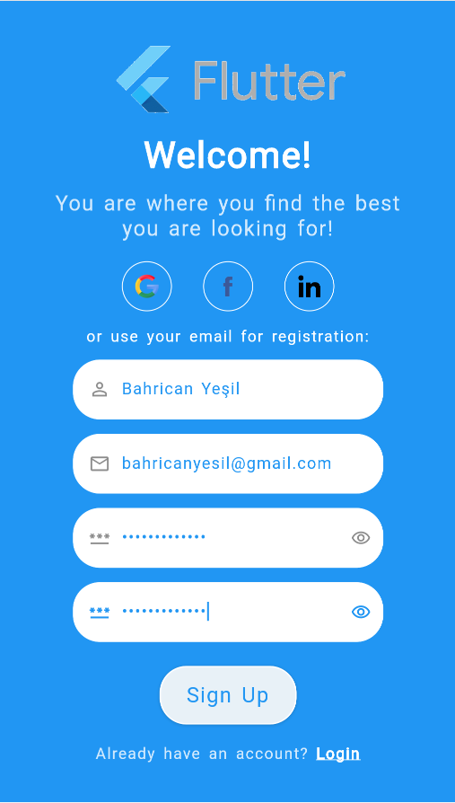
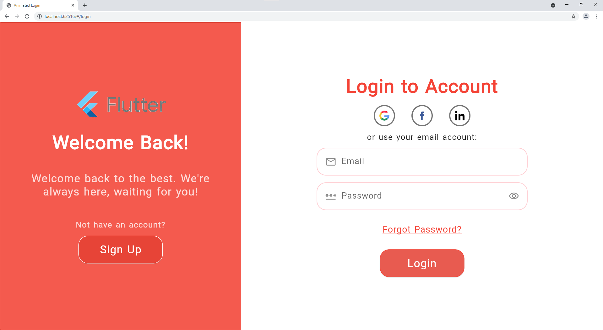
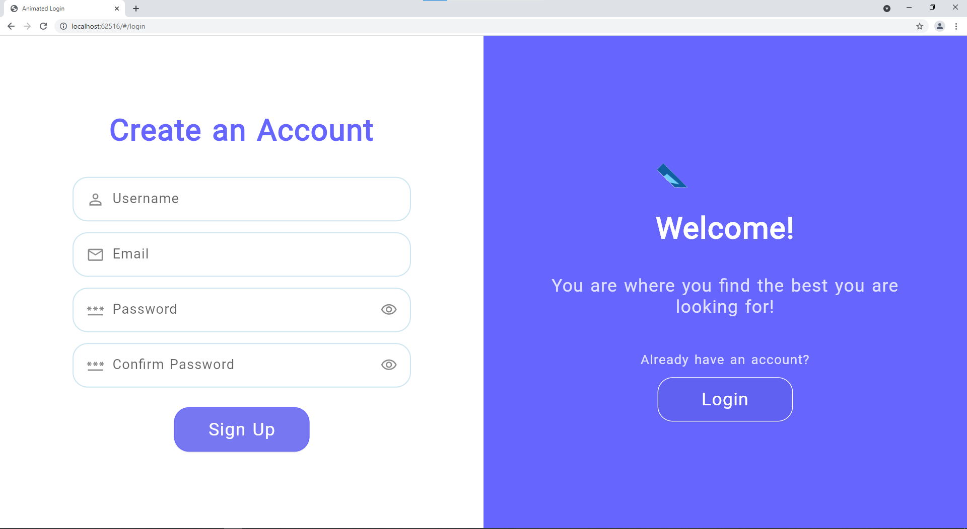
More Screenshots
Web Login
Mobile Login
Web Sign Up
Mobile Sign Up
Color Change
Without Social Logins
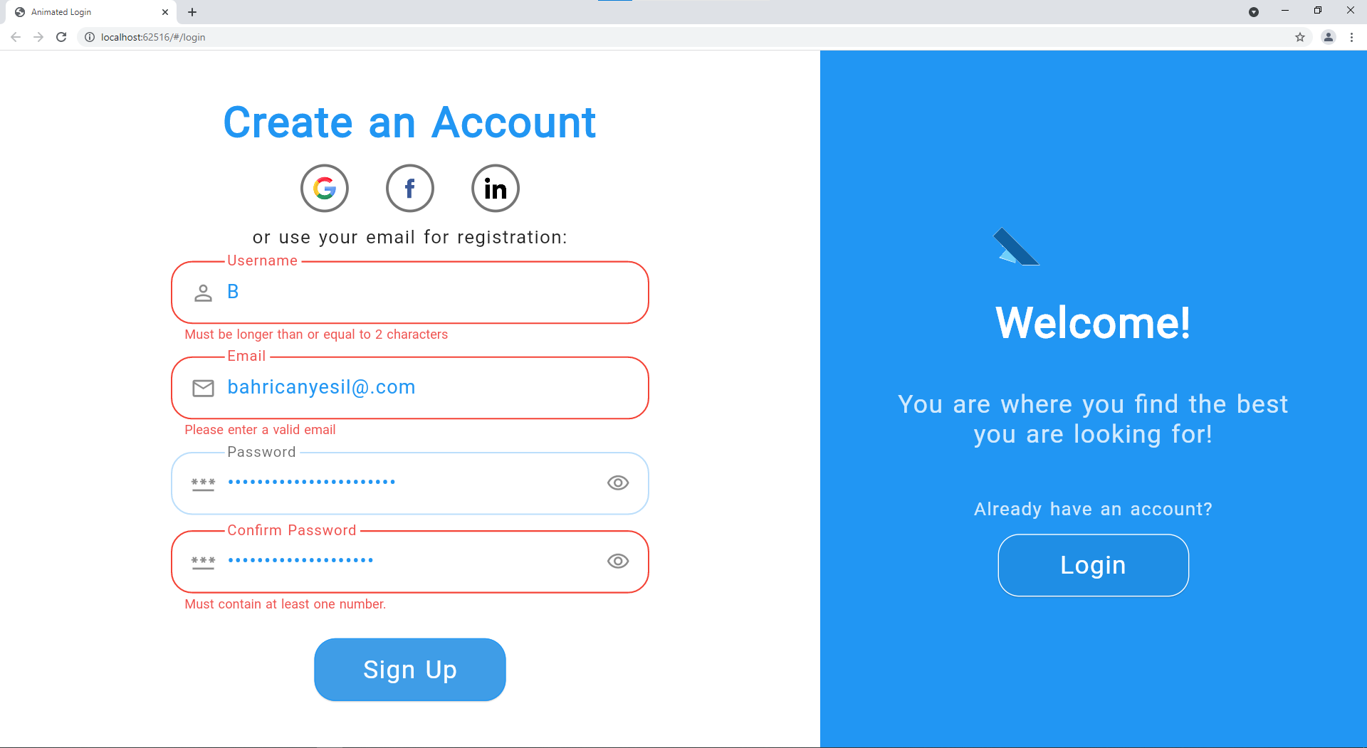
Error Example
Contributing
Contributions are so important for both me and those who want to use this package. I will be very appreciative if you allocate time to push forward the package.
All help is welcomed but if you have questions, bug reports, issues, feature requests, pull requests, etc, please first refer to the Contributing Guide.
Describe the bug
After entering a password or username and taping login on mobile. The TextField continue to have focus. So the keyboard is still showing.
Expected
When tapin or clicking on login, the cursor is remove from the textfield. So this is cleaner and when showing a snackbar for showing error while login this is not hide behind the keyboard (on android at least! )
There is no way to overpass the password validation other than passing false to the LoginTheme (showFormFieldErrors: false).
I think this is misleading.
The general use case:
As of user, I want to be able to use my own validator on fields and decide when to apply it.
Styling the language button is different than styling the login button. If there is no particular reason, I would like to style it like the other button using a ButtonStyle.
When using the animatedComponentOrder since the AnimationType is not export with the library we can't use the FULL functionnality. (controlling the animation LEFT and RIGHT)
One use case is being able to hide the Welcome title or do more fancy stuff.
What do you think of being able to pass Widget instead of text for LoginText where it make sense and/or completely removing LoginText, I will show you later with example what I have in mind.
By default, if no widget it provided use a Text widget with default TextTheme. (exactly like today)
This can also remove the need of passing the TextTheme to the loginTheme.
If you need you style the Welcome here is what I have in mind...
Usually the forgot password is place under the login button.
There are multiple solution but here I propose a cool one....I think.
We would need to have a way to order components.
A suggestion:
Define an enum
enum Components{
title,
title_description,
form,
login_action_button,
accrount_creation_action,
forgot_password_action
}
Add a property display_order to the AnimatedLogin class OR to the Theme with a default value provided for the list.
This will not break the current API.
And you can mark the showForgotPassord as deprecated....and in the meantime when this is true...change the display_order list !
Same thing for showChangeActionTitle
Instead of passing a string to display the image, provide a Widget. So this is opening the doors of using an SVG image as an example.
Just make sure to wrap this widget in a box with constraints.
We are not able change the look and feel of the dialog box.
If you can add a property(LanguageTheme ) to the AnimatedLogin class like proposed bellow
Classes skeleton to show you what I think cover styling of the current available dialog
class LanguageTheme {
  final ButtonStyle? languageButtonStyle;
  final AnimatedDialogTheme? dialogtheme;
}

class AnimatedDialogTheme {
  final TextStyle? title;
  final TextStyle? items;
  final DividerTheme? dividerTheme;
  final ShapeBorder? shape;
}
When theming the button everything work as expected for the desktop view, here is an example:
But when going into the mobile view the theming of the button is not right. I would expect the button to be orange in my example, like the image shown previously
When looking at the code, you would need to change the getter
Widget get _formPart => FormPart(
for a function to pass the right actionButtonStyle depending of the View.
Also, the actionTextStyle supersede the ButonStyle texttheme. (this is not obvious at first sight)
An idea would be removing the actionTextStyle property completly and only use the actionButtonStyle.
Describe the bug
Opening the app either in web or desktop, the hide/show-icon button in the password-inputs are too large. This also leads to the password-input having a greater height compared to the other inputs. All password inputs (in login and in registration) are affected.
To Reproduce
Steps to reproduce the behavior:
Open login or registration in windows/chrome
notice the too large hide/show icons in the password input
My authorization works both by corporate login and by email, but registration can only be by email (corporate login is issued elsewhere). Therefore, please share hints for email in authorization and registration
feature-request
opened by tas-unn 2
Releases(v1.4.0)
v1.4.0(Feb 12, 2022)
[1.4.0] - 12.02.2022
Extracted main components as widgets
Enabled custom ordering of the screen elements
Wrapped most elements with padding to enable custom margins around the components
Collected auth operations in auth provider and minimized business on view files
Optimizations on example app
Screen size adjustments
[1.3.0] - 28.01.2022
Loading indicators are integrated to the buttons instead of dialogs.
Integrated cancelable operations for auth functions.
CopyWith method is added to the AnimatedDialogTheme and LanguageDialogTheme.


 12 Dec 15, 2022
 2 Apr 6, 2022
 1.1k Dec 28, 2022
 1 Dec 7, 2021
 2 Dec 20, 2022
 1 Oct 12, 2022
 3 Jan 19, 2022
 18 Dec 27, 2022
 15 Oct 17, 2022
 3 Oct 26, 2021
 2 Apr 5, 2022
 6 Nov 6, 2022
 1.2k Jan 3, 2023
 211 Jan 1, 2023
 26 Nov 28, 2022
 3 Apr 16, 2022
 551 Jan 6, 2023