
Multi split view
A widget to provides horizontal or vertical multiple split view for Flutter.
- Horizontal or vertical
- Configurable weight or size for each child
- Automatic calculation of weights when:
- Child added without defined weight
- Weight redistribution when a child is removed
- Listener to detect children size changes
Usage
- Horizontal
- Vertical
- Horizontal and vertical
- Size
- Divider
Horizontal
MultiSplitView(children: [child1, child2, child3]);

Vertical
MultiSplitView(axis: Axis.vertical, children: [child1, child2]);

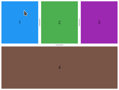
Horizontal and vertical
    MultiSplitView(axis: Axis.vertical, children: [
      MultiSplitView(children: [child1, child2, child3]),
      child4
    ]);

Setting the weight
    // setting 10% of weight for the first child
    MultiSplitView multiSplitView = MultiSplitView(
        children: [child1, child2, child3],
        controller: MultiSplitViewController(initialWeights: [0.1]));

Minimal child weight
    MultiSplitView(axis: Axis.vertical, children: [
      MultiSplitView(children: [child1, child2], minimalWeight: .40),
      MultiSplitView(children: [child3, child4])
    ]);

Minimal child size in pixels
Used if minimalWeight has not been set. The size will be converted into weight and will respect the limit defined by the MultiSplitView.defaultMinimalWeight constant, allowing all children to be visible.
    MultiSplitView(axis: Axis.vertical, children: [
      MultiSplitView(children: [child1, child2], minimalSize: 100),
      MultiSplitView(children: [child3, child4])
    ]);
Resizable
MultiSplitView(children: [child1, child2, child3], resizable: false);
Listener
    MultiSplitView(
        children: [child1, child2, child3, child4],
        onSizeChange: (childIndex1, childIndex2) => print(
            'Index of children whose size has changed: $childIndex1 and $childIndex2'));
Divider thickness
    MultiSplitView multiSplitView =
        MultiSplitView(children: [child1, child2, child3]);

    MultiSplitViewTheme theme = MultiSplitViewTheme(
        child: multiSplitView,
        data: MultiSplitViewThemeData(dividerThickness: 30));

Divider painters
Allows customizing the divider through the DividerPainter class.
The DividerPainters factory class offers default painters.
Divider - background color
The DividerPainters.background allows setting the background color. The default color is NULL.
    MultiSplitView multiSplitView = MultiSplitView(children: [child1, child2]);

    MultiSplitViewTheme theme = MultiSplitViewTheme(
        child: multiSplitView,
        data: MultiSplitViewThemeData(
            dividerPainter: DividerPainters.background(color: Colors.black)));

Divider - highlighted background color
    MultiSplitView multiSplitView = MultiSplitView(children: [child1, child2]);

    MultiSplitViewTheme theme = MultiSplitViewTheme(
        child: multiSplitView,
        data: MultiSplitViewThemeData(
            dividerPainter: DividerPainters.background(
                color: Colors.grey[200], highlightedColor: Colors.grey[800])));

Dashed divider
    MultiSplitView multiSplitView = MultiSplitView(children: [child1, child2]);

    MultiSplitViewTheme theme = MultiSplitViewTheme(
        child: multiSplitView,
        data: MultiSplitViewThemeData(
            dividerPainter: DividerPainters.dashed(
                color: Colors.deepOrange, highlightedColor: Colors.black)));

Dashed divider - Customizations
    MultiSplitViewTheme theme = MultiSplitViewTheme(
        child: multiSplitView,
        data: MultiSplitViewThemeData(
            dividerPainter: DividerPainters.dashed(
                gap: 30, size: 20, thickness: 3, highlightedThickness: 6)));

Grooved divider 1
    MultiSplitView multiSplitView = MultiSplitView(children: [child1, child2]);

    MultiSplitViewTheme theme = MultiSplitViewTheme(
        child: multiSplitView,
        data: MultiSplitViewThemeData(
            dividerPainter: DividerPainters.grooved1(
                color: Colors.indigo[100]!,
                highlightedColor: Colors.indigo[900]!)));

Grooved divider 1 - Customizations
    MultiSplitViewTheme theme = MultiSplitViewTheme(
        child: multiSplitView,
        data: MultiSplitViewThemeData(
            dividerPainter: DividerPainters.grooved1(
                size: 5,
                highlightedSize: 30,
                thickness: 3,
                highlightedThickness: 6)));

Grooved divider 2
    MultiSplitView multiSplitView = MultiSplitView(children: [child1, child2]);

    MultiSplitViewTheme theme = MultiSplitViewTheme(
        child: multiSplitView,
        data: MultiSplitViewThemeData(
            dividerPainter: DividerPainters.grooved2(
                color: Colors.grey[400]!, highlightedColor: Colors.red)));

Grooved divider 2 - Customizations
    MultiSplitViewTheme theme = MultiSplitViewTheme(
        child: multiSplitView,
        data: MultiSplitViewThemeData(
            dividerPainter: DividerPainters.grooved2(
                gap: 15,
                thickness: 4,
                count: 3,
                highlightedCount: 9,
                strokeCap: StrokeCap.square)));

Divider - Custom painter
It is possible to extend the DividerPainter class to create a painter from scratch.
class MyDividerPainter extends DividerPainter {
  @override
  Map<int, Tween> buildTween() {
    Map<int, Tween> map = super.buildTween();
    // create your tween here, example:
    map[100] = Tween<double>(begin: 1, end: 5);
    return map;
  }

  @override
  void paint(
      {required Axis dividerAxis,
      required bool resizable,
      required bool highlighted,
      required Canvas canvas,
      required Size dividerSize,
      required Map<int, dynamic> animatedValues}) {
    super.paint(
        dividerAxis: dividerAxis,
        resizable: resizable,
        highlighted: highlighted,
        canvas: canvas,
        dividerSize: dividerSize,
        animatedValues: animatedValues);
    double myAnimatedValue = animatedValues[100];
    // ...
  }
}
    MultiSplitView multiSplitView = MultiSplitView(children: [child1, child2]);

    MultiSplitViewTheme theme = MultiSplitViewTheme(
        child: multiSplitView,
        data: MultiSplitViewThemeData(dividerPainter: MyDividerPainter()));


 1.7k Jan 7, 2023
 62 Dec 30, 2022
 204 Dec 27, 2022
 158 Dec 2, 2022
 49 Oct 7, 2021
 196 Dec 2, 2022
 9 Jul 13, 2022
 108 Sep 11, 2022
 5 Dec 19, 2022
 67 Jan 6, 2023
 0 Apr 12, 2022
 23 Aug 29, 2022
 8 Oct 22, 2022
 97 Jan 5, 2023
 2 Jul 29, 2022
 73 Sep 7, 2022
 296 Dec 28, 2022
 457 Jan 4, 2023