Full customable rolling switch widget for flutter apps based on Pedro Massango's 'crazy-switch' widget

Overview

lite_rolling_switch

Full customable rolling switch widget for flutter apps based on Pedro Massango's 'crazy-switch' widget https://github.com/pedromassango/crazy-switch

About

Custom Switch button with attractive animation, made to allow you to customize colors, icons and other cosmetic content. Manage the widget states in the same way you do with the classical material's switch widget.

NOTE: Currently, you cannot directly change the widget width and height properties. This feature will be available soon.

Previews

Image preview

Image preview 2

Basic Implementation

import 'package:lite_rolling_switch/lite_rolling_switch.dart';

LiteRollingSwitch(
    //initial value
    value: true,
    textOn: 'disponible',
    textOff: 'ocupado',
    colorOn: Colors.greenAccent[700],
    colorOff: Colors.redAccent[700],
    iconOn: Icons.done,
    iconOff: Icons.remove_circle_outline,
    textSize: 16.0,
    onChanged: (bool state) {
      //Use it to manage the different states
      print('Current State of SWITCH IS: $state');
    },
),

Other

Comments
  • on change function is being called on load

    on change function is being called on load

    when the widget loads, the state is false, and therefore unintended calls are being made on the app. Is there a way to isolate the on tap function only. I only want the calls to be made when a user taps the widget, not on load. Thank you.

    opened by MasterNeuromancer 6
  • Solving setState() or markNeedsBuild() called during build.

    Solving setState() or markNeedsBuild() called during build.

    This issue appeared when a user trying to call setState in the onChanged function.

    This appears because of the call to _determine which caused a call to setState during initState.

    You can try the following code to raise the error and see that my code fixes it (This is just you main example with a Container changing color):

    import 'package:flutter/material.dart';
    import 'package:lite_rolling_switch/lite_rolling_switch.dart';
    
    void main() => runApp(MyApp());
    
    class MyApp extends StatelessWidget {
      @override
      Widget build(BuildContext context) => MaterialApp(
            title: 'Examples',
            home: MyHomePage(),
          );
    }
    
    class MyHomePage extends StatefulWidget {
      MyHomePage({
        Key key,
      }) : super(key: key);
    
      @override
      _MyHomePageState createState() => _MyHomePageState();
    }
    
    class _MyHomePageState extends State<MyHomePage> {
      bool changeColor = true;
    
      @override
      Widget build(BuildContext context) {
        return Scaffold(
          appBar: AppBar(
            title: Text('Example'),
          ),
          body: Center(
            child: Column(
              mainAxisAlignment: MainAxisAlignment.center,
              children: <Widget>[
                Container(
                  height: 100,
                  color: changeColor ? Colors.green : Colors.red,
                ),
                //By default
                LiteRollingSwitch(
                  value: false,
                  onChanged: (bool state) {
                    print('turned ${(state) ? 'on' : 'off'}');
                  },
                ),
    
                //Customized
                Padding(
                  padding: EdgeInsets.only(top: 20),
                  child: LiteRollingSwitch(
                    value: true,
                    textOn: 'active',
                    textOff: 'inactive',
                    colorOn: Colors.deepOrange,
                    colorOff: Colors.blueGrey,
                    iconOn: Icons.lightbulb_outline,
                    iconOff: Icons.power_settings_new,
                    onChanged: (bool state) {
                      print('turned ${(state) ? 'on' : 'off'}');
                      print('CHANGE COLOR');
                      setState(() {
                        changeColor = !changeColor;
                      });
                    },
                  ),
                )
              ],
            ),
          ),
        );
      }
    }
    
    opened by lulupointu 2
  • abandoned package?

    abandoned package?

    It seems that the author of the package is no longer available to work on it. If someone is still looking to use this package, I have written an updated null-safe version of the switch.

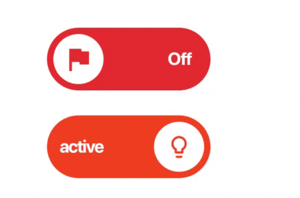
    It supports arbitrary width and height as well as full customization of the icons and text (Widget, not IconData or String) I have removed all other onTap callbacks because they can instead be done with a GestureDetector from the outside if really needed. I have also removed the swiping because it did not check which direction was swiped and cannot be used like material switch swiping. The switch will also no longer call onChanged in initState which was unecessary and caused assertions to trigger.

    import 'package:flutter/material.dart';
    import 'dart:ui';
    import 'dart:math';
    
    class RollingSwitch extends StatefulWidget {
      /// Rolling switch button.
      /// * [value] determines whether this switch is on or off.
      /// * [onChanged] is called when the user toggles the switch on or off.
      const RollingSwitch({
        super.key,
        required this.value,
        required this.onChanged,
        this.width = 100,
        this.height = 40,
        this.textOff,
        this.textOn,
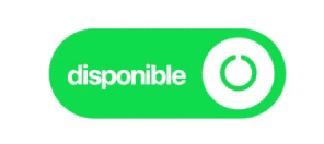
        this.colorOn = Colors.green,
        this.colorOff = Colors.red,
        this.iconOff,
        this.iconOn,
        this.animationDuration = const Duration(milliseconds: 300),
      });
    
      /// Value of the switch.
      final bool value;
    
      /// Called when the switch value changes.
      final ValueChanged<bool> onChanged;
    
      /// The width of the button.
      final double width;
    
      /// The height of the button.
      final double height;
    
      /// Text displayed on the switch when in the "off" state.
      final Widget? textOff;
    
      /// Text displayed on the switch when in the "on" state.
      final Widget? textOn;
    
      /// Icon of the switch when in the "off" state.
      final Widget? iconOff;
    
      /// Icon of the switch when in the "on" state.
      final Widget? iconOn;
    
      /// Color of the switch when in the "on" state.
      final Color colorOff;
    
      /// Color of the switch when in the "off" state.
      final Color colorOn;
    
      /// The duration in which the button transitions states.
      final Duration animationDuration;
    
      @override
      State<RollingSwitch> createState() => _RollingSwitchState();
    }
    
    class _RollingSwitchState extends State<RollingSwitch>
        with SingleTickerProviderStateMixin {
      late AnimationController controller = AnimationController(
        vsync: this,
        duration: widget.animationDuration,
        value: widget.value ? 1 : 0,
      );
      late Animation<double> animation =
          CurvedAnimation(parent: controller, curve: Curves.easeInOut);
      double get animationValue => controller.value;
    
      @override
      void didUpdateWidget(covariant RollingSwitch oldWidget) {
        super.didUpdateWidget(oldWidget);
        if (oldWidget.value != widget.value) {
          if (widget.value) {
            controller.forward();
          } else {
            controller.reverse();
          }
        }
      }
    
      @override
      void dispose() {
        controller.dispose();
        super.dispose();
      }
    
      @override
      Widget build(BuildContext context) => AnimatedBuilder(
            animation: animation,
            builder: (context, child) {
              const Color contrastColor = Colors.white;
              Color transitionColor =
                  Color.lerp(widget.colorOff, widget.colorOn, animationValue)!;
              return IconTheme(
                data: Theme.of(context).iconTheme.copyWith(
                      color: transitionColor,
                    ),
                child: DefaultTextStyle(
                  style: Theme.of(context).textTheme.bodyText2!.copyWith(
                        color: contrastColor,
                        fontWeight: FontWeight.bold,
                      ),
                  child: GestureDetector(
                    onTap: () => widget.onChanged(!widget.value),
                    child: Container(
                      clipBehavior: Clip.antiAlias,
                      padding: const EdgeInsets.all(4),
                      width: widget.width,
                      height: widget.height,
                      decoration: ShapeDecoration(
                        color: transitionColor,
                        shape: const StadiumBorder(),
                      ),
                      child: LayoutBuilder(
                        builder: (context, constraints) {
                          return Stack(
                            alignment: Alignment.center,
                            fit: StackFit.passthrough,
                            children: [
                              Positioned(
                                right: 0,
                                child: Transform.translate(
                                  offset: Offset(10 * animationValue, 0),
                                  child: Opacity(
                                    opacity: 1 - animationValue,
                                    child: Container(
                                      padding:
                                          const EdgeInsets.symmetric(horizontal: 4),
                                      child: widget.textOff ?? const Text('Off'),
                                    ),
                                  ),
                                ),
                              ),
                              Positioned(
                                left: 0,
                                child: Transform.translate(
                                  offset: Offset(10 * (1 - animationValue), 0),
                                  child: Opacity(
                                    opacity: animationValue,
                                    child: Container(
                                      padding:
                                          const EdgeInsets.symmetric(horizontal: 4),
                                      child: widget.textOn ?? const Text('On'),
                                    ),
                                  ),
                                ),
                              ),
                              Row(
                                children: [
                                  Transform.translate(
                                    offset: Offset(
                                      (constraints.maxWidth - widget.height) *
                                          animationValue,
                                      0,
                                    ),
                                    child: Transform.rotate(
                                      angle: lerpDouble(0, 2 * pi, animationValue)!,
                                      child: Container(
                                        height: widget.height,
                                        width: widget.height,
                                        decoration: const BoxDecoration(
                                          shape: BoxShape.circle,
                                          color: contrastColor,
                                        ),
                                        child: Stack(
                                          alignment: Alignment.center,
                                          fit: StackFit.passthrough,
                                          children: [
                                            Opacity(
                                              opacity: 1 - animationValue,
                                              child: widget.iconOff ??
                                                  const Icon(Icons.flag),
                                            ),
                                            Opacity(
                                              opacity: animationValue,
                                              child: widget.iconOn ??
                                                  const Icon(Icons.check),
                                            ),
                                          ],
                                        ),
                                      ),
                                    ),
                                  ),
                                ],
                              ),
                            ],
                          );
                        },
                      ),
                    ),
                  ),
                ),
              );
            },
          );
    }
    
    opened by clragon 1
  • Too big

    Too big

    The size of the switch is too big, can' t lower down its height and width. If I do try to lessen them by wrapping them inside the container then things get squeezed.

    opened by shasank27 1
  • Intento redibujar el widget y no me lo permite

    Intento redibujar el widget y no me lo permite

    LiteRollingSwitch _buttom() { return LiteRollingSwitch(

    value: poput, textOn: 'Disponible', textOff: 'Ocupado', colorOn: Colors.greenAccent[700], colorOff: Colors.redAccent[700], iconOn: Icons.done, iconOff: Icons.remove_circle_outline, textSize: 15.0, onChanged: (bool valor){ setState(() { poput = valor; });

    },

    ); }

    y sin el setState no hace nada pero si esta cambiando el valor del value

    opened by Miller9921 1
  • (CLOSED)PULL

    (CLOSED)PULL

    Add new functionality in the code and divide the code into multiple widget for a little more readability. In addition to that, improve performance.

    Add:

    • height and Width support.
    • Add AnimationController for color and opacity in-out. -AnimationBuilder for improve performance

    Change:

    • String TextOn and TextOff for TextWidget.
    • value for initialStateRight.
    • Change lerp and clamp math calculation to the Animation, to improve performance and Curve animation.

    Remove:

    • SetState() to improve performance.
    • Remove Opacity widget for FadeTransaction.
    • Remove animation when initialState is false, the widget starts in the correct state.

    https://blog.codemagic.io/how-to-improve-the-performance-of-your-flutter-app./

    opened by jamescardona11 0
  • [Request] Turn off rolling animation

    [Request] Turn off rolling animation

    At first, thank you for the great package! Could you add a parameter to turn off rolling animation? I want just to have a custom icon on a knob, and don't want this fancy rolling.

    enhancement 
    opened by subzero911 5
Owner
Eduardo Muñoz
Chilean NodeJS developer
Eduardo Muñoz
An advanced switch widget, that can be fully customized with size, text, color, radius of corners.

flutter_advanced_switch An advanced switch widget, that can be fully customized with size, text, color, radius of corners. Switch Light Switch Dark Ge

Alex Melnyk 13 Dec 15, 2022
A highly customizable toggle switch with a loading state.

A highly customizable toggle switch with a loading state.

null 6 Dec 30, 2022
GetX demo Counter with full understanding of State Management, Route Management and SnackBar

GetX demo Counter with full understanding of State Management, Route Management and SnackBar

TAD 1 Apr 4, 2022
⌚️ A general flutter timeline widget based on real-world application references

framework platform tags title flutter Android, iOS, Web, macOS, Linux, Windows flutter, timeline, flutter timeline, timeline tile flutter timeline flu

Universe 285 Dec 21, 2022
A flutter package to control rebuilds of a widget based on updates of a Listenable

A flutter package to control rebuilds of a widget based on updates of a Listenable. What is Grab? Grab is similar to ValueListenablebuiler or Animated

Kabo 5 Dec 3, 2022
Unofficial search provider for Medium for dart/flutter apps.

medium_search Unofficial search provider for Medium that can be used in dart or flutter apps. This library provides you an easy way to get search resu

Clone Conflict 1 Jan 10, 2022
Pick colors from pixels of everything visible in your Flutter apps

pixel_color_picker A widget that extracts colors from its childs. This package lets you basically extract colors from everything in your screen.

Eleandro Duzentos 14 Oct 17, 2022
A collapsible sidebar for Flutter apps implementing the Material Design.

collapsible_sidebar A collapsible sidebar for Flutter apps implementing the Material Design. Features Material Design Pre-built customizable tile widg

Arjun Sinha 121 Nov 30, 2022
Code generation for Flutter Padding widgets based on your constants

Code generation for Flutter Padding widgets based on your constants

Emanuele 14 Oct 20, 2022
A Flutter sticky headers & index ListView. Based on scrollable_positioned_list.

Language: English | 中文简体 azlistview A Flutter sticky headers & index ListView. Based on scrollable_positioned_list. AzListView, SuspensionView, IndexB

Flutter中国开源项目 971 Jan 7, 2023
A simple Flutter widget to add in the widget tree when you want to show nothing, with minimal impact on performance.

nil A simple widget to add in the widget tree when you want to show nothing, with minimal impact on performance. Why? Sometimes, according to a condit

Romain Rastel 127 Dec 22, 2022
A flutter carousel widget, support infinite scroll, and custom child widget.

carousel_slider A carousel slider widget. Features Infinite scroll Custom child widgets Auto play Supported platforms Flutter Android Flutter iOS Flut

Bart T 1 Nov 25, 2021
A Flutter Widget to make interactive timeline widget.

Bubble Timeline Package A Flutter Widget to make interactive timeline widget. This widget can be used to make Event Timelines, or Timelines for certai

Vansh Goel 12 Sep 22, 2022
📸 Easy to use yet very customizable zoomable image widget for Flutter, Photo View provides a gesture sensitive zoomable widget.

?? Easy to use yet very customizable zoomable image widget for Flutter, Photo View provides a gesture sensitive zoomable widget. Photo View is largely used to show interacive images and other stuff such as SVG.

Blue Fire 1.7k Jan 7, 2023
A widget lib that the widget in this lib can react to flutter ScrollController's offset

Language: English | 中文简体 linked_scroll_widgets A lib full of widgets that can react to the scrollController's offset change,to custom your UI effect.

WenJingRui 8 Oct 16, 2022
Progress Dialog widget for flutter projects with ability to customize loading widget, background color and background blur.

DISCONTINUED Checkout ArsDialog ars_progress_dialog Customizable progress dialog for Flutter applications with smooth animation for background dim col

Arsam 8 Apr 15, 2022
A Flutter widget that will give a Glitch Animation Effect to it's child widget.

GlitchEffect A Flutter widget that will give a Glitch Animation Effect to it's child widget. Installation Add the latest version of package to your pu

Sameer Singh 6 Nov 25, 2022
Widget, that can make any static located widget hidable

Installing See the official installing guidline from hidable/install Usage & Overview To start using Hidable widget, we have to create a ScrollControl

Anon 18 Dec 16, 2022
A widget that allow user resize the widget with drag

Flutter-Resizable-Widget A widget that allow user resize the widget with drag Note: this widget uses Getx Example bandicam.2021-11-11.12-34-41-056.mp4

MohammadAminZamani.afshar 22 Dec 13, 2022