Input fields for Flutter standalone or within a form

Overview

Flutter Input Widgets - Standalone or within a Form → flutter_input

This package provides input widgets (fields) to manipulate data. The data to manipulate is either a single variable or an entry in a map. The map can even be nested. Parameter path defines the key to access the entry in the map. To access an entry in a nested map, the keys must be separated by a single slash (/) character.

All input widgets share a common set of parameters and methods. A list of validators can be attached to each input widget.

Each input widget can be used standalone. If it finds a InputForm ancestor then it will automatically register itself to the form. The form provides methods to enable(), reset(), save() or validate() all fields at once.

Input Widgets

The following input widgets are available. See section Development below for building your own input widget.

  • InputCheckbox - Checkbox for data type bool
  • InputCountry - Dropdown to select a country (shows flags)
  • InputDate - Calendar based selection for data type DateTime (date part only)
  • InputDatePicker - A highly customizable date picker with week of year and multiple swipe actions
  • InputDateTime - Wheels for data type DateTime can be customized for date only, time only or both
  • InputDropDown<T> - Dropdown button for data type T
  • InputFavorite - A favorite button with selectable icon for data type bool
  • InputKeyboard - Text input for data type String, int or double
  • InputLanguage - Dropdown to select a language (Locale)
  • InputPassword - Text field with a switch to make obscured input visible (String)
  • InputRadio<T> - Radio button to select one value of type T
  • InputRating - Rating widget with selectable icons and a range slider for data type int
  • InputSlider - Slider for data type double between a minimum and maximum value
  • InputSpinner - Spinner with buttons for data type double to decrease or increase a value between a minimum and maximum
  • InputSwitch - Switch for data type bool

Common Parameters

All input widgets share a common set of parameters. All parameters are named and optional.
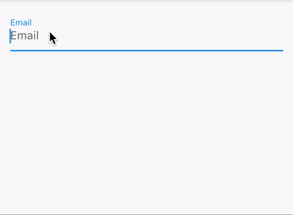
  • Key key - Identifier for the field
  • bool autosave = true - automatically saves any changed value. If autovalidate is true then the value will only be changed when there are no validation failures.
  • bool autovalidate = false - automatically validates changed values
  • InputDecoration decoration - e.g. for a label (see example)
  • bool enabled - to enable or disable user input. If not set then uses setting from InputForm or defaults to true (if there is no form).
  • T initialValue - sets the fields initial value. Overrides using the value from map.
  • ValueSetter<T> onChanged - invoked on every change of the input field value
  • ValueSetter<T> onSaved - invoked by save() which will be automatically called by InputForm.save().
  • String path - to access the value in map
  • List<InputValidator> validators - list of validators

Validators

The following validators can be given to parameter validators of an input widget. Each validator accepts the optional parameter message to set an individual error message if the validation fails.

  • after(DateTime date) - validates that the field value is after date
  • before(DateTime date) - validates that the field value is before date
  • future - validates that the DateTime field value lies in the future
  • max(num maxVal) - validates that the num field value is not larger than maxVal
  • maxLen(num maxLen) - validates that the length of the String field value is not longer than maxLen
  • min(num minVal) - validates that the num field value is not smaller than minVal
  • minLen(num minLen) - validates that the length of the String field value is not shorter than minLen
  • notNull - validates the the field value is not empty
  • past - validates that the DateTime field value lies in the past

Usage

Each input widget will automatically register itself if it finds an InputForm ancestor. Otherwise it will just run standalone. It will use initialValue for its value to display. If initialValue is null then it will use the value from map[path] if both are set. If map is not set, then the field will use map from an InputForm ancestor (if there is any).

Saving a modified value will happen

  • on any change if autosave = true (which is the default)
  • when save() is called
  • when save() is called on the InputFormState

The changed value will be written to the map at path if both were supplied. Also method onSave() will be invoked with the changed value.

Demo

For a complete example see example/main.dart.

InputDatePicker

The highly customizable InputDatePicker allows you to choose a date from a calendar page which also shows the week of the year. It provides spinners, swipes and a dropdown to select the month. The year can even be entered as text. All parts can be customized by DatePickerStyles.

Screenshot

Development

To create a new input field for data type T follow these steps:

  1. Copy one of the included class files.
  2. Rename the class widget and its state to your new one.
  3. Replace T with the value type of your new input field.
  4. Adapt parameters and leave the call to super() with all the common parameters.
  5. Adapt method build( BuildContext context) in the state class. It must end with return super.buildInputField( context, ... where ... is the code to display your new field widget.

Utilities

This package also contains some utilities.

  • InputUtils.convertToType() converts a value to a given target type.
  • InputUtils.readFromJson() reads a value from a nested map.
  • InputUtils.writeToJson() writes a value into a nested map.
  • See date_helper.dart for extensions on DateTime for weekOfYear, julianDay and more.

To Do

  • create a customizable calendar picker with week numbers
  • create a text input field for int and double
  • create an input widget for a calendar with events
  • create an input widget to select multiple choices like a multi-select list
  • add some images to this documentation
  • internationalize the whole package
  • create an input widget to change the language within the app
You might also like...

User auth form - Signup and signin user auth form with ability to stay signed in and have an option to signout.

user_auth_form SIgnup and signin user authentification form Getting Started This project is a starting point for a Flutter application. A few resource

Jan 6, 2022

Create highly customizable, simple, and controllable autocomplete fields for Flutter.

Create highly customizable, simple, and controllable autocomplete fields for Flutter.

Field Suggestion Installing Depend on it Add this to your package's pubspec.yaml file: dependencies: field_suggestion: latest_version Install it Y

Oct 18, 2022

First Open Source Flutter based Beautiful Material Design Text fields.

First Open Source Flutter based Beautiful Material Design Text fields.

Pretty text field First Open Source Flutter based Beautiful Material Design Text fields.(More designed text fields coming soon.) Features [*] Compatib

Aug 29, 2022

Counter provider - App para practicar el disenio de layouts con widgets mas comunes containers, stacks, row/columns, text fields

Counter provider - App para practicar el disenio de layouts con widgets mas comunes containers, stacks, row/columns, text fields

App para practicar el disenio de layouts con widgets mas comunes containers, sta

Feb 16, 2022

Create a Flutter User Profile Page UI where you can access and edit your user's information within your Flutter app.

Create a Flutter User Profile Page UI where you can access and edit your user's information within your Flutter app.

Flutter Tutorial - User Profile Page UI 1/2 Create a Flutter User Profile Page UI where you can access and edit your user's information within your Fl

Dec 6, 2022

Create a Flutter User Profile Page UI where you can access and edit your user's information within your Flutter app.

Create a Flutter User Profile Page UI where you can access and edit your user's information within your Flutter app.

Flutter Tutorial - User Profile Page UI #2 Create a Flutter User Profile Page UI where you can access and edit your user's information within your Flu

Dec 15, 2022

Let's create a selectable Flutter Navigation Drawer with routing that highlights the current item within the Flutter Sidebar Menu.

Let's create a selectable Flutter Navigation Drawer with routing that highlights the current item within the Flutter Sidebar Menu.

Flutter Tutorial - Sidebar Menu & Selectable Navigation Drawer Let's create a selectable Flutter Navigation Drawer with routing that highlights the cu

Dec 26, 2022

Flutter plugin to manage home screen widget within flutter app.

Flutter App Widget App Widget / Home Screen widget plugin for flutter app Usage Please see app_widget subdirectory for the usage documentation. Plafor

Dec 16, 2022

Get git information from within the Flutter application

 Get git information from within the Flutter application

git_info_plus Get git information from within the Flutter application. Usage Dart final String branchName = await GitInfo.branchName; final DateTime l

May 17, 2022
Comments
  • How to navigate to input widget with validation failure?

    How to navigate to input widget with validation failure?

    The example contains 3 tabs with different input widgets. If the form is submitted and a widget on another tab has a validation error, the user must find that tab manually.

    Request 1: support obtaining validation failure messages through InputForm Request 2: solve the problem to automatically display the failed widget

    opened by hlemcke 1
  • Support for Cupertino widgets

    Support for Cupertino widgets

    @djarjo Any plans to support Cupertino widgets? At present, the library requires a Material hierarchy — it would be nice to remove this requirement, in order to use e.g. a CupertinoScaffold instead of a regular Scaffold.

    opened by adario 2
  • InputDatePicker: how to use year entered through keyboard when tapping on month dialog or month button?

    InputDatePicker: how to use year entered through keyboard when tapping on month dialog or month button?

    Steps to reproduce in example:

    1. switch to editing mode
    2. select tab "date & time"
    3. open date picker and enter 1900 into year field
    4. open month selection and select another month

    => year field retains focus and goes back to initial year

    opened by hlemcke 0
Owner
null
Object-oriented package for validating Flutter form fields.

formdator Contents Overview Getting Started List of Validators Categories Demo Application References Overview Form Validator — Formdator is a fully o

Dartoos 10 Oct 26, 2022
Flutter Plugin - Simple character blocked input that usually used for redeem/validation input.

Block Input Simple character blocked input that usually used for redeem code or validation code input. Gallery Example Full example import 'package:bl

Enkh-Amar 7 Nov 2, 2022
Verify code input. You can create a verify code input.

flutter_verification_code_input A Flutter package that help you create a verification input. Installing flutter_verification_code_input: git:

Tiny Express 49 Dec 7, 2022
Verify code input. You can create a verify code input.

flutter_verification_code_input A Flutter package that help you create a verification input. Installing flutter_verification_code_input: git:

Tiny Express 49 Dec 7, 2022
Magpie is a visualized platform which designed to create, develop and compile your standalone flutter module.

Magpie Workflow is a visualized platform which is designed to create, develop and compile your standalone flutter module;

Wuba 124 Dec 4, 2022
A flutter plugin that implements google's standalone ml kit

Google's ML Kit for Flutter Google's ML Kit for Flutter is a set of Flutter plugins that enable Flutter apps to use Google's standalone ML Kit. Featur

kyle reginaldo 2 Aug 29, 2022
MoneyTextFormField is one of the flutter widget packages that can be used to input values in the form of currencies, by displaying the output format in realtime.

MoneyTextFormField MoneyTextFormField is one of the flutter widget packages that can be used to input values in the form of currencies, by displaying

Fadhly Permata 11 Jan 1, 2023
A Flutter package that provides a dropdown form field using a dropdown button inside a form field.

Dropdown form field A dropdown form field using a dropdown button inside a form field. Demo Features Can be used as regular form field. Simple to impl

Carlos Eugenio Torres 72 Jan 1, 2023
Form builder image picker - Form builder image picker for flutter

form_builder_image_picker Field for picking image(s) from Gallery or Camera for

Ferri Sutanto 0 Jan 28, 2022
Jannis 0 Jan 29, 2022