Flutter plugin to display a popup menu button widget with handsome design and easy to use.

Overview

menu_button

Pub Package License

Flutter widget to display a popup menu button very simply and easily customizable.

Resources

Installations

Add menu_button: ^1.4.2+1 in your pubspec.yaml dependencies. And import it:

import 'package:menu_button/menu_button.dart';

Usage

The widget has a lot of properties to customize it, we will see here the ones needed to get a "basic" menu button.

Firstly we have to declare a variable to keep the selected item (selectedKey) and a list that contains all the items we want to display in this menu button.

Here we will make a list of strings that we will call keys and that contains the values Low, Medium & High.

String selectedKey;

List<String> keys = <String>[
  'Low',
  'Medium',
  'High',
];

Now that we have these two elements we can start using the MenuButton<T> widget.

MenuButton<String>(
  child: normalChildButton,
  items: keys,
  itemBuilder: (String value) => Container(
   height: 40,
   alignment: Alignment.centerLeft,
   padding: const EdgeInsets.symmetric(vertical: 0.0, horizontal: 16),
   child: Text(value),
  ),
  toggledChild: Container(
    child: normalChildButton,
  ),
  onItemSelected: (String value) {
    setState(() {
      selectedKey = value;
    });
  },
  onMenuButtonToggle: (bool isToggle) {
    print(isToggle);
  },
)

And finally here is an example of the child widget used for the MenuButton above:

final Widget normalChildButton = SizedBox(
  width: 93,
  height: 40,
  child: Padding(
    padding: const EdgeInsets.only(left: 16, right: 11),
    child: Row(
      mainAxisAlignment: MainAxisAlignment.spaceBetween,
      children: <Widget>[
        Flexible(
          child: Text(selectedKey, overflow: TextOverflow.ellipsis)
        ),
        const SizedBox(
          width: 12,
          height: 17,
          child: FittedBox(
            fit: BoxFit.fill,
            child: Icon(
              Icons.arrow_drop_down,
              color: Colors.grey,
            ),
          ),
        ),
      ],
    ),
  ),
);

Of course you can make your own according to your needs.

Basic Parameters

Parameter Description
child A widget to display the default button to trigger the menu button
items The list that contains all values that you want to display on the menu button
itemBuilder A widget to design each item of the menu button
onItemSelected Function triggered when an item is selected
onMenuButtonToggle Function triggered when menu button is triggered (true if displayed, false if not)
toggledChild Same as child but when the menu button is opened

More Parameters

Parameter Description
crossTheEdge By default false you can set it to true if you want the button to expand
divider A custom divider between each items
decoration A custom decoration for menu button
edgeMargin By default 0 add a custom value to prevent the button to not touch the edge, check the example edge_menu_button.dart for more information
itemBackgroundColor By default Colors.white add custom Colors to customize the background of every items
label Add a widget to display a custom label as MaterialDesign on top of the button, check label_menu_button.dart for more information
labelDecoration If you use a label you can set a custom LabelDecoration
menuButtonBackgroundColor By default Colors.white add custom Colors to customize the background of the menu button
popupHeight By default popupHeight is automatically calculated but if you need a custom height use this property
scrollPhysics By default items are not scrollable (NeverScrollableScrollPhysics), add a ScrollPhysics to enable it, for instance AlwaysScrollableScrollPhysics
showSelectedItemOnList By default true, set it to false if you don't want the selected items in the list

For a more detail example please take a look at the example folder.
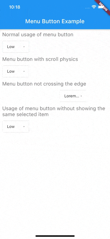
Example

Menu button with 3 items:


If something is missing, feel free to open a ticket or contribute!

Comments
  • exceptions on asserts

    exceptions on asserts

    I was running with "All Exceptions" mode in the VSCode debugger.

    These exceptions fail, and you have the same one twice in a row.

    In menu_button.dart

    44: assert(!dontShowTheSameItemSelected || selectedItem != null), 45: assert(!dontShowTheSameItemSelected || selectedItem != null);

    bug 
    opened by sgehrman 11
  • I can't scroll childs when dropdown is opened

    I can't scroll childs when dropdown is opened

    I'm using your dependency, i have a list of numbers to child, 1...12, but, shows just the 1 until 4, and i can't scroll, if my page have a bigger size, i can choose others numbers I need scroll the list of items..

    image image

    • Device: iPhone 8
    • OS: iOS 13
    bug enhancement 
    opened by lucas-sesti 6
  • Last menu item gets extra area

    Last menu item gets extra area

    Describe the bug When there is only 2 button items then there is another two button area in the drop down menu items before even selecting the button items..i guess..

    Screen Shot 2020-06-16 at 9 14 30 PM

    Expected behavior there should not have any extra area like this one i assume.

    if i have understood correctly i am not using any expanded widget for menu button... i have only used which is given in the how to use section of the pub.dev for this packages..

    I am using column so is it occurring for using column?

    here is the code:

    b``` ody: Container( alignment: Alignment.center, child: Column( crossAxisAlignment: CrossAxisAlignment.center, children: [

             MenuButton(
               child: SizedBox(
                 width: 83,
                 height: 40,
                 child: Padding(
                   padding: const EdgeInsets.only(left: 16, right: 11),
                   child: Row(
                     mainAxisAlignment: MainAxisAlignment.spaceBetween,
                     children: <Widget>[
                       Flexible(
    
                         child: Text(
                           selectedItem,
                           style: TextStyle(color: Colors.black),
                           overflow: TextOverflow.ellipsis,
                         ),
                       ),
                       SizedBox(
                           width: 12,
                           height: 17,
                           child: FittedBox(
                               fit: BoxFit.fill,
                               child: Icon(
                                 Icons.arrow_drop_down,
                                 color: Colors.grey,
                               )
                           )
                       ),
                     ],
                   ),
                 ),
               ),// Widget displayed as the button
               items: ['button1','button2'],// List of your items
               topDivider: true,
               selectedItem: selectedItem,
               popupHeight: 200, // This popupHeight is optional. The default height is the size of items
               scrollPhysics: AlwaysScrollableScrollPhysics(), // Change the physics of opened menu (example: you can remove or add scroll to menu)
               itemBuilder: (value) => Container(
                   width: 83,
                   height: 40,
                   alignment: Alignment.centerLeft,
                   padding: const EdgeInsets.symmetric(horizontal: 16),
                   child: Text(value)
               ),// Widget displayed for each item
               toggledChild: Container(
                 color: Colors.white,
                 child: SizedBox(
                   width: 83,
                   height: 40,
                   child: Padding(
                     padding: const EdgeInsets.only(left: 16, right: 11),
                     child: Row(
                       mainAxisAlignment: MainAxisAlignment.spaceBetween,
                       children: <Widget>[
                         Flexible(
    
                           child: Text(
                             selectedItem,
                             style: TextStyle(color: Colors.black),
                             overflow: TextOverflow.ellipsis,
                           ),
                         ),
                         SizedBox(
                             width: 12,
                             height: 17,
                             child: FittedBox(
                                 fit: BoxFit.fill,
                                 child: Icon(
                                   Icons.arrow_drop_down,
                                   color: Colors.grey,
                                 )
                             )
                         ),
                       ],
                     ),
                   ),
                 ),// Widget displayed as the button,
               ),
               divider: Container(
                 height: 1,
                 color: Colors.grey,
               ),
               onItemSelected: (value) {
                 setState(() {
                   selectedItem = value;
                   print(selectedItem);
                 });
    
                 // Action when new item is selected
               },
               decoration: BoxDecoration(
                   border: Border.all(color: Colors.grey[300]),
                   borderRadius: const BorderRadius.all(Radius.circular(3.0)),
                   color: Colors.white
               ),
               onMenuButtonToggle: (isToggle) {
                 print(isToggle);
               },
             ),
    
    opened by dipcse07 5
  • Overlay opening to outside of screen

    Overlay opening to outside of screen

    Describe the bug I'm using your dependency but my dropdown button is in the end of screen, and when i open the dropdown, the dropdown open outside of screen, like this: image

    To Reproduce Just put in the end of screen and try open

    Smartphone (please complete the following information):

    • Device: iPhone 8
    • OS: iOS 13.4

    When i have free time, i'll try to see this bug and create pull request, but i don't have so much time now, if you have, can you fixed?

    bug 
    opened by lucas-sesti 5
  • Issue with corner rounding

    Issue with corner rounding

    Seems to be an issue with the rounding when a custom decorator is provided.

    https://user-images.githubusercontent.com/13068724/111939667-42cd8680-8aa3-11eb-83a2-a70b1a3b2aad.mov

    bug 
    opened by jacksonw765 4
  • Ripple effect not showing on items when decoration.color is set

    Ripple effect not showing on items when decoration.color is set

    Is your feature request related to a problem? Please describe. When I set the MenuButton's decoration to decoration: BoxDecoration(color: Colors.white) the ripple effect when clicking an items is not showing. This happens because of this well-known fact. The color of the decoration covers the underlying InkWell. When setting no color on the decoration, the items are translucent but the ripple effect does show. Here is a screenshot of how that looks:

    Simulator Screen Shot - iPhone 12 Pro Max - 2021-02-16 at 10 47 58

    Describe the solution you'd like A simple color property for the drop-down items that is applied to the parent of the InkWell could solve the problem. E.g. adding a property itemBackground to MenuButton, then pass it from MenuButton to _MenuItem<T> and then within _MenuItem<T> do:

    @override
      Widget build(BuildContext context) {
        return Material(
            color: itemBackground,
            child: InkWell(
                onTap: () => Navigator.of(context).pop<T>(value), child: child
            ),
        );
      }
    

    Describe alternatives you've considered As described above, omitting decoration color, which didn't help.

    enhancement 
    opened by WieFel 3
  • Added option to not show the same selected item in list of items and created label to dropdown

    Added option to not show the same selected item in list of items and created label to dropdown

    I created a logic to not show the same selected item, example: Low Medium High

    when Low is selected, the item list will be: Medium and High, and if i selected Medium, the list will be: High, Low, etc...

    and i created a label with some options, like background color, vertical position, and left position..

    enhancement 
    opened by lucas-sesti 3
  • feat: added distanceBetweenFieldAndPopup attribute

    feat: added distanceBetweenFieldAndPopup attribute

    As requested in the issue https://github.com/huextrat/menu_button/pull/29#issue-806669568, I've implemented a way to adjust the distance between the field and the popup. It's a double, so you can customize the way you want.

    opened by pedrolemoz 0
  • Width of popup is crossing the edge

    Width of popup is crossing the edge

    I created verification to check if the width of popup is bigger than screen, and created new home screen to show all options of the menu button (i don't change the readme.md because i don't know if you want write your way)

    enhancement 
    opened by lucas-sesti 0
  • Created optional Scroll Physics to Menu Button

    Created optional Scroll Physics to Menu Button

    I created recently an issue, to fixed the scroll physics menu button, but, how i use a lot this dependency, i think its better help you to fix faster the people problems.

    opened by lucas-sesti 0
  • WidgetsBinding Flutter V3

    WidgetsBinding Flutter V3

    {basePath}/flutter/.pub-cache/hosted/pub.dartlang.org/menu_button-1.4.2+1/lib/menu_button.dart:524:22: Warning: Operand of null-aware operation '!' has type 'WidgetsBinding' which excludes null.

    • 'WidgetsBinding' is from 'package:flutter/src/widgets/binding.dart' ('{basePath}/flutter/packages/flutter/lib/src/widgets/binding.dart'). WidgetsBinding.instance!.addPostFrameCallback((Duration timeStamp) { ^
    bug 
    opened by HosseinAsadi 0
  • How to adjust the offset of the dropdown?

    How to adjust the offset of the dropdown?

    Hi! I want to achive this particular design, where the dropdown is bellow the button (in this case, a text form field). I've implemented this dropdown by using OverlayEntry and Positioned, but i'm looking for something better, and I found your package quite interesting to use.

    image

    Can you tell me how do I achive this?

    opened by pedrolemoz 3
  • Curved container showing white edges

    Curved container showing white edges

    I just upgraded my app to flutter 2.2 and I noticed a graphical issue with the package, we use a rounded container as a child and it seems that the background of the package is white, so now the corners of the container are showing where the curves are. This was not happening pre-flutter 2.2.

    image

    To Reproduce We just built a menubutton using this close

                              MenuButton(
                                child: Container(
                                    decoration: BoxDecoration(
                                        color: BaseTheme.colorScheme().dropColor,
                                        borderRadius:
                                            BorderRadius.all(Radius.circular(7))),
                                    child: SizedBox(
                                      width: 121,
                                      height: 51,
                                      child: Padding(
                                        padding: const EdgeInsets.only(
                                            left: 16, right: 11),
                                        child: Row(
                                          mainAxisAlignment:
                                              MainAxisAlignment.spaceBetween,
                                          children: <Widget>[
                                            Flexible(
                                              child: Text(
                                                widget.selectedDay,
                                                textScaleFactor:
                                                    MediaQuery.of(context)
                                                        .textScaleFactor
                                                        .clamp(1.0, 1.5),
                                                style: TextStyle(
                                                    color: BaseTheme.colorScheme()
                                                        .dropTextColor,
                                                    fontSize: 18,
                                                    fontWeight: FontWeight.w500),
                                                overflow: TextOverflow.ellipsis,
                                              ),
                                            ),
                                            SizedBox(
                                                width: 30,
                                                height: 30,
                                                child: FittedBox(
                                                    fit: BoxFit.fill,
                                                    child: Icon(
                                                      Icons.keyboard_arrow_down,
                                                      //Icons.arrow_drop_down,
                                                      size: 19,
                                                      color: Color(0xffD1DDE6),
                                                    ))),
                                          ],
                                        ),
                                      ),
                                    )), // Widget displayed as the button
                                items: <String>[
                                  '1',
                                  '2',
                                  '3',
                                  '4',
                                  '5',
                                  '6',
                                  '7',
                                ], // List of your items
                                topDivider: true,
                                popupHeight: 200,
                                selectedItem: widget.selectedDay,
    
                                //dontShowTheSameItemSelected: true,
                                scrollPhysics:
                                    AlwaysScrollableScrollPhysics(), // Change the physics of opened menu (example: you can remove or add scroll to menu)
                                itemBuilder: (value) => Container(
                                  width: 121,
                                  height: 51,
                                  alignment: Alignment.centerLeft,
                                  padding:
                                      const EdgeInsets.symmetric(horizontal: 16),
                                  child: Text(
                                    value,
                                    textScaleFactor: MediaQuery.of(context)
                                        .textScaleFactor
                                        .clamp(1.0, 1.5),
                                    style: TextStyle(
                                        color: Color(0xFF8E8E8E),
                                        fontSize: 12,
                                        fontWeight: FontWeight.w800),
                                  ),
                                  decoration: BoxDecoration(
                                    color: Color(0xFFF5F5F5),
                                    //border: Border.all(width: 2, color: Color(0xFF79D7F7)),
                                  ),
                                ), // Widget displayed for each item
                                toggledChild: Container(
                                  color: BaseTheme.colorScheme().dropColor,
                                  child: SizedBox(
                                    width: 121,
                                    height: 51,
                                    child: Padding(
                                      padding: const EdgeInsets.only(
                                          left: 16, right: 11),
                                      child: Row(
                                        mainAxisAlignment:
                                            MainAxisAlignment.spaceBetween,
                                        children: <Widget>[
                                          Flexible(
                                            child: Text(
                                              widget.selectedDay,
                                              textScaleFactor:
                                                  MediaQuery.of(context)
                                                      .textScaleFactor
                                                      .clamp(1.0, 1.5),
                                              style: TextStyle(
                                                  color: Color(0xFFF5F5F5),
                                                  fontSize: 18,
                                                  fontWeight: FontWeight.w500),
                                              overflow: TextOverflow.ellipsis,
                                            ),
                                          ),
                                          SizedBox(
                                              width: 30,
                                              height: 30,
                                              child: FittedBox(
                                                  fit: BoxFit.fill,
                                                  child: Icon(
                                                    Icons.keyboard_arrow_up,
                                                    //Icons.arrow_drop_down,
                                                    size: 19,
                                                    color: Colors.white,
                                                  ))),
                                        ],
                                      ),
                                    ),
                                  ), // Widget displayed as the button,
                                ),
                                divider: Container(
                                  height: 1,
                                  color:
                                      BaseTheme.colorScheme().blueButtonTextColor,
                                ),
                                onItemSelected: (value) async {
    
    
                                  setState(() {
                                    widget.selectedDay = value;
                                    //print(monthValue);
                                  });
    
                                  // Action when new item is selected
                                },
                                decoration: BoxDecoration(
                                  //border: Border.all(color: Colors.grey[300]),
                                  borderRadius:
                                      const BorderRadius.all(Radius.circular(8.0)),
                                  //color: Color(0xFF4E709F),
                                  color: daysBackground,
                                ),
                                onMenuButtonToggle: (isToggle) {
                                  //print(isToggle);
                                  setState(() {
                                    daysBackground = Color(0xFF4E709F);
                                  });
                                },
                              ),
    
    bug 
    opened by jay2jp 0
Owner
Hugo EXTRAT
Mobile App Developer @sqli & Mentor @OpenClassrooms 🚀 Flutter - React Native - Android
Hugo EXTRAT
This is a repository for Flutter Focused Menu, an easy to implement package for adding Focused Long Press Menu to Flutter Applications

Focused Menu This is an easy to implement package for adding Focused Long Press Menu to Flutter Applications Current Features Add Focused Menu to Any

Paras Jain 160 Dec 26, 2022
An easy way to show a flutter custom popup widget.

flutter_easy_popup An easy way to show a flutter custom popup widget. Screenshot Example Screenshot Dropdown Menu App Operation Guide Multi Highlights

BakerJ 42 Oct 26, 2022
Flutter-pop-up-menu - Pop up Menu - Mobile Devices Programming

Pop Up Menu App A flutter demo app with a pop up menu button Developer Alexander Sosa (https://www.linkedin.com/in/alexander-sosa-asillanes/) Technolo

Alexander Sosa 0 Jan 3, 2022
An easy to use side menu in flutter and can used for navigations

Easy Sidemenu Easy sidemenu is An easy to use side menu (bar) for flutter that you can use for navigations in your application. Sidemenu is a menu tha

Mohammad Jamalianpour 86 Dec 29, 2022
Flutter ticket pass - A Flutter Widget to display the details of a ticket/pass purchased by customers and display the details of the purchase

ticket_pass_package A Flutter package to display the purchase of a ticket/pass along with additional details such as list of buyers. The source code i

null 40 Aug 13, 2022
A fancy easy to use Folding Menu for Flutter Applications

Folding Menu This is an easy to use package for adding Folding Menu to your Flutter Applications Demo Usage To Use, simply add Folding Menu to your St

Paras Jain 12 Nov 26, 2022
A Flutter package to create a nice circular menu using a Floating Action Button.

FAB Circular Menu A Flutter package to create a nice circular menu using a Floating Action Button. Inspired by Mayur Kshirsagar's great FAB Microinter

Mariano Cordoba 198 Jan 5, 2023
Swipeable button view - Create Ripple Animated Pages With Swipeable Button View

swipeable_button_view You can create ripple animated pages with swipeable_button

cemreonur 3 Apr 22, 2022
A flutter widget to indicate loading progress. Easy to use, easy to extend

?? ?? ?? A flutter widget to indicate loading progress. Easy to use, easy to extend

Manuel Duarte 2 May 30, 2022
🧾 Flutter widget allowing easy cache-based data display in a ListView featuring pull-to-refresh and error banners.

Often, apps just display data fetched from some server. This package introduces the concept of fetchable streams. They are just like normal Streams, b

Marcel Garus 17 Jan 18, 2022
This library provides a customizable Flutter widget that makes it easy to display text in the middle of a Divider.

1. About 1.1. Introduction 1.1.1. Install Library 1.1.2. Import It 1.1.3. Use TextDivider 1.2. Details 1.2.1. Customization Options 1.2.2. Horizontal

Kato Shinya 2 Feb 9, 2022
Display images flutter - Simple app to display images in flutter

Display Images In Flutter Simple app to display images in a flutter. In this dem

Manish Ahire 1 Jan 29, 2022
This animation popup for popover to show something awesome.

8641695823774957995.mp4 pop_over_custom A new Flutter project. Getting Started This project is a starting point for a Flutter application. A few resou

null 11 Jun 27, 2022
A Flutter step_tracker plugin is collect information from user and display progress through a sequence of steps. this plugin also have privilege for fully customization from user side. like flipkart, amazon, myntra, meesho.

step_tracker plugin A Flutter step_tracker plugin is collect information from user and display progress through a sequence of steps. this plugin also

Roshan nahak 5 Oct 21, 2022
🍝 restaurant menu app made with flutter inspired by this design https://goo.gl/jChLBV

Menu Flutter Todo Make background colors that changes with PageView Add custom tab indicators Change food prices Make cart animation Customize card sh

Braulio Cassule 593 Jan 1, 2023
Use CMP Crew, Create a room, invite your friends to join, and let them add their orders to the shared menu!

Tired of collecting your friends’ orders at restaurants? Lost track of how many of you want tea? Don’t worry we got you covered! Use CMP Crew, Create a room, invite your friends to join, and let them add their orders to the shared menu!

Ahmed Ihab 14 Dec 15, 2022
Flutter plugin to display a simple steps indicator line widget

steps_indicator A simple steps indicator widget Installation Add steps_indicator: ^1.3.0 in your pubspec.yaml dependencies. And import it: import 'pac

Hugo EXTRAT 49 Oct 18, 2022
MindInventory 15 Sep 5, 2022