Sleek circular slider/progress bar & spinner for Flutter
A highly customizable circular slider/progress bar & spinner for Flutter.


Getting Started
- Installation
- Basic Usage
- SleekCircularSlider parameters
- CircularSliderAppearance parameters
- CustomSliderWidths parameters
- CustomSliderColors parameters
- InfoProperties parameters
- YouTube video
Installation
Add
sleek_circular_slider : ^lastest_version
to your pubspec.yaml, and run
flutter packages get
in your project's root directory.
Basic Usage
Import it to your project file
import 'package:sleek_circular_slider/sleek_circular_slider.dart';
And add it in its most basic form like it:
final slider = SleekCircularSlider(
                      appearance: CircularSliderAppearance(),
                      onChange: (double value) {
                        print(value);
                      });
There are additional optional parameters one can initialize the slider with.
final slider = SleekCircularSlider(
  min: 0,
  max: 1000,
  initialValue: 426,
  onChange: (double value) {
    // callback providing a value while its being changed (with a pan gesture)
  },
  onChangeStart: (double startValue) {
    // callback providing a starting value (when a pan gesture starts)
  },
  onChangeEnd: (double endValue) {
    // ucallback providing an ending value (when a pan gesture ends)
  },
  innerWidget: (double value) {
    // use your custom widget inside the slider (gets a slider value from the callback)
  },
);
Use as a progress bar
Slider user's interaction will be disabled if there is either no [onChange] or [onChangeEnd] provided. That way one can use the widget not as a slider but as a progress bar.
final slider = SleekCircularSlider(
  appearance: CircularSliderAppearance(
    customWidths: CustomSliderWidths(progressBarWidth: 10)),
  min: 10,
  max: 28,
  initialValue: 14,
);
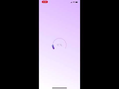
Use as a spinner
There is one more use case for the library. It's a spinner which can be shown to users while loading etc. In this mode the widget is not interactive and ignores all angles so there is no need to provide them.
final slider = SleekCircularSlider(
  appearance: CircularSliderAppearance(
    spinnerMode: true,
));
SleekCircularSlider parameters
| Parameter | Default | Description |
|---|---|---|
| appearance CircularSliderAppearance | A set of objects describing the slider look and feel. | |
| min double | 0 | The minimum value the user can select. Must be less than or equal to max. |
| max double | 100 | The maximum value the user can select. Must be greater than or equal to min. |
| initialValue double | 50 | The initial value for this slider. |
| onChange OnChange(double value) | Called during a drag when the user is selecting a new value for the slider by dragging. | |
| onChangeStart OnChange(double value) | Called when the user starts selecting a new value for the slider. | |
| onChangeEnd OnChange(double value) | Called when the user is done selecting a new value for the slider. | |
| innerWidget Widget InnerWidget(double value) | A custom widget to replace the build in text labels which can capture a slider value from the callback. |
CircularSliderAppearance parameters
| Parameter | Default | Description |
|---|---|---|
| size double | 150 | The width & height value for the slider. |
| startAngle double | 150 | The angle (in degrees) the slider begins with. |
| angleRange double | 240 | The angle range (in degrees) the slider reaches when maximum value set. |
| counterClockwise bool | false | The setting indicating direction of the widget. |
| customWidths CustomSliderWidths | The object with a set of widths for the track, bar, shadow etc. | |
| customColors CustomSliderColors | The object with a set of colors for the track, bar, shadow etc. | |
| infoProperties InfoProperties | The object with a set of properties for internal labels displaying a current slider value. | |
| animationEnabled bool | true | The setting indicating whether external changes of a slider value should be animated. |
| spinnerMode bool | false | The setting turning the widget into a spinner. |
| spinnerDuration int | 1500 | The spinner animation duration in miliseconds |
| animDurationMultiplier double | 1.0 | The multiplier of duration for the animation when value changed |
CustomSliderWidths parameters
| Parameter | Default | Description |
|---|---|---|
| trackWidth double | progressBarWidth / 4 | The width of the slider's track. |
| progressBarWidth double | slider's size / 10 | The width of the slider's progress bar. |
| shadowWidth double | progressBarWidth * 1.4 | The width of the slider's shadow. |
| handlerSize double | progressBarWidth / 5 | The size of the slider's handler. |
CustomSliderColors parameters
| Parameter | Default | Description |
|---|---|---|
| trackColor Color | #DCBEFB | The color of the slider's track. |
| trackColors List | null | The list of colors for the track's gradient. |
| trackGradientStartAngle double | 0 | The start angle for the track's gradient. |
| trackGradientEndAngle double | 180 | The end angle for the track's gradient. |
| progressBarColor Color | The color of the slider's progress bar. Won't be used if the slider uses gradient progressBarColors != null | |
| progressBarColors List | [#1E003B, #EC008A, #6285DA] | The list of colors for the progress bar's gradient. |
| gradientStartAngle double | 0 | The start angle for the progress bar's gradient. |
| gradientEndAngle double | 180 | The end angle for the progress bar's gradient. |
| dynamicGradient bool | false | The gradient angles will change dynamically with value changing. If true it will ignore both the grandientStartAngle and gradientEndAngle |
| dotColor Color | #FFFFFF | The color of the slider's handle. |
| hideShadow bool | false | The setting indicating whether the shadow should be showed. |
| shadowColor Color | #2C57C0 | The color of the shadow. |
| shadowMaxOpacity double | 0.2 | The opacity of the shadow in its darker part. |
| shadowStep double | The shadow is being painted with a number of steps. This value determines how big is a width of each step. The more steps are painted the softer the shadow is. For a flat shadow use a difference between the shadowWidth and the progressWidth for the shadowStep. |
InfoProperties parameters
| Parameter | Default | Description |
|---|---|---|
| mainLabelStyle TextStyle | The text style of the main text widget displaying a slider's current value. | |
| topLabelStyle TextStyle | The text style of the top text widget. | |
| bottomLabelStyle TextStyle | The text style of the bottom text widget. | |
| topLabelText String | The text for the top text widget. | |
| bottomLabelText String | The text for the bottom text widget. | |
| modifier String PercentageModifier(double percentage) | closure adding the % character | The closure allowing to modify how a current value of the slider is displayed. |
Example of the modifier
String percentageModifier(double value) {
   final roundedValue = value.ceil().toInt().toString();
   return '$roundedValue %';
 }
It will convert a current value to int and add the % sufix to it.
YouTube video
Todo
-
add divisions
-
add more comments to document the code
-
add the counterclockwise direction
-
add the spinner mode
-
add the second handle (interval selection)
-
add text labels on a curved path
Acknowledgments
- Hat tip to David Anaya for his awesome blog post about building a circular slider in Flutter and radian to degrees conversions which helped me a lot!


 311 Dec 30, 2022
 360 Dec 30, 2022
 476 Dec 16, 2022
 2 Feb 18, 2022
 15 Sep 5, 2022
 6 Dec 23, 2022
 193 Nov 14, 2022
 34 Aug 8, 2022
 0 Dec 22, 2021
 523 Dec 30, 2022
 407 Jan 6, 2023
 74 Nov 24, 2022
 40 Dec 29, 2022
 157 Nov 22, 2022
 16 Aug 4, 2020
 108 Dec 12, 2022
 41 Jul 18, 2022
 30 Dec 17, 2022
 6 May 23, 2022