NeoPOP
NeoPOP is CRED's inbuilt library for using NeoPOP components in your app.
What really is NeoPOP?
NeoPOP was created with one simple goal; to create the next generation of a beautiful, affirmative design system. NeoPOP stays true to everything that design at CRED stands for.
NeoPOP is built for Android, iOS, Flutter and Web

Installation
Add neopop as a dependency in your pubspec.yaml file.
dependencies:
    neopop: ^1.0.2
NeoPopButton

NeoPopButton render 5 surfaces, top, left, right, bottom and center. NeoPopButton widget gives you mutliple configs that you can use for your widget.
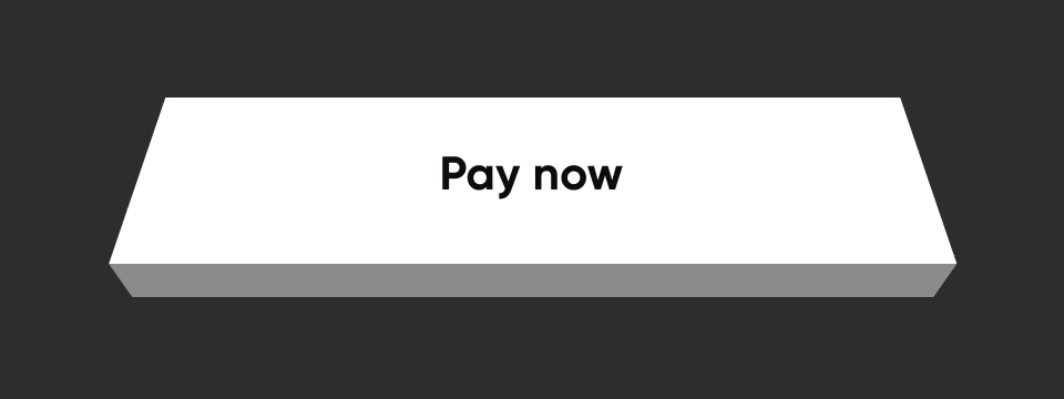
Elevated

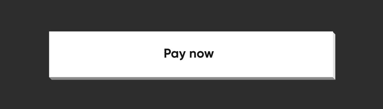
NeoPopButton(
    color: Colors.white,
    onTapUp: () => HapticFeedback.vibrate(),
    onTapDown: () => HapticFeedback.vibrate(),
    child: Padding(
        padding: EdgeInsets.symmetric(horizontal: 20, vertical: 15),
        child: Row(
            mainAxisAlignment: MainAxisAlignment.center,
            children: [
                Text("Pay now"),
            ],
        ),
    ),
),
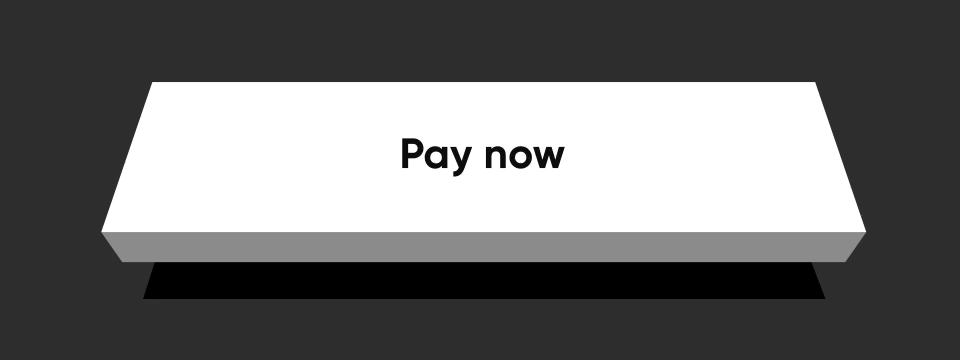
Flat

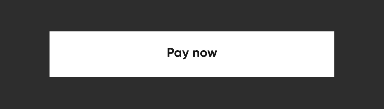
By specifying the buttonPosition as Position.center, NeoPOP will compute right and bottom surface's color according to color. Top and left surface's color is computed w.r.t parentColor and grandparentColor
NeoPopButton(
    color: Colors.white,
    onTapUp: () => HapticFeedback.vibrate(),
    onTapDown: () => HapticFeedback.vibrate(),
    parentColor: Colors.transparent,
    buttonPosition: Position.center,
    child: Padding(
        padding: const EdgeInsets.symmetric(horizontal: 20, vertical: 15),
        child: Row(
            mainAxisAlignment: MainAxisAlignment.center,
            children: const [
                Text("Pay Now"),
            ],
        ),
    ),
),
Shimmer
const NeoPopShimmer(
    shimmerColor: Colors.yellow,
    child: Padding(
        padding: const EdgeInsets.symmetric(horizontal: 100, vertical: 15),
        child: Text("Hello"),
    ),
),
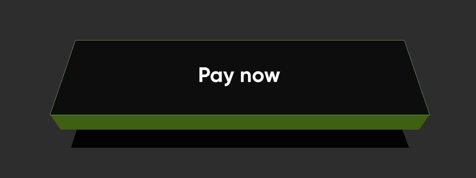
Flat Strokes

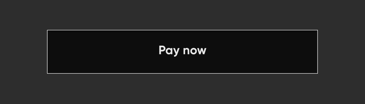
To add border on a flat button, add border
NeoPopButton(
    color: const Color.fromRGBO(0, 0, 0, 1),
    buttonPosition: Position.center,
    onTapUp: () {},
    border: const Border.fromBorderSide(
        BorderSide(color: kBorderColorWhite, width: kButtonBorderWidth),
    ),
    child: Padding(
        padding: const EdgeInsets.symmetric(horizontal: 20, vertical: 15),
        child: Row(
            mainAxisAlignment: MainAxisAlignment.center,
            children: const [
                Text("Pay Now", style: TextStyle(color: Colors.white)),
            ],
        ),
    ),
),
Elevated Strokes

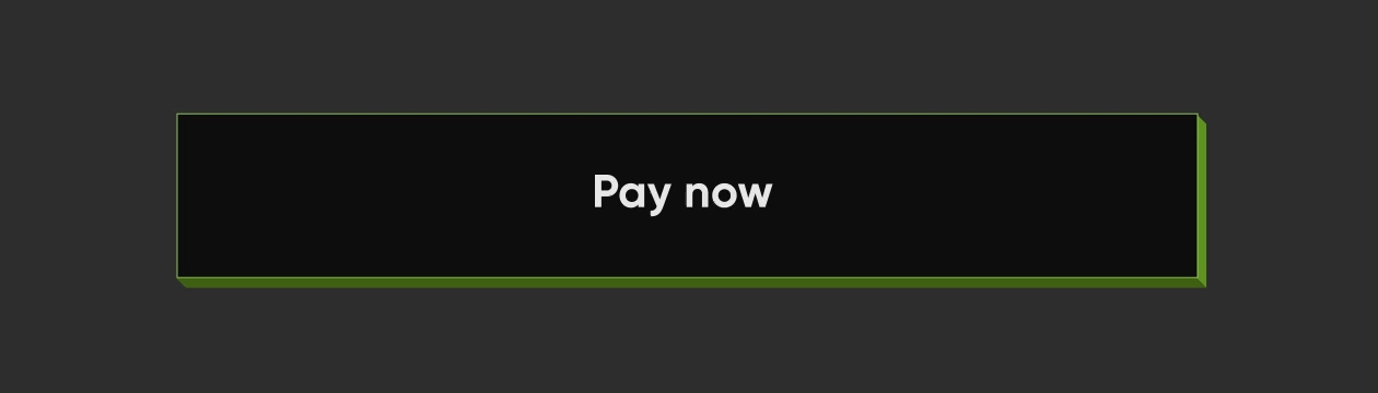
NeoPopButton(
    color: kSecondaryButtonLightColor,
    bottomShadowColor: ColorUtils.getVerticalShadow(kBorderColorGreen).toColor(),
    rightShadowColor: ColorUtils.getHorizontalShadow(kBorderColorGreen).toColor(),
    animationDuration: kButtonAnimationDuration,
    depth: kButtonDepth,
    onTapUp: () {},
    border: Border.all(
        color: kBorderColorGreen,
        width: kButtonBorderWidth,
    ),
    child: Padding(
        padding: const EdgeInsets.symmetric(horizontal: 20, vertical: 15),
        child: Row(
            mainAxisAlignment: MainAxisAlignment.center,
            children: const [
                Text("Scan & Pay", style: TextStyle(color: Colors.white)),
            ],
        ),
    ),
),
Adjacent Buttons

Vertically Aligned Buttons
Column(
    mainAxisSize: MainAxisSize.min,
    children: [
        NeoPopButton(
        color: kSecondaryButtonLightColor,
        bottomShadowColor: kShadowColorDarkGreen,
        rightShadowColor: kShadowColorGreen,
        buttonPosition: Position.fullBottom,
        onTapUp: () {},
        border: Border.all(
            color: kBorderColorGreen, width: kButtonBorderWidth,
        ),
        child:  const Padding(
                    padding: EdgeInsets.symmetric(horizontal: 8.0, vertical: 15.0),
                    child: Text(
                    "Button",
                    style: TextStyle(color: Colors.white),
                ),
            ),
        ),
        NeoPopButton(
            color: kPrimaryButtonColor,
            buttonPosition: Position.fullBottom,
            onTapUp: () {},
            child:  const Padding(
                padding: EdgeInsets.symmetric(horizontal: 8.0, vertical: 15.0),
                child: Text("Button"),
            ),
        ),
    ],
),
Horizontally Aligned Buttons
Row(
    mainAxisSize: MainAxisSize.min,
    children: [
        Expanded(
        child: NeoPopButton(
            color: kPrimaryButtonColor,
            buttonPosition: Position.fullBottom,
            depth: kButtonDepth,
            onTapUp: () {},
            child: const Center(
            child:  Padding(
                    padding: EdgeInsets.symmetric(
                        horizontal: 8.0, vertical: 15.0),
                    child: Text("Button"),
                    ),
                ),
            ),
        ),
        Expanded(
            child: NeoPopButton(
                color: kSecondaryButtonLightColor,
                bottomShadowColor: kShadowColorDarkGreen,
                rightShadowColor: kShadowColorGreen,
                buttonPosition: Position.fullBottom,
                depth: kButtonDepth,
                onTapUp: () {},
                border: Border.all(
                    color: kBorderColorGreen, width: kButtonBorderWidth,
                ),
                child: const Center(
                child: Padding(
                    padding: EdgeInsets.symmetric( horizontal: 8.0, vertical: 15.0),
                    child: Text(
                            "Button",
                            style: TextStyle(color: Colors.white),
                        ),
                    ),
                ),
            ),
        ),
    ],
),
NeoPopButton Attributes
| Attribute | Type | Description |
|---|---|---|
child |
Widget |
The child of button widget |
color |
Color |
Color of the button |
depth |
double |
The depth of the button if it is elevated |
onTapUp |
VoidCallback? |
Callback triggered when the forward & reverse button animation is finished |
onTapDown |
VoidCallback? |
Callback triggered as soon as the user clicks the enabled button |
onLongPress |
VoidCallback? |
Callback triggered when user has long pressed the cta |
disabledColor |
Color |
Color of the button when it is disabled |
parentColor |
Color |
Button's immediate ancestor's color |
grandparentColor |
Color |
Button's second level ancestor's color |
buttonPosition |
Position |
The position of button in reference to parent view. default - Position.fullBottom |
animationDuration |
Duration |
Animation duration of the button click. default - const Duration(milliseconds: 50) |
forwardDuration |
Duration? |
If you want different forward duration for button click, use forwardDuration |
reverseDuration |
Duration? |
If you want different reverse duration for button click, use reverseDuration |
border |
Border? |
The border to be painted around the button |
enabled |
bool |
If set to false, the button will be disabled. default - true |
shadowColor |
Color? |
The base color of the shadow. The shadow colors will be derived from this |
rightShadowColor |
Color? |
The color of the right shadow. |
leftShadowColor |
Color? |
The color of the left shadow. |
topShadowColor |
Color? |
The color of the top shadow. |
bottomShadowColor |
Color? |
The color of the bottom shadow. |
NeoPopTiltedButton

Non Floating

 NeoPopTiltedButton(
    color: kPrimaryButtonColor,
    onTapUp: () {},
    child: Padding(
        padding: const EdgeInsets.symmetric(
        horizontal: 80.0,
        vertical: 15,
        ),
        child: SvgPicture.asset('assets/svg/cta_text_view.svg'),
    ),
),
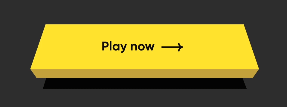
Floating

NeoPopTiltedButton(
    isFloating: true,
    onTapUp: () => HapticFeedback.vibrate(),
    onTapDown: () => HapticFeedback.vibrate(),
    decoration: const NeoPopTiltedButtonDecoration(
        color: kPopYellowColor,
        plunkColor: kPlunkColorYellow,
        shadowColor: kTiltedButtonShadowColor,
    ),
    child: Padding(
        padding: const EdgeInsets.symmetric(
        horizontal: 70.0,
        vertical: 15,
        ),
        child: SvgPicture.asset('assets/svg/cta_text_play_now.svg'),
    ),
),
Strokes

NeoPopTiltedButton(
    isFloating: true,
    onTapUp: () {},
    decoration: const NeoPopTiltedButtonDecoration(
        color: Color(0xFF0D0D0D),
        plunkColor: Color(0xFF3F6915),
        shadowColor: Colors.black,
        border: Border.fromBorderSide(
        BorderSide(color: Color(0xFF8DD04A), width: 1),
        ),
    ),
    child: const Padding(
        padding: EdgeInsets.symmetric(horizontal: 70.0, vertical: 15),
        child: Text('Play Now', style: TextStyle(color: Colors.white)),
    ),
),
Shimmer
NeoPopTiltedButton(
    isFloating: true,
    onTapUp: () {},
    decoration: const NeoPopTiltedButtonDecoration(
        color: Color.fromRGBO(255, 235, 52, 1),
        plunkColor: Color.fromRGBO(255, 235, 52, 1),
        shadowColor: Color.fromRGBO(36, 36, 36, 1),
        showShimmer: true,
    ),
    child: const Padding(
        padding: EdgeInsets.symmetric(
        horizontal: 70.0,
        vertical: 15,
        ),
        child: Text('Play Now'),
    ),
),
NeoPopTiltedButton Attributes
| Attribute | Type | Description |
|---|---|---|
child |
Widget |
The child of the button |
color |
Color? |
Color of the button |
decoration |
NeoPopTiltedButtonDecoration? |
The decoration to paint the button. The color and decoration arguments cannot both be supplied, since it would potentially result in the decoration drawing over the background color. To supply a decoration with a color, use decoration. |
buttonDepth |
double? |
The depth of the tilted button. default: 8.0 |
onTapUp |
VoidCallback? |
A callback triggered when a pointer that will trigger a tap with button has stopped contacting the screen |
onTapDown |
VoidCallback? |
A callback triggered when a pointer that might cause a tap with button has contacted the screen |
shadowDistance |
double? |
The maximum distance from the button at which the shadow is painted. default: 20 |
yPosFactor |
double? |
Factor that defines the floating positions of buttons and shadow along vertical-axis. default: 5 |
isFloating |
bool |
Whether the button is floating. default: false |
floatingDuration |
Duration? |
The duration of the floating animation. One floating cycle i.e to-and-fro movement of the button and shadow accounts for two floating durations. default: Duration(milliseconds: 1500) |
floatingDelay |
Duration? |
The delay between two floating cycles. default: Duration(milliseconds: 750) |
tapDuration |
Duration? |
The duration of the animation when button is pressed or released. default: Duration(milliseconds: 100) |
enabled |
bool |
Whether the button is enabled. default: true |
Contributing
Pull requests are welcome! We'd love help improving this library. Feel free to browse through open issues to look for things that need work. If you have a feature request or bug, please open a new issue so we can track it.
License
Copyright 2022 Dreamplug Technologies Private Limited.

Licensed under the Apache License, Version 2.0 (the "License");
you may not use this file except in compliance with the License.
You may obtain a copy of the License at

 http://www.apache.org/licenses/LICENSE-2.0
Unless required by applicable law or agreed to in writing, software
distributed under the License is distributed on an "AS IS" BASIS,
WITHOUT WARRANTIES OR CONDITIONS OF ANY KIND, either express or implied.
See the License for the specific language governing permissions and
limitations under the License.


 30 Nov 9, 2022
 17 Dec 26, 2022
 40 Mar 18, 2022
 4 Mar 4, 2022
 5 Jun 21, 2022
 15 Dec 25, 2022
 169 Dec 9, 2022
 793 Dec 30, 2022
 30 Nov 10, 2022