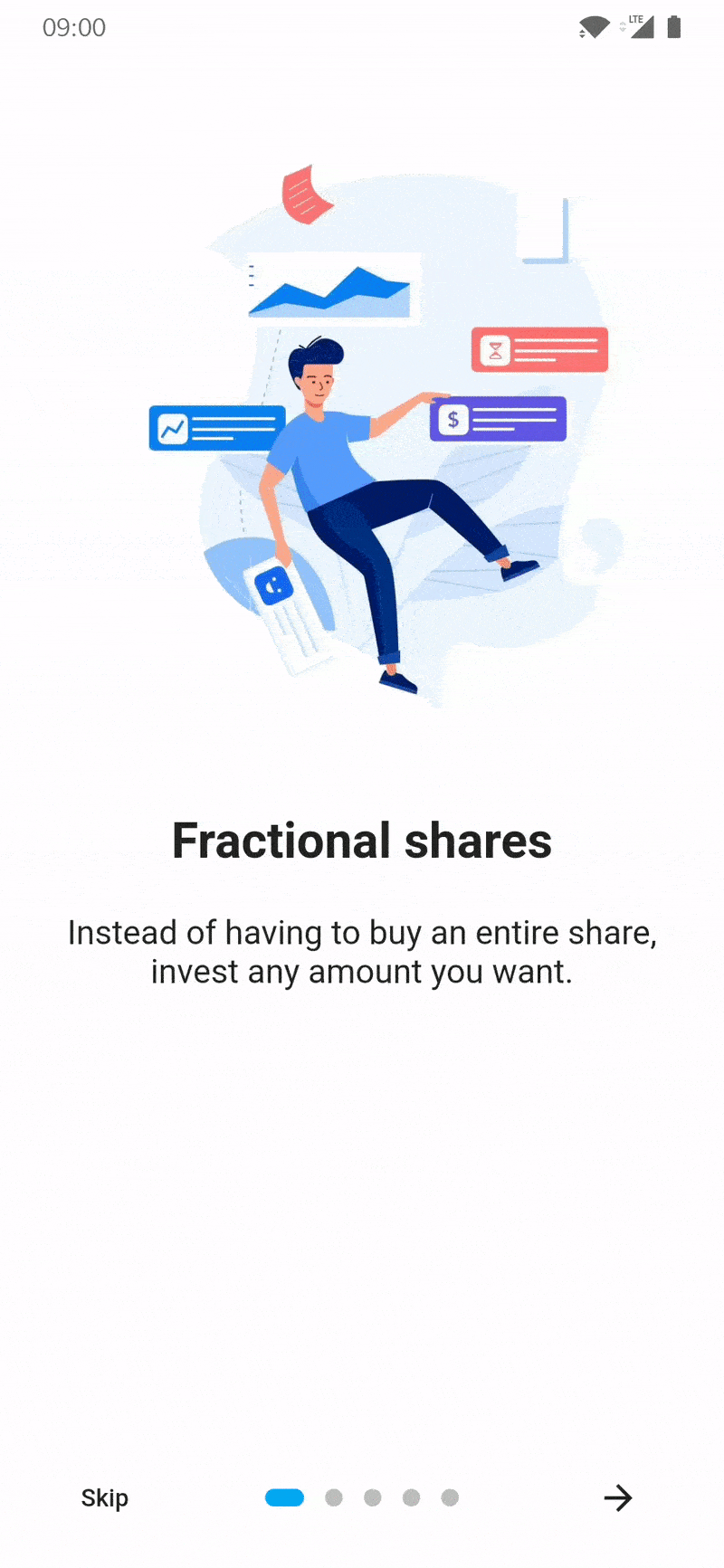
Add easily to your app an introduction screen to provide informations to new users

Overview

IntroductionScreen pub package

Introduction screen allow you to have a screen at launcher for example, where you can explain your app. This Widget is very customizable with a great design.

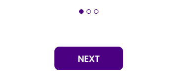
Introduction_screen use another package, dots_indicator, that I also created.

Installation

You just need to add introduction_screen as a dependency in your pubspec.yaml file.

dependencies:
  introduction_screen: ^2.1.0

Example

Many parameters are available, in next section of example all are not listed. To see all parameters available please check end of README. If you want to display IntroductionScreen only once (e.g: first start of your app), use SharedPreferences (or similar) to save status (already display or not). It's not responsability of this package ot handle this.

In these example, listPagesViewModel is the list of pages. A page is base on PageViewModel. See example of a PageViewModel below.

PageViewModel

Simple page

This example only define title, body and an image (you can define any widget)

PageViewModel(
  title: "Title of first page",
  body: "Here you can write the description of the page, to explain someting...",
  image: Center(
    child: Image.network("https://domaine.com/image.png", height: 175.0),
  ),
)

Page with custom colors

This example show you how to define the color of the page

PageViewModel(
  title: "Title of first page",
  body: "Here you can write the description of the page, to explain someting...",
  image: Center(child: Image.asset("res/images/logo.png", height: 175.0)),
  decoration: const PageDecoration(
    pageColor: Colors.blue,
  ),
)

Page with custom text style

This example show you how to define another TextStyle for the title and the body

PageViewModel(
  title: "Title of first page",
  body: "Here you can write the description of the page, to explain someting...",
  image: const Center(child: Icon(Icons.android)),
  decoration: const PageDecoration(
    titleTextStyle: TextStyle(color: Colors.orange),
    bodyTextStyle: TextStyle(fontWeight: FontWeight.w700, fontSize: 20.0),
  ),
)

Page with a footer, like a button

This example show you how to define a page with a footer, like a Button

PageViewModel(
  title: "Title of first page",
  body: "Here you can write the description of the page, to explain someting...",
  image: const Center(child: Icon(Icons.android)),
  footer: ElevatedButton(
    onPressed: () {
      // On button presed
    },
    child: const Text("Let's Go !"),
  ),
);

Page with widget body

This example show you how to define a page with a body as Widget and not a simple String You can to the same this for title, with titleWidget parameter.

PageViewModel(
  title: "Title of first page",
  bodyWidget: Row(
    mainAxisAlignment: MainAxisAlignment.center,
    children: const [
      Text("Click on "),
      Icon(Icons.edit),
      Text(" to edit a post"),
    ],
  ),
  image: const Center(child: Icon(Icons.android)),
);

IntroductionScreen

Note :

If you not provide next parameter, the Next button will be not displayed. If you want to display a skip button, you must add skip parameter and showSkipButton: true.

The done parameter is required only if showDoneButton: true.

Simple intro screen

Simple intro screen

IntroductionScreen(
  pages: listPagesViewModel,
  done: const Text("Done", style: TextStyle(fontWeight: FontWeight.w600)),
  onDone: () {
    // When done button is press
  },
); //Material App

Intro screen with skip button

IntroductionScreen(
  pages: listPagesViewModel,
  onDone: () {
    // When done button is press
  },
  showSkipButton: true,
  skip: const Text("Skip"),
  done: const Text("Done", style: TextStyle(fontWeight: FontWeight.w600)),
);

Intro screen with custom button text and dots indicators

IntroductionScreen(
  pages: listPagesViewModel,
  onDone: () {
    // When done button is press
  },
  onSkip: () {
    // You can also override onSkip callback
  },
  showSkipButton: true,
  skip: const Icon(Icons.skip_next),
  next: const Icon(Icons.next),
  done: const Text("Done", style: TextStyle(fontWeight: FontWeight.w600)),
  dotsDecorator: DotsDecorator(
    size: const Size.square(10.0),
    activeSize: const Size(20.0, 10.0),
    activeColor: theme.accentColor,
    color: Colors.black26,
    spacing: const EdgeInsets.symmetric(horizontal: 3.0),
    activeShape: RoundedRectangleBorder(
      borderRadius: BorderRadius.circular(25.0)
    )
  ),
);

Intro screen with custom button colors

When one of the colors such as skipColor is defined, color will be ignored.

IntroductionScreen(
  pages: listPagesViewModel,
  done: const Text("Done", style: TextStyle(fontWeight: FontWeight.w600)),
  color: Colors.orange,  
  skipColor: Colors.red,  
  doneColor: Colors.green,  
  nextColor: Colors.blue,
  onDone: () {
    // When done button is press
  },
); 

Parameters of IntroductioonScreen widget

Many parameters can be used to customized Intro like you want ! This is all parameters you can add :

  • Page that will be display (PageViewModel), by adding pages: [..] parameter.
  • Use your own pages (Widget) without using those predefined, by adding rawPages: [..] parameter.
    • If you provide both rawPages and pages parameter, pages will be used.
  • Set a custom callback when done button is pressed, by adding onDone: () {} parameter.
    • This param is required, except if you set showDoneButton: false
  • Define Done button (Widget), by adding done: Text('Done')
    • This param is required, except if you set showDoneButton: false
  • Set a custom callback when skip button is pressed, by adding onSkip: () {} parameter.
    • By default, it will go to the last page
  • Add callback to listen page changes, by adding onChange: (page) {} parameter.
  • Define Skip button (Widget), by adding skip: Text('Skip')
    • This param is required if you set showSkipButton: true
  • Define Next button (Widget), by adding next: Text('Next')
    • This param is required, except if you set showNextButton: false
  • Hide/show Skip button, by adding showSkipButton: false parameter. (Default false)
  • Hide/show Next button, by adding showNextButton: false parameter. (Default true)
  • Hide/show Done button, by adding showDoneButton: false parameter. (Default true)
  • Display or not the progress dots, by adding isProgress: false parameter. (Default true)
  • Enable or disable dots progress tap, by adding isProgressTap: false parameter. (Default true)
  • Freeze the scroll, by adding freeze: true parameter. (Default false)
  • Global background color, by adding globalBackgroundColor: Colors.blue parameter.
    • Tips: use Colors.transparent to display an image as background (using Stack with IntroductionScreen inside for example)
  • Customize dots (progression) by adding dotsDecorator: DotsDecorator(...)
    • You can customize dots size, shape, colors, spacing.
  • Customize dots container by adding dotsContainerDecorator: BoxDecorator(...)
    • You can customize container that contain controls.
  • Duration of scrolling animation, by adding animationDuration: 400 parameter. (Default 350)
  • Initial page, by adding initialPage: 2 parameter. (Default 0)
  • Skip button flex, by adding skipFlex: 1 parameter. (Set 0 to disable Expanded behaviour, default 1)
  • Dots indicator flex, by adding dotsFlex: 1 parameter. (Set 0 to disable Expanded behaviour, default 1)
  • Next/Done button flex, by adding nextFlex: 1 parameter. (Set 0 to disable Expanded behaviour, default 1)
  • Animation curve between pages, by adding curve: Curves.elasticIn parameter. (Default Curves.easeIn)
  • Change global color of buttons (skip, next, done), by adding color: Colors.yellow parameter.
  • Change skip button color, by adding skipColor: Colors.red parameter.
  • Change next button color, by adding nextColor: Colors.green parameter.
  • Change done button color, by adding doneColor: Colors.blue parameter.
  • Enable or disable SafeArea on top, by adding isTopSafeArea: true parameter (Default false).
  • Enable or disable SafeArea on bottom, by adding isBottomSafeArea: true parameter. (Default false)
  • Customize margin of controls's container, by adding controlsMargin: EdgeInsets.all(16.0) parameter. (Default EdgeInsets.zero)
  • Customize padding of controls's container, by adding controlsPadding: EdgeInsets.all(8.0) parameter. (Default EdgeInsets.all(16.0)
  • Add global header (top), static and displayed above pages, by adding globalHeader: Image.asset(...) parameter.
  • Add global footer below controls/dots, by adding globalFooter: ElevatedButton(...) parameter.
  • Provide a scrollController for scrollView inside pages, by adding scrollController parameter.
    • Will be ignored for page(s) if useScrollView is set to false in PageViewModel(s)
  • Change axis of scroll by adding pagesAxis: Axis.vertical. (Default Axis.horizontal)
  • Change default scroll physics of PageView by adding scrollPhysics: ClampingScrollPhysics(). (Default BouncingScrollPhysics())
  • You can also enable right-to-left behavious by adding rtl: true. (Default false)

Parameters of PageViewModel (each pages)

You can also provide many parameter to customize each pages :

  • title: "Title of the page" or titleWidget: Text("Custom widget for title")
  • body: "Body of the page" or bodyWidget: Text("Custom widget for body")
  • image: Image.asset(...) image of the page.
    • It's expecting a Widget, so if you want to pass a Video, Text, or anything else, you can.
  • footer: ElevatedButton(...), display a widget below body
    • Like image param, it's expecting a Widget, you can pass what you want.
  • decoration: PageDecoration(...), page decoration to customize page
    • See next section for all parameters you can pass
  • reverse: true, reverse order of image and content (title/body). (Default: false)
  • useScrollView: false, by default pages use a Scrollview to handle small screen or long body text. You can remove ScrollView by setting to false.

Parameters of PageDecoration (decoration of a page)

  • pageColor: Colors.white, background color of the page
    • You cannot use both pageColor and boxDecoration params
  • titleTextStyle: TextStyle(...), TextStyle of the title
  • bodyTextStyle: TextStyle(...), TextStyle of the body
  • boxDecoration: BoxDecoration(...), BoxDecoration of page container
    • You cannot use both pageColor and boxDecoration params
  • imageFlex: 2, flex ratio of the image
  • bodyFlex: 3, flex ratio of the content (title/body)
  • imagePadding: EdgeInsets.only(bottom: 12.0), padding of the image Widget. (Default EdgeInsets.only(bottom: 24.0))
  • contentPadding: EdgeInsets.only(all: 24.0), padding of the content (title/body/footer) Widget. (Default EdgeInsets.all(16))
  • titlePadding: EdgeInsets.only(bottom: 24.0), padding of the title text/Widget. (Default EdgeInsets.only(top: 16.0, bottom: 24.0))
  • descriptionPadding: EdgeInsets.only(bottom: 24.0), padding of the body text/Widget. (Default EdgeInsets.zero)
  • footerPadding: EdgeInsets.only(top: 24.0), padding of the footer text/Widget. (Default EdgeInsets.symmetric(vertical: 24.0))
  • bodyAlignment: Align.center, content (title, body, footer) alignment. (Default Align.topCenter)
  • imageAlignment: Align.center, image alignment. (Default Align.bottomCenter)
  • fullScreen: true, Set image as fullscreen (background). (Default false)
Comments
  • Bug: Not compiling at Flutter Master after latest update

    Bug: Not compiling at Flutter Master after latest update

    Describe the bug It just stopped compiling after latest Flutter Master upgrade A clear and concise description of what the bug is.

    To Reproduce Steps to reproduce the behavior:

    1. change to master channel with flutter channel master and flutter upgrade
    2. run your application

    Additional context

    Logs ../../.pub-cache/hosted/pub.dev/introduction_screen-3.1.0/lib/src/introduction_screen.dart:505:35: Error: The method 'elementAtOrNull' is defined in multiple extensions for 'List' and neither is more specific. - 'List' is from 'dart:core'. - 'ScrollController' is from 'package:flutter/src/widgets/scroll_controller.dart' ('../flutter/packages/flutter/lib/src/widgets/scroll_controller.dart'). Try using an explicit extension application of the wanted extension or hiding unwanted extensions from scope. ?.elementAtOrNull(index), ^^^^^^^^^^^^^^^ ../../.pub-cache/hosted/pub.dev/collection-1.17.0/lib/src/list_extensions.dart:271:6: Context: This is one of the extension members. E? elementAtOrNull(int index) => (index < length) ? this[index] : null; ^^^^^^^^^^^^^^^ ../../.pub-cache/hosted/pub.dev/introduction_screen-3.1.0/lib/src/helper.dart:6:6: Context: This is one of the extension members. T? elementAtOrNull(int index) { ^^^^^^^^^^^^^^^ Target kernel_snapshot failed: Exception

    FAILURE: Build failed with an exception.

    bug 
    opened by brunodmn 11
  • Prep new release - 3.1.0?

    Prep new release - 3.1.0?

    Hi @Pyozer

    Should we prep a new release, say 3.1.0 listing any potential breaking changes due to all the merged PRs?

    They all add new features however, so I think we'll be good. I'll run the example again to check though. I'm just waiting for #143 and #138 to get back to us, but they aren't blockers.

    Thanks, Gavin.

    new release 
    opened by ghenry 11
  • Hiding Of Skip Button Is Now Handled By A Visibility Widget So It Doesn't Jump Around

    Hiding Of Skip Button Is Now Handled By A Visibility Widget So It Doesn't Jump Around

    This issue shows the problem:

    https://github.com/Pyozer/introduction_screen/issues/118

    They solved it some other way. This pull request solves it by replacing the widget with a visibility widget allowing it to maintain its size even if hidden.

    opened by impure 9
  • Positioning of dots, next and skip buttons.

    Positioning of dots, next and skip buttons.

    I wanted to position the dots vertically above the next button as in the image. As of now, after a lot of research, I haven't found a way to do this.

    Onboarding1

    help wanted 
    opened by neha-ajith 9
  • '(showNextButton && next != null) || !showNextButton': is not true.

    '(showNextButton && next != null) || !showNextButton': is not true.

    Am having this issue while running on an Android device :

    'package:introduction_screen/src/introduction_screen.dart': Failed assertion: line 209 pos 16: '(showNextButton && next != null) || !showNextButton': is not true

    But works fine on IOS.

    The version am using is :

    introduction_screen: ^2.0.0
    

    also tried :

    introduction_screen:2.1.0
    

    but still the same error.

    opened by huxaiphaer 7
  • Exception caught by rendering library

    Exception caught by rendering library

    Get this as a message when clicking on the Next button.

    ════════ Exception caught by rendering library ═════════════════════════════════ The following assertion was thrown during performLayout(): Assertion failed: firstIndex == 0 || childScrollOffset(firstChild!)! - scrollOffset <= precisionErrorTolerance is not true

    The relevant error-causing widget was IntroductionScreen-[LabeledGlobalKey#1ed5a] When the exception was thrown, this was the stack C:/b/s/w/ir/cache/builder/src/out/host_debug/dart-sdk/lib/internal/js_dev_runtime/private/ddc_runtime/errors.dart 236:49 throw C:/b/s/w/ir/cache/builder/src/out/host_debug/dart-sdk/lib/_internal/js_dev_runtime/private/ddc_runtime/errors.dart 29:3 assertFailed packages/flutter/src/rendering/sliver_fixed_extent_list.dart 270:77 performLayout packages/flutter/src/rendering/object.dart 1779:7 layout packages/flutter/src/rendering/sliver_padding.dart 137:5 performLayout ... The following RenderObject was being processed when the exception was fired: RenderSliverFillViewport#86a84 relayoutBoundary=up2 NEEDS-LAYOUT NEEDS-COMPOSITING-BITS-UPDATE RenderObject: RenderSliverFillViewport#86a84 relayoutBoundary=up2 NEEDS-LAYOUT NEEDS-COMPOSITING-BITS-UPDATE needs compositing parentData: paintOffset=Offset(0.0, 0.0) (can use size) constraints: SliverConstraints(AxisDirection.right, GrowthDirection.forward, ScrollDirection.idle, scrollOffset: 500.0, remainingPaintExtent: 500.0, crossAxisExtent: 583.3, crossAxisDirection: AxisDirection.down, viewportMainAxisExtent: 500.0, remainingCacheExtent: 500.0, cacheOrigin: 0.0) geometry: SliverGeometry(scrollExtent: 2000.0, paintExtent: 500.0, maxPaintExtent: 2000.0, hasVisualOverflow: true, cacheExtent: 500.0) scrollExtent: 2000.0 paintExtent: 500.0 maxPaintExtent: 2000.0 hasVisualOverflow: true cacheExtent: 500.0 currently live children: 1 to 1 child with index 1: RenderIndexedSemantics#a7310 needs compositing parentData: index=1; keepAlive; layoutOffset=500.0 constraints: BoxConstraints(w=500.0, h=583.3) semantic boundary size: Size(500.0, 583.3) index: 1 child: RenderRepaintBoundary#8bae2 needs compositing parentData: (can use size) constraints: BoxConstraints(w=500.0, h=583.3) layer: OffsetLayer#d59ff engine layer: OffsetEngineLayer#9c469 offset: Offset(0.1, 0.0) size: Size(500.0, 583.3) metrics: 96.3% useful (1 bad vs 26 good) diagnosis: this is an outstandingly useful repaint boundary and should definitely be kept child: RenderPadding#62d49 needs compositing parentData: (can use size) constraints: BoxConstraints(w=500.0, h=583.3) size: Size(500.0, 583.3) padding: EdgeInsets.zero textDirection: ltr child: RenderPadding#10557 needs compositing parentData: offset=Offset(0.0, 0.0) (can use size) constraints: BoxConstraints(w=500.0, h=583.3) size: Size(500.0, 583.3) padding: EdgeInsets(0.0, 0.0, 0.0, 60.0) textDirection: ltr child with index 0 (kept alive but not laid out): RenderIndexedSemantics#de945 needs compositing parentData: index=0; keepAlive; layoutOffset=0.0 constraints: BoxConstraints(w=500.0, h=583.3) semantic boundary size: Size(500.0, 583.3) index: 0 child: RenderRepaintBoundary#cd89d needs compositing parentData: (can use size) constraints: BoxConstraints(w=500.0, h=583.3) layer: OffsetLayer#93293 engine layer: OffsetEngineLayer#b6c9d offset: Offset(-499.9, 0.0) size: Size(500.0, 583.3) metrics: 95.2% useful (1 bad vs 20 good) diagnosis: this is an outstandingly useful repaint boundary and should definitely be kept child: RenderPadding#500c5 needs compositing parentData: (can use size) constraints: BoxConstraints(w=500.0, h=583.3) size: Size(500.0, 583.3) padding: EdgeInsets.zero textDirection: ltr child: RenderPadding#cf691 needs compositing parentData: offset=Offset(0.0, 0.0) (can use size) constraints: BoxConstraints(w=500.0, h=583.3) size: Size(500.0, 583.3) padding: EdgeInsets(0.0, 0.0, 0.0, 60.0) textDirection: ltr child with index 2 (kept alive but not laid out): RenderIndexedSemantics#dc12f needs compositing parentData: index=2; keepAlive; layoutOffset=1000.0 constraints: BoxConstraints(w=500.0, h=583.3) semantic boundary size: Size(500.0, 583.3) index: 2 child: RenderRepaintBoundary#6feef needs compositing parentData: (can use size) constraints: BoxConstraints(w=500.0, h=583.3) layer: OffsetLayer#d2623 DETACHED engine layer: OffsetEngineLayer#07e54 offset: Offset(-499.8, 0.0) size: Size(500.0, 583.3) metrics: 92.3% useful (1 bad vs 12 good) diagnosis: this is an outstandingly useful repaint boundary and should definitely be kept child: RenderPadding#b6774 needs compositing parentData: (can use size) constraints: BoxConstraints(w=500.0, h=583.3) size: Size(500.0, 583.3) padding: EdgeInsets.zero textDirection: ltr child: RenderPadding#79d61 needs compositing parentData: offset=Offset(0.0, 0.0) (can use size) constraints: BoxConstraints(w=500.0, h=583.3) size: Size(500.0, 583.3) padding: EdgeInsets(0.0, 0.0, 0.0, 60.0) textDirection: ltr child with index 3 (kept alive but not laid out): RenderIndexedSemantics#4eaef needs compositing parentData: index=3; keepAlive; layoutOffset=1500.0 constraints: BoxConstraints(w=500.0, h=583.3) semantic boundary size: Size(500.0, 583.3) index: 3 child: RenderRepaintBoundary#8b975 needs compositing parentData: (can use size) constraints: BoxConstraints(w=500.0, h=583.3) layer: OffsetLayer#1f0c5 DETACHED engine layer: OffsetEngineLayer#f1c7b offset: Offset(0.0, 0.0) size: Size(500.0, 583.3) metrics: 80.0% useful (1 bad vs 4 good) diagnosis: this is a useful repaint boundary and should be kept child: RenderPadding#ca787 needs compositing parentData: (can use size) constraints: BoxConstraints(w=500.0, h=583.3) size: Size(500.0, 583.3) padding: EdgeInsets.zero textDirection: ltr child: RenderPadding#bf9aa needs compositing parentData: offset=Offset(0.0, 0.0) (can use size) constraints: BoxConstraints(w=500.0, h=583.3) size: Size(500.0, 583.3) padding: EdgeInsets(0.0, 0.0, 0.0, 60.0) textDirection: ltr ════════════════════════════════════════════════════════════════════════════════

    bug 
    opened by reddnavneet 7
  • Overflow error for dots navigation

    Overflow error for dots navigation

    Using: v3.0.2 Flutter: 2.10.4 Emulator: Pixel 5 API 30 Resolution: 1080 x 2340 dp: 393x851

    Screenshot_20220408_185819

    I haven't messed with the intro screens in ages, but suddenly noticed this overflow today. (See screenshot.) I tried changing the "nextFlex" value around. It just moves the dots left and right. Oddly, I can't get the dots to center themselves on the screen.

    If I remove two of the intro screens then the overflow fits. Obviously, that's not a solution.

    Here's the error msg:

    The following assertion was thrown during layout:
    A RenderFlex overflowed by 32 pixels on the right.

    The relevant error-causing widget was:
    IntroductionScreen-[LabeledGlobalKey#0db96]

    The overflowing RenderFlex has an orientation of Axis.horizontal.
    The edge of the RenderFlex that is overflowing has been marked in
    the rendering with a yellow and black striped pattern. This is
    usually caused by the contents being too big for the RenderFlex.
    Consider applying a flex factor (e.g. using an Expanded widget)
    to force the children of the RenderFlex to fit within the
    available space instead of being sized to their natural size.
    This is considered an error condition because it indicates that
    there is content that cannot be seen. If the content is
    legitimately bigger than the available space, consider clipping
    it with a ClipRect widget before putting it in the flex, or using
    a scrollable container rather than a Flex, like a ListView.
    The specific RenderFlex in question is: RenderFlex#2acb8 relayoutBoundary=up8 OVERFLOWING:
    parentData: (can use size)
    constraints: BoxConstraints(0.0<=w<=120.2, 0.0<=h<=Infinity)
    size: Size(120.2, 22.0)
    direction: horizontal
    mainAxisAlignment: center
    mainAxisSize: min
    crossAxisAlignment: center
    textDirection: ltr
    verticalDirection: down

    opened by polyGeek 6
  • add support for fullscreen images

    add support for fullscreen images

    Addresses issue #14 by allowing a mixture of partial- and full-screen images for the onboarding experience. I also added support for decorating the progress button container in case it needs to sit on top of a dark image.

    opened by d6p2b 6
  • Minor improvements questions

    Minor improvements questions

    Hello Jean I like the simplicity of your library

    but I was wondering if it was possible to Iset the image optional, on the pageviews.

    and then make it possible to override the default skip action, for instance if I wanted to skip to the next screen instead of the next pageview.

    opened by Nalsos 6
  • Add new 'canProgress'  event for Introduction Screen

    Add new 'canProgress' event for Introduction Screen

    Can I suggest adding a new event to this otherwise excellent widget?

    Add a new 'canProgress' event that can be used to check whether it is valid to progress to the next page, like:

    canProgress: (page) { // return true if movement to next page is permitted, or false if the progression is to be stopped. }

    enhancement 
    opened by davoutuk 5
  • 'firstIndex == 0 || childScrollOffset(firstChild!)! - scrollOffset <= precisionErrorTolerance': is not true

    'firstIndex == 0 || childScrollOffset(firstChild!)! - scrollOffset <= precisionErrorTolerance': is not true

    Screen Shot 2021-12-20 at 1 13 39 AM

    Exception occurs on the last page, either via scrolling or clicking the "Next" button.

    I've copied the code from "Example" tab on pub.dev, made a few modifications (removed last 3 PageViewModel() from within "pages: []", changed the text and images. Everything loads fine, including the last page. Once the last page loads and is displayed, then the exception is thrown.

    Any help would be appareciated.

    bug 
    opened by zeddyyz 5
Releases(v3.1.2)
Owner
Jean-Charles Moussé
Mobile (Android, iOS, Flutter) and Web (React, JS, PHP) developer. Student at Efreitech
Jean-Charles Moussé
Access app version and git informations from auto-generated and configurable widgets

This is a proof of concept and WIP Feedback and ideas welcome !! Access your pubspec and git commit informations like versions and commit status from

Robert Felker 15 Jul 7, 2021
Doctor Consultation App in Flutter containing splash screen on boarding screen Routing state management Dash board Bottom navigation Decorated Drawer and Doctors Screen in the last.

Online doctor Consultation App UI in Flutter Doctor Consultation App UI in Flutter Visit Website Features State Management Navigation Bar Responsive D

Habib ullah 14 Jan 1, 2023
Android test task master - Create PIN code screen, authentication by PIN code screen and menu screen

Here is described test tasks for a android dev. Need to implement three screens:

null 3 Oct 4, 2022
An introduction slider has some screens that can use to describe your application.

An introduction slider has some screens that can use to describe your application. You can describe your application's title, description, logo, etc. It comes with several features.

Rahul Chouhan 6 Dec 7, 2022
flutter_thrio makes it easy and fast to add flutter to existing mobile applications, and provide a simple and consistent navigator APIs.

中文文档 英文文档 问题集 原仓库不再维护,代码已经很老了 最近版本更新会很快,主要是增加新特性,涉及到混合栈的稳定性的问题应该不多,可放心升级,发现问题加 QQ 群号码:1014085473,我会尽快解决。 不打算好好看看源码的使用者可以放弃这个库了,因为很多设定是比较死的,而我本人不打算花时间写

null 290 Dec 29, 2022
flutter_thrio makes it easy and fast to add flutter to existing mobile applications, and provide a simple and consistent navigator APIs.

本仓库不再维护,可移步新仓库 https://github.com/flutter-thrio/flutter_thrio 中文文档 问题集 QQ 群号码:1014085473 The Navigator for iOS, Android, Flutter. Version 0.2.2 requir

Hellobike 732 Dec 5, 2022
Flutter video compress - Generate a new file by compressed video, and provide metadata. Get video thumbnail from a video path, supports JPEG/GIF. To reduce app size not using FFmpeg in IOS.

flutter_video_compress Generate a new path by compressed video, Choose to keep the source video or delete it by a parameter. Get video thumbnail from

天海るり 179 Dec 8, 2022
Introduction to flutter app final input

TASK CREATOR Introduction to Flutter URSB Webinar Topics What is flutter Why Flutter ? Flutter architecture Advantage and Disadvantage Widgets State A

Nehry Dedoro 2 Aug 28, 2022
Breathe is a mental health blogging app where users can join communities of doctors and other users from around the world and both share their problems as well as lend a ear to and help others

?????????????? ?????????????? In a condensed, suffocating society you can feel closed off, when you can't process your emotions and are going through

Soham Sen 3 May 16, 2022
Ali Türkay AVCI 1 Jan 20, 2022
Introduction to Dart for GDSC, 2021. Cairo University.

Introduction to Dart Cairo University GDSC, 2021 Note: Most of the examples here are from the dart docs. Roadmap Data Types Conditions Loops Null Safe

Michael Soliman 3 Nov 1, 2021
Integrationtestapp - Introduction and example on Flutter Integration Testing

integrationtestapp Flutter Project with integration test example. Setup integrat

null 0 Feb 11, 2022
An introduction to one of the famous flutter package called bloc

BLoC Tutorial - Udemy The full documentation on BLoC package is available in bloclibrary.dev. This video tutorial is also available on youtube. If you

Md. Siam 1 Mar 26, 2022
A splash view is a short introduction to an application shown when it is launched.

A splash view is a short introduction to an application shown when it is launched. In the splash view, basic introductory information, such as the company logo, content, etc. is displayed at the moment the application load.

Rahul Chouhan 3 Sep 3, 2022
A most easily usable cookie management library in Dart. With SweetCookieJar, you can easily manage cookie on your application.

A most easily usable cookie management library in Dart! 1. About 1.1. Introduction 1.1.1. Install Library 1.1.2. Import It 1.1.3. Use SweetCookieJar 1

Kato Shinya 9 Oct 27, 2022
A most easily usable cache management library in Dart. With CacheStorage, you can easily manage cache on your application.

A most easily usable cache management library in Dart! 1. About 1.1. Introduction 1.1.1. Install Library 1.1.2. Import It 1.1.3. Use CacheStorage 1.2.

Kato Shinya 1 Dec 13, 2021
A most easily usable RESAS API wrapper in Dart. With this library, you can easily integrate your application with the RESAS API.

A most easily usable RESAS API wrapper library in Dart! 1. About 1.1. What Is RESAS? 1.2. Introduction 1.2.1. Install Library 1.2.2. Import It 1.2.3.

Kato Shinya 2 Apr 7, 2022
Esizer - A Flutter package provide responsive, dynamic, configurable size for each device screen size

ESizer A Flutter package provide responsive, dynamic, configurable size for each

Extreme Vietnam Public 1 Feb 15, 2022