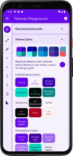
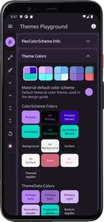
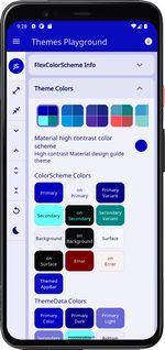
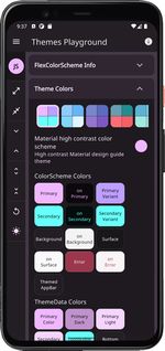
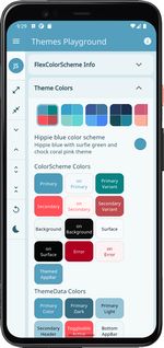
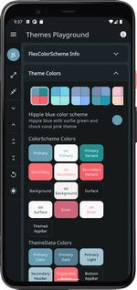
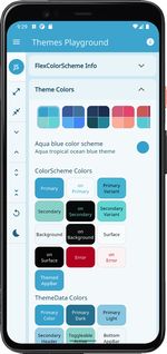
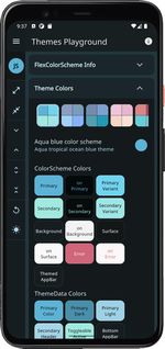
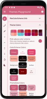
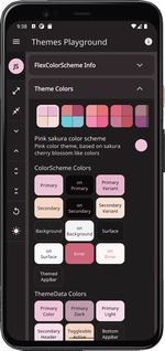
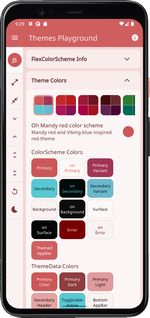
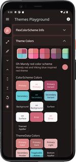
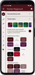
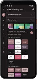
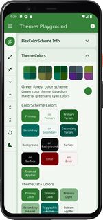
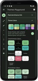
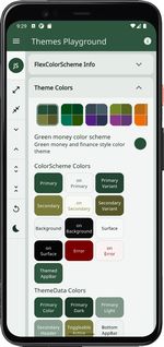
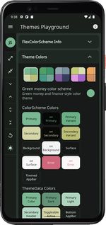
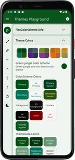
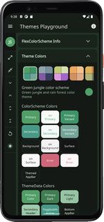
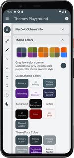
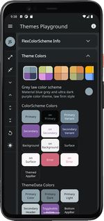
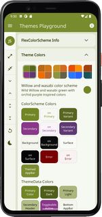
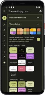
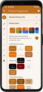
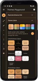
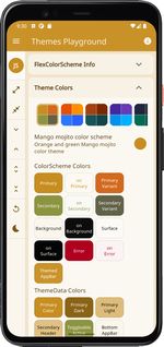
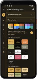
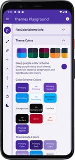
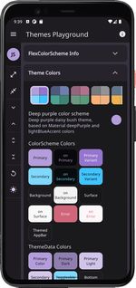
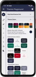
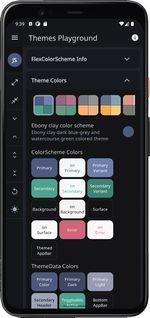
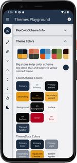
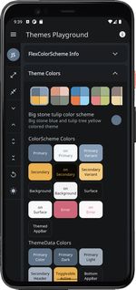
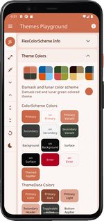
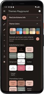
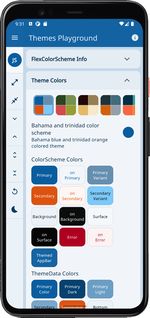
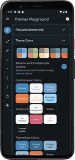
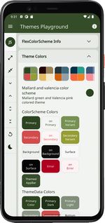
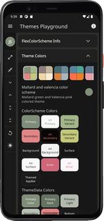
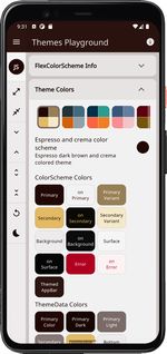
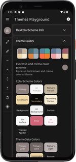
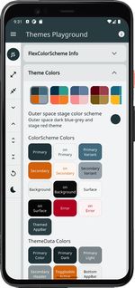
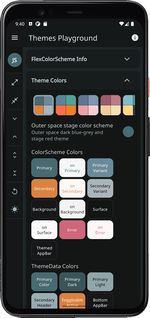
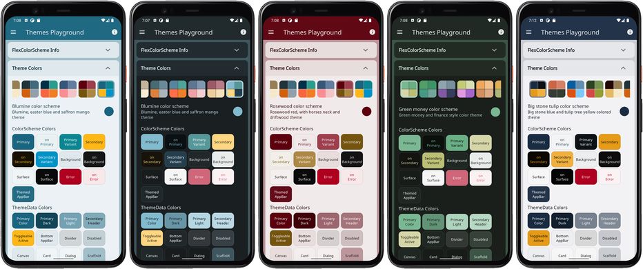
A Flutter package to make and use beautiful color scheme based themes.

Overview

Pub Version GitHub Workflow Status (event) Test codecov License

FlexColorScheme

Use FlexColorScheme to make beautiful color scheme based Flutter themes, with optional primary color surface blends. The themes are based on the same concept as Flutter's ColorScheme based themes, but with many additional features.

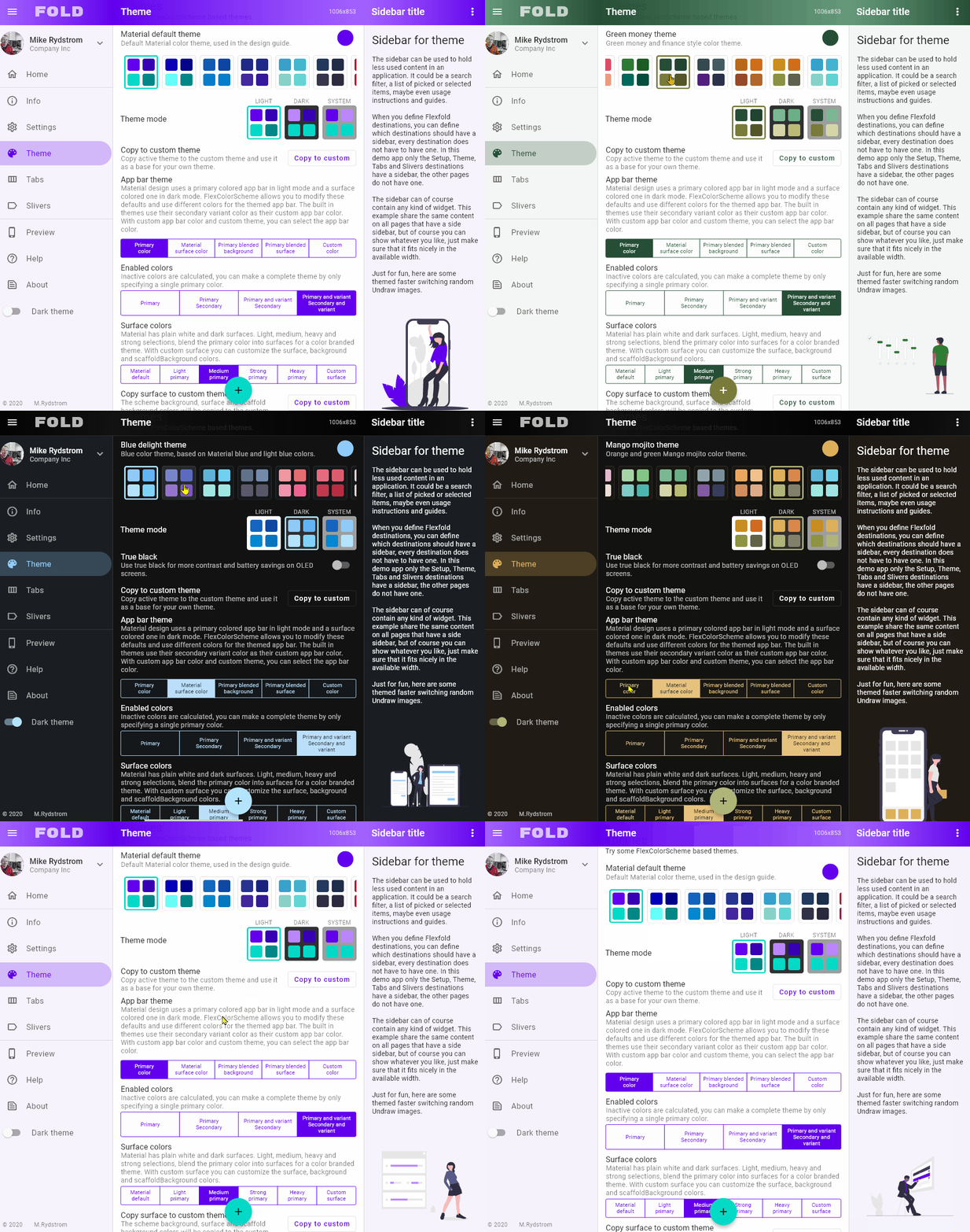
main_image
FlexColorScheme theme examples (click image to open hires version)

When you color theme a Flutter application, all built in widgets use the colors of the ColorScheme in your theme. At least in theory, and it is almost so if you defined your Flutter ThemeData by using the ThemeData.from factory, but even it misses some details. FlexColorScheme goes the extra mile to ensure that all Flutter SDK widgets gets themed completely by its built-in color schemes, or custom colors you provide.

You can opt in on using pre-made opinionated widget sub-themes. By opting in, you can for example adjust the border radius on all widgets with a single property to set the same themed border radius on them. Current Flutter SDK widgets are based on the Material 2 guide and use 4 dp corner radius as default on most corners.

When you opt in on the sub themes, the border radius on widgets default to the new rounded corners as specified by the Material 3 guide, where the rounding varies by widget type. You can stick with this, or set global radius to a value you prefer. You can also easily set the themed border radius per widget and override the shared value in just a few cases. Use simple property values per widget, no need for verbose custom sub theme Shape definitions.

Contents

What is new in version 4?

For a detailed list of what is new in version 4, please refer to the change log.

There are two major new features. The first one is that FlexColorScheme now comes with opinionated widget sub themes that you can opt in on. By default, these Flutter UI widget sub themes follow the Material 3 guide. This is done as far as reasonably possible while still using standard Material 2 theming features available in Flutter 2.5. There is a Material 3 style TextTheme as well, and by default this text theme is also slightly color tinted using the color scheme's primary color. You can turn these styles on and off, based on your your own preferences when you opt in on the sub themes.

The second main new feature is that FlexColorScheme now offers 9 different surface color blend modes, with 40 different blend levels each. Version 3 only had one "blend style" with 5 levels, including the no blend option. The version 3 blend style API is still available. Despite the major version bump, all APIs from version 3 are fully compatible with version 4. The version was mostly bumped because it contains so many new features that it made sense.

Looking for version 3 docs with working image links?

You can find it here.

New Color Schemes

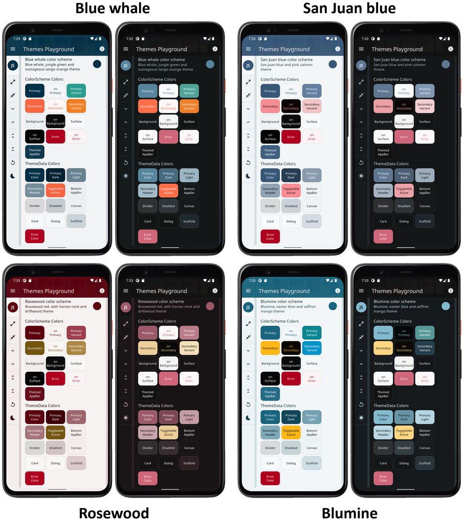
There are of course new built-in color schemes. Four of them seems to be the standard for new releases. The new color schemes are:

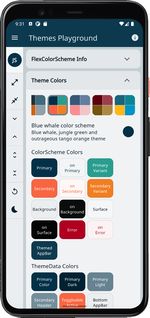
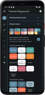
  • Blue whale - Blue whale, jungle green and outrageous tango orange
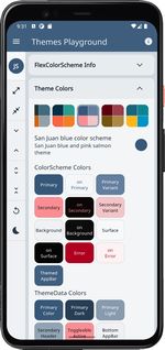
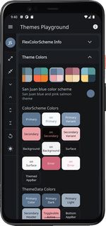
  • San Juan - San Juan blue and pink salmon theme
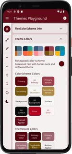
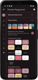
  • Rosewood - Rosewood red, with horses neck and driftwood theme
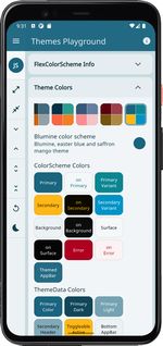
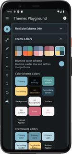
  • Blumine - Blumine, easter blue and saffron mango theme

new_themes
FlexColorScheme new V4 themes (click image to open hires version)

Total number of offered built-in color schemes is now 36 matched light and dark pairs. By using the swap primary and secondary colors, you can double the amount of variations with just a boolean toggle. Not all the color schemes are so attractive when you swap the colors, but some were designed to support it and look well with the colors reversed too. You can for example use this to present the dark mode with primary and secondary colors swapped compared to the light mode.

You can check out this Tweet and its thread here to see a visual presentation FlexColorScheme's features.

Quick Start Guide

The quickest way to try FlexColorScheme V4 is to build the default example application and use it as a hot reload playground to get to know it.

Default example - Hot Reload Playground

To try the default example on a device or simulator, clone the repository and run the example:

cd example/
flutter run --release

The result is a demo app that uses a custom defined color scheme, has a theme mode switch, includes theme colors presentation and Material widget samples. With these you can see the active color scheme's colors and the created theme's impact on common Material UI widgets.

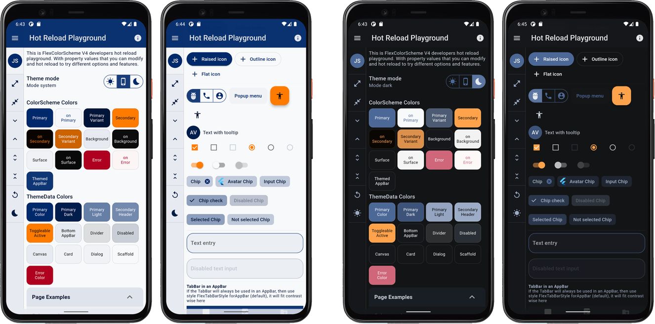
The default sample app, the "Hot Reload Playground", looks like this:

playground_default
Hot Reload Playground the Default Example App (click image to open hires version)

It comes fully loaded with template settings and thorough comments that explain what to change to produce different results. You could for example change the _useScheme to true, as shown below and hot reload it, to then use the new FlexScheme.blueWhale theme instead.

// To use a pre-defined color scheme, don't assign any FlexSchemeColor to
// `colors`, instead pick a FlexScheme and assign it to the `scheme` property.
// Try eg the new "Blue Whale" color scheme.
const FlexScheme _scheme = FlexScheme.blueWhale;

// To make it easy to toggle between using the above custom colors, or the
// selected predefined scheme in this example, set _useScheme to true to use the
// selected predefined scheme above, change to false to use the custom colors.
const bool _useScheme = true;

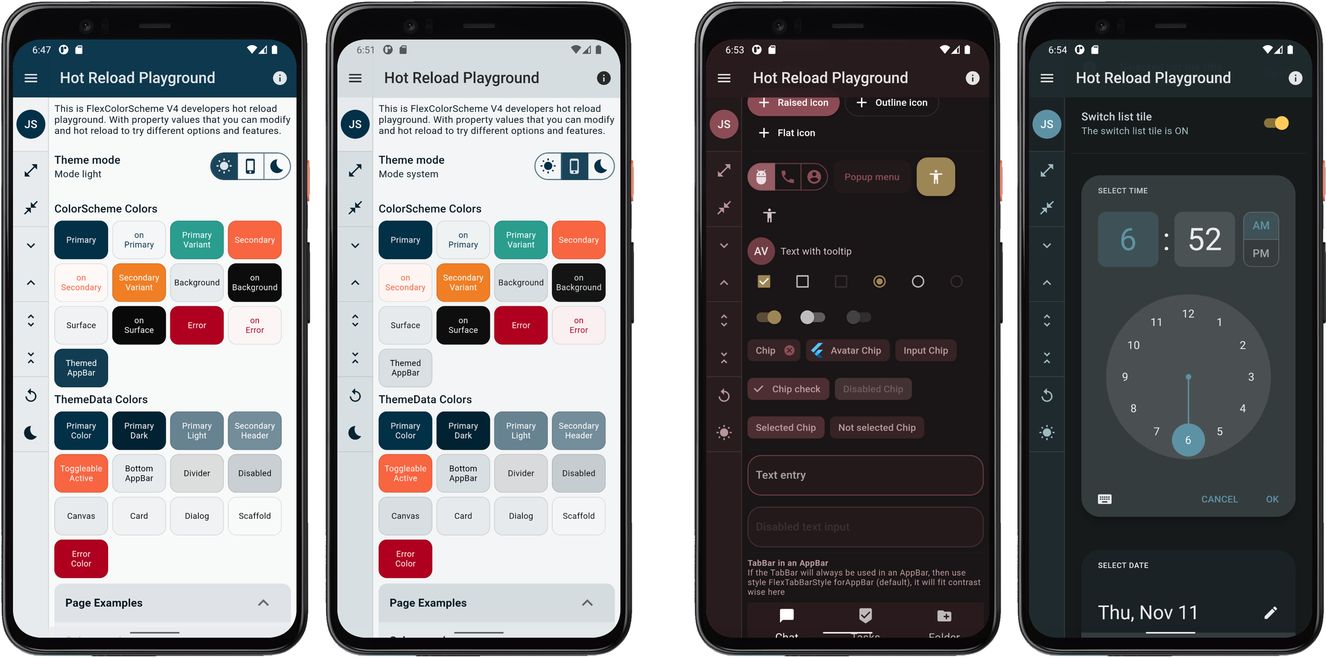
There are many settings you can play with in the default example application. The above selected blue whale theme is the first one shown in the image below.

options
Hot Reload Playground (click image to open hires version)

The other results shown above were also produced by editing a few properties in this hot reload playground.

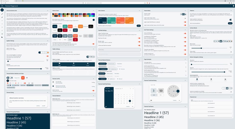
In the hot reload playground the side menu has no real functionality, it is mainly there to present more surface area using the theme colorscheme background color. The theme toggle in the menu does work though.

Themes Playground

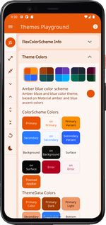
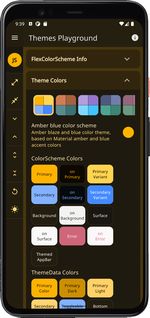
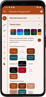
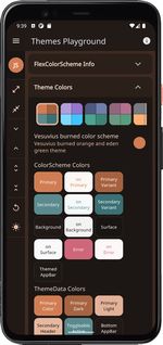
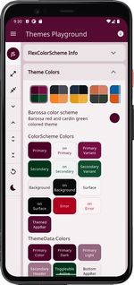
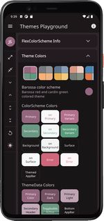
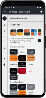
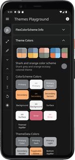
The side menu in the default example is actually made for and used in the last step and example 5 in the tutorial. The final example doubles as an interactive Themes Playground application. There the menu options actually have their indicated functionality.

The Themes Playground is useful as a tool to find themes and settings you prefer, or just use it to figure out what you can do with FlexColorScheme. The playground persists all its settings, and you can reset them back to their default values.

The Themes Playground can be used as a web app here. Its source code is also available in the example sub folder in folder /example5.

It is recommended to go through the tutorial further below to get introduced to all features step by step. However, feel free to go straight for example 5 if your really like to dive into the deep end. It is a bit more advanced example than those generally bundled with packages, but not that complicated.

The Themes Playground is best experienced at as high resolution as possible, even 4k. It is responsive and works splendidly down to phone sizes too. It is however easier to see and experience what each configuration option in FlexColorScheme does, when you use a large screen with high resolution, then you can see the result of all settings at one glance.

playground-4k
FlexColorScheme Themes Playground app at 4k resolution (click image to open hires version)

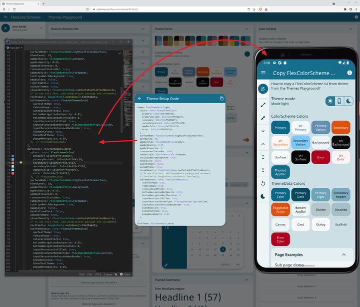
With the Themes Playground you can also copy any built-in color scheme to a customizable color scheme, that you can modify by clicking on the four main scheme colors in the custom scheme. The Themes Playground can also generate FlexColorScheme setup code that will create the same color scheme and theme that you are looking. All you have to do is copy the code and paste it into your app. You can find an example in this tweet and referenced thread

Installing and Using

In the pubspec.yaml of your Flutter project, add the following dependency:

dependencies:
  flex_color_scheme: ^4.1.0

In your library file add the following import:

import 'package:flex_color_scheme/flex_color_scheme.dart';

You can now start using FlexColorScheme V4 based color schemes and theming in your application. A quick way to do so is to try one of the 36 built-in color schemes. The schemes have enums that you can use to refer to them with.

Please study the default example for a thorough guide on how to use all properties in FlexColorScheme. To try it on your own from scratch, create a default Flutter counter app. Add the FlexColorScheme import and modify one line of code and add two lines as shown below.

Here we use the "Oh Mandy red" color scheme that is represented by enum value FlexScheme.mandyRed. We set the MaterialApp.themeMode to ThemeMode.system, so that the device can control if the app uses its light or dark theme mode, based on the device theme system setting. You can toggle theme mode by changing theme mode on the device.

Assign FlexThemeData.light to the app's theme, which is the application's light theme definition property, and FlexThemeData.dark to darkTheme. For both FlexThemeData dark and light we set the scheme property to FlexScheme.mandyRed to use the "Oh Mandy red" predefined scheme colors, and get matching light and dark themes based on the scheme's color definitions.

The three line modified MaterialApp of the Flutter default counter app becomes:

  class MyApp extends StatelessWidget {
    @override
    Widget build(BuildContext context) {
    return MaterialApp(
      title: 'Flutter Demo',
      // The Mandy red, light theme.
      theme: FlexThemeData.light(scheme: FlexScheme.mandyRed),
      // The Mandy red, dark theme.
      darkTheme: FlexThemeData.dark(scheme: FlexScheme.mandyRed),
      // Use dark or light theme based on system setting.
      themeMode: ThemeMode.system,
      home: MyHomePage(title: 'Flutter Demo Home Page'),
    );

New in version 4:
The FlexThemeData.light and FlexThemeData.dark APIs are new in version 4. They are extensions on ThemeData that create FlexColorScheme.light and FlexColorScheme.dark objects and call their toTheme method in one step. The new syntax is shorter and also look very similar to ThemeData.light and ThemeData.dark factories.

The old APIs work as before and will not be deprecated, they implement the actual functionality and are also needed in more advanced theming use cases. They can for example be useful and preferred when you add your own custom widget sub-themes to FlexColorScheme themes. With FlexColorScheme you can extract the color scheme it will use for its ThemeData. You often need the colors in this scheme when you create widget sub-themes.

The above additions gives us the following look on the familiar counter app:

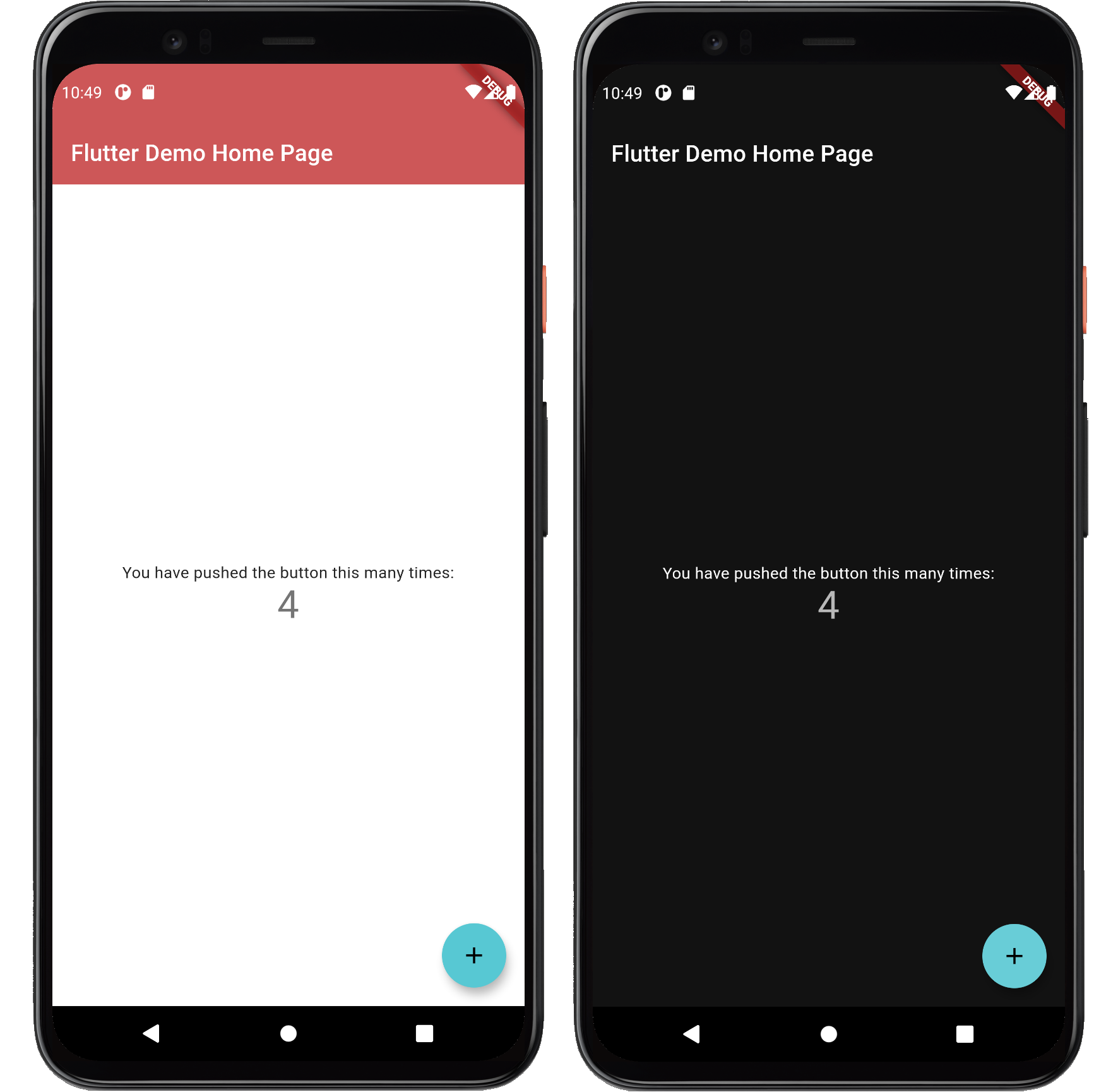
counter sample

FlexColorScheme applied on the standard Flutter Counter Template

Not as exciting as the earlier images above. That is because the basic counter app uses very few features and widgets, so it cannot really illustrate the result very well. This is why the included examples contain demo UI, that is not really at all relevant to using FlexColorScheme, and is mainly there to be able to properly demonstrate the results.

All Color Schemes

Color schemes are no fun without some built-in schemes ready to try and use. FlexColorScheme comes bundled with 36 ready to go matching light and dark color schemes. You you can use them in your applications if you like. Here is a grid showing all the color schemes in light and dark mode. You can click on them to open a high resolution version of each image.

Light Dark Light Dark Light Dark Light Dark

All available color schemes (click to open a hires version of each image)

In the scheme reference you can find a table listing all the built-in color schemes with their FlexScheme enum value, name and description.

Another convenient and recommended way to see and try all the predefined color schemes is by using the Web versions of the package example 4 "All Themes" and of course example 5 "Themes Playground" is the ultimate showcase of all the built-in color schemes as well. Using it you can try all the built-in color schemes with theming options, and see the impact they have on often used Flutter UI widgets.

Color Scheme Designs

The built-in color schemes are all tuned matching light and dark scheme pairs. Most of them are pretty conservative, but some are intentionally a bit more playful and bold. The first two color schemes are actually the Flutter and Material 2 Design Guide examples of light and dark color schemes, and the Flutter high contrast light and dark color versions as well. So OK, there are actually "only" 34 new and different from standard Flutter ready-made light and dark color scheme pairs. The color scheme "Amber blue" is also a high-contrast theme. An alternative to the built-in Material high contrast theme.

The built-in schemes do not claim to be a "this selection" fits all needs collection. Nor do they claim to be more correct than any other color scheme. What fits your needs and looks good to you, is the right choice for your application and use case.

You can make your own custom scheme totally from scratch, or use these as a starting point and inspiration. You can copy colors from existing schemes, even via their const FlexColor name. All the color values in the color schemes are available as const values too, so you can easily make new custom combinations using existing color schemes and add a few custom ones to the mix.

Use Your Own Color Schemes with FlexColorScheme

The package examples show how you can easily make and use your own custom color schemes with FlexColorScheme. Maybe the built-in examples will inspire your creative side to define your own schemes. The tutorial walks you through how to define your own color schemes and make themes based on them.

You can create your own custom list of schemes, then use this list with only your own custom color schemes selection. You may also append some, or even all the built-in schemes after your custom schemes, and give your users a lot of theme options. How to do this is demonstrated in the tutorial in examples 4 and 5.

While building, testing and using this package over a period of time, a number of color schemes were born as a side product. I decided to include them in FlexColorscheme and offer them for re-use and inspiration as they are. It is however not necessary to use them to reap the benefits of FlexColorScheme.

The color and scheme definitions for the built-in color schemes are in their own class. They will not be included in the release compiled version of your application if you do not use (reference) them in your application, and instead only use your own custom color schemes for the themes.

Example Applications

FlexColorScheme comes bundled with six different examples. Earlier we already saw how you can build the default example, and use it as a "Hot Reload Playground". You can use it to experiment and learn on your own about FlexColorScheme's features and how to use them.

The default example is a template that is heavily commented to guide you and encourage you to play around with different options in code, then use Flutter's hot reload feature and see the results at once.

The other five examples are a part of a tutorial path, with increasing complexity, that we will walk through in the tutorial. It ends with the complete Themes Playground demo app included as example 5.

Building the Examples

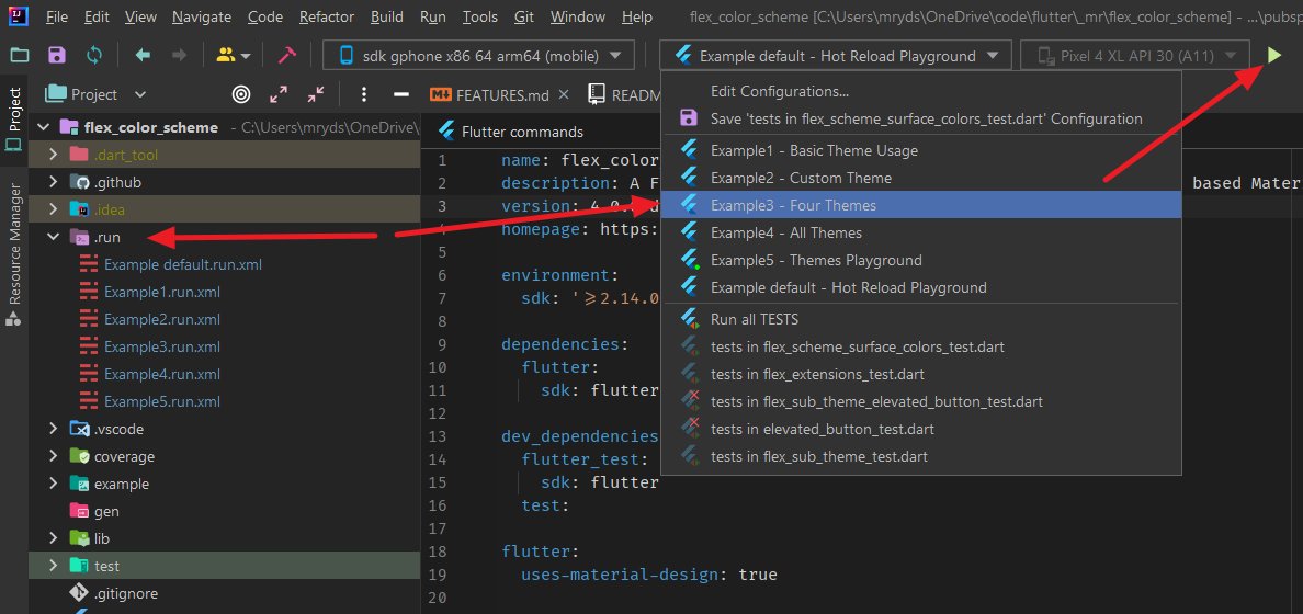
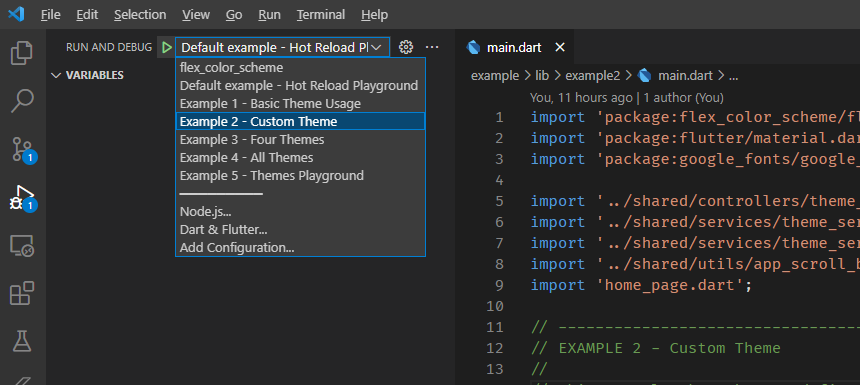
You can build the examples by using preconfigured launch and run config files for VS-Code (.vscode -> launch.json) and Android Studio/IntelliJ (.run -> *.xml files).

When you have cloned the package repo and open the project in VS-Code or Android Studio/IntelliJ the configurations should be available for you, so you can easily build all the examples.

In IntelliJ and Android Studio you can use: intellij-run

For IntelliJ and Studio there is a .run config that can be used to build and run the examples

In VS-Code you can use: vscode-run

For VS-Code there is a launch.json that can be used to build and run the examples

Live WEB Demos of the Examples

If you want to take a quick look at all the examples, you can try live web versions of them.

Example 1 represents the simplest use case. To use one of the built-in color schemes as your application theme. You can toggle between its light and dark variant, or allow device system theme mode setting to control if the dark or light theme is used.

ColorScheme example 1
Example 1) Using a built-in FlexColorScheme color scheme as application theme (click image to open hires version)

Example 2 is like example 1, but we use custom colors to make a custom color scheme and turn it into a theme. The architecture is also more advanced, it uses the approach introduced with Flutter skeleton template, using a theme service and theme controller. Here we keep settings only in memory using the in memory ThemeServiceMem theme service.

ColorScheme example 2
Example 2) Using custom colors with FlexColorScheme color scheme as application theme (click image to open hires version)

In example 3 we can toggle the active theme between 3 different predefined color schemes, plus the custom one we defined in example 2. We can opt in and out of using the new sub theming.

All the settings are persisted locally, using a theme service called ThemeServicePrefs. This service uses the package SharedPreferences to persist the theme settings locally as they are modified.

ColorScheme example 3
Example 3) Using three built-in schemes, plus a custom color scheme as application theme options (click image to open hires version)

In example 4 we can select any of the different built-in color schemes plus three custom ones, and use them as the application theme. In this example we persist the theme settings using a theme service called ThemeServiceHive. It persists the settings locally using a package called Hive.

ColorScheme example 4
Example 4) Using custom schemes, plus all the built-in ones as application theme options (click image to open hires version)

Example 5 is the last, and most complex of the examples. It presents all configuration and settings available in FlexColorScheme. You can modify them interactively and the application changes theme as you modify any setting.

In this example we also persist the theme settings as you change any value and parameter in the app. This is done using the same theme service ThemeServiceHive that was used in example 4. The settings can also be reset back to their default values.

This example is best seen and tested on a tablet, desktop or desktop web browser, rather than on a phone. The app certainly works well on a phone sized canvas too, it is using a very responsive design. It is just difficult to get a good overview of all the settings possibilities and their impact on different, widgets, while changing the settings on the phone UI, since you cannot see everything at the same time as you change property values.

ColorScheme example 5
Example 5) The Themes Playground (click image to open hires version)

Flexfold demo

Another classic example of FlexColorScheme usage can be seen in the Flutter web Flexfold demo app.

Flexfold demo

Flexfold Demo uses FlexColorScheme for its themes.

The live version of the Flexfold demo is still using FlexColorScheme version 3. Example 5, the Themes Playground now has even more theming features than the Flexfold demo does.

Flutter Theming Introduction

When you make themed Flutter applications you should base the colors of your application on a light theme mode suitable ColorScheme, and a dark theme mode ColorScheme. Then create your light and dark ThemeData using these color schemes, by assigning the ColorScheme for each mode to the colorScheme property in ThemeData. In your MaterialApp you then assign the ThemeData for your light, and dark theme to the theme and darkTheme properties in the MaterialApp.

This gives you an application that uses the defined color schemes on all the Flutter SDK built-in Material UI widgets. Well, on most of them anyway. Flutter's ThemeData.from a ColorScheme has a few gaps. The used color scheme is not consistently applied on all built-in Flutter SDK Material UI Widgets. To get it really right, you also have to assign the colors from your ColorScheme to a number of color properties that still
exist as direct properties in ThemeData.

Flutter ThemeData

At its core, FlexColorScheme.toTheme creates a ThemeData object. It helps you make a color scheme based, consistent and a more refined Flutter ThemeData object.

The Flutter ThemeData object is a very large theme property data, and theme behaviour controlling class. It can change the look and feel of Flutter applications completely. It is not really that difficult to use, but it has many quirks and oddities, especially when it comes to used colors. This is mostly due to past legacy and things that were not considered early on. Some parts were done differently first, later things changed, but those earlier ways are still supported to not break past behavior, together with some newer ways to define and setup colors.

This is all further complicated by the fact that under the hood many Flutter SDK UI widgets still use the original direct color properties in ThemeData. These properties are now mostly assigned color values via ThemeData.colorScheme. Exactly how depends on which ThemeData factory constructor you use.

Many older widgets still do not use the ThemeData.colorScheme properties for their default color values directly, they still use color property values in ThemeData, that got assigned values from ThemeData.colorScheme, that varies depending on used ThemeData factory! Still with me? Very basic and old widgets, like for example Material and Card fall into this category. While some newer widgets actually do use colors from ThemeData.colorScheme directly. Additionally, the colors in the ColorScheme help by the colorScheme property in ThemeData can actually not represent all the colors that exist in ThemeData's color properties. Thus, some of those color properties never get any ColorScheme based values assigned to them. They are left to default values assigned by the ThemeData factory, unless you explicitly assign them some color that fits with your color scheme. If this is not done, it can then look odd when some widgets use the factory default colors, while the rest of your app's widgets correctly use the ColorScheme based colors. Luckily there are not so many widgets left that still applies to, but there are a few, for example CircleAvatar.

It can all be very confusing and frustrating to fight with ThemeData and its colors, and if not done properly, it may result in themes with color schemes that are not entirely consistent or logical across all standard SDK widgets in your application.

One of the fundamental things FlexColorScheme does, is that it fixes these minor inconsistencies and gaps that exist with Flutter's ThemeData.from factory and handles the complexity of using the ThemeData factory directly. It releases you from the burden of knowing what colors in it affects which widgets how.

FlexColorScheme makes a few opinionated, but subtle theme modifications compared to the ThemeData.from themes created from a ColorScheme. By default, FlexColorScheme theming refrains from touching theme properties not related to making the colors more consistent. Some minor adjustments were however needed. This is covered in detail in the external inside FlexColorScheme document (external link).

There is a Flutter development plan to deprecate most, if not all, the direct color properties in the ThemeData class. Flutter SDK Widgets should after that only use ColorSceheme based colors that are in the ThemeData colorScheme property, as the default colors for their designs. This design document describes the plan and reasoning. There is also a color property deprecation check list issue 91772 to mirror this plan.

For FlexColorScheme the progress of these actions are monitored closely. Needed changes and updates in FlexColorScheme will be implemented when
related changes in ThemeData reach the Flutter stable channel. FlexColorScheme already of course correctly defines a ColorScheme for ThemeData. The typical maintenance need is removing deprecated ThemeData properties and check if some new sub-theme color property needs to be modified to replicate past FlexColorScheme theming behaviour, when its corresponding color property is removed from ThemeData.

Color Blended Surfaces

The Material 2 Guide briefly mentions color branded and blended surfaces. In the new version of Material Design called Material You and now also known as Material 3, color branded or blended and also just colored surfaces, are used extensively. It is done in more flexible ways than what can be done with theming alone in current version of Flutter. We look forward to seeing these features soon in Flutter as well.

With FlexColorScheme you can already with current version of Flutter SDK (2.5.3 when this was written) easily create fancy looking primary color branded and alpha blended themes. These themes work natively with the current Material 2 design based themes and all UI widgets in the current version of Flutter.

The themes are created by using different blend modes and blend level strengths, for blending in primary color into surface and background colors. This can bring different and new nuances to your application. Below an example of the same theme, but using different blend modes and levels. The effect can be kept
very subtle or made very bold and impactful.

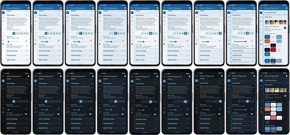
The first light and dark image pair show the theme using blend level 0. At level 0 there are no alpha blends in any surfaces, so all modes look the same. The next six images use the same blend level strength 18, but show six different blend modes. Next, one of the modes is repeated, but at blend level 33. Last the theme that was used to generate all these different nuances of the same color scheme based theme, is shown.

blend examples
FlexColorScheme using same theme, but with different blend modes and levels (click image to open hires version)

There are 9 different blend modes at 40 different levels each, that you can choose from, to tune a theme to your liking. You don't have to use the same blend mode or level for your light and dark theme mode, the included examples mostly only do so to keep the interactive examples simpler. Often a different blend mode and level for your light and dark themes, may produce a more balanced or more impactful result, depending on your design goal.

The above images were made with the Themes Playground (example 5) app running as a phone app, instead of using the web demo. The application is open source, and is included as the last example in the pub.dev bundled examples and on GitHub here. The Themes Playground is an interesting and useful tool when you want to find fitting themes, blend modes and levels to use as your application's FlexColorScheme based theme. It even allows you to copy/paste the code needed to make the Flutter theme you are looking at.

Frequently Asked Questions

Below some frequently asked question and answers about using FlexColorScheme.

Custom Color Schemes

A FlexColorScheme can like Flutter's standard ColorScheme be created by specifying all the required color scheme colors. However, with FlexColorScheme you can also specify only the primary color and get all other colors needed for a complete color scheme computed based the given primary color.

There is a helper class FlexSchemeColor, with a factory called FlexSchemeColor.from, it can create complete color schemes from incomplete color scheme data. Additionally, its toDark method can create a computed matching dark scheme from a defined light scheme.

These features are useful when you quickly want to test a single color, or maybe only a primary and secondary color for a light theme, and get all other scheme colors computed. When you figure out the colors you want, you can use exactly tuned color definitions and make your custom color schemes from const values instead. Using different ways to create custom color schemes is presented in detail in the tutorial examples 2, 3 and 4.

And you can also use the live version of example 5, the Themes Playground to copy existing color schemes and modify them interactively and copy the code for a theme, either custom one or all the setups you made for a built-in one.

Can I Add Custom Sub Themes?

When you make a theme with FlexThemeData.light or dark, it returns a normal Flutter ThemeData object that you can use like any other ThemeData object. You can then use this returned ThemeData and add additional custom sub theming to it with ThemeData's normal copyWith method, before passing it on to your application's theme or darkTheme properties.

If you need color values that FlexColorScheme has created, maybe some auto calculated main colors, but more typically the blended surface and on surface colors for your sub themes, you can get them too. For this advanced use case, it is recommended to use FlexColorScheme with the factory constructor FlexColorScheme.light and FlexColorScheme.dark, to create the FlexColorScheme objects first. Then get the ColorScheme they define with its toScheme method, and use this ColorScheme data as input to your custom sub theme creation.

When you make sub themes, you often need access to the colors their main ThemeData is using and storing in its colorScheme property. This step gives you that before even creating the ThemeData object from your FlexColorScheme object. You can then Pass the ColorScheme you got from toScheme, or just one or some of its color values, along to your methods that define your sub theme data.

Turn your FlexColorScheme to ThemeData with its toTheme method, and then add your sub themes with copyWith to this object in the same go. They now use the same ColorScheme colors, that the ThemeData created with toTheme gets as as well.

You can of course also create the FlexColorScheme ThemeData with the extensions FlexThemeData.light and dark, and get the ColorScheme object from the ThemeData colorScheme property you get. Then use that color scheme to create your sub-themes that need access to those color values. Finally, use copyWith to create a new ThemeData with your custom sub themes included. This is however one extra step and additional ThemeData object compared to the approach.

If you are creating modifications to a sub-theme that FlexColorScheme already defines, and you want to keep the properties it has assigned. For example only override a few property values in such a sub theme, then you will indeed need to first create the FlexColorScheme based ThemeData object. Use the sub theme from it that you want to add a modified copy of, as input to the new ThemeData. In such a case you might as well use FlexThemeData.light and dark API, since there is no win in the steps by first creating the FlexColorScheme object.

If you are not opting in on the opinionated sub themes, this applies to the following sub themes that are not null in even the vanilla FlexColorScheme based ThemeData:

  • ThemeData.appBarTheme
  • ThemeData.bottomAppBarTheme
  • ThemeData.tabBarTheme
  • ThemeData.inputDecorationTheme
  • ThemeData.textSelectionTheme
  • ThemeData.tooltipTheme
  • ThemeData.buttonTheme (for the legacy and deprecated buttons)
  • ThemeData.chipTheme
  • ThemeData.bottomNavigationBarTheme

The changes made in the above vanilla FlexColorScheme based ThemeData sub themes are pretty small, but the themes are not null. You can read more about what changes FlexColorScheme makes to them in this "Inside FlexColorScheme" document (external link).

When you opt in on using the opinionated sub themes in version 4, the above sub themes are typically further modified. Additionally, the following sub themes are also no longer null, which they are in the vanilla version:

  • ThemeData.iconTheme
  • ThemeData.primaryIconTheme
  • ThemeData.textButtonTheme
  • ThemeData.elevatedButtonTheme
  • ThemeData.outlinedButtonTheme
  • ThemeData.toggleButtonsTheme
  • ThemeData.floatingActionButtonTheme
  • ThemeData.cardTheme
  • ThemeData.popupMenuTheme
  • ThemeData.dialogTheme
  • ThemeData.timePickerTheme
  • ThemeData.snackBarTheme
  • ThemeData.bottomSheetTheme

If you want to add custom sub-themes and keep the already existing modified properties in ThemeData intact, you cannot use just a copyWith using a sub theme constructor, you have to use the sub-theme instance from the current ThemeData, and the copyWith on it, assign it to the sub theme in the copyWith on the ThemeData. This is the same way that you would modify ThemeData when you create scoped ThemeData inside your app, and want it to fully inherit the parent Theme, but with a few properties modified in some sub themes only. This sounds more complicated than it is.

To make it easier to follow, here is an example of what this looks like. Say you want to modify shadow color of the appBarTheme in ThemeData, but you also want to keep all the other theme changes FlexColorScheme has introduced to it, like e.g. using surface color with a blend of primary as its background color, if you have chosen that mode for the AppBar theme. You can then add your shadow color like this:

class MyApp extends StatelessWidget {
    @override
    Widget build(BuildContext context) {
    final ThemeData lightTheme = FlexThemeData.light(scheme: FlexScheme.mandyRed);
    return MaterialApp(
      title: 'Flutter Demo',
      theme: lightTheme.copyWith(appBarTheme: lightTheme.appBarTheme.copyWith(
           shadowColor: const Color(0xFFFFFFFF));
      themeMode: ThemeMode.light,
      home: MyHomePage(title: 'Flutter Demo Home Page'),
    );
  }
}

This is still a bit involved. I might look into the possibility of providing deepCopyWith methods, at least for the first sub theme level, in a future version. Some kind of deepCopyWith method for sub-themes would be really handy to even have in the Flutter SDK on ThemeData.

One additional possibility when creating totally custom sub-themes is to utilize the static helper functions in the FlexSubThemes class. FlexColorScheme uses them internally to create sub themes in version 4. You can find its API documentation here.

You can of course also use these sub theming functions, and even complement them with copyWith values for properties they do not provide. Please note that the FlexSubThemes static helper functions are not meant to provide all properties for all existing sub themes. They only cover the properties and themes needed by FlexColorScheme. When using FlexColorScheme you can use the FlexSubThemesData configuration class, passed in to FlexColorScheme.subThemesData property, as a convenient way configure and customize them.

If I don't Use the Predefined Schemes, Why Should I Use FlexColorScheme?

The purposes with the FlexColorScheme package is to:

  • Fixes some odd things in Flutter's standard ThemeData definitions and make all SDK Widgets, old, new and even deprecated ones, use the specified color scheme in the expected way.
  • Enable easy switching among multiple color schemes in an app.
  • Provide an easy way to make themes with primary color branded and blended backgrounds and surfaces. Be able to to easily vary the blend level and mode for different surfaces.
  • Provide a quick toggle for different AppBar styles, without the need to manually make a custom theme for it every time, including matching TabBar.
  • Provide optional support for a true black mode for dark themes.
  • Quickly swap the primary and secondary color definitions, if you want to try your theme the other way around.
  • Theme the Android System navigation bar to match your app theme, and make it partially or totally transparent.
  • With default settings FlexColorScheme avoids touching the Widget sub-theme definitions, but in a few cases it is needed to fix things and to make some minor design changes. In the default produced ThemeData the changes are as few and subtle as possible, leaving the task of Widget sub theming more up to you. However, you can also opt in on widget sub themes to get a more refined and opinionated look on widgets and used text theme. The defaults for the new opt in sub themes are inspired by the new Material 3 guide. Following it when it can easily be accomplished by using the Material 2 based theming in Flutter. Full support for Material 3 widgets and themes is coming to Flutter later.
  • FlexColorScheme also provides a way to make "lazy" quick toned ColorScheme themes from just a single light scheme color. Even its dark scheme counterpart can be made from this single color definition.

If you like the above features, then FlexColorScheme may fit your theming requirements, even if you do not use any of its built-in color schemes.

Can We Change this Predefined Scheme's Colors?

No, current predefined schemes will not be changed. Changing them would be a breaking change to the package version promise. The scheme colors could in theory be changed by releasing a new major version that break past scheme color definitions. At the moment, there are no plans to ever add breaking releases to just change a predefined scheme's color(s). All current color definition values are also included in the package tests, and a failed color value test is considered a breaking change.

Can We Add This Scheme?

To keep things interesting, there will from time to time be new color schemes added to the package. If you have a beautiful color scheme with matching light and dark theme mode colors, that you think would be perfect to include, then please post a suggestion as a GitHub issue.

No promise is made about its eventual inclusion, but if it is a nice, unique, and overall a pretty color scheme, it will likely be included. Coming up with nice color schemes is trickier than it seems, suggestions and contributions to new ones are very welcome.

Can I use different built-in color schemes for my light and dark themes?

Yes this is possible. Use different FlexScheme enum values for the light and dark FlexThemeData.light and FlexThemeData.dark factories' scheme property. If the colors used by the selected schemes are a bit related, this can be used to create nice and unique light and dark combinations of the predefined schemes.

By using the colors property you could even apply a FlexSchemeColor that has data that was designed for a light theme, to the FlexThemeData.dark factory, and wise versa. For example, using the FlexThemeData.dark factory, you could to its colors property assign the FlexSchemeColors from
FlexColor.schemes[FlexScheme.mandyRed].light that are designed and intended to be used with the light mode factory.

The results will typically not be very useful or pretty. The rationale for the slightly involved data structure, is to keep it flexible, but at the same time provide self documenting API guidance on how the data was designed to be used and consumed.

The scheme property prevents using the light scheme colors for the dark factory and wise versa. It can however be done if so desired by using the colors property as explained above. The colors property is always needed and used when you make custom color schemes using the FlexThemeData.light and FlexThemeData.dark factories.

Tutorial

In this tutorial we go through all the bundled examples and explain the used FlexColorScheme features in each example.

The key part for each example is always in the used MaterialApp, where all the FlexColorScheme setup for the themes are made. The rest of the content in the examples is mainly there to make a visual presentation of the resulting theme from the used color scheme, and to allow you to control the theme settings.

Example 1 - Basic Theme Usage

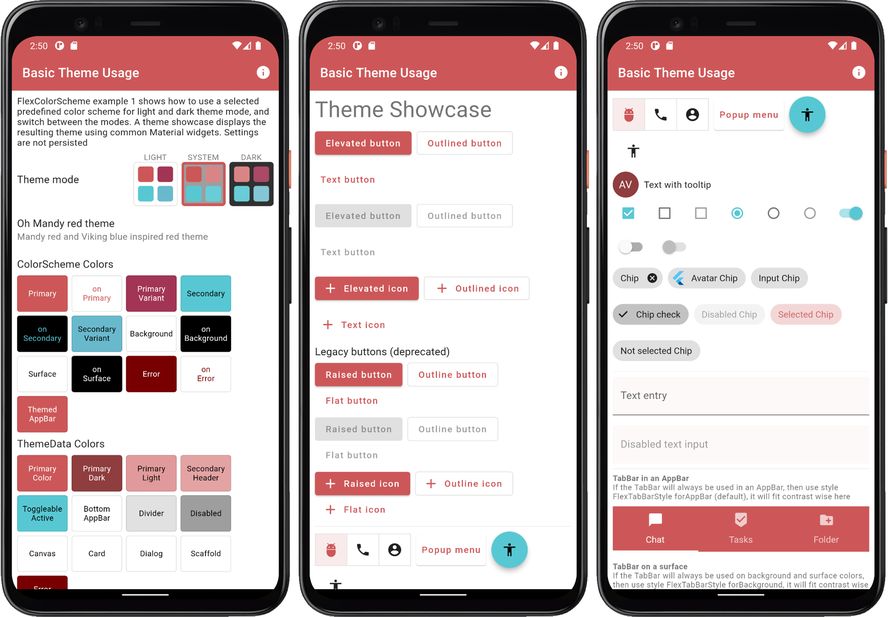
The first and simplest example shows how you can use a predefined color scheme in FlexColorScheme to define light and dark themes using the selected scheme. How to turn it into a theme used by your application, and then switch between its light and dark mode themes. A theme showcase widget shows the theme's effect on several common Material UI widgets.

The full code is not shown below, only highlights. Please find the complete example code here.

void main() => runApp(const DemoApp());

class DemoApp extends StatefulWidget {
 const DemoApp({Key? key}) : super(key: key);

 @override
 _DemoAppState createState() => _DemoAppState();
}

class _DemoAppState extends State<DemoApp> {
 // Used to select if we use the dark or light theme, start with system mode.
 ThemeMode themeMode = ThemeMode.system;

 @override
 Widget build(BuildContext context) {
   // Select the predefined FlexScheme color scheme to use. Modify the
   // used FlexScheme enum value below to try other pre-made color schemes.
   const FlexScheme usedScheme = FlexScheme.mandyRed;

   return MaterialApp(
     debugShowCheckedModeBanner: false,
     scrollBehavior: AppScrollBehavior(),
     title: 'Basic Theme Usage',
     // Use a predefined FlexThemeData.light() theme for the light theme.
     theme: FlexThemeData.light(
       scheme: usedScheme,
       // Use very subtly themed app bar elevation in light mode.
       appBarElevation: 0.5,
     ),
     // Same definition for the dark theme, but using FlexThemeData.dark().
     darkTheme: FlexThemeData.dark(
       scheme: usedScheme,
       // Use stronger themed app bar elevation in dark mode.
       appBarElevation: 2,
     ),
     // Use the above dark or light theme based on active themeMode.
     themeMode: themeMode,
     home: HomePage(
       // We pass it the current theme mode.
       themeMode: themeMode,
       // On the home page we can toggle theme mode between light and dark.
       onThemeModeChanged: (ThemeMode mode) {
         setState(() {
           themeMode = mode;
         });
       },
       // Pass in the FlexSchemeData we used for the active theme. 
       flexSchemeData: FlexColor.schemes[usedScheme]!,
     ),
   );
 }
}

To the HomePage we pass in the current value of the themeMode and use a callback to get back its changed value, we use it to update themeMode in a standard setState to make the app rebuild using the new value.

We also pass in the FlexSchemeData we defined for our custom theme to the HomePage. Not really needed, but we use it on the home page to show the active theme's name, description and colors in the theme mode switch.

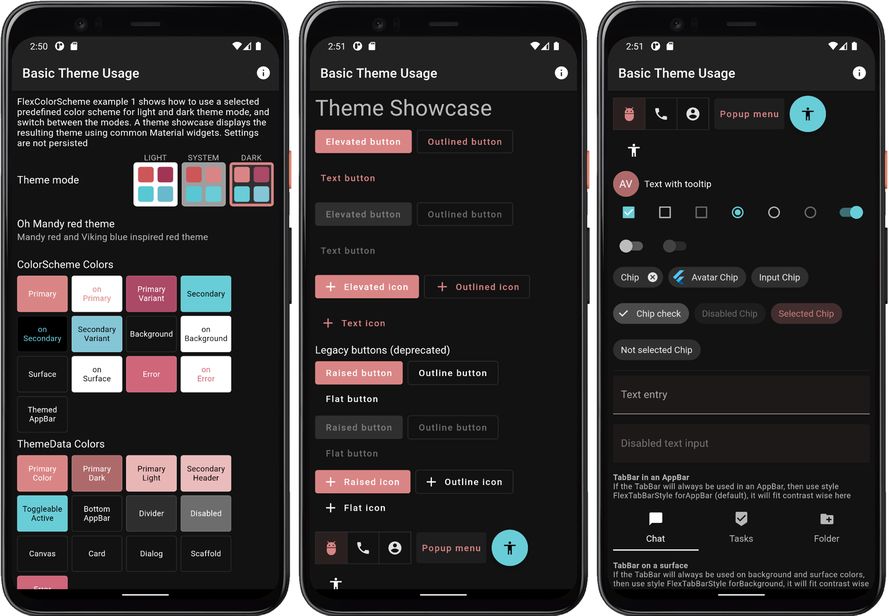
When you build and run example 1 you get an application that looks like this in light and dark mode:
ColorScheme example 1 light ColorScheme example 1 dark
Example 1) Using a built-in FlexColorScheme color scheme as application theme. (click image to open hires version)

Scroll down in the app to see the theme showcase further below. It presents the theme with common Material UI widgets. You can try this example as a Flutter web app here.

Example 2 - Custom Theme

This example shows how you can define your own color schemes using FlexSchemeColor and FlexSchemeData, to create FlexColorScheme based application themes from them.

The full code is not shown below, only highlights. Please find the complete example code here.

In this example, and the ones after it, we use a ThemeService and ThemeController to manage our theme settings. This follows the example architecture you get when you create a Flutter template application architecture with:

 > flutter create -t skeleton my_flutter_app

This example uses a theme service with only memory storage and no persistence. In later examples we use locally persisting theme services. In this example we use the theme controller to change the theme mode and to toggle opting in and out of FlexColorScheme's opinionated sub-themes.

Future<void> main() async {
  WidgetsFlutterBinding.ensureInitialized();
  // This used theme service.
  final ThemeService themeService = ThemeServiceMem();
  // Initialize the theme service.
  await themeService.init();
  // Create a ThemeController that uses the ThemeService. 
  final ThemeController themeController = ThemeController(themeService);
  // Load all the preferred theme settings, while the app is loading, before 
  // MaterialApp is created. This prevents a sudden theme change when the app 
  // is first displayed.
  await themeController.loadAll();
  // Run the app and pass in the ThemeController. The app listens to the
  // ThemeController for changes.
  runApp(DemoApp(themeController: themeController));
}

To make a custom color scheme, we for simplicity define it as a local constant in this example. We make a FlexSchemeData object with a name, description and FlexSchemeColor scheme colors defined for the light and matching dark scheme.

const FlexSchemeData _myFlexScheme = FlexSchemeData(
  name: 'Midnight blue',
  description: 'Midnight blue theme, custom definition of all colors',
  light: FlexSchemeColor(
    primary: Color(0xFF00296B),
    primaryVariant: Color(0xFF2F5C91),
    secondary: Color(0xFFFF7B00),
    secondaryVariant: Color(0xFFFDB100),
  ),
  dark: FlexSchemeColor(
    primary: Color(0xFF6B8BC3),
    primaryVariant: Color(0xFF4874AA),
    secondary: Color(0xffff7155),
    secondaryVariant: Color(0xFFF1CB9D),
  ),
);

We could also have stored the light and dark scheme only in their own FlexSchemeColor objects, and added them directly in their respective colors property in FlexThemeData.light and FlexThemeData.dark. However, we will also use this information on the HomePage for the theme switch widget and to display the scheme name and description. Putting them in a FlexSchemeData object that bundles the light and dark scheme color FlexSchemeColor, plus a name and description, is a convenient way to pass it along and re-use the information on the home page.

We use the FlexSchemeData instance _myFlexScheme instance light and dark properties, as colors value for our FlexThemeData.light and FlexThemeData.dark, that we then assign to the MaterialApp light theme property theme and darkTheme property respectively.

The setup is similar to how we used one of the built-in predefined FlexSchemeData objects in example 1 via its enum selection property, but in this case we defined our own custom FlexSchemeData in _myFlexScheme and used the colors property in FlexSchemeData to tell it to use those colors instead of a built-in scheme.

We glue the ThemeController to the MaterialApp. The Flutter standard AnimatedBuilder Widget listens to the ThemeController for changes. The Flutter AnimatedBuilder is a bit oddly named for this use case. Here it serves the purpose of functioning as a "ChangeNotifierBuilder", that rebuilds its child when its Listenable, the animation changes. Which it does whenever our ThemeController calls notifyListeners. Which we do in the ThemeController class when we have new updated data that requires the theme to update.

The usage of the AnimatedBuilder does not have anything to do with the fact that the theme changes animate from current ThemeData and colors in it, to the new ones it changes to. This is a built-in feature in ThemeData and its inherited Theme in Flutter SDK. You can change the Theme with call-backs or other state management systems too and still get the nice theme change animation.

The AnimatedBuilder is a poor name when it is used as ChangeNotifierBuilder, that does not exist in Flutter SDK. It should, just for a better and more logical name, but the AnimatedBuilder serves the same purpose here as a ChangeNotifierBuilder would.

This results in that whenever you update any theme settings managed by the ThemeController, the MaterialApp is rebuilt with the new setting becoming effective. It rebuilds the entire app UI when any value in the ThemeController trigger a change via a notifyListeners call. This is fine though, since all property changes in it are of the nature that the entire App UI needs to be redrawn anyway, so this approach works well for this use case.

class DemoApp extends StatelessWidget {
  const DemoApp({Key? key, required this.themeController}) : super(key: key);
  final ThemeController themeController;

  @override
  Widget build(BuildContext context) {

    return AnimatedBuilder(
      animation: themeController,
      builder: (BuildContext context, Widget? child) {
        return MaterialApp(
          debugShowCheckedModeBanner: false,
          scrollBehavior: AppScrollBehavior(),
          title: 'Custom Theme',
          // Define FlexThemeData.light() theme using above custom colors.
          theme: FlexThemeData.light(
            colors: _myFlexScheme.light,
            // Opt in/out on FlexColorScheme sub-themes with theme controller.
            useSubThemes: themeController.useSubThemes,
            // Use  very low elevation light theme mode. On light colored
            // AppBars this show up as a nice thin underline effect.
            appBarElevation: 0.5,
            // Here we want the large default visual density on all platforms.
            visualDensity: VisualDensity.standard,
            // Use a custom font, Noto Sans in this case.
            fontFamily: GoogleFonts.notoSans().fontFamily,
          ),
          // Same setup for the dark theme, but using FlexThemeData.dark().
          darkTheme: FlexThemeData.dark(
            colors: _myFlexScheme.dark,
            useSubThemes: themeController.useSubThemes,
            appBarElevation: 1,
            visualDensity: VisualDensity.standard,
            fontFamily: GoogleFonts.notoSans().fontFamily,
          ),
          // Use the dark or light theme, based on theme controller setting.
          themeMode: themeController.themeMode,
          home: HomePage(
            flexSchemeData: _myFlexScheme,
            // Pass in the theme controller to the home page.
            controller: themeController,
          ),
        );
      });
  }
}

As shown above, you can add a font via just a fontFamily from GoogleFonts. For better and more fine controlled results, prefer defining complete TextThemes, using a font and its different styles, you can then even use more than one font for your text theme. Then assign the TextTheme to the textTheme and primaryTextTheme properties in FlexThemeData. This is how you would use do it with standard ThemeData too.

The themeController is also passed to the HomePage where we use it in UI widgets to change the theme mode, and to opt in and out of using the sub themes feature in FlexColorScheme.

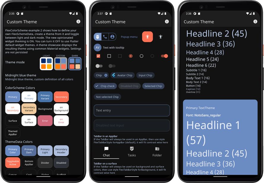
When you build and run example 2 you get a sample application that looks like this in light and dark mode: ColorScheme example 2 light ColorScheme example 2 dark
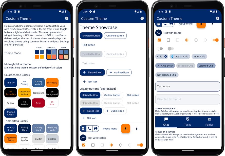
Example 2) Using custom colors with FlexColorScheme color scheme as application theme (click image to open hires version)

Scroll down in the app to see the theme showcase further below. It presents the theme with common Material UI widgets. You can try this example as a Flutter web app here.

Example 3 - Four Themes

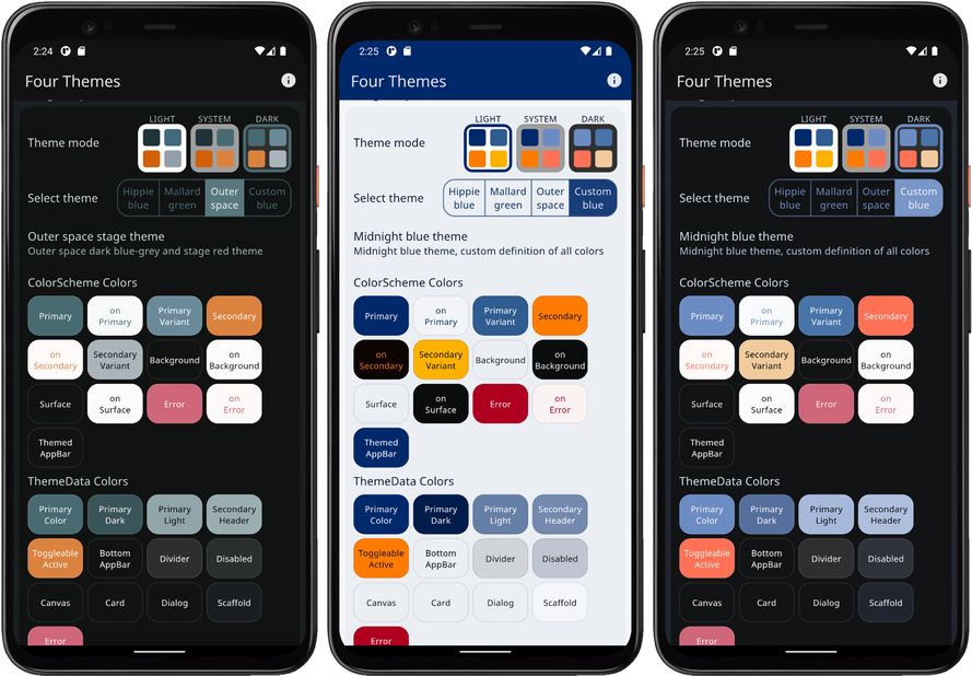
This example shows how you can use three built-in color schemes, add a custom scheme, and then use all four as selectable FlexColorScheme based theme options in an application. The example also uses surface colors with primary color blends.

The full code is not shown below, only highlights. Please find the complete example code here.

The main start function of the app is very similar to example 2, but in this case we use another ThemeService implementation, the ThemeServicePrefs version, that will locally persist the theme selection options we make.

The ThemeServicePrefs persistence is based on the popular package SharedPreferences.

Future<void> main() async {
  WidgetsFlutterBinding.ensureInitialized();
  // The ThemeServiceHive constructor requires a box name, the others do not.
  // The box name is just a file name for the file that stores the settings.
  final ThemeService themeService = ThemeServiceHive('flex_scheme_box_5');
  // Initialize the theme service.
  await themeService.init();
  // Create a ThemeController that uses the ThemeService.
  final ThemeController themeController = ThemeController(themeService);
  // Load all the preferred theme settings, while the app is loading, before
  // MaterialApp is created. This prevents a sudden theme change when the app
  // is first displayed.
  await themeController.loadAll();
  // Run the app and pass in the ThemeController. The app listens to the
  // ThemeController for changes.
  runApp(DemoApp(themeController: themeController));
}

The custom color definitions are the same as in example 4, and done in AppColor. With some additional helpers to allow us to use a completely interactively customizable theme.

We also set the surface mode to FlexSurfaceMode.levelSurfacesLowScaffold and blendLevel to 20. This gives us the same mid-level primary color alpha blend on the theme colorscheme background and surface colors, while scaffold has a much lower blend.

In dark mode we decided to use the inverted blend surface mode to this, highScaffoldLowSurfaces, where surface and background colors have lower primary color alpha blend, in relation the Scaffold background color.

class DemoApp extends StatelessWidget {
 const DemoApp({Key? key, required this.themeController}) : super(key: key);
 final ThemeController themeController;

 @override
 Widget build(BuildContext context) {
   return AnimatedBuilder(
     animation: themeController,
     builder: (BuildContext context, Widget? child) {
       return MaterialApp(
         debugShowCheckedModeBanner: false,
         scrollBehavior: AppScrollBehavior(),
         title: 'Four Themes',
         theme: FlexThemeData.light(
           colors: themeController.usedScheme == FlexScheme.custom
                   ? _myFlexScheme.light
                   : FlexColor.schemes[themeController.usedScheme]!.light,
           // We use a surface color mode where all Material surfaces use
           // the same primary color branding, but scaffold background
           // uses much less.
           surfaceMode: FlexSurfaceMode.levelSurfacesLowScaffold,
           // We set the blend level strength to 20.
           blendLevel: 20,
           appBarElevation: 0.5,
           useSubThemes: themeController.useSubThemes,
           visualDensity: FlexColorScheme.comfortablePlatformDensity,
           fontFamily: GoogleFonts.notoSans().fontFamily,
         ),
         // We do the exact same definition for the dark theme.
         darkTheme: FlexThemeData.dark(
           colors: themeController.usedScheme == FlexScheme.custom
                   ? _myFlexScheme.dark
                   : FlexColor.schemes[themeController.usedScheme]!.dark,
           // We don't have to use the same surface mode in dark mode, for an
           // interesting effect here we use a mode where scaffold background
           // color gets a much higher blend value than surface and background.
           surfaceMode: FlexSurfaceMode.highScaffoldLowSurfaces,
           // You don't have to use same blend level or mode in light
           // and dark mode, here we use a lower value in dark mode, that
           // goes better together with the highScaffoldLowSurfaces mode.
           blendLevel: 15,
           appBarElevation: 1,
           useSubThemes: themeController.useSubThemes,
           visualDensity: FlexColorScheme.comfortablePlatformDensity,
           fontFamily: GoogleFonts.notoSans().fontFamily,
         ),
         themeMode: themeController.themeMode,
         // This simple example app has only one page.
         home: HomePage(
           // Pass in the FlexSchemeData we use for the active theme.
           flexSchemeData: themeController.usedScheme == FlexScheme.custom
                   ? _myFlexScheme
                   : FlexColor.schemes[themeController.usedScheme]!,
           // Pass in the theme controller to the home page.
           controller: themeController,
         ),
       );
     },
   );
 }
}

We select used theme for the app by using the theme controller's usedScheme property, that contains the value of currently selected FlexScheme enum. If it is the custom value, we use our custom scheme myFlexScheme colors. If it is any other value, we get the corresponding colors from the FlexColor.schemes map, using the enum value as key.

On the HomePage we have a Flutter SDK ToggleButtons UI widget, that allows us the select 4 different FlexScheme enum values, it changes the themeController accordingly. In this case the used enum values we can use are hippieBlue, mallardGreen, outerSpace and the custom option.

You can find the simple ToggleButtons based enum value selector here.

The themeController is also used to decide if we opt in or out on using the new sub theming via useSubThemes. A simple on/off switch on the HomePage allows us to toggle its state between true and false, thus turning on or off the usage of new FlexColorScheme sub themes feature.

Below are the four resulting themes with their light and dark modes, that we can select and use in this example.
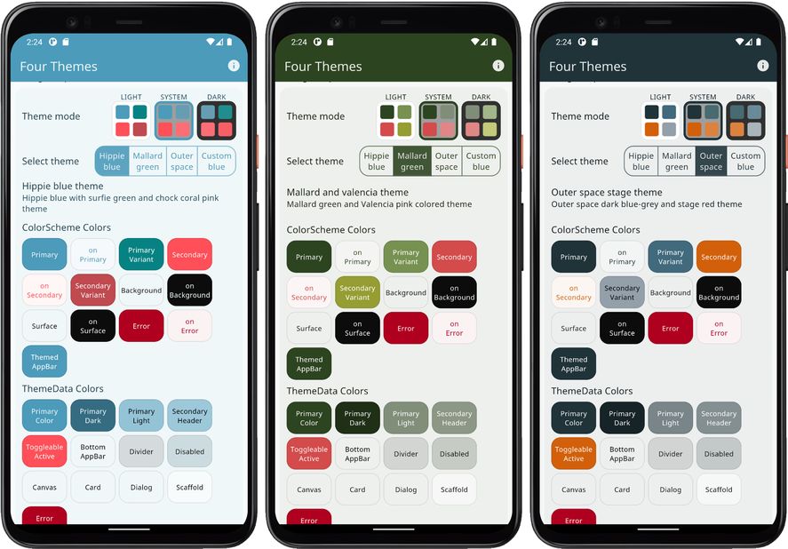
ColorScheme example 3 light ColorScheme example 3 dark
Example 3) Using three built-in schemes, plus a custom color scheme as application theme options. (click image to open hires version)

Scroll down in the app to see the theme showcase further below. It presents the theme with common Material UI widgets. You can try this example as a Flutter web app here.

Example 4 - All Themes

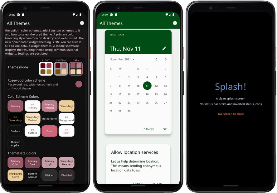
This example shows how you can use all the built-in color schemes, plus three custom color schemes. How to select which one of these schemes is used to define the active theme.

The example also uses primary color blending on background and surface colors. A subpage is available that shows the same theme applied when opening another page, that in Flutter just inherits the same theme.

The full code is not shown below, only highlights. Please find the complete example code here.

The main start function of the app is identical to example 3, we thus continue to persist the theme settings with ThemeServiceHive. It is based on the popular package Hive.

Why do we use Hive here and not SharedPreferences?

The examples are all built using same "example" app. If we use SharedPreferences in more than one of the apps they would use the same storage container and share the settings when you build them locally. By using Hive for most examples, we can change the storage container name for each example. In these demos the SharedPreferences service is only used for example 3, but you can swap in the Hive based one for it as well.

// The ThemeServiceHive constructor requires a box name, the others do not.
// The box name is just a file name for the file that stores the settings.
final ThemeService themeService = ThemeServiceHive('flex_scheme_box_4');

Instead of having having our final and const color and scheme definitions values in the main file, we moved them into a static class called AppColor.

There we begin by defining the same colors that we used in example 2 and 3, to be our first custom color. In this case we also assign a custom color to the optional appBarColor.

// Create a custom flex scheme color for a light theme.
static const FlexSchemeColor _myScheme1Light = FlexSchemeColor(
  primary: Color(0xFF00296B),
  primaryVariant: Color(0xFF2F5C91),
  secondary: Color(0xFFFF7B00),
  secondaryVariant: Color(0xFFFDB100),
  // The built in schemes use their secondary variant color as their
  // custom app bar color, but it can be any color. We use a custom color
  // here. We will see this in example 5 when using the theme and selecting
  // the custom app bar style.
  appBarColor: Color(0xFFf95738),
);
// Create a corresponding custom flex scheme color for a dark theme.
static const FlexSchemeColor _myScheme1Dark = FlexSchemeColor(
  primary: Color(0xFF6B8BC3),
  primaryVariant: Color(0xFF4874AA),
  secondary: Color(0xffff7155),
  secondaryVariant: Color(0xFFF1CB9D),
  appBarColor: Color(0xFF892807),
);

You can build a scheme the long way, by specifying all the required scheme colors, like above, or you can also build schemes from a single primary color. With the FlexSchemeColor.from factory. When doing so the only required color is the primary color, the other colors will be computed. You can optionally also provide the primaryVariant, secondary and secondaryVariant colors with the factory, but any color that is not provided will always be computed to get all the required colors in FlexSchemeColor.

In this example we create our 2nd scheme from just a primary color for the light and dark schemes. The custom appBarColor does in this case also receive the same color value as the one that is computed for secondaryVariant color. This is its default with the FlexSchemeColor.from factory if the color is not specified.

 // Vivid green colors.
static final FlexSchemeColor _myScheme2Light =
FlexSchemeColor.from(primary: const Color(0xFF055C34));
static final FlexSchemeColor _myScheme2Dark =
FlexSchemeColor.from(primary: const Color(0xFF629F80));

For our 3rd custom color scheme we define primary and secondary colors, but no variant colors, we will not make any dark scheme definitions either, all these missing colors will be computed. The missing color definitions will get computed by the factory FlexSchemeColor.from when it creates the FlexSchemeColor object. To make our dark colors for this light scheme, we use the method toDark further below with the _myScheme3Light instance.

  // Blue and red colors, for a classic blue and red theme.
 final FlexSchemeColor myScheme3Light = FlexSchemeColor.from(
  primary: const Color(0xFF04368E),
  secondary: const Color(0xFFA00505),
 );

Next we create a list AppData.schemes, with all the color schemes we will use. Starting with our three custom color schemes. Normally when we make custom schemes, those are probably the ones we want to use primarily, so we put them first in our preferred order. After our custom schemes, we add all the pre-defined built-in ones, offering them as options users can switch to and use if they like.

A FlexSchemeData object stores name and description plus the matching FlexSchemeColor for light and dark mode color schemes.

static final List<FlexSchemeData> schemes = <FlexSchemeData>[
  // We add our custom light and dark FlexSchemeColor schemes we defined
  // to a list of FlexSchemeData, where we can bundle each light and dark
  // theme that goes together and give it a name and description too.
  const FlexSchemeData(
    name: 'C1: Midnight',
    description: 'Midnight blue theme, created by using custom color values '
            'for all colors in the scheme',
    // FlexSchemeData holds separate defined color schemes for light and
    // matching dark theme colors. Dark theme colors typically need to be less
    // saturated versions of their than light counter parts. Using the same
    // colors in light and dark theme modes does not work so well.
    light: _myScheme1Light,
    dark: _myScheme1Dark,
  ),
  // Do the same for our second custom scheme.
  FlexSchemeData(
    name: 'C2: Greens',
    description: 'Vivid green theme, created from one primary color in light '
            'mode and another primary for dark mode',
    light: _myScheme2Light,
    dark: _myScheme2Dark,
  ),
  // We also do the same for our 3rd custom scheme, BUT we create its matching
  // dark colors, from the light FlexSchemeColor with the toDark method.
  FlexSchemeData(
    name: 'C3: Red & Blue',
    description: 'Classic read and blue, created from only light theme mode '
            'primary and secondary colors',
    light: _myScheme3Light,
    // We create the dark desaturated colors from the light scheme.
    dark: _myScheme3Light.toDark(),
  ),
  // Unpack all built-in FlexColor schemes using spread operator into our list.
  ...FlexColor.schemesList,
];

The setup of the MaterialApp is as simple as in the previous example and almost identical, we just use few other choices for surfaceMode and its blendLevel. We also use values for the choice of visualDensity and fontFamily from a static AppData class.

class DemoApp extends StatelessWidget {
  const DemoApp({Key? key, required this.themeController}) : super(key: key);
  final ThemeController themeController;

  @override
  Widget build(BuildContext context) {
    // Whenever the user updates theme settings, the MaterialApp is rebuilt.
    return AnimatedBuilder(
      animation: themeController,
      builder: (BuildContext context, Widget? child) {
        return MaterialApp(
          debugShowCheckedModeBanner: false,
          scrollBehavior: AppScrollBehavior(),
          title: 'All Themes',
          // Define the light theme for the app, using current scheme index.
          theme: FlexThemeData.light(
            // We moved the definition of the list of color schemes to use into
            // a separate static class and list. We use the theme controller
            // to change the index of used color scheme from the list.
            colors: AppColor.schemes[themeController.schemeIndex].light,
            // Here we use another surface blend mode, where the scaffold
            // background gets a strong blend. This type is commonly used
            // on web/desktop when you wrap content on the scaffold in a
            // card that has a lighter background.
            surfaceMode: FlexSurfaceMode.highScaffoldLowSurfaces,
            // Our content is not all wrapped in cards in this demo, so
            // we keep the blend level fairly low for good contrast.
            blendLevel: 5,
            appBarElevation: 0.5,
            useSubThemes: themeController.useSubThemes,
            // In this example we use the values for visual density and font
            // from a single static source, so we can change it easily there.
            visualDensity: AppData.visualDensity,
            fontFamily: AppData.font,
          ),
          // We do the exact same definition for the dark theme, but using
          // FlexThemeData.dark() and the dark FlexSchemeColors in our
          // AppColor.schemes list instead.
          darkTheme: FlexThemeData.dark(
            colors: AppColor.schemes[themeController.schemeIndex].dark,
            surfaceMode: FlexSurfaceMode.highScaffoldLowSurfaces,
            // We go with a slightly stronger blend in dark mode. It is worth
            // noticing, that in light mode, the alpha value used for the blends
            // is the blend level value, but in dark mode it is 2x this value.
            // Visually they match fairly well, but it depends on how saturated
            // your dark mode primary color is.
            blendLevel: 7,
            appBarElevation: 0.5,
            useSubThemes: themeController.useSubThemes,
            visualDensity: AppData.visualDensity,
            fontFamily: AppData.font,
          ),
          // Use the dark or light theme based on controller setting.
          themeMode: themeController.themeMode,
          // Here we only pass the theme controller to the HomePage.
          home: HomePage(controller: themeController),
        );
      },
    );
  }
}

To select which of the 39 themes we use, becomes as simple as giving the themeController.schemeIndex the index value of the color scheme we want to use. We do that with a simple popup menu button the HomePage. This is a standard Flutter SDK UI widget, you can find how it is set up for this use case here.

In the app you can then use the popup menu available in the ListTile, showing the current theme to change the active theme. You can choose any of the built-in 36 schemes, plus the three custom color schemes we added.

When you change scheme, you will notice that the active theme color changes are animated by interpolating from the active theme colors, to the new theme colors. This is a very nice standard feature when you modify the theme used by a Flutter Material application.

When you build Example 4, it starts with the Blue whale theme.
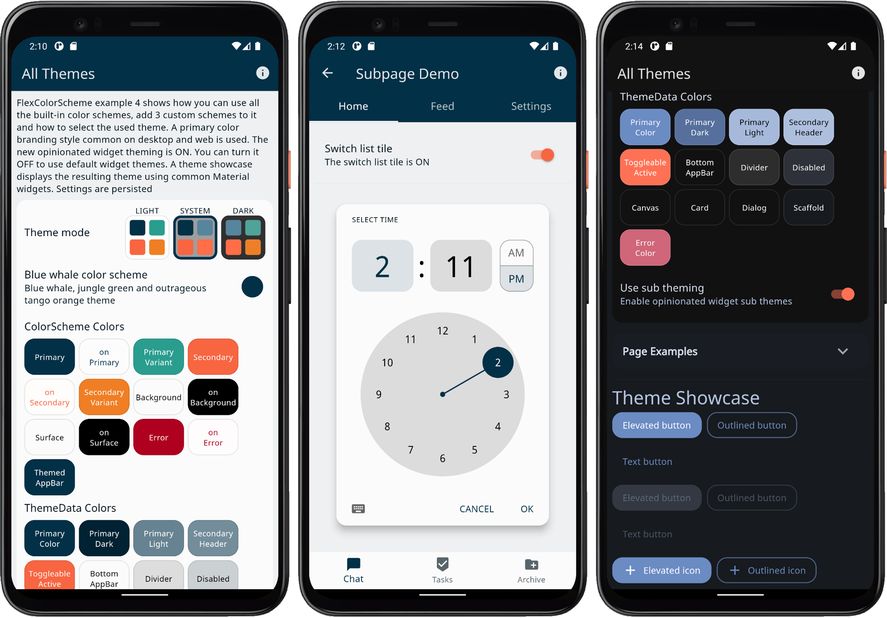
ColorScheme example 4 light ColorScheme example 4 dark
Example 4) Using custom schemes, plus all the built-in ones as application theme options (click image to open hires version)

Scroll down in the app to see the theme showcase further below. It presents the theme with common Material UI widgets. You can try this example as a Flutter web app here.

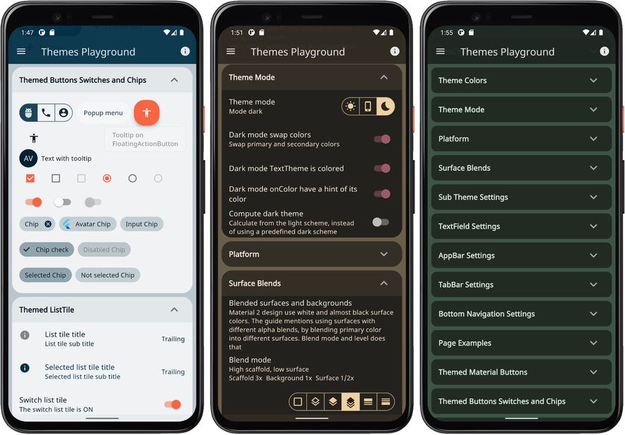
Example 5 - Themes Playground

This example shows how you can use all the built-in color schemes in FlexColorScheme to define themes from them. How you can set up your own custom scheme colors, and use them together with the predefined ones. Like the previous example, this can give you an idea of how you can create your own complete custom list of color schemes if you do not want to use the predefined ones.

This example also shows how you can use and vary the surface blend modes, change the blend strength. You can see how the quick custom AppBar theme and its companion TabBar theme works. The usage of the true black feature for dark themes is also demonstrated. Using the optional Windows desktop like tooltip theme is also shown.

The example includes a responsive side menu, it gives a visual presentation of what applications that have larger visible surfaces using surface blends look like. The menu has working click commands that allows you to show and hide the contents of the cards holding settings and results. On smaller media this makes it quicker to find interesting parts. There is a choice that allows you the reset the persisted settings back to their default values. To make a light/dark mode quick toggle always accessible when you test options and themes, it is also available on the side menu as a toggle.

In addition to allowing you to opt in and out of using the sub themes, this demo also allows you to control many sub theming options, like adjusting the border radius on all widgets to some other preferred value. To use the Material 3 (M3) text theme, different theme options on TextField, among many other sub theming features.

A subpage is also available that show that the same active theme is also applied when opening another page. This works because all built-in widgets use the same inherited theme and use the colors in the theme in predefined ways by default. This is a good example and explanation of why you should use the same theme colors for your custom re-usable widgets as their default color property values. Then theme your application to make it look the way you want it to look, rather than defining constant color values that you apply directly to widget color properties.

If you tried the previous examples on a device, you might have noticed that the system navigation bar on Android devices does not always change. It is not themed to have matching background or theme mode that matches the active application theme as it changes. This example shows how it can be fixed and that the used method remain in effect when opening a subpage.

The same custom color schemes as in example 4, are also used in this example. They are not explained here again, please see example 4 for details.

The full code is not shown below, only highlights. Please find the complete example code here.

The main start function of the app is the same as in previous example.

Future<void> main() async {
  WidgetsFlutterBinding.ensureInitialized();
  // Here we use Shared Preferences. 
  final ThemeService themeService = ThemeServicePrefs();
  // To swap to Hive use this instead:
  // Initialize the theme service.
  await themeService.init();
  // Create a ThemeController that uses the ThemeService.
  final ThemeController themeController = ThemeController(themeService);
  // Load all the preferred theme settings
  await themeController.loadAll();
  // Run the app and pass in the ThemeController. The app listens to the
  // ThemeController for changes.
  // The ThemeController controls all the myriad of Theme settings used
  // in the demo application and also persists settings with injected
  // ThemeService.
  runApp(DemoApp(themeController: themeController));
}

This example has a toggle that allows you to for all the schemes use toDark computed dark schemes, instead of the hand tuned built-in ones. You can then compare this result to hand-made dark themes. The toDark method does a pretty good job and can even be tuned with a level property.

If you use the toDark method on the last custom scheme, you will not see any difference, because we already created its dark scheme in this example with this method. Turning the toggle on for it, computes the same dark scheme from the same light scheme colors again. There is a slider that you can use to adjust the white blend level of the toDark method. From its default value of 35%, to be anything from 0...100 %, you can experiment with it and see what it does.

Additionally, this example includes a toggle that allows you to instead of using the FlexColorScheme.toTheme method, use the standard Flutter ThemeData.from factory to create the theme from the same color scheme definition. We can use this toggle to see and study the differences that FlexThemeData brings to the standard with different settings.

The code for the MaterialApp for this complex looking application is actually very similar and even identical regarding its core principle to example 4. It is just a large number of ThemeController values that we assign to properties in FlexThemeData.light and FlexThemeData.dark. Plus many more UI widgets used to set new values to the controller. The ThemeService persists all the values as we change them, same way as before too. The theme controller notifies its listeners about the change, still using the same setup as before in our MaterialApp since example 2. The app then just rebuilds the UI to reflect our new theme settings.

It gets repetitive and rather long to show the details here. It is easier to read main and MaterialApp StatelessWidget code here. It is well commented and explains all its parts well. You can certainly examine the HomePage, I recommend doing that with and IDE though. It is beyond the scope of this tutorial to explain all its details, but mostly it is just simple UI layout code and dealing with some issues not related to FlexColorScheme.

The concludes the walk through of example 5. When we build it, the example starts with the blue whale color scheme.
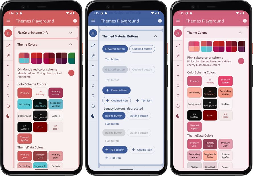
ColorScheme example 5 light ColorScheme example 5 dark
Example 5) The Themes Playground (click image to open hires version)

You can try the FlexColorScheme Themes Playground example as a Flutter web app here.

Custom Themes and Automatic Flutter Source Code

After the first release of FlexColorScheme v4, example 5 was expanded with two new major features. This did not require any changes to FlexColorScheme itself, it was just useful new features in example 5 and published live version of it. The new features make the Themes Playground a very useful companion app for FlexColorScheme. It is now possible to use it to make custom theme setups with totally custom colors, and get the colors and theme you see, in use in your app with just a few clicks and a bit of code copy/paste action.

In the updated version of example 5, published as the Themes Playground, these new features and tools are available:

Custom color scheme
Copy an existing color scheme's colors to a custom scheme, that can then be modified by using a color picker. In this case by using FlexColorPicker. It has an interesting feature that names all colors, a practical copy/paste color values feature, and it also allows you to enter a color using its hex RGB color value.

Get Setup Source Code
The Themes Playground can now also generate the code needed for you to get the FlexColorScheme based theme you currently have defined as your active theme.

Using the Get the code for this theme feature, you can just copy and paste the current seen FlexColorScheme configuration from it, to your own application. Then just use it without even knowing what all the properties do. You can just go by what looks OK to you in the Themes Playground, copy its setup code and use it as it is. All you have to do is copy the code and paste it into your app.

You can find an example on how to do in this tweet and referenced thread.

copy theme code
Using Themes Playground to Copy Theme Setup Source Code (click image to open hires version)

In later documentation updates the above features will be demonstrated in more detail.

This is the first version of this code copy/paste feature to get the configuration code for the shown FlexColorScheme based theme. A small bit of inception going on here, basically using FlexColorScheme to generate code for using FlexColorScheme. If you notice any issues with it, please open an issue in the repo.

Scheme Reference

This table lists all current built-in color schemes, with its enum value, short name and description. It shows a small thumbnail of each color scheme, that opens a link to a high-resolution version of it.

FlexScheme Name Description Light___ Dark___
material Material default Default Material color theme, used in the design guide.
materialHc Material high contrast High contrast Material design guide theme.
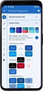
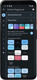
blue Blue delight Blue color theme, based on Material blue and light blue colors.
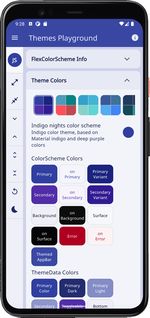
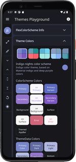
indigo Indigo nights Indigo color theme, based on Material indigo and deep purple colors.
hippieBlue Hippie blue Hippie blue with surfie green and chock coral pink theme.
aquaBlue Aqua blue Aqua tropical ocean blue theme.
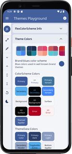
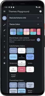
brandBlue Brand blues A mixture of blue colors from well known web brands.
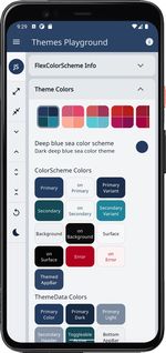
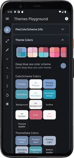
deepBlue Deep blue sea Dark deep blue sea color theme.
sakura Pink sakura Pink color theme, based on sakura cherry blossom like colors.
mandyRed Oh Mandy red Mandy red and Viking blue colored theme.
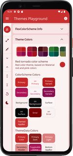
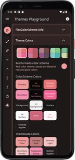
red Red tornado Red color theme, based on Material red and pink colors.
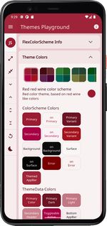
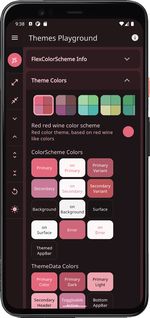
redWine Red red wine Red color theme, based on red wine like colors.
purpleBrown Purple brown Purple brown tinted aubergine and eggplant colored theme.
green Green forest Green color theme, based on Material green and cyan colors.
money Green money Green money and finance style color theme.
jungle Green jungle Green jungle and rain forest color theme.
greyLaw Grey law Material blue grey and ultra dark purple color theme. Colors suitable for law firms.
wasabi Willow and wasabi Wild Willow and wasabi green with orchid purple inspired colors.
gold Gold sunset Gold sunset color theme, based on orange like colors.
mango Mango mojito Orange and green Mango mojito color theme.
amber Amber blue Amber blaze and blue color theme, based on Material amber and blue accent colors, a high-contrast theme. An alternative to the default Material high contrast theme.
vesuviusBurn Vesuvius burned Vesuvius burned orange and eden green theme.
deepPurple Deep purple Deep purple daisy bush theme, based on Material deepPurple and lightBlueAccent colors.
ebonyClay Ebony clay Ebony clay dark blue-grey and watercourse green colored theme.
barossa Barossa Barossa red and cardin green colored theme. A somber color set suited for courts and law firms.
shark Shark and orange Shark grey and orange ecstasy colored theme.
bigStone Big stone tulip Big stone blue and tulip tree yellow colored theme.
damask Damask and lunar Damask red and lunar green colored theme.
bahamaBlue Bahama and trinidad Bahama blue and trinidad orange colored theme.
mallardGreen Mallard and valencia Mallard green and Valencia pink colored theme.
espresso Espresso and crema Espresso dark brown and crema colored theme.
outerSpace Outer space stage Outer space dark blue-grey and stage red theme.
blueWhale Blue whale Blue whale, jungle green and outrageous tango orange theme.
sanJuanBlue San Juan blue San Juan blue and pink salmon theme.
rosewood Rosewood Rosewood red, with horses neck and driftwood theme.
blumineBlue Blumine Blumine, easter blue and saffron mango theme.
Comments
  • CircleAvatar Widget is ignored by colorscheme

    CircleAvatar Widget is ignored by colorscheme

    Hi, thank you for this great package.

    I'm not quite sure if this is the intended behavior, but I noticed that the default CircleAvatar() Widget's background color has the standard blue color and is ignored by the colorScheme.

    From the Circle Avatar Documentation:

    If a [backgroundColor] is not specified, the theme's [ThemeData.primaryColorLight] is used with dark foreground colors, and [ThemeData.primaryColorDark] with light foreground colors.

    I think it would be great to change the background color of CircleAvatar() to colorScheme.surface or something else for further improvements of the package.

    question 
    opened by florianh01 15
  • suggestion:  widget button or mixin

    suggestion: widget button or mixin

    At the beginning of your doc. Have a nice easy quick start to add 36 standard themes and switch between them by user selection. For Stateful widgets.. it is difficult to see how to do this, examples are based on stateless widgets. Perhaps have a mixin to help integration. I do not see how to change the text color(I want to match appbar) and background color(I want grey).

    opened by bksubhuti 12
  • Elevated button text is tainted even if blend text is false

    Elevated button text is tainted even if blend text is false

    darkTheme: FlexThemeData.dark( scheme: FlexScheme.deepBlue, surfaceMode: FlexSurfaceMode.highScaffoldLowSurface, blendLevel: 40, darkIsTrueBlack: true, subThemesData: const FlexSubThemesData( blendTextTheme: false, ), visualDensity: FlexColorScheme.comfortablePlatformDensity, useMaterial3: true, // To use the playground font, add GoogleFonts package and uncomment // fontFamily: GoogleFonts.notoSans().fontFamily, ),

    image

    question works as expected 
    opened by zezo357 10
  • Documentation improvement

    Documentation improvement

    You can opt in on using pre-made opinionated widget sub-themes. By opting in, you can for example adjust the border radius on all widgets with a single property to set the same themed border radius on them. Current Flutter SDK widgets are based on the Material 2 guide and use 4 dp corner radius as default on most corners.

    I was exploring your great library and there is no word in documentation or anywhere on how to implement this. In your sample there is a toggle to enable round corners everywhere. What is the API called? I can't find it.

    documentation 
    opened by bernaferrari 8
  • useSubThemes get the cards borderRadius

    useSubThemes get the cards borderRadius

    First of all I know this has nothing to do with flex_color_scheme, but I image it is a question more people will have when deciding to activate useSubThemes. (Which is a real game changer :heart_eyes:)

    Lets say we create a Container that should have a shape like the Theme's Card. Then one can easily do this with

    Container(
            decoration: ShapeDecoration(
                shape: CardTheme.of(context).shape ??
                    const RoundedRectangleBorder(
                        borderRadius: BorderRadius.all(Radius.circular(
                            4))) // on null take the default Card borderShape
                ));
    

    With this it is impossible (from my understanding to edit the used ShapeBorder and add a color. So we instead of ShapeDecoration we have to make use of BoxDecoration. But BoxDecoration uses a borderRadius which is not exposed by the cardTheme. So my question would be if you know either a good way to extract the borderRadius of cardTheme, or add a borderColor to the already existing ShapeBorder (not in theme, but individually).

    P.S. I am really happy for you that the rest of the community saw the benefit of your packages and the like count now reflects that. :+1:

    question 
    opened by jlnrrg 8
  • BottomAppBar taps first item where ever i tap

    BottomAppBar taps first item where ever i tap

    I had spend much of time to find this bug and finally i found the problem is happening when i give the theme with FlexThemeData.

    BottomAppBar automaticly taps the first item where ever i tap on the screen.

    How to produce:

    MaterialApp(
          /* theme: ThemeData.light().copyWith(
            useMaterial3: true,
          ), */
          theme: FlexThemeData.light(
            scheme: FlexScheme.amber,
            useMaterial3: true,
          ),
          home: Scaffold(
            bottomNavigationBar: BottomAppBar(
              child: BottomNavigationBar(
                type: BottomNavigationBarType.fixed,
                items: [
                  BottomNavigationBarItem(icon: Icon(Icons.abc), label: '1'),
                  BottomNavigationBarItem(icon: Icon(Icons.abc), label: '2'),
                  BottomNavigationBarItem(icon: Icon(Icons.abc), label: '3'),
                ],
              ),
            ),
          ),
        ),
    

    Nov-16-2022 01-21-03

    Package verison: flex_color_scheme: 6.0.1

    [✓] Flutter (Channel stable, 3.3.8, on macOS 13.0.1 22A400 darwin-x64, locale en-TR)
        • Flutter version 3.3.8 on channel stable at /Users/mustafa.dikcinar/fvm/versions/3.3.8
        • Upstream repository https://github.com/flutter/flutter.git
        • Framework revision 52b3dc25f6 (7 days ago), 2022-11-09 12:09:26 +0800
        • Engine revision 857bd6b74c
        • Dart version 2.18.4
        • DevTools version 2.15.0
    
    [✓] Android toolchain - develop for Android devices (Android SDK version 33.0.0)
        • Android SDK at /Users/mustafa.dikcinar/Library/Android/sdk
        • Platform android-33, build-tools 33.0.0
        • Java binary at: /Applications/Android Studio.app/Contents/jre/Contents/Home/bin/java
        • Java version OpenJDK Runtime Environment (build 11.0.12+0-b1504.28-7817840)
        • All Android licenses accepted.
    
    [✓] Xcode - develop for iOS and macOS (Xcode 14.1)
        • Xcode at /Applications/Xcode.app/Contents/Developer
        • Build 14B47b
        • CocoaPods version 1.11.3
    
    [✓] Chrome - develop for the web
        • Chrome at /Applications/Google Chrome.app/Contents/MacOS/Google Chrome
    
    [✓] Android Studio (version 2021.2)
        • Android Studio at /Applications/Android Studio.app/Contents
        • Flutter plugin can be installed from:
          🔨 https://plugins.jetbrains.com/plugin/9212-flutter
        • Dart plugin can be installed from:
          🔨 https://plugins.jetbrains.com/plugin/6351-dart
        • Java version OpenJDK Runtime Environment (build 11.0.12+0-b1504.28-7817840)
    
    [✓] VS Code (version 1.73.1)
        • VS Code at /Applications/Visual Studio Code.app/Contents
        • Flutter extension version 3.52.0
    
    opened by mdikcinar 6
  • Add null-safety support

    Add null-safety support

    First of all, thanks a lot for this package. It saved me so much time as theming and frontend isn't really my forte.

    I have been in the process of migrating my app to dart 2.12.x-pre to get some basic null safety checks going. It would be nice if this package had a null safe version too. See https://dart.dev/null-safety/migration-guide

    Null safety is not on my critical path but would likely be at some point when a stable flutter version with null safety is released.

    Happy new year 🎉

    opened by harsimranmaan 6
  • Suggestion about Themes  playground

    Suggestion about Themes playground

    Sketch of the idea :

    flex_color_schema

    • I have checked your theme by playground and I think we can assess the user experience and make more easy if we add the feature that i explained in the sketch above .

    • if you think its a useful idea please contact meso we can collaborate .

    enhancement tooling samples out of scope 
    opened by zakariachamakh 5
  • Lerping between flex_color_scheme-generated themes causes error

    Lerping between flex_color_scheme-generated themes causes error

    Description

    On iOS, switching between light mode and dark mode (CMD + SHIFT + A for iOS Simulator on macOS) with a flex_color_scheme theme for either theme or darkTheme will cause TextStyle.lerp to fail. This doesn't occur when the vanilla ThemeData.light() and ThemeData.dark() default themes are used.

    Minimal Reproducible Example:

    import 'package:flex_color_scheme/flex_color_scheme.dart';
    import 'package:flutter/material.dart';
    
    void main() => runApp(MyApp());
    
    class MyApp extends StatelessWidget {
      @override
      Widget build(BuildContext context) {
        return MaterialApp(
          darkTheme: FlexColorScheme.dark(
            colors: FlexSchemeColor.from(primary: Colors.blue),
          ).toTheme,
          home: MyHomePage(),
        );
      }
    }
    
    class MyHomePage extends StatelessWidget {
      Widget build(_) => Scaffold(
            appBar: AppBar(
              title: Text('flex_color_scheme MRE'),
            ),
          );
    }
    

    Error text

    ════════ Exception caught by widgets library ═══════════════════════════════════
    The following assertion was thrown building AnimatedTheme(duration: 200ms, dirty, state: _AnimatedThemeState#976ce(ticker active, ThemeDataTween(ThemeData#8c9b4 → ThemeData#47fa6))):
    'package:flutter/src/painting/text_style.dart': Failed assertion: line 937 pos 12: 'a == null || b == null || a.inherit == b.inherit': is not true.
    2
    
    Either the assertion indicates an error in the framework itself, or we should provide substantially more information in this error message to help you determine and fix the underlying cause.
    In either case, please report this assertion by filing a bug on GitHub:
      https://github.com/flutter/flutter/issues/new?template=2_bug.md
    
    The relevant error-causing widget was
    MaterialApp
    lib/main.dart:9
    When the exception was thrown, this was the stack
    #2      TextStyle.lerp
    package:flutter/…/painting/text_style.dart:937
    #3      TextTheme.lerp
    package:flutter/…/material/text_theme.dart:690
    #4      Typography.lerp
    package:flutter/…/material/typography.dart:302
    #5      ThemeData.lerp
    package:flutter/…/material/theme_data.dart:1530
    #6      ThemeDataTween.lerp
    package:flutter/…/material/theme.dart:175
    ...
    

    flutter doctor -v:

    [✓] Flutter (Channel stable, 2.0.6, on macOS 11.4 20F71 darwin-x64, locale en-GB)
        • Flutter version 2.0.6 at /Users/jacklusher/dev/flutter
        • Framework revision 1d9032c7e1 (7 weeks ago), 2021-04-29 17:37:58 -0700
        • Engine revision 05e680e202
        • Dart version 2.12.3
    
    [✓] Android toolchain - develop for Android devices (Android SDK version 30.0.3)
        • Android SDK at /Users/jacklusher/Library/Android/sdk
        • Platform android-30, build-tools 30.0.3
        • Java binary at: /Applications/Android Studio.app/Contents/jre/jdk/Contents/Home/bin/java
        • Java version OpenJDK Runtime Environment (build 11.0.8+10-b944.6916264)
        • All Android licenses accepted.
    
    [✓] Xcode - develop for iOS and macOS
        • Xcode at /Applications/Xcode.app/Contents/Developer
        • Xcode 12.5, Build version 12E262
        • CocoaPods version 1.10.1
    
    [✓] Chrome - develop for the web
        • Chrome at /Applications/Google Chrome.app/Contents/MacOS/Google Chrome
    
    [✓] Android Studio (version 4.2)
        • Android Studio at /Applications/Android Studio.app/Contents
        • Flutter plugin can be installed from:
          🔨 https://plugins.jetbrains.com/plugin/9212-flutter
        • Dart plugin can be installed from:
          🔨 https://plugins.jetbrains.com/plugin/6351-dart
        • Java version OpenJDK Runtime Environment (build 11.0.8+10-b944.6916264)
    
    [✓] IntelliJ IDEA Community Edition (version 2021.1)
        • IntelliJ at /Applications/IntelliJ IDEA CE.app
        • Flutter plugin version 55.1.5
        • Dart plugin version 211.7179
    
    [✓] VS Code (version 1.57.1)
        • VS Code at /Applications/Visual Studio Code.app/Contents
        • Flutter extension version 3.23.0
    
    [✓] Connected device (2 available)
        • iPhone 12 Pro Max (mobile) • A1EC90B9-985B-4AF5-A7DC-3961CCBF5D21 • ios            • com.apple.CoreSimulator.SimRuntime.iOS-14-5 (simulator)
        • Chrome (web)               • chrome                               • web-javascript • Google Chrome 91.0.4472.106
        ! Error: Jack's iPhone XS is busy: Waiting for Device. Xcode will continue when Jack's iPhone XS is finished. (code -10)
    
    • No issues found!
    
    documentation wontfix Flutter SDK bug 
    opened by Screendead 5
  • How to define additional colors

    How to define additional colors

    I would like to define additional colors (e.g. successColor) that have different values on Light and Dark theme. Is there a straightforward way to do this with this package?

    enhancement question 
    opened by fotiDim 4
  • [Question] How to use custom blending

    [Question] How to use custom blending

    Hello! I was wondering how one could use a custom blend coloring with the FlexSchemeSurfaceColors.blend factory. I wasn't able to find usages of that constructor.

    Thanks!

    question 
    opened by davidmartos96 4
  • Add support for AppBarTheme.scrolledUnderElevation parameter

    Add support for AppBarTheme.scrolledUnderElevation parameter

    In my app, I have a list screen where I'm using a GridView. However, when scrolling the AppBar receives a shadow effect (only happens with material3). To remove the shadow, I need to set the parameter scrolledUnderElevation = 0.

    AppBar( scrolledUnderElevation: 0, ... )

    If can set AppBarTheme.scrolledUnderElevation default to zero or a parameter for FlexSubThemesData.

    https://github.com/rydmike/flex_color_scheme/blob/master/lib/src/flex_color_scheme.dart#L5894 appBarTheme: AppBarTheme( scrolledUnderElevation: 0, ...)

    enhancement question 
    opened by Willian199 3
  • fix: Different design between Windows and Web

    fix: Different design between Windows and Web

    Hi Mike,

    First of all, thank you for the plugin which allows me to have a unifying design! 😊

    Description

    I am developing a flutter application on windows with your plugin but I have two different designs between the web and windows version of themesplayground-v5 (5.0.1 Build-01). I checked that I had the same theme settings as well as ColorScheme. I found (for the moment) this bug only on the "Card" type widget, the bug for me is on elevation property. Do you know where it can come from?

    Windows vs Web (Screenshot)

    Windows | Web :-------------------------:|:-------------------------: windows-img-1 | web-img-1 windows-img-2 | web-img-2

    documentation Flutter SDK bug 
    opened by makanddream 6
Releases(6.1.2)
  • 6.1.2(Dec 26, 2022)

  • 6.1.1(Nov 22, 2022)

    6.1.1

    Nov 22, 2022

    FIX

    • Themes Playground (Example 5): Fixed scroll issue in page view mode on Web builds. Only examples related, no package impact.
    • API doc updates.
    Source code(tar.gz)
    Source code(zip)
  • 6.1.0(Nov 20, 2022)

    6.1.0

    Nov 20, 2022

    FlexColorScheme version 6.1.0 contains many new features, more component sub-themes and configurable properties. It improves seed-generated color scheme capabilities by adding more pre-configured seed generation configurations and color contrast accessibility options.

    A criticism of Material 3's color system and seed-generated color schemes, is that using colored contrasting colors may be less accessible. FlexColorScheme offers a way to enable in-app modification of its seed-generated color schemes, any seed generation configuration can optionally return results with plain white and black contrasting on colors. This can be applied separately for main on colors and on surfaces.

    The Themes Playground application, has been updated to include most of the new features. It has been improved to make it easier to discover some of its previously existing features, like using custom colors in the Playground to define your own theme.

    NEW

    • Scaffold background color can now be used as the themed AppBar background color. The enum FlexAppBarStyle that is used by property appBarStyle got a new value scaffoldBackground that enables this. This is useful for matching the AppBar color exactly to the Scaffold background color, when Scaffold background uses different surface blends than the theme's ColorScheme surface or background colors.
    • Added properties materialTapTargetSize and pageTransitionsTheme to FlexColorScheme and FlexThemeData. They are only convenience properties to avoid having to use a copyWith on FlexColorScheme produced ThemeData, to define them.
    • Property swapLegacyOnMaterial3 in FlexColorScheme.light/dark and FlexThemeData.light/dark allows for better automatic adjustment of built-in scheme colors to the Material 3 color-system. It applies to color schemes that were originally designed for Material 2, when using the Material 3 mode with or without seed-generated ColorSchemes.
      • Setting swapLegacyOnMaterial3 to true, will when useMaterial3 is true, swap the built-in scheme colors secondary and tertiary and also their container colors.
      • This only happens for built-in schemes where this swap makes the color design more compatible with the intended design and usage of the secondary and tertiary colors in Material 3 color system.
      • To implement this, the class FlexSchemeColor has a new boolean meta-data property called swapOnMaterial3, that has been defined to be true, if the FlexSchemeColor it defines, benefits design compliance wise from swapping its secondary and tertiary colors when using Material 3.
      • For backwards compatibility the swapLegacyOnMaterial3 is false by default, but it is recommended to always set it to true. The flag has no impact when using Material 2.
      • The swapLegacyOnMaterial3 flag can also be toggled in the Themes Playground, it is on by default there.
      • When the swap is done for a FlexSchemeColor, it is done before any other built-in scheme modifier properties, including swapColor and usedColors.
    • The FloatingActionButton can now be set to always be circular, also in Material 3 and without assigning a high-radius setting. If you always want a circular FAB, and stadium on extended FAB, then set fabAlwaysCircular in FlexSubThemesData to true, and FAB stays circular regardless of if you use M2 or M3, or how you modify the global default border radius. You could get this effect before too by setting a very high themed radius on the FAB, but this is more convenient.
    • Additional new FlexSubThemesData properties:
      • Slider theme can now be adjusted via FlexSubThemesData properties sliderBaseSchemeColor, sliderValueTinted and sliderTrackHeight.
      • The chipSelectedSchemeColor was added as themed background color, it is used by Chips that are selectable. The chipDeleteIconSchemeColor can be used to theme the "Delete" icon color on Chips. While adding these features, some Flutter M3 Chip spec and theming issues were found, see issue #115364 for more information.
      • Switch got a switchThumbSchemeColor property, to control the thumb color separately. A switch custom color theme was prepared for M3 Switch, which is not yet available in Flutter 3.3.
      • Tooltip theme now has FlexSubThemesData properties tooltipRadius, tooltipWaitDuration, tooltipShowDuration, tooltipSchemeColor and tooltipSchemeColor.
      • The bottomSheetBackgroundColor and bottomSheetModalBackgroundColor can be used to theme the background color of the BottomSheet.
      • Use navigationBarElevation to adjust the themed elevation of NavigationBar.
      • Use popupMenuElevation and popupMenuSchemeColor to further quick theme the PopupMenuButton.
      • The outlinedButtonBorderWidth, outlinedButtonPressedBorderWidth, toggleButtonsBorderWidth, inputDecoratorBorderWidth and inputDecoratorFocusedBorderWidth define the themed outline border thickness in different states of their respective components. These properties use previously existing properties thinBorderWidth and thickBorderWidth as their defaults. Resulting in that, the new properties are API backwards compatible, and they have shared global default settings. The new part is that you can now define themed outline border thickness separately for these components.
      • The elevatedButtonTextStyle, outlinedButtonTextStyle and textButtonTextStyle were added to be able to theme TextStyle on ElevatedButton, OutlinedButton, TextButton. These are convenience properties to allow different text styles on buttons without having to use copyWith on the overall ThemeData and its button component themes to modify the text styles, often sizes.
        • These properties do not offer any simplification over standard ThemeData and its button themes. The current version does not include adjusting them in the Themes Playground. Adding all possible usage of them is currently not in the scope of the Playground app. However, button font size changes may be added later as a usage example of these properties. These properties are using the tricky MaterialStateProperty, that have so far been avoided in this flattened simplified theming. It was used for the benefit of offering the text styles as ThemeData pass along properties. Modifying the ButtonStyle theme using copyWith, is a bit more involved than for other sub themes, with these properties you can customize the button text style using FlexSubThemesData properties instead. If you need to modify the FlexColorScheme created buttons themes even further for some not included properties, an example of how to do that can be found here.

    CHANGE

    • FlexColorScheme now uses FlexSeedScheme version 1.1. It includes the following new features and changes:
      • Features that enabled implementation of just black and white seeded on colors.
      • Additional FlexTones, the FlexTones.oneHue and FlexTones.vividBackground.
      • See FlexSeedScheme on pub.dev for more information.
    • In FlexSubThemesData all component controlling properties except booleans, are now nullable and null by default. FlexColorScheme made sub themes still default to same values as before when assigning a default FlexSubThemesData() to FlexColorScheme.subThemesData. The properties are nullable to enable using different defaults in FlexColorScheme made sub-themes for Material 2 and Material 3 modes.
    • Style breaking: Changed component themes thinBorderWidth to default to 1.0. It was 1.5 before. This is a style breaking change from previous thin outline style in FlexColorScheme.
      • Using fractional values may cause artefacts on monitors using native resolution where 1 dp = 1 physical display pixel (common on desktop PC/Linux monitors). We see the new default as a design FIX to avoid such issues with default settings. You can still set thinBorderWidth to 1.5, to get the same result as previous default theme.
    • Style breaking: When opting in on opinionated sub-themes, the Chip style is slightly modified from previous versions. The new opinionated FCS default style is more distinct than before and more aligned with styling borrowed from the Material 3 mode Chip design. The deleteIconnColor now defaults to onSurface instead of primary and it can be defined to be any color scheme based color. The Chips revised style, look better than before. Using Material 3 and with it themed Chips is also fully supported, also customizing color on selected state of selectable Chips is available. Color-tinted chips are also available as before. Be aware though that Material 3 theming in the current 3.3 version of Flutter has some limitations. If you assign a custom color to selected chips, the disabled state of Chips can no longer conform, to M3 spec of disabled selected Chips.
      • For more information, see issue #115364. Note that if you deviate on Chips from its expected designed background brightness, which is now possible to do for selected Chips with the new theming capabilities in the Playground. There is no way via theming to set correct text and icon contrasting brightness for selected Chips that require dark text and icons on bright Chips in dark theme mode. Wise versa for light theme mode, setting light text on dark selected Chips in light mode, is also not possible. This limitation applies to selected FilterChip and InputeChip, there is simple not enough theme properties in ChipTheme to support this. Due to this limitation, we recommend only using Chip theme designs that work with dark text in light mode, and light text in dark mode.
    • Style breaking: When opting in on opinionated sub-themes, the BottomSheet background color now defaults to theme's ColorScheme surface color, in both M2 and M3 mode. Previously it defaulted to the Material's default color theme.canvasColor, that typically equals ColorScheme background. The new default follows upcoming Material 3 default for BottomSheet. The style change is minor, in most designs the color values are the same. If needed you can put it back to theme background color with:
        final ThemeData themeLight = FlexThemeData.light(
          subThemesData: const FlexSubThemesData(
            bottomSheetBackgroundColor: SchemeColor.background,
            bottomSheetModalBackgroundColor: SchemeColor.background,
          ),
        );
    

    FIX

    • Temporary Material 3 Flutter SDK GAP fixes
      • The FlexColorScheme Material 3 mode sub-themed BottomSheet gets a manually applied elevation tint to keep it distinguishable from the background. This temporary fix works despite Material tint elevation being broken in Flutter 3.3 and earlier, when useMaterial3 is true.
      • Same temporary M3 fix is also used on themed PopupMenuButton.
      • Unfortunately, elevation-based shadow cannot be added to any of them in the M3 mode. It will have to wait for actual implementation of the components and their Material 3 themes with support for it.
      • The M3 supporting components and themes for BottomSheet and PopupMenuButton, already exist in the Flutter master channel, they will probably land in next new stable release after Flutter 3.3.
      • These temporary M3 fixes, make it possible to use the BottomSheet and PopupMenuButton when opting in on Material 3. Since shadow elevations are still not working for them in M3, it is not perfect, but much better.
      • The reasons why these issues exist are because these components have not yet been migrated to M3 in Flutter 3.3, plus the combination of this Material elevation issue #107190 in M3 mode. As a result we get no elevation tint or any shadow on such Material using widgets in M3 mode.
      • The issue #107190 has been fixed in master. Even if only it lands, we will get shadows back in M3 default Material, also if the components and their themes do not land. In combination with the here made M3 manual elevation tint fix, they would in such a case get the correct M3 default background elevation tint behaviour and shadow.
      • The above temporary work-around fixes will be removed when the stable version of the framework implements correct Material 3 elevation behavior for these widgets, and produces the same results itself. Hopefully in the next stable release of Flutter.

    THEMES PLAYGROUND

    • On Theme colors panel:

      • Improved the discoverability of defining and using totally custom colors for your theme in the Playground. It has always existed, but maybe now users will discover it more easily. You can still also copy any existing theme, as a starting point for your custom color definitions.
      • Simplified the terminology used on the Theme colors panel. Also simplified its color presentation.
      • Added an on/off switch that controls the swapLegacyOnMaterial3 setting.
    • Updated and shortened the Introduction. Probably nobody reads it, or the package docs with Playground guides, but at least it is there.

    • The Seeded ColorScheme panel:

      • When using seeded color schemes, it is now possible to force contrasting on colors for all the main colors (primary, secondary, tertiary, error and their containers) to be plain black or white, for better and more traditional contrast text and iconography colors. Likewise, for the on colors for all the surfaces, background, surface, surfaceVariant and inverseSurface. This is a great toggle to get a more classic look while seeding main and surface colors. Turning these toggles on can also help with accessibility by increasing contrast and not using color on color for contrast. Offering these as user controllable toggles in apps can be a good way to allow users to tune not only the look, but also color accessibility.
      • Now also show the source input "Scheme defined" colors, the FlexSchemeColor, that gets used as key colors for the Material 3 seeded ColorScheme generation, when it is turned on.
        • Arranged the panel content for better inclusion and presentation of the created Tonal Palettes used to make the seeded ColorScheme.
        • The Tonal palette color tones now have tooltips that present each tone.
    • On Surface blends:

      • Changed the surface blend mode defaults to settings that are more mobile design-friendly. No API change involved. API defaults are the same as before, changes only affect the Playground app defaults.
        • Previously used Playground default values were intended for desktop and tablet designs, where controls and text are placed on containers with a lower surface blend, like the Cards used in the Themes Playground app itself. While one can make a responsive app, that uses this design nicely from mobile to tablet and desktop sizes, most mobile only apps are not designed so. Using Playground defaults that produce a nice theme for more typical mobile designs, will help new FlexColorScheme and Themes Playground users, configure nice themes even quicker.
      • The blend mode control now also has a popup-menu, that always shows all surface blend modes, also in smaller UI. On smaller devices the ToggleButtons control, as before, only shows popular options.
    • Other new controllable properties and features:

      • AppBar theming can now use themed scaffoldBackground color as its themed background color. This is useful for matching the AppBar color exactly to the Scaffold background color, when Scaffold background uses different surface blends than the theme's ColorScheme surface or background colors.
      • On FAB and Chips panel, added the Always use circular FAB feature.
      • Added support for adjusting background color and elevation of BottomSheet.
      • Added support for adjusting elevation of NavigationBar.
      • Added support for adjusting elevation and background color of PopupMenuButton.
      • Added support for component independent settings of ToggleButtons border width.
      • Added support for component independent settings of OutlineButtons border widths.
      • Added support for component independent settings of InputDecorator border widths.
      • Added support for adjusting Dialog elevation.
      • Added support for adjusting Slider via base color, track height and base color tinted value indicator.
      • Added support for adjusting Tooltip via scheme color, radius, opacity, show duration and wait duration.
      • Added support for adjusting Switch thumb color via scheme color selection.
    • User interface changes:

      • New design of popup menu indicators for AppBarStyle, SchemeColor selection and SurfaceStyle. Their style follow ToggleButtons height and border radius.
      • All single option select ToggleButtons controls in a ListTile can now for convenience be toggled in sequence by just tapping on the ListTile it is used in.
      • Split out some components that where on shared panels, to their own panel/page. This is done when components get more settings and having them in a separate panel makes sense.
      • A themed Slider widget is now presented in the Widget Showcase panel. Basic theming options are now available. The Slider theme is already excellent out of the box. When you need more radical changes to it, those typically go beyond the scope of FCS and require extending the Slider widget.
      • Removed animation from horizontal list Theme selector when selecting a theme.
      • Removed animation from the theming topics when selecting one on the Page view.
      • Removed the slide to page animation, when clicking on a topic, on the topic panel selector.
        • Direct panel/page selection via the control now instead uses a small Fade and Zoom in to show the selected settings panel.
        • Without any panel page change effect, it was hard to notice what changed. The default slide to the page animation, with the PageView is fine when swiping, where it remains, but it was a tad annoying when clicking on the panel page selector.
      • Changed all used Slider.adaptive to Slider.
        • The Cupertino adaptive one has poorer UX. You cannot click on the track to move the thumb to a given position. The app presents Material theming, so we will show only Material widgets in the apps own controls, on all platforms going forward.
      • Changed all used custom SwitchListTileAdaptive to just SwitchListTile.
        • We like using the Material theme following SwitchListTileAdaptive iOS switch on iOS on macOS. However, the app presents Material theming, and the new Material 3 Switch will land in Flutter stable soon. The new Material 3 Switch is even nicer than the Cupertino Switch, and we want to see it in the app when it lands. We will thus use the Material Switch in the Themes Playground app on all of its own controls on all platforms going forward.
        • The SwitchListTileAdaptive is kept in use on examples 2 to 4. As an example of how to make and use a theme following platform adaptive ListTileSwitch. In the SwitchListTileAdaptive doc comments it is mentioned that the plain SwitchListTile.adaptive is not theme color following on iOS/macOS platforms, nor can it be themed to be so. You have to make a custom wrapper like SwitchListTileAdaptive.
    • FIX Themes Playground

      • Fixed codegen for Switch, CheckBox and Radio, that did not include color selection for setting primary color since it used to be default. The issue only concerned the Themes Playground code generation, APIs worked as expected.
    Source code(tar.gz)
    Source code(zip)
  • 6.0.1(Sep 21, 2022)

    6.0.1

    Sep 21, 2022

    FIX

    • A null check was fixed by sososdk in FlexColorScheme.light when using custom scheme PR #90. Issue did not exist in FlexColorScheme.dark.

    • Cam16 from Material Color Utilities was exported by accident by FlexColorScheme in version 6.0.0 via its FlexSeedScheme package export. This export was removed. Cam16 was not exported before moving features to FlexSeedScheme and should not have been now either. FlexSeedScheme does however export it as before, it is used by the FlexColorPicker.

    Source code(tar.gz)
    Source code(zip)
  • 6.0.0(Aug 30, 2022)

    6.0.0

    Aug 31, 2022

    • Updated minimum dependencies to Dart >=2.18.0 and Flutter >= 3.3.0.

    Due to a number of known and below documented Flutter SDK issues when using useMaterial3 set to true, we cannot yet recommend using the option in production. Use it only if you are willing to accept the still incomplete Material 3 implementation in Flutter and the issues. If you keep useMaterial3 set to false, and use FCS opinionated component themes, you can create a theme that is visually fairly similar to M3, but still using M2 ThemeData mode to avoid many issues.

    BREAKING

    • This FlexColorScheme version no longer directly depends on package Material Color Utilities package, which is also used by Flutter SDK. Instead, it uses package FlexSeedScheme that depends on it. As a part of this change classes FlexTones, FlexTonalPalette and FlexCorePalette where moved into the package FlexSeedScheme. FlexColorScheme still exports these classes. If you were using them directly before, you can still do so without adding the FlexSeedScheme package.

    • In FlexSeedScheme, FlexTones contains a minor breaking change to make the API cleaner. The FlexTones.light and FlexTones.dark no longer produce the config for the Material 3 tone and chroma setup. They no longer lock the chroma values to the default values for M3, but use null in their configs for their chroma values. Resulting in that chroma from key colors will be used, as long as they are over set minimum values. These named constructors then provide a cleaner starting API for defining additional configurations, by not forcing null to be passed to use chroma value in key colors. To get the Material 3 configuration, use the factory FlexTones.material instead of FlexTones.light and FlexTones.light. It as before produces the correct Material 3 configuration, by defining secondaryChroma: 16 and tertiaryChroma: 24 using FlexTones.light and FlexTones.dark to return the correct Material 3 matching FlexTones configuration as before. This change was introduced to prepare for extracting FlexTones and FlexSeedScheme to their own package that will provide a fromFlexSeeds extension on ColorScheme. It is unlikely to impact any normal usage of FlexColorScheme, but it is still a breaking change.

    • In FlexSeedScheme FlexCorePalette.fromSeeds properties secondaryChroma and tertiaryChroma now default to null instead of previous M3 palette default generating values 16 and 24 respectively. Set them to values 16 and 24 to create same tonal palettes as Material Color Utilities CorePalette and previous versions of FlexCorePalette.

    • To allow for greater flexibility and addition of tonal palette tones 5 (custom for FCS) and 98 (Google Material 3 Web theme builder app includes tone 98 to, but not Flutter SDK), FlexCorePalette no longer extends CorePalette, it is a modified re-implementation.

    • In FlexSeedScheme the FlexTonalPalette method asList and constructor fromList, now include the values of the error color in produced asList, and as required values in fromList.

    NEW

    • In FlexSeedScheme, added customization possibility of error tonal palette to the default FlexTonalPalette constructor.

    • In FlexSeedScheme, added two new FlexTones:

      1. FlexTones.ultraContrast with even more contrast that highContrast.
      2. FlexTones.jolly for a seeded ColorScheme with more poppy and jolly seed colors.
    • In FlexSeedScheme, added SeedColorScheme.fromSeeds(...) that can be used to create a seeded ColorScheme using multiple seed colors and FlexTones configuration.

    • In FlexSeedScheme, added FlexTonalPalette a re-implementation of Material Color Utilities TonalPalette, with addition of tonal palette tones 5 and 98. The tone 98 also exists in the Web Material Theme Builder app, but not in Flutter or Material Color Utilities package. Tone 5 is custom addition for FlexTones and FlexColorScheme.

    • Added appBarCenterTitle property to FlexSubThemesData configuration. It works the same way as centerTitle in AppBar and its theme. The property is not available in the Themes Playground app, only via the API. We recommend keeping it null to use platform adaptive default behavior, but offer it as convenience property for those that like to use same centering style regardless of used platform.

    • Added two new properties to FlexSubThemes.elevatedButtonTheme.

      • Boolean useMaterial3, defaults to false.
      • onBaseSchemeColor, defaults to null SchemeColor?.

      When useMaterial3 is false, the elevatedButtonTheme.baseSchemeColor is used as background color as before, and the new property elevatedButtonTheme.onBaseSchemeColor is used as foreground color. However, when useMaterial3 is true, their foreground and background color roles are reversed, and baseSchemeColor becomes its foreground color and the onBaseSchemeColor its background color.

    • Added elevatedButtonSecondarySchemeColor property of type SchemeColor? to FlexSubThemesData. Use it to control secondary color of the ElevatedButton in its sub-themes. FCS applies this color to FlexSubThemes.elevatedButtonTheme.onBaseSchemeColor. If useMaterial3 is false, it is the foreground color. If useMaterial3 is true, it is the background color. Material 3 and 2 have a completely different default elevated button styles. The Material 2 elevated button is color wise, like the M3 filled button, but with elevation.

    • Added two new properties to FlexSubThemes.outlinedButtonTheme.

      • Boolean useMaterial3, defaults to false.
      • outlineSchemeColor, defaults to null SchemeColor?. When useMaterial3 is false, the outlineSchemeColor defaults to baseSchemeColor. When useMaterial3 is true, the outlineSchemeColor defaults to SchemeColor.outline.

    REMOVED EARLIER DEPRECATED MEMBERS

    As a chore and clean up all previously deprecated members have been removed from version 6.0.0. It no longer has any self deprecated members. This removes a lot legacy backwards compatibility with deprecated members from versions 2, 3 and 4, and even one from version 5.1.0. Removed all earlier self deprecated members as follows:

    • FlexSubThemesData:
      inputDecorationRadius, bottomNavigationBarSchemeColor, navigationBarIsStyled, navigationBarTextSchemeColor, navigationBarMutedUnselectedText, navigationBarIconSchemeColor, navigationBarHighlightSchemeColor.
    • FlexColorScheme:
      primaryVariant, secondaryVariant, useSubThemes. Removed static FlexColorScheme.m3TextTheme deprecated in 5.1.0 and static FlexColorScheme.themedSystemNavigationBar in version 2 its deprecated parameter nullContextBackground.
    • FlexThemeData:
      primaryVariant, secondaryVariant, useSubThemes.
    • FlexSchemeColor:
      primaryVariant, secondaryVariant.
    • SchemeColor:
      primaryVariant, secondaryVariant.
    • FlexConstants:
      kDarkenSecondaryVariant, kDarkenSecondaryVariantFromSecondary, kDarkenPrimaryVariant.
    • FlexSubThemes.bottomNavigationBar: baseSchemeColor.
    • FlexSubThemes.navigationBarTheme: textSchemeColor, unselectedTextSchemeColor, mutedUnselectedText, iconSchemeColor, highlightSchemeColor.

    STYLE CHANGE - BREAKING

    • FlexSubThemesData.fabUseShape opinionated component theme style default was changed from true to false, this breaks previous default style. The opinionated style change was done to use a style that by default matches M3 style when ThemeData.useMaterial3 is true. The new default style is also a way to work around issue #107946, where it is shown that you cannot create a theme that replicates the default roundings in M3 of the FAB. Style migration: If you had kept FlexSubThemesData.fabUseShape unspecified and relied on default value in a previous version, you must set it to true to get the same result as before. Breaking style changes like this, in the opinionated opt in component sub-themes are unfortunate. However, required as FlexColorScheme continues to evolve with Flutter SDK to support Material 3 theming, while offering its own opinionated tweaks on some M3 default styles as well.

    STYLE CHANGE - MINOR

    • The M3 color utilities package material_color_utilities from the Material team, that Flutter SDK depends on and FCS also uses, introduced a minor breaking change going from version 0.1.4 to 0.1.5. Some colors in the tonal palettes no longer give exactly the same color values as before. This changes the results for some colors when you create a ColorScheme.fromSeed or FCS does it internally with its extended version SeedColorScheme.fromSeeds. The new algorithm changes for example all the default M3 error colors slightly. The changes in the color values are minor, and not visually noticeable to the eye. Values are however slightly different, and this release uses the new value for FCS M3 error colors. Tests were also updated to use the new values. The change did break FCS color value tests, and should be per its own policy be considered a major breaking change. However, since the Material 3 design and material_color_utilities calls this change minor, then so does FCS.

    • The opt-in opinionated tinted text themes were made less aggressive on the tint, and received a bit of opacity for styles that in 2014/2018/2021 styles have opacity. The custom styles uses significantly less opacity since they already also get alpha blended tint color applied. Combining it with same level of opacity would make them too low contrast.

    • Style fix, the main text theme uses surfaceTint color instead of primary when tinted text theme is enabled. By default surfaceTint equals primary, but if theme surfaceTint is set to use a custom color, the for surface tinted textTheme is now also based on it, to fit the custom tinted surfaces. The primary text theme, that fits on primary color, still uses primary color as its tint color.

    • The FlexAppBarStyle property was made nullable. It now defaults to null in all constructors. When it is null and useMaterial3 is false, the app bar will use style FlexAppBarStyle.primary in light mode as default, like before and FlexAppBarStyle.material in dark mode. However, if useMaterial3 is true, then it will use FlexAppBarStyle.surface in both light and dark mode, to match the un-themed defaults of Material 3 design AppBar.

    • Updated ElevatedButton to support useMaterial3 defaults concerning its switched foreground and background color roles. It now also uses stadium border instead of 20dp, M3 size, padding and elevation defaults, when useMaterial3 is opted in on.

    • Updated OutlinedButton to support useMaterial3 defaults concerning its outline color default. It now also uses stadium border instead of 20dp, M3 size and padding, when useMaterial3 is opted in on.

    • Updated TextButton to support useMaterial3 defaults concerning its use of stadium border instead of 20dp radius, as well M3 size and padding, when useMaterial3 is opted in on.

    • Changed opinionated dialog sub-theme defaults to match M3 defaults. Elevation set to 6, was 10 and actionsPadding defaults to EdgeInsets.only(left: 24.0, right: 24.0, bottom: 24.0), it did not have a custom default before. These are new defaults for the opinionated dialog sub-theme for both M2 and M3.

    • Updated Chip sub-theme when opting in on useMaterial3. When true it now uses upcoming M3 styled Chips instead of its own opinionated custom style, also when the opinionated component sub-themes are enabled. To get the same opinionated coloring as before, but on the M3 styled chips when using M3, set component sub-themes data subThemesData: const FlexSubThemesData(chipSchemeColor: SchemeColor.primary). This feature will only work with intended design in stable channel after feature and PR "Migrate Chips to Material 3" lands in stable channel. Currently, it is only available in Flutter master 3.1.0-x.

    • Updated InputDecoration default sub-theme when opting in on useMaterial3. When true it now results in a more upcoming M3 styled TextField style by default, instead of its own more opinionated custom style, also when the opinionated component sub-themes are enabled. It still uses a touch a lot of its own style in M3 mode, because TextField's real M3 design is not yet available in Flutter 3.3. TextField FCS opinionated style, combined with M3 real defaults, will need more work on M3 styles after "Migrate TextField to Material 3" lands in stable channel. The M3 alignment of FCS InputDecoration planned adjustments are:

      • Use same error container color idea for FCS default that M3 uses, could be OK for all modes.
      • Option to use FCS component defaults on fill colors and disabled colors, also when opting in on M3. These FCS defaults can provide a nice alternative also when opting in on M3, but should not force it on M3 unless asked for.

    CHANGE

    • Un-deprecated earlier internal deprecation of FlexSubThemes.buttonTheme, as long as Flutter SDK has not deprecated it, neither will FCS.
    • Un-deprecated earlier internal deprecation of all "variant" named const FlexColor colors. They are not used actively by any built-in schemes. However, in line with past statement. The old M2 color names and values will not be removed. Feel free to use to them, if so desired.
    • To support deprecation of toggleableActiveColor when PR Deprecate toggleableActiveColor #97972 lands, while retaining the previous FCS defaults for Switch, CheckBox and Radio widgets, when not opting in on component sub-themes. The created SwitchThemeData, CheckboxThemeData and CheckboxThemeData can no longer be null, when not opting in on sub-themes like before. To support the previous nicely theme colored toggles in light and dark themes, that were set by defining the right scheme color for toggleableActiveColor in M2 and M3 theme modes, sub-themes for them that replicates the color styles must now be created also when not opting in on sub-themes. This update includes the necessary change to do so. This will be reflected in updates to the core defaults documentation. For a migration guide concerning toggleableActiveColor see Flutter breaking-changes.
    • Since Flutter 3.3 did not yet include the actual deprecation of toggleableActiveColor FCS still defines its appropriate color value for ThemeData.

    EXAMPLES

    • Themes Playground: New feature, the used code highlight colors were added as colors in a CodeTheme class ThemeExtension to ThemeData. To demonstrate how one can use theme extensions directly with FlexColorScheme as well, in this case to add custom semantic colors for the code view's code keyword highlighter. Additionally, a fancy Material 3 feature was added, color harmonization of custom colors. The process is described in M3 guide under custom colors. The M3 library MaterialColorUtilities has the Blend function needed to perform the color harmonization, as described here and the Dart color Blend function is here.

    • Themes Playground: Updated the default AppBar style, it uses a dropdown menu that can also select 'null' choice and use default M2 and M3 theming as defaults via it. The AppBar panel now also displays an AppBar Widget of its own, so one does not have to look at the actual AppBar to see the style. It also has widgets below it used to demonstrate the opacity setting.

    • Themes Playground: Code gen and control enable/disable for onColor blends updated to lock controls with no impact when using seeded color scheme. Code is also not generated for onColor blend settings that has no impact when using seeded color schemes.

    • Themes Playground: Features and code gen for additional Elevated.button individual foreground and background colors.

    • Themes Playground: Features and code gen for additional Outlined.button separate outline color.

    • Themes Playground: To the component panel added support to customize outline border thickness for OutlinedButton, ToggleButtons and TextField's InputDecorator.

    • Themes Playground: Added features and UI for new Flutter SDK ColorScheme colors outlineVariant and scrim.

    DOCS

    • Removed duplicated section of 5.1.0 changelog entry with date July 5, 2022.

    • Harmonized the changelog style and its past history. The new style and how it looks will be tested with a dev release to ensure it works well on pub.

    KNOWN FLUTTER SDK ISSUES IMPACTING THEMING

    The issues below in the Flutter SDK itself, are known to impact FlexColorScheme and Flutter theming in general. The issues are typically caused by incomplete Material 3 implementation in Flutter.

    • The M3 Chip themes available in Flutter master 3.1.0-0.0.pre.2216 at the time of writing, do as noted here PR 107166 comment, not yet M3 theme plain vanilla Chip when using Material 3. This might be fixed in an additional PR later in the SDK. This proposal tracks the potential implementation of this #109470.

    • #107946 Cannot theme Shape and IconSize differently for different sized FloatingActionButtons. One of the drivers behind the breaking FAB style defaults for the opinionated FAB theme in FCS, was this issue.

    • #108539 Cannot theme shape independently for SnackBar with different behavior. This is the reason why FCS does not yet offer a custom shape in its opinionated SnackBar theme. To replicate the un-themed behavior with slightly different border radius values, one must make custom wrapper widgets for SnackBar.

    The Flutter SDK M3 useMaterial3 flag set to true continues to have a number of challenges in addition to the above ones. We as before still have the issues below in Flutter stable 3.0.5 and also at least in Flutter master 3.1.0-0.0.pre.2216 and earlier:

    • #107190 Elevation issue with Material widget, when opting in on useMaterial3 causes widespread elevation issues. Concerning the reported elevation issue for dialogs included in the linked report, it was observed as fixed for them in master, but later the PR fixing it was reverted. Then it was relanded and then the reland reverted, see Issue #107423, PR #108718, PR #109170 and PR 109172. Even after it lands it won't solve all the mentioned incompleteness caused M3 elevation issues, only Dialogs. Popup in particular will remain troublesome.

    • #103864 Dynamically changing Typography in ThemeData generates an error

    • #107305 Regression: AppBarTheme properties iconTheme and actionsIconTheme ignored on master channel when useMaterial3 is true. This was not in stable Flutter channel stable 3.0.5. This issue was fixed via PR #108332 and could no longer be observed in master, 3.1.0-0.0.pre.2108 or later versions. The fix did however not make it into Flutter stable 3.3.0 and now exists there. The issue must be re-opened or a new one submitted.

    • This issue discussed in SliverAppBar.medium and large PR #103962, now exists in stable channel. There is no open issue for it yet.

    Source code(tar.gz)
    Source code(zip)
  • 6.0.0-dev.1(Aug 28, 2022)

    6.0.0-dev.1

    Aug 28, 2022

    This dev release is for Flutter beta 3.3.0-0.5.pre, it will be released when next Flutter stable version after 3.0 comes out, presumably version 3.3.

    If you experiment with this dev release and want to use the Theme Playground, then please use the version 6 beta build, here. The doc site does not yet contain any information about version 6, it will be added after its stable release.

    Due to a number of known and below documented Flutter SDK issues when using useMaterial3 set to true, we cannot yet recommend using the option in production. Use it only if you are willing to accept the still incomplete Material 3 implementation in Flutter and the issues. If you keep useMaterial3 set to false, and use FCS opinionated component themes, you can create a theme that is visually fairly similar to M3, but still using M2 ThemeData mode to avoid many issues.

    BREAKING

    • This FlexColorScheme version no longer directly depends on package Material Color Utilities package, which is also used by Flutter SDK. Instead, it uses package FlexSeedScheme that depends on it. As a part of this change classes FlexTones, FlexTonalPalette and FlexCorePalette where moved into the package FlexSeedScheme. FlexColorScheme still exports these classes. If you were using them directly before, you can still do so without adding the FlexSeedScheme package.

    • In FlexSeedScheme, FlexTones contains a minor breaking change to make the API cleaner. The FlexTones.light and FlexTones.dark no longer produce the config for the Material 3 tone and chroma setup. They no longer lock the chroma values to the default values for M3, but use null in their configs for their chroma values. Resulting in that chroma from key colors will be used, as long as they are over set minimum values. These named constructors then provide a cleaner starting API for defining additional configurations, by not forcing null to be passed to use chroma value in key colors. To get the Material 3 configuration, use the factory FlexTones.material instead of FlexTones.light and FlexTones.light. It as before produces the correct Material 3 configuration, by defining secondaryChroma: 16 and tertiaryChroma: 24 using FlexTones.light and FlexTones.dark to return the correct Material 3 matching FlexTones configuration as before. This change was introduced to prepare for extracting FlexTones and FlexSeedScheme to their own package that will provide a fromFlexSeeds extension on ColorScheme. It is unlikely to impact any normal usage of FlexColorScheme, but it is still a breaking change.

    • In FlexSeedScheme FlexCorePalette.fromSeeds properties secondaryChroma and tertiaryChroma now default to null instead of previous M3 palette default generating values 16 and 24 respectively. Set them to values 16 and 24 to create same tonal palettes as Material Color Utilities CorePalette and previous versions of FlexCorePalette.

    • To allow for greater flexibility and addition of tonal palette tones 5 (custom for FCS) and 98 (Google Material 3 Web theme builder app includes tone 98 to, but not Flutter SDK), FlexCorePalette no longer extends CorePalette, it is a modified re-implementation.

    • In FlexSeedScheme the FlexTonalPalette method asList and constructor fromList, now include the values of the error color in produced asList, and as required values in fromList.

    NEW

    • In FlexSeedScheme, added customization possibility of error tonal palette to the default FlexTonalPalette constructor.

    • In FlexSeedScheme, added two new FlexTones:

      1. FlexTones.ultraContrast with even more contrast that highContrast.
      2. FlexTones.jolly for a seeded ColorScheme with more poppy and jolly seed colors.
    • In FlexSeedScheme, added SeedColorScheme.fromSeeds(...) that can be used to create a seeded ColorScheme using multiple seed colors and FlexTones configuration.

    • In FlexSeedScheme, added FlexTonalPalette a re-implementation of Material Color Utilities TonalPalette, with addition of tonal palette tones 5 and 98. The tone 98 also exists in the Web Material Theme Builder app, but not in Flutter or Material Color Utilities package. Tone 5 is custom addition for FlexTones and FlexColorScheme.

    • Added appBarCenterTitle property to FlexSubThemesData configuration. It works the same way as centerTitle in AppBar and its theme. The property is not available in the Themes Playground app, only via the API. We recommend keeping it null to use platform adaptive default behavior, but offer it as convenience property for those that like to use same centering style regardless of used platform.

    • Added two new properties to FlexSubThemes.elevatedButtonTheme.

      • Boolean useMaterial3, defaults to false.
      • onBaseSchemeColor, defaults to null SchemeColor?.

      When useMaterial3 is false, the elevatedButtonTheme.baseSchemeColor is used as background color as before, and the new property elevatedButtonTheme.onBaseSchemeColor is used as foreground color. However, when useMaterial3 is true, their foreground and background color roles are reversed, and baseSchemeColor becomes its foreground color and the onBaseSchemeColor its background color.

    • Added elevatedButtonSecondarySchemeColor property of type SchemeColor? to FlexSubThemesData. Use it to control secondary color of the ElevatedButton in its sub-themes. FCS applies this color to FlexSubThemes.elevatedButtonTheme.onBaseSchemeColor. If useMaterial3 is false, it is the foreground color. If useMaterial3 is true, it is the background color. Material 3 and 2 have a completely different default elevated button styles. The Material 2 elevated button is color wise, like the M3 filled button, but with elevation.

    • Added two new properties to FlexSubThemes.outlinedButtonTheme.

      • Boolean useMaterial3, defaults to false.
      • outlineSchemeColor, defaults to null SchemeColor?. When useMaterial3 is false, the outlineSchemeColor defaults to baseSchemeColor. When useMaterial3 is true, the outlineSchemeColor defaults to SchemeColor.outline.

    REMOVED EARLIER DEPRECATED MEMBERS

    As a chore and clean up all previously deprecated members have been removed from version 6.0.0. It no longer has any self deprecated members. This removes a lot legacy backwards compatibility with deprecated members from versions 2, 3 and 4, and even one from version 5.1.0. Removed all earlier self deprecated members as follows:

    • FlexSubThemesData:
      inputDecorationRadius, bottomNavigationBarSchemeColor, navigationBarIsStyled, navigationBarTextSchemeColor, navigationBarMutedUnselectedText, navigationBarIconSchemeColor, navigationBarHighlightSchemeColor.
    • FlexColorScheme:
      primaryVariant, secondaryVariant, useSubThemes. Removed static FlexColorScheme.m3TextTheme deprecated in 5.1.0 and static FlexColorScheme.themedSystemNavigationBar in version 2 its deprecated parameter nullContextBackground.
    • FlexThemeData:
      primaryVariant, secondaryVariant, useSubThemes.
    • FlexSchemeColor:
      primaryVariant, secondaryVariant.
    • SchemeColor:
      primaryVariant, secondaryVariant.
    • FlexConstants:
      kDarkenSecondaryVariant, kDarkenSecondaryVariantFromSecondary, kDarkenPrimaryVariant.
    • FlexSubThemes.bottomNavigationBar: baseSchemeColor.
    • FlexSubThemes.navigationBarTheme: textSchemeColor, unselectedTextSchemeColor, mutedUnselectedText, iconSchemeColor, highlightSchemeColor.

    STYLE CHANGE - BREAKING

    • FlexSubThemesData.fabUseShape opinionated component theme style default was changed from true to false, this breaks previous default style. The opinionated style change was done to use a style that by default matches M3 style when ThemeData.useMaterial3 is true. The new default style is also a way to work around issue #107946, where it is shown that you cannot create a theme that replicates the default roundings in M3 of the FAB. Style migration: If you had kept FlexSubThemesData.fabUseShape unspecified and relied on default value in a previous version, you must set it to true to get the same result as before. Breaking style changes like this, in the opinionated opt in component sub-themes are unfortunate. However, required as FlexColorScheme continues to evolve with Flutter SDK to support Material 3 theming, while offering its own opinionated tweaks on some M3 default styles as well.

    STYLE CHANGE - MINOR

    • The M3 color utilities package material_color_utilities from the Material team, that Flutter SDK depends on and FCS also uses, introduced a minor breaking change going from version 0.1.4 to 0.1.5. Some colors in the tonal palettes no longer give exactly the same color values as before. This changes the results for some colors when you create a ColorScheme.fromSeed or FCS does it internally with its extended version SeedColorScheme.fromSeeds. The new algorithm changes for example all the default M3 error colors slightly. The changes in the color values are minor, and not visually noticeable to the eye. Values are however slightly different, and this release uses the new value for FCS M3 error colors. Tests were also updated to use the new values. The change did break FCS color value tests, and should be per its own policy be considered a major breaking change. However, since the Material 3 design and material_color_utilities calls this change minor, then so does FCS.

    • The opt-in opinionated tinted text themes were made less aggressive on the tint, and received a bit of opacity for styles that in 2014/2018/2021 styles have opacity. The custom styles uses significantly less opacity since they already also get alpha blended tint color applied. Combining it with same level of opacity would make them too low contrast.

    • Style fix, the main text theme uses surfaceTint color instead of primary when tinted text theme is enabled. By default surfaceTint equals primary, but if theme surfaceTint is set to use a custom color, the for surface tinted textTheme is now also based on it, to fit the custom tinted surfaces. The primary text theme, that fits on primary color, still uses primary color as its tint color.

    • The FlexAppBarStyle property was made nullable. It now defaults to null in all constructors. When it is null and useMaterial3 is false, the app bar will use style FlexAppBarStyle.primary in light mode as default, like before and FlexAppBarStyle.material in dark mode. However, if useMaterial3 is true, then it will use FlexAppBarStyle.surface in both light and dark mode, to match the un-themed defaults of Material 3 design AppBar.

    • Updated ElevatedButton to support useMaterial3 defaults concerning its switched foreground and background color roles. It now also uses stadium border instead of 20dp, M3 size, padding and elevation defaults, when useMaterial3 is opted in on.

    • Updated OutlinedButton to support useMaterial3 defaults concerning its outline color default. It now also uses stadium border instead of 20dp, M3 size and padding, when useMaterial3 is opted in on.

    • Updated TextButton to support useMaterial3 defaults concerning its use of stadium border instead of 20dp radius, as well M3 size and padding, when useMaterial3 is opted in on.

    • Changed opinionated dialog sub-theme defaults to match M3 defaults. Elevation set to 6, was 10 and actionsPadding defaults to EdgeInsets.only(left: 24.0, right: 24.0, bottom: 24.0), it did not have a custom default before. These are new defaults for the opinionated dialog sub-theme for both M2 and M3.

    • Updated Chip sub-theme when opting in on useMaterial3. When true it now uses upcoming M3 styled Chips instead of its own opinionated custom style, also when the opinionated component sub-themes are enabled. To get the same opinionated coloring as before, but on the M3 styled chips when using M3, set component sub-themes data subThemesData: const FlexSubThemesData(chipSchemeColor: SchemeColor.primary). This feature will only work with intended design in stable channel after feature and PR "Migrate Chips to Material 3" lands in stable channel. Currently, it is only available in Flutter master 3.1.0-x.

    • Updated InputDecoration default sub-theme when opting in on useMaterial3. When true it now results in a more upcoming M3 styled TextField style by default, instead of its own more opinionated custom style, also when the opinionated component sub-themes are enabled. It still uses a touch a lot of its own style in M3 mode, because TextField's real M3 design is not yet available in Flutter 3.3. TextField FCS opinionated style, combined with M3 real defaults, will need more work on M3 styles after "Migrate TextField to Material 3" lands in stable channel. The M3 alignment of FCS InputDecoration planned adjustments are:

      • Use same error container color idea for FCS default that M3 uses, could be OK for all modes.
      • Option to use FCS component defaults on fill colors and disabled colors, also when opting in on M3. These FCS defaults can provide a nice alternative also when opting in on M3, but should not force it on M3 unless asked for.

    CHANGE

    • Un-deprecated earlier internal deprecation of FlexSubThemes.buttonTheme, as long as Flutter SDK has not deprecated it, neither will FCS.
    • Un-deprecated earlier internal deprecation of all "variant" named const FlexColor colors. They are not used actively by any built-in schemes. However, in line with past statement. The old M2 color names and values will not be removed. Feel free to use to them, if so desired.
    • To support deprecation of toggleableActiveColor when PR Deprecate toggleableActiveColor #97972 lands, while retaining the previous FCS defaults for Switch, CheckBox and Radio widgets, when not opting in on component sub-themes. The created SwitchThemeData, CheckboxThemeData and CheckboxThemeData can no longer be null, when not opting in on sub-themes like before. To support the previous nicely theme colored toggles in light and dark themes, that were set by defining the right scheme color for toggleableActiveColor in M2 and M3 theme modes, sub-themes for them that replicates the color styles must now be created also when not opting in on sub-themes. This update includes the necessary change to do so. This will be reflected in updates to the core defaults documentation. For a migration guide concerning toggleableActiveColor see Flutter breaking-changes.
    • Since Flutter 3.3 did not yet include the actual deprecation of toggleableActiveColor FCS still defines its appropriate color value for ThemeData.

    EXAMPLES

    • Themes Playground: New feature, the used code highlight colors were added as colors in a CodeTheme class ThemeExtension to ThemeData. To demonstrate how one can use theme extensions directly with FlexColorScheme as well, in this case to add custom semantic colors for the code view's code keyword highlighter. Additionally, a fancy Material 3 feature was added, color harmonization of custom colors. The process is described in M3 guide under custom colors. The M3 library MaterialColorUtilities has the Blend function needed to perform the color harmonization, as described here and the Dart color Blend function is here.

    • Themes Playground: Updated the default AppBar style, it uses a dropdown menu that can also select 'null' choice and use default M2 and M3 theming as defaults via it. The AppBar panel now also displays an AppBar Widget of its own, so one does not have to look at the actual AppBar to see the style. It also has widgets below it used to demonstrate the opacity setting.

    • Themes Playground: Code gen and control enable/disable for onColor blends updated to lock controls with no impact when using seeded color scheme. Code is also not generated for onColor blend settings that has no impact when using seeded color schemes.

    • Themes Playground: Features and code gen for additional Elevated.button individual foreground and background colors.

    • Themes Playground: Features and code gen for additional Outlined.button separate outline color.

    • Themes Playground: To the component panel added support to customize outline border thickness for OutlinedButton, ToggleButtons and TextField's InputDecorator.

    • Themes Playground: Added features and UI for new Flutter SDK ColorScheme colors outlineVariant and scrim.

    DOCS

    • Removed duplicated section of 5.1.0 changelog entry with date July 5, 2022.

    • Harmonized the changelog style and its past history. The new style and how it looks will be tested with a dev release to ensure it works well on pub.

    KNOWN FLUTTER SDK ISSUES IMPACTING THEMING

    The issues below in the Flutter SDK itself, are known to impact FlexColorScheme and Flutter theming in general. The issues are typically caused by incomplete Material 3 implementation in Flutter.

    • The M3 Chip themes available in Flutter master 3.1.0-0.0.pre.2216 at the time of writing, do as noted here PR 107166 comment, not yet M3 theme plain vanilla Chip when using Material 3. This might be fixed in an additional PR later in the SDK. This proposal tracks the potential implementation of this #109470.

    • #107946 Cannot theme Shape and IconSize differently for different sized FloatingActionButtons. One of the drivers behind the breaking FAB style defaults for the opinionated FAB theme in FCS, was this issue.

    • #108539 Cannot theme shape independently for SnackBar with different behavior. This is the reason why FCS does not yet offer a custom shape in its opinionated SnackBar theme. To replicate the un-themed behavior with slightly different border radius values, one must make custom wrapper widgets for SnackBar.

    The Flutter SDK M3 useMaterial3 flag set to true continues to have a number of challenges in addition to the above ones. We as before still have the issues below in Flutter stable 3.0.5 and also at least in Flutter master 3.1.0-0.0.pre.2216 and earlier:

    • #107190 Elevation issue with Material widget, when opting in on useMaterial3 causes widespread elevation issues. Concerning the reported elevation issue for dialogs included in the linked report, it was observed as fixed for them in master, but later the PR fixing it was reverted. Then it was relanded and then the reland reverted, see Issue #107423, PR #108718, PR #109170 and PR 109172. Even after it lands it won't solve all the mentioned incompleteness caused M3 elevation issues, only Dialogs. Popup in particular will remain troublesome.

    • #103864 Dynamically changing Typography in ThemeData generates an error

    • FIXED #107305 Regression: AppBarTheme properties iconTheme and actionsIconTheme ignored on master channel when useMaterial3 is true. This is not in stable Flutter channel stable 3.0.5, but if you used master channel it was something to be aware of, as it exists in Flutter master 3.1.0-0.0.pre.2033 and many earlier master 3.1.0-x versions. This issue was fixed via PR #108332 and can no longer be observed in master, 3.1.0-0.0.pre.2108 or later versions.

    Source code(tar.gz)
    Source code(zip)
  • 5.1.0(Jul 8, 2022)

    v5.1.0 - July 8, 2022

    • Updated to support Flutter 3.0.0, Dart 2.17 and latest Flutter package dependencies in example apps. Requires at least Flutter 3.0.0 and Dart 2.17.0.

    NEW

    • Added full support for in Flutter 3.0.0 new ColorScheme.surfaceTint color. It is set to ColorScheme.primary color by default, as Flutter and Material 3 does. If a custom surfaceTint color is provided, it is also used as the blend color, instead of primary color, for FlexColorScheme's surface blend feature.

    • Added API for using Flutter 3.0.0 theme extensions directly via FlexColorScheme API. It was added as a convenience feature in order to avoid having to add theme extensions with a copyWith on FlexColorScheme produced ThemeData. With the FlexColorScheme.extensions and FlexThemeData.extensions properties you can add custom theme extensions directly.

    DEPRECATED

    • Deprecated: FlexColorScheme.m3TextTheme. The custom M3 text theme is no longer needed after Flutter 3.0.0 release that includes the new M3 Typography in addition to its earlier released TextTheme. You can opt in on using the new M3 style TextTheme as before by setting FlexColorScheme.subThemesData.useTextTheme to true or by setting FlexColorScheme.useMaterial3 to true. Using either does however come with known issue #103864, where dynamically switching Typography, e.g. from 2014 or 2018, to M3 2021 Typography, triggers the mentioned assert in issue #103864. This issue has always existed in Flutter SDK ThemeData when dynamically changing between different Typography. Before FlexColorScheme avoided triggering this issue by only using Typography 2018, also when opting in on M3 TextTheme, that before used 2018 based Typography to make a custom M3 like TextTheme. Avoiding this issue is no longer possible when opting in on M3, that now correctly uses its own and different Typography from M2. This exposes this issue if you dynamically change ThemeData from one to another Typography. To avoid this Flutter SDK issue, use the same Typography for all your themes in your app and don't dynamically switch theme between ThemeData objects that uses different Typography in your application. The use cases for doing this are few, but it is still a Flutter SDK limitation to be aware about.

    • Deprecated: FlexSubThemes.buttonTheme that creates an opinionated ButtonThemeData. The ButtonThemeData is marked as obsolete in Flutter SDK, but not yet deprecated in Flutter version 3.0.0. FlexColorscheme now marks it as deprecated. It will be removed in a future FlexColorScheme release when Flutter SDK deprecates ButtonThemeData.

    M3 STYLE FIXES AND CHANGES

    • FAB M3 defaults change: Floating Action Button background color, will when opting in on ThemeData.useMaterail3, use color theme.colorScheme.primaryContainer, otherwise theme.colorScheme.secondary is used.

    • Input Decorator default change: The TextField and its InputDecorator border radius default value was changed from 20dp to 16 dp when using opinionated component themes. If opting in on Material 3, the default value for M3 design is used, which is only 4 dp. See specification https://m3.material.io/components/text-fields/specs. Flutter 3.0.x does not yet implement the new M3 TextField style, but via this change when opting in on M3, FlexColorScheme offers an early approximation of it.

    • NavigationBar M3 defaults change: Default colors of NavigationBar when opting in on useMaterial3 and not using opinionated component themes will now match M3 default colors. The background color will follow M3 style also by default when component themes are enabled and useMaterial3 is true. This style is difficult to replicate with a single color otherwise. The difference is subtle for FCS surface tinted background colors. You can still set it to background color to replicate past FCS default color when sub-themes were enabled. For other properties, if opinionated component themes are not used, FCS will use default M3 theme styles on NavigationBar when useMaterial3 is true. If opting in on opinionated component themes, FCS uses its own custom opinionated default style. Which can be modified to be the same as default M3 style too, just as before. The change also includes a default font size change for FCS opinionated styled navigation bar, from 11dp to 12dp. This change was done to harmonize it with its M3 style.

    • NavigationRail M3 defaults change: Default colors of NavigationRail when opting in on useMaterial3 and not using opinionated component themes will now match M3 default colors. If opinionated component themes are not used, FCS will use default M3 theme styles on NavigationRail when useMaterial3 is true. If opting in on opinionated component themes, FCS uses its own custom opinionated default style. Which can be modified to be the same as default M3 style too, just as before. The change also includes a default font size change for FCS opinionated styled rail, from 14dp to 12dp. This change was done to harmonize it with its M3 style.

    • Toggleable M3 style change: Default color of toggles (Switch, CheckBox and Radio) are now using primary color as default themed color when opting in on opinionated component themes or setting ThemeData.useMaterail3 to true. The Switch, CheckBox and Radio themes then use a style that match the M3 color design intent. In it, switches and toggles are mostly primary color based. In M3 color design, the secondary color is a poor choice for switches and toggles, and it is therefore not used as their default color. It does not look nice with M3 based ColorSchemes, created e.g. using M3 color seeding. If you use a custom M3 color design, where secondary color is still prominent, you can of course still use it.

    • Fixed lint: "Avoid using private types in public APIs". See tweet discussion about why and when you might run into this lint being triggered by older Stateful Widgets. The lint warning was addressed in the package and examples.

    EXAMPLE UPDATES

    • Added a Theme Extensions example to the default example app, i.e. the "Hot Reload Playground".

    • Themes Playground: Updated the default style info labels for Switch, CheckBox and Radio.

    • Themes Playground: To the top row theme selector, where the FlexColorScheme and component themes switches are, added the "Use Material 3" toggle. Previously this toggle was only available on the introduction panel. The availability in the header makes it easy to toggle it ON and OFF at any time, to see what impact it has on widgets.

    • Themes Playground: Updated the default style info labels for the NavigationBar. The logic to display default color labels in different config modes (M2/M3/FCS/FCS+M2/FCS+M3) is quite involved, please report any issues.

    • Themes Playground: Updated the default style info labels for the NavigationRail. The logic to display default color labels in different config modes (M2/M3/FCS/FCS+M2/FCS+M3) is quite involved, please report any issues.

    • Themes Playground: Due to issue #107190, the Playground previous default to use Material 3 was changed to false.

    • Added support in Themes Playground to customize the surfaceTint color. It controls both the elevation color used for elevated Material surfaces in M3. Plus for FlexColorScheme it is also used as the surface blend color. By default, the surfaceTint color equals ColorScheme.primary color. Generally there are not many good design reasons to change the color, but it is now possible to do so. A good graphical designer can use it to create subtle difference from the standard surface elevation color branding effects. Used poorly, it mostly creates not so appealing visual and coloring results.

    KNOWN FLUTTER SDK ISSUES

    The issues below in the Flutter SDK itself, are known to impact FlexColorScheme and Flutter theming in general.

    • Switching Typography dynamically in Flutter SDK ThemeData is broken, see issue #103864 for more information. If it is done and the error ignored, an app doing so eventually become unstable.

    • The Themes Playground app contains a workaround to avoid issue #103864. The workaround is done by always using 2021 Typography, but simulating 2018 Typography. This is done by using a custom TextTheme that looks like 2018 Typography is used when using M2 theme mode. The Playground App actually always stays in 2021 Typography, but looks like it switches it. Which it does by applying a custom TextTheme in 2021 Typography, that looks like 2018 Typography is used. All other examples also avoid the issue by only using the M3 2021 Typography and not even mimicking a switch between M2 and M3 Typography. The above workaround is needed because the Playground app has toggles that switches Typography frequently, without the workaround it will eventually crash. With this workaround it never switches Typography, it just looks like it does, but app stays in 2021 Typography all the time. The by Themes Playground generated ThemeData config will use the actual real effective Typography. This is also fine, since an app using the theme will likely never switch used Typography. However, if it does, it will face the same issue the Playground app did. The issue is a Flutter SDK issue that FlexColorScheme cannot fix. Most likely 99% of apps will never run into this issue.

    • In Flutter SDK 3.0.x, when opting in on useMaterial3:true, the Material widget and other SDK widgets built on it, gets no elevation when only the elevation property is defined. It is required to also define shadowColor and/or surfaceTintColor to get any elevation effect. When using the Material widget itself this is easy to address. However, widgets like Drawer, PopupMenuButton, BottomNavigationBar, NavigationRail, Dialog, AlertDialog, TimePickerDialog, DatePickerDialog, MaterialBanner and BottomSheet do not expose these Material properties and cannot be elevated.

    • The issue is reported and tracked here #107190 and also mentioned in the FlexColorScheme repo here #54. There are no good workarounds for using elevation on these widgets when useMaterial3 is true. The options are to not use M3, if such elevations are important to your app design. One working fix is to wrap those widgets in a theme where useMaterial3 is false, then te rest of your app can still use it. This is however a rather tedious workaround fix. Due to current SDK Material elevation issues when useMaterial3 is true, it is recommended to not use it yet.

    • This regression in master channel impacts AppBar icon colors when using Material 3 #107305. It has not yet landed in stable channel Flutter 3.0.4, but if you use master channel it is something to be aware of.

    Source code(tar.gz)
    Source code(zip)
  • 5.0.1(Apr 29, 2022)

    v5.0.1 - April 29, 2022

    FIX

    • For the custom and temporary m3TextTheme: Fixed the Typography letterSpacing for bodyLarge to match corrected M3 spec that had wrong specification on the M3 website 0.15 -> 0.5. See Flutter SDK issue 102121.
    • Themes Playground: Fix wrong color code copied to clipboard when tapping input color.
    • Themes Playground: Make prettier default constructor for FlexSubThemesData() if that is all that was defined in Themes Playground config.
    Source code(tar.gz)
    Source code(zip)
  • 5.0.0(Apr 21, 2022)

    v5.0.0 - April 21, 2022

    The full journey from version 4.2.0 to stable 5.0.0 includes the steps in change logs for development versions 5.0.0-dev.3, -dev.2 and -dev.1. Please refer to them for all details. This changelog contains a summary of breaking and other critical changes from version 4.2.0.

    Overview

    FlexColorScheme version 5 is style wise a big breaking change since all the built-in produced ColorSchemes the themes use have been revised to follow the new Flutter 2.10.0 Material 3 based ColorScheme. The color changes to the built-in schemes have been kept minimal compared to previous styles.

    Mostly new color values were added to provide support for all the new colors in the Flutter Material 3 ColorScheme update, that landed in Flutter 2.10.0. The new colors are style aligned with past styles as far possible, while also keeping them inline with the Material 3 ColorScheme design intent.

    As ColorScheme.primaryVariant and secondaryVariant have been deprecated in Flutter 2.10 SDK, so have they in FlexColorScheme. All past color constants for all color values and helper classes with the name "variant" in them, have been self deprecated in FlexColorScheme. The variant color values still exists, if you have used any of them directly, they still work. The old built-in variant color values will remain available at least until version 6.0, maybe even 7.0 if so requested by users.

    Breaking

    • Requires at least Flutter 2.10.0.

      • Version 5.0.0 requires at least Flutter version 2.10.0 to work. This breaking change is required since the new color properties in ColorScheme do not exist in any stable version of Flutter before version 2.10.
    • surfaceStyle removed.

      • In version 5.0.0, the in version 4.2.0 deprecated property surfaceStyle, including all its implementing classes, enums, helpers and tests have been removed.
      • Removed property: surfaceStyle in FlexColorScheme.light and FlexSchemeData.light.
      • Removed property: surfaceStyle in FlexColorScheme.dark and FlexSchemeData.dark.
      • Removed: enum FlexSurface, that only surfaceStyle was using.
      • Removed: factory FlexSchemeSurfaceColors.from that was used to create surface using the surfaceStyle. The factory FlexSchemeSurfaceColors.blend replaced it in version 4.0.0 already, when using surfaceMode and blendLevel.
      • Migration: Use surfaceMode and blendLevel instead, it has more blend styles and finer granularity than the removed surfaceStyle.
    theme: FlexThemeData.light(
      scheme: FlexScheme.flutterDash,
      surfaceMode: FlexSurfaceMode.highScaffoldLowSurface,
      blendLevel: 20,
    ),
    
    • FlexSubThemesData.navigationBarIsStyled removed.

      • The property navigationBarIsStyled in FlexSubThemesData has been removed. If you have used it, it has a broader more general replacement called FlexSubThemesData.useFlutterDefaults.
      • Migration: Consider using useFlutterDefaults instead, or set styles manually using individual properties to desired styles matching Flutter defaults un-themed component designs.
    • FlexColorScheme.useSubThemes no function

      • Deprecated property useSubThemes. This property has no function after 4.2.0 stable and 5.0.0-dev.1. Previously setting this property to true activated the default set and configuration of the optional opinionated component sub-themes, even if you did not pass any FlexSubThemesData() configuration data to subThemesData. Before when useSubThemes was true and no subThemesData defined, it created one internally using the default constructor FlexSubThemesData() and used it. It also ignored any defined and to subThemesData assigned one, if the flag was set to false.
      • The default component sub-themes are now instead always activated and created by explicitly assigning at least a default constructor FlexSubThemesData() to FlexColorScheme.subThemesData.
      • Removing this property makes the API more consistent. It follows the same design that is used for keyColors with FlexKeyColors and tones with FlexTones.
      • Migration: If you previously had only set FlexColorScheme.useSubThemes to true and not specified any subThemesData properties, you must now add the default constructor. Likewise, if you had set FlexColorScheme.useSubThemes to false, and had a FlexColorScheme.subThemesData defined, you must remove it disable using it. If you need to toggle it ON and OFF, use a bool to enabled/disable it, then pass in the FlexSubThemesData when enabled, and null when not using it.

    Breaking and deprecated due to Flutter SDK change in 2.10.0 stable release.

    • primaryVariant and secondaryVariant
      • The colors primaryVariant and secondaryVariant in FlexColorScheme are deprecated and can no longer be used to set colors values that result in any color values in Flutter SDK deprecated same named ColorScheme color properties.
      • The ColorScheme deprecated properties primaryVariant and secondaryVariant will always get their Flutter SDK default values, regardless of what input you give to them in FlexColorScheme. Flutter sets its deprecated primaryVariant equal to primary and secondaryVariant equal to secondary.
      • This means that if your application used those color scheme values on any custom widgets, their colors will change if you upgrade from a previous version of FlexColorScheme and don't do any other changes. You need to migrate to use primaryContainer, secondaryContainer, tertiary or tertiaryContainer color, as replacement colors in your custom widgets. The right choice depends on your color design.
      • If you use a FlexColorScheme setup made for a version before version 5.0, with version 5.0, and, if you have used custom color schemes where you defined theFlexColorScheme properties primaryVariant and secondaryVariant or defined and used them via custom FlexSchemeColors, in the colors property in FlexColorScheme. Then, in those cases the variant color properties will function as fallback input for color properties primaryContainer and secondaryContainer respectively, unless own color values for these properties are provided.
      • When you upgrade package version to 5.0.0 and have used custom color schemes, you will find your custom variant colors on the corresponding new container colors. Be aware that past variant color shades are not necessarily a great fit for a Material 3 design intent of container colors, but at least you will get your past custom colors used in the new theme by default.
      • Migration: Define new custom colors values for all container colors and tertiary color. Use them to make your custom FlexColorScheme instead. Then migrate away from using Flutter SDK ColorScheme colors primaryVariant and secondaryVariant anywhere in your application. Instead, use any of its new ColorScheme color properties as fitting with your design. This is something you have to do after Flutter 2.10, even if you are not using FlexColorScheme. Sure, not immediately, but eventually when the Flutter SDK ColorScheme colors primaryVariant and secondaryVariant are removed after a year or so.

    Change and breaking past style.

    • The custom "internal" and temporary m3TextTheme was changed. It is style breaking with 4.2.0 and 5.0.0-dev.1 & 2. It breaks past used style when opting in on component themes and its optional custom m3TextTheme enabled. The updated custom implementation of it now follows the implementation used in Flutter master channel, apart from this issue, where it for now implements the value used in the M3 Web guide. The changes in styles otherwise concern the addition of the font geometry height, which the previous custom implementation did not have. The usage of the custom m3TextTheme should be considered internal and temporary. It will be changed to use the actual Flutter implementation once PR #97829 lands in Flutter stable channel. The custom m3TextTheme will then be deprecated.

    • The computed colors for ThemeData colors primaryColorLight, primaryColorDark and secondaryHeaderColor were changed. It is style breaking with 4.2.0 and 5.0.0-dev.1 & 2. The change breaks past used styles on these rarely used colors. These ThemeData colors are also on a deprecation path and will likely receive some new none MaterialColor dependent color defaults when that change happens. The new ColorScheme.primary computed colors for these rarely used colors are better balanced than before, and work well regardless of used ColorScheme.primary shade and tint.

    • The color definition value for FlexColor.espressoLightPrimary color was changed. This is style breaking with 4.2.0 and 5.0.0-dev.1 & 2. The new color for FlexColor.espressoLightPrimary breaks past used color for this color constant. The color was changed from 0xFF220804 to 0xFF452F2B. Past color was too dark brown, almost black to be very usable in a UI. It was very black coffee like, but not very practical in a UI, it was too close to black. Since version 5 is anyway a major style breaking with the introduction of the new Material 3 ColorScheme, the opportunity to improve this color value used in the built-in theme espresso theme was used.

    Beware

    • SchemeColor values and order, potentially breaking. The enum SchemeColor has new values and past values are in a new order. The order was changed to accommodate all the new color values, and to keep them in the same order as their corresponding color properties in Flutter Material 3 ColorScheme color values. The change of order is potentially breaking, but highly unlikely to break anything in major ways in normal usage.
    Source code(tar.gz)
    Source code(zip)
  • 5.0.0-dev.3(Apr 20, 2022)

    v5.0.0-dev.3 - April 20, 2022

    Test release to verify builds and minor changes before stable release.

    Documentation update

    • The package documentation has now moved too its own site at docs.flexcolorscheme.com.

    • It is a major update and rewrite of previous documentation. It also contains general Flutter theming guidance. One chapter is still work in progress. When it is completed, the stable v5.0.0 will be released.

    Change: Custom "internal" and temporary m3TextTheme revised.

    • Style breaking with 4.2.0 and 5.0.0-dev.1 & 2
    • Breaks past used style when opting in on component themes and its optional custom m3TextTheme enabled. The updated custom implementation of it now follows the implementation used in Flutter master channel, apart from this issue, where it for now implements the value used in the M3 Web guide.
    • The changes in styles otherwise concern the addition of the font geometry, height, which the previous custom implementation did not have. The usage of the custom m3TextTheme should be considered internal and temporary, it will be changed to use the actual Flutter implementation once PR #97829 lands in Flutter stable channel. The custom m3TextTheme will then be deprecated.

    Change: Computed colors for ThemeData colors primaryColorLight, primaryColorDark and secondaryHeaderColor were changed.

    • Style breaking with 4.2.0 and 5.0.0-dev.1 & 2, breaks past used styles on the rarely used colors primaryColorLight, primaryColorDark and secondaryHeaderColor.

    • These ThemeData colors are on a deprecation path and will likely receive some new none MaterialColor dependent color defaults when that change happens. The new ColorScheme.primary computed colors for these rarely used colors are better balanced than before, and work well regardless of used ColorScheme.primary shade and tint.

    Change: Color definition for FlexColor.espressoLightPrimary color was changed.

    • Style breaking with 4.2.0 and 5.0.0-dev.1 & 2: New color for FlexColor.espressoLightPrimary breaks past used color for this color constant.

    • The color was changed from 0xFF220804 to 0xFF452F2B. Past color was too dark brown, almost black to be very usable in a UI. It was very black coffee like, but not very practical in a UI, it was too close to black. Since version 5 is anyway a major style breaking with the introduction of the new Material 3 ColorScheme, the opportunity to improve this color value used in the built-in theme espresso theme was used.

    Examples

    • Examples contain minor improvements and fixes.
    Source code(tar.gz)
    Source code(zip)
  • 5.0.0-dev.2(Apr 4, 2022)

    v5.0.0-dev.2 - April 4, 2022

    BREAKING

    • Completed in version 4.0.0 planned, for version 5.0.0, removal of deprecated property surfaceStyle, including all its implementing classes, enums and helpers:

      • Removed property: surfaceStyle in FlexColorScheme.light.
      • Removed property: surfaceStyle in FlexColorScheme.dark.
      • Removed: enum FlexSurface, that surfaceStyle where.
      • Removed: factory FlexSchemeSurfaceColors.from that was used to create surface using the FlexSurface. The factory FlexSchemeSurfaceColors.blend replaced in version 4.0.0 already when using surfaceMode and blendLevel.
      • Removed tests and modified tests needing to consider above removals.
    • Deprecated property useSubThemes. This property has no function after 4.2.0 stable and 5.0.0-dev.1. FlexColorScheme opinionated component sub-themes are now created by adding a default constructor FlexSubThemesData() or one with some custom property values set, to subThemesData. This creates sub-themes using the FlexColorScheme opinionated sub-themes. Removing this property makes the API more consistent. It now follows the same design that is used for keyColors with FlexKeyColors and tones with FlexTones. Setting the property useSubThemes will not cause an error, it just has no effect. You can safely remove it. The property useSubThemes will be removed in release 6.0.0.

    • The property navigationBarIsStyled in FlexSubThemesData was removed in v5.0.0-dev.1 as no longer needed. It is now kind of back with a new broader replacement called FlexSubThemesData.useFlutterDefaults. The in dev.1 version tested API-style to set various SchemeColor properties to null, to get SDK default for them was not nice. The FlexSubThemesData should default to its own preferred and recommended harmonized defaults when not defined. It is better to offer a toggle that can be set, to when possible/offer an opt-out from some bigger style differences from SDK defaults. This can be useful if one wants to create custom component themes and wish to start from less opinionated ones. The new useFlutterDefaults is false by default, and the sub-themes undefined null values result in its own harmonized and recommended settings. By setting it to true a bit messier and un-harmonized Flutter default are back. Currently, this impacts different styles and colors on BottomNavigationBar, NavigationBar, and NavigationRail. See API docs for details regarding defaults with this flag on and off.

    • The FlexSubThemesData property popupMenuRadius and the radius in corresponding static sub-theme helper FlexSubThemes.popupMenuTheme, now defaults to 4. In versions before v5.0.0-dev.2 it defaulted to 10. The M3 spec for it was not available when it was chosen originally. It was assumed to have higher border radius like rest of designs. However, the spec has it defined here now, and it is 4. Since border radius default values are stated in FlexColorScheme sub-theme design goals to follow the M3 design specs, it was updated to match the spec. A bit higher rounding, may actually fit better with the very round M3 design, try 8 or 10. It is very simple to change bach with the API.

    FIX

    • Pub.dev analysis does not like document references to deprecated Flutter properties. Changed the primaryVariant and secondaryVariant references in document comments to primaryVariant and secondaryVariant. Nor does it like when you use tests to deprecated Flutter SDK members, removed them too, they were not needed either after some redesign of a few tests.

    • Fixed. When using sub-themes and selecting a ColorScheme based color, as color for the AppBar, instead of using abbBarStyle in light and dark factories, the appBarOpacity was not applied to the selected color. The priority of effective AppBar color was also revised to follow the norm, which from lowest to highest is:

      • abbBarStyle in light/dark factories and ThemeData extensions, which selects the used color from active scheme or colors, in the same factories or extensions.
      • appBarBackgroundSchemeColor in FlexSubThemesData when used.
      • appBarBackground in FlexColorScheme.

    CHANGE

    • Changed the priority in FlexColorScheme when using direct input color properties, colorScheme input and using key color seeded ColorScheme generation. The new order is that input colorScheme is in this rare use case always overridden by the seed generate ColorScheme. This allows us to use a colorScheme as input to seed generation, where this color scheme could already have been externally seeded generated, but that we want to modify by using custom FlexTones or surface blends in FleColorScheme. The direct properties overrides the seeded color scheme as before, unless it is primary, secondary, tertiary or their container colors. In that case the keyColors, "keep" property determines if those colors are kept or not.

    • The FlexSubThemesData property inputDecorationRadius was deprecated and renamed to inputDecoratorRadius, to harmonize the other InputDecoration property names in FlexSubThemesData. The old name will be removed in release 6.0.0.

    • Deprecated and renamed navigationBarHighlightSchemeColor to navigationBarIndicatorSchemeColor in FlexSubThemesData, to harmonize the naming standard. Likewise, the parameter highlightSchemeColor ìn FlexSubThemes.navigationBarTheme was deprecated and replaced by indicatorSchemeColor. The old names will be removed in release 6.0.0.

    • In 5.0.0-dev.1, the renamed properties were deprecated and broken with 4.2.0. They are still deprecated, but now fallback via the old properties. They are no longer breaking. This concerns FlexSubThemesData properties:

      • bottomNavigationBarSchemeColor -> bottomNavigationBarSelectedLabelSchemeColor
      • navigationBarTextSchemeColor -> navigationBarSelectedLabelSchemeColor
      • navigationBarMutedUnselectedText -> navigationBarMutedUnselectedLabel
      • navigationBarIconSchemeColor -> navigationBarSelectedIconSchemeColor

      And FlexSubThemes.navigationBarTheme properties:

      • textSchemeColor -> selectedLabelSchemeColor
      • unselectedTextSchemeColor -> unselectedLabelSchemeColor
      • iconSchemeColor -> selectedIconSchemeColor
      • mutedUnselectedText -> mutedUnselectedLabel

      And FlexSubThemes.bottomNavigationBarTheme properties:

      • baseSchemeColor -> selectedLabelSchemeColor

      The old property names will be removed in release 6.0.0.

    NEW

    • Added SchemeColor based theming of SnackBar background color via snackBarBackgroundSchemeColor in FlexSubThemesData and support for it in FlexSubThemes.

    • Changed the color values for FlexColor.materialLightSecondaryContainer and FlexColor.materialLightSecondaryContainerHc. These color properties do not have any specification in Material 2 spec. Updated the colors values that had been made up for dev.1 release to better match the design intent of those colors for the new Material 3 ColorScheme.

    • Added inputDecoratorUnfocusedBorderIsColored to FlexSubThemesData and support for it in FlexSubThemes via unfocusedBorderIsColored. Previously an unfocused or hovered border/underline always had a hint of selected base color. Setting this to false, leaves it at the grey defaults used by Flutter defaults.

    • Added navigationBarIndicatorOpacity and navigationRailIndicatorOpacity to FlexSubThemesData, to expose their already existing properties in corresponding sub-themes used by FlexColorScheme.

    DEMO APPS

    • Themes Playground improvements:
      • Added a new single panel "Page" view. The previous large masonry grid view is still available. Both views can be used and switch to based on what is appropriate when using different media sizes.
      • The switches to keep main input colors for primary, secondary, tertiary and their containers, where separated so that their state and code generation for light and dark theme mode are separate. This makes them more useful for actual theme setup. Earlier you had to separate them by editing the generated code.
      • Added display of SnackBar style to the Themed Material panel.
      • Added display of more ListTile types.
      • Added ColorScheme based color selection theming of SnackBar background color.
      • Added CodeView as a panel of its own. It is now possible to view the changes to generated code as settings are changed. In the advanced view where one can keep it open and close other panels, except one being operated in. In page view it is shown as last page, however if the media is large enough, it is shown side-by-side with controls on current page. This is a really handy view for studying what each control does in the generated code.
      • Added missing code gen for button border radius.
      • Fixed broken code gen for dark mode blend level.
      • Decoupled all bundled theming controls in the app.
      • Added individual override controls for border radius to all components.
      • Added option to swap or not swap computed dark mode main and container color.
      • Added indicator opacity controls to NavigationBar and NavigationRail.
      • Reduced amount of pre-set defaults in the app, so it starts with simpler setup code.
      • Changed the code gen style for dark mode when using from light mode computed dark theme.
      • Changed the code gen, so it does not add any code when using API default values.
      • Changed the ThemeService to use generic types.

    TESTS

    • Finalized test updates. Now 1684 tests, coverage about 99.8%.
    Source code(tar.gz)
    Source code(zip)
  • 5.0.0-dev.1(Mar 14, 2022)

    v5.0.0-dev.1 - March 14, 2022

    Version 5 is a big refactor with deprecation of previous variant based color names in favor of container ones that were added to updated M3 based ColorScheme in Flutter 2.10.0. The same additions and changes are now also introduced in FlexColorScheme. Despite being a very big release, with many new features, actual breaking changes are very few and mostly concerns in version 4 deprecated members and of course requiring minimum Flutter 2.10.0 to work.

    The WIP updates now includes the version of the key color seeded M3 ColorScheme usage intended for the final design. The feature supports seeding by not only using a single primary key color, but also using separate key colors for secondary and tertiary colors. The Flutter SDK ColorScheme.fromSeed only support using a single color as seed. The primary, secondary and tertiary color are used as key color seeds, when seeding is used, and by default all three color are used as key for their respective tonal palette used by the generated ColorScheme. Using secondary and teritary colors can each optionally be turned OFF. If both are, the result is same as when using ColorScheme.fromSeed, with the primary color as seed key color.

    When using a key seed color generated ColorScheme, it may sometimes, e.g. for branding purposes, be useful to lock a certain color in the resulting ColorScheme to the actual key color value used for primary, secondary and tertiary. FlexColorScheme includes scheme appropriate colors for each of these color properties, as well their containers. You can for each property define which ones you want to keep as defined by these input colors, in the seed generated ColorScheme. You can of course use this feature with custom input colors as well.

    The bundled example 5, the Themes Playground is now fully up to date with all the new features. Its updated code generation still needs results verification.

    There are also now in Flutter master channel more actual M3 impacts and ThemeData color property deprecations commits landed in Flutter master channel that I reviewed and prepared for in advance when possible.

    Much work on tests, and readme documentation updates remain, but API docs are up-to-date. And this book long change log should help. There are only a few breaking changes, and most of them are rarely used properties, so migration should be relatively easy, despite the long list of changes and new features.

    BREAKING

    • Requires at least Flutter stable 2.10.0.This release uses new M3 ColorScheme properties that are not included before Flutter version 2.10.0, as well as the ThemeData flag useMaterial3.

    • Removed parameter surfaceStyle from FlexThemeData extensions FlexThemeData.light and FlexThemeData.dark that uses in version 4.2.0 already deprecated property surfaceStyle in FlexColorScheme class. The same deprecated property surfaceStyle in FlexColorScheme class is still available in 5.0.0-dev.1. In the stable release 5.0.0 it might be removed as well. They were all scheduled for deprecation in version 5.0.0, but keeping it around a bit longer in the main class in 5.0.0-dev releases to prolong backwards API compatibility during development. Maybe I will keep it in the release too, many tests need to be rewritten when they are removed.

    • The enum SchemeColor has new values and past values are in a new order. The order was changed to accommodate new color values and to keep them in the same order as their corresponding color properties in M3 ColorScheme. The change of order is potentially breaking, but unlikely to break anything in major ways, other than possibly local storage of selected enum values. In the bundled samples you might for example see wrong color selections loaded from local storage, just reset or select correct value to fix it.

    • To get more harmonized setup on opt-in sub themes for NavigationBar, BottomNavigationBar and NaivgationRail a few properties in FlexSubThemesData and FlexSubThemes had to be modified and broken. Impact is estimated to be low for most users.

      The following properties were renamed in FlexSubThemesData:

      • navigationBarTextSchemeColor -> navigationBarSelectedLabelSchemeColor
      • navigationBarMutedUnselectedText -> navigationBarMutedUnselectedLabel
      • navigationBarIconSchemeColor -> navigationBarSelectedIconSchemeColor
      • bottomNavigationBarSchemeColor -> bottomNavigationBarSelectedLabelSchemeColor

      In FlexThemeData the property navigationBarIsStyled was removed. It is no longer needed. The same end result it enabled can be achieved by by setting all NavigationBar related properties in FlexSubThemesData that have a none null default value to null.

      The following parameters were renamed in FlexSubThemes.navigationBarTheme:

      • textSchemeColor -> selectedLabelSchemeColor
      • unselectedTextSchemeColor -> unselectedLabelSchemeColor
      • iconSchemeColor -> selectedIconSchemeColor
      • mutedUnselectedText -> mutedUnselectedLabel

      The following parameter wa renamed in FlexSubThemes.bottomNavigationBarTheme:

      • baseSchemeColor -> selectedLabelSchemeColor

    NEW

    • Added useMaterial3 to all theme constructors and factories. This is the same flag as in ThemeData, it does not have any major impact on default themed widgets in Flutter 2.10.x. Opting in on opinionated sub-themes, will however as before give opinionated component sub-themes that result in Material 3 like styles. Similar look will become default widget design in later Flutter SDK versions when using the flag useMaterial3 is set to true.

    • Added new properties onPrimaryContainer, onSecondaryContainer, tertiary, tertiaryContainer, onTertiary and onTertiaryContainer to the un-namedFlexColorScheme constructor and factories FlexColorScheme.light and FlexColorScheme.dark, as well as to extension FlexThemeData to extensions FlexThemeData.light and FlexThemeData.dark on ThemeData.

    • In FlexColor added new color properties for all color values to cover the new "Container" color properties in Flutter 2.10 new M3 ColorScheme. For every built-in FlexColor, there are now also these new color properties:

      • primaryContainer
      • secondaryContainer
      • tertiary
      • tertiaryContainer

      The previous color values maps as follows:

      • tertiary = old secondaryVariant color value, that is deprecated for each color value.
      • Old primaryVariant, is just deprecated for each color value.

      The "variant" colors are still available as deprecated properties, and will remain available until version 6.0.0. The old color properties and their values still work as inputs, and they produce same equivalent ColorScheme results as before. This is done by the values still being assigned as fallback value in custom schemes so that new:

      • primaryContainer, if not assigned, falls back via old primaryVariant.
      • secondaryContainer, if not assigned, falls back via old secondaryVariant.

      When it comes to the new built-in scheme designs, the color used on past:

      • secondaryVariant was a reasonable fit for new M3 tertiary color property and was used as its value.
      • The new properties secondaryContainer and tertiaryContainer, had to get new built-in color values that fit with the M3 design intent for those color properties. This while considering the value secondary already had, and the value tertiary got by being assigned the color value of past secondaryVariant.
      • The new color property primaryContainer also needed a new color value. The past primaryVariant is not the correct design fit for how the color value is intended to be used in M3 Color design.
      • In many cases it was possible to make nice color schemes, by reshuffling some existing color values and using colors from light scheme, in container properties in dark scheme and vice versa. Sometimes new better tuned color values were used. In all events all Container color properties are new features in this release, so they are considered "new" even if their color value might have been recycled from previous properties in some cases. Some Container color values may still be fine-tuned before final 5.0.0 release, but it is unlikely.
    • In class FlexSchemeColor added new color properties primaryContainer and secondaryContainer they replace deprecated properties primaryVariantand secondaryVariant. The old properties still work and are used as fallback to the new ones when the new ones are not provided. The previous properties are still available as deprecated, and will remain available until version 6.0.0, or until they are removed from the Flutter stable channel, whichever comes first. The properties for built-in schemes were assigned to their new corresponding FlexColorvalues.

    • In class FlexSchemeColor added new color definitions from FlexColor for FlexSchemeColor.tertiary and FlexSchemeColor.tertiaryContainer.

    • In class FlexSchemeColor the FlexSchemeColor.secondaryContainer and FlexSchemeColor.tertiaryContainer should be brighter versions of their none container parent light mode and darker in dark mode. They receive such color values via new corresponding FlexColorvalues.

    • In factory FlexSchemeColor.from added optional and nullable parameter brightness. If not assigned, the factory works as before, producing a complete FlexSchemeColor from just one or more color property inputs, by producing a toned complete FlexSchemeColor suitable for a light or dark M2 design based theme. If brightness is given value Brightness.light it produces a FlexSchemeColor from just one or more color property inputs suitable for a M3 light theme mode theme. If brightness is dark, for a dark mode intended M3 scheme. When brightess is defined the factory also sets defaults for error and errorContainer colors, if they were not passed in. The error color is based on the Material 2 guide color and errorContaier is a FlexColorScheme definition as it has no M2 value. Seed based new M3 error colors are used when using key based seeded M3 ColorScheme. An option to also use M3 based error colors when not using seeded ColorScheme, may be added in a future version.

    • Factory FlexSchemeColor.effective got the same nullable and optional brightness property as FlexSchemeColor.from, with same functionality, producing the same kind of M3 tone mapped colors when reducing amount of used colors, and also providing error color defaults. The FlexSchemeColor.effective factory otherwise works as before considering color swapping and effective input colors reduction. Producing same results via usedColors input limiter as if provided FlexSchemeColor would have been created with FlexSchemeColor.from limited to same colors as implied
      by usedColors parameter in the FlexSchemeColor.effective factory.

    • To the method FlexSchemeColor.toDark(), that computes a dark theme mode appropriate FlexSchemeColor set from colors designed for light theme mode, added the optional positional bool parameter swapColors. It is false by default to not break past behavior. It is used to swap the "main" and its Container color properties. So that primary <> primarycontainer, secondary<> secondarycontainer and tertiary<> tertiaryContainer in the input light theme mode designed FlexSchemeColor are swapped before producing the output FlexSchemeColor suitable for a dark theme mode. This is useful if the input
      FlexSchemeColor is designed for a light M3 based ColorScheme. If it is then, to get a correct M3 designed output and via whiteBlend value desaturated colors, the main and container values of the light mode colors should be swapped in the result. In light mode, M3 main is darker than container, but in M3 dark mode it should be the other way around so that main is lighter and container is darker. By swapping the colors and then desaturating them with an adjustable white alpha blend, we can achieve this design goal as well, when computed dark theme mode colors from a set of provided light theme mode input colors.

    • Added additional opinionated component sub-themes for:

      • SwitchThemeData via FlexSubThemes.switchTheme.
      • CheckboxTHemeData via FlexSubThemes.checkboxTheme.
      • Radio via FlexSubThemes.radioTheme.
      • NavigationRailThemeData via FlexSubThemes.navigationRailTheme.

      There are many quick and easy configuration parameters added to FlexSubThemesData. There following built in widgets now have quick and easy custom theming option via sub-themes opt-in.

      • TextButton
      • ElevatedButton
      • OutlinedButton
      • Older buttons using ButtonThemeData
      • ToggleButtons
      • Switch
      • Checkbox
      • Radio
      • InputDecoration
      • FloatingActionButton
      • Chip
      • Card
      • PopupMenuButton
      • Dialog
      • TimePickerDialog
      • SnackBar
      • Tooltip
      • BottomSheet
      • BottomNavigationBar
      • NavigationBar
      • NavigationRail
    • Added additional ColorScheme color selection options to component sub-themes configuration class FlexSubThemesData. The feature introduced in version 4.2.0 is now also supported by sub-themes for:

      • FloatingActionButton, via FlexSubThemesData.fabSchemeColor.
      • TextButton, via FlexSubThemesData.textButtonColor.
      • ElevatedButton, via FlexSubThemesData.elevatedButtonColor.
      • OutlinedButton, via FlexSubThemesData.outlinedButtonColor.
      • MaterialButton, via FlexSubThemesData.materialButtonColor.
      • ToggleButtons, via FlexSubThemesData.toggleButtonsColor.
      • Switch via FlexSubThemes.switchTheme.
      • Checkbox via FlexSubThemes.checkboxTheme.
      • Radio via FlexSubThemes.radioTheme.
      • NavigationRail via FlexSubThemes.navigationRailTheme.
      • Dialog backgrounds, affects DialogTheme and TimePickerThemeData via FlexSubThemesData.dialogBackgroundColor. If used this property overrides color property dialogBackground in all FlexColorScheme constructors, factories and theme data extensions.
      • AppBar background color, via the AppBar sub-theme definition is built into the FlexColorScheme.toTheme method (legacy). May migrate its implementation to own FlexSubThemes sub-theme later.
      • TabBar for indicator and item color. The TabBar sub-theme definition is currently built into the FlexColorScheme.toTheme method (legacy). May migrate its implementation to own FlexSubThemes sub-theme later.
    • Added a FlexKeyColors configuration class that can be used with the FlexColorScheme.keyColors to enable and configure Material 3 based key color based tonal palettes' generation that are then used to define the ColorScheme. The tonal palettes are generated using existing built-in or custom colors, as key colors for generating palettes. The method matches the ColorScheme.fromSeed Flutter SDK feature if you only use primary color as input. However, it also offers more configuration and flexibility on how to use key colors as seed colors. It does so without the need to go to lower API levels to produce custom tonal palettes and use them manually in the ColorScheme definition. The implementation makes it easy to use use a combination of key seeded colors and fixed colors, in any combination, to produce the color scheme. This makes using seeded colors an option for supplementary colors while e.g. primary color is locked to a given brand or design color value, but other colors in the ColorScheme are less critical, and it is more important that they match the tone of the over all theme.

    • Added bool property useMaterial3ErrorColors to FlexColorScheme.light and FlexColorScheme.dark. Set to true, to use the new Material 3 error colors, instead of past Material2 based ones, which are still default. When using key color seed generated [ColorScheme]s always use the Material 3 based error colors.

    • Added custom tone configuration for seeded ColorScheme. M3 color design has it own fixed defaults for which tone from the relevant TonalPalette is used as input on each color property in the light and corresponding dark ColorScheme. By configuring and passing in a FlexTones to tones in FlexColorScheme.light and FlexColorScheme.dark it is possible to control which color tone from the relevant TonalPalette is used for each color property in generated ColorScheme. Obviously making poor selections produces bad results, but there are some tuning that works very well for different needs, e.g. primary could be assigned a one step lower value in light mode, to produce seeded color schemes that are more vivid or saturated.

    • The Material 3 based seeded ColorScheme also locks down the chroma level of seed color for secondary colors to 16 and to 24 for tertiary colors, and keeps it at min 48 for primary color. The FlexTones configuration makes it possible to change these restrictions. You can then get more vivid tonal palettes also for secondary and tertiary TonalPalettes. FlexTones has a FlexTones.light and FlexTones.dark constructor that have default values that gives the same result as using the hard coded ColorScheme.fromSeed tone mapping and chroma limit behavior on TonalPalette. These constructors are also convenient to use when making custom FlexTones setups. To show how, it comes with four built in examples. They take a Brightness value as input, and return FlexTones configs with different design goals suitable for dark or light mode brightness themes. There is FlexTones.material, it is an alternative Brightness input based API for FlexTones.light and FlexTones.dark to get the default Material 3 design guide config. In a similar fashion there are 3 alternative configurations.

      • FlexTones.soft, for even softer and more earthy tones than M3 defaults, that are pretty soft and pastel like to begin with.
      • If you prefer more vivid tones to be generated, try FlexTones.vivid.
      • If you like or need more contrast differences between your colors, you can try FlexTones.highContrast.

      It is easy to make your own configs with the API. The setup of the these built-in examples shows how.

    • Added new alpha blend control blendOnLevel value for onColors to class FlexSubThemesData. It is used to produce onColors for main colors that can be adjusted and be more in-line with M3 seed color usage design by tuning their blend level. Before, this was turned on via blendOnColors toggle that will remain, but has a slightly modified new function. The blendOnLevel introduces a new blend level value for onColor that is not tied to used blend level on surfaces.

    • Defined matching color values for new FlexSchemeColor.secondaryContainer and FlexSchemeColor.tertiaryContainer for all existing built-in color schemes. This was surprisingly tedious task.

    • New color schemes: Added four new built-in color schemes. Total number of color schemes is now 40 matched light and dark pairs.

      • Flutter Dash - A Flutter Dash 4k desktop wallpaper colors based theme. Use enum value FlexScheme.flutterDash for easy access to it.
      • M3 baseline - Material guide 3 baseline based theme. Use enum value FlexScheme.materialBaseline for easy access to it.
      • Verdun green - Material guide 3 verdun and mineral green with hemlock. Use enum value FlexScheme.verdunHemlock for easy access to it.
      • Dell genoa green - Material guide 3 theme with dell, axolotl and genoa greens. Use enum value FlexScheme.dellGenoa for easy access to it.

    CHANGE

    • Added all the new ColorScheme M3 color properties to SchemeColor enum and its static functions schemeColor and schemeColorPair. Deprecated the enum values primaryVariant and secondaryVariant. These deprecated enum values are still available, but return correct replacement M3 color values from the in Flutter 2.10.0 updated ColorScheme when using functions schemeColor and schemeColorPair.

    • To class FlexColorScheme default constructor, light and dark factories, added properties primaryContainer and secondaryContainer. They replace deprecated properties primaryVariant secondaryVariant. The old properties still work and are used as fallback to the new ones, if the new ones are not provided. The previous properties are still available as deprecated, and will remain available until version 6.0.0.

    • In extension FlexThemeData to extensions FlexThemeData.light and FlexThemeData.dark added properties primaryContainer and secondaryContainer. They replace deprecated properties primaryVariant secondaryVariant. The old properties still work and are used as fallback to the new ones, if the new ones are not provided. The previous properties are still available as deprecated, and will remain available until version 6.0.0.

    • The opt-in, custom M3 TextTheme is now defined using the new actual M3 TextStyle names available in Flutter 2.10.0. The change is none breaking thanks to underlying implementation in Flutter SDK 2.10.0. It now also includes the new styles headlineMedium and labelMedium that do not directly map to any previous M2 text styles. Flutter SDK automatically maps the new TextTheme and its TextStyles to corresponding M2 text style names, so they work and can be used as before. This opt-in TextTheme includes the new M3 typography (text size and letter spacing), for what presumably will become EnglishLike2021 as Typography when it is included in Flutter. This typography (font geometry) is not yet available in Flutter 2.10.0 and was not even in master at the time when when Flutter 2.10.0 was released. FlexColorScheme has included a EnglishLike2021 geometry since version 4.0.0, now it also uses the correct TextStyle names since they became available in Flutter 2.10.0. The actual EnglishLike2021 will arrive in the Flutter stable release after 2.10.x. The current custom version of it will be removed then.

    • The feature of blendOnColors has changed design wise slightly, it is now used as a toggle to indicate that on colors for the main colors, that is onPrimary, onSecondary, onTertiary and onError should also receive an alpha bland of its color pair, of strength blendOnLevel/2 when blendOnColors is true. If blendOnColors is false, they use white or black contrast color as appropriate for their main color pair. The blending of onColor only occurs when their main color is not using seed based ColorScheme based color value.

    • The darkIsTrueBlack option in FlexColorScheme.dark that makes and keeps scaffold background fully black, now makes other blended surfaces 5% darker instead of 8%, scaffold remains black.

    • The lightIsWhite option in FlexColorScheme.light that makes and keeps scaffold background fully white, now makes other blended surfaces 5% lighter instead of 8%, scaffold remains white.

    • The built-in description for FlexScheme.material was changed to "Default Material 2 color theme, used in the design guide" from "Default Material color theme, used in the design guide", to make it clear it came from the M2 guide.

    • The built-in description for FlexScheme.materialHc was changed to "High contrast Material 2 design guide theme" from "High contrast Material design guide theme", to make it clear it came from the M2 guide.

    • The order of the colors, in the rarely outside FlexColorScheme used demo apps, theme presentation/switch button FlexThemeModeSwitch was changed for better placement of new color primaryContainer and tertiary. The Colors primaryVariant and secondaryVariant were removed from it since the colors are deprecated in Flutter SDK. The change was from:

      | Before | Before | |-------------------|-----------------| | Primary | Primary variant | | Secondary | Secondary variant |

      to:

      | After | After | |--------------------|-----------------| | Primary | Secondary | | Primary container | Tertiary |

    FIXED

    • When using FlexSubThemesData.inputDecoratorSchemeColor the floating label did not change to the selected ColorScheme based SchemeColor. Now it does, it also keeps the correct error color behavior. Tricky bugger to define this one by the way.

    • FIX TO MATCH M2 SPEC and STYLE BREAKING: In all previous versions of FlexColorScheme, the Flutter ThemeData.estimateBrightnessForColor was used to calculate if black or white on color should be used on the error colors. In dark mode for the default error FlexColor.materialDarkError and the high contrast dark mode error color FlexColor.materialDarkErrorHc, this resulted in correctly computed contrast color value white being used on them. Regardless of this the Material 2 guide specifies and Flutter SDK uses the on color for these colors as black. These two cases were added as special considerations to return black color for these two particular cases, even if the Flutter contrast color computation says it should be white, but M2 spec is black.

    KNOWN ISSUES

    • Due to Flutter SDK issue #100027 "Using systemNavigationBarDividerColor changes statusBarIconBrightness and systemNavigationBarIconBrightness on Android 11" a number of temporary changes were made to FlexColorScheme.themedSystemNavigationBar. The divider feature is disabled until the issue has been resolved. There is also a temporary workaround implemented that attempts to keep system icon brightness getting the wrong brightness on Android 11, it may not always work.

    EXAMPLES and Themes Playground

    • Update examples 1...4

      • Add a few of the new features to examples 3 and 4.
      • Removed showing the old, already in Flutter v1.26 deprecated buttons RaisedButton, OutlineButton and FlatButton in ALL the examples. They are going away in next stable release of Flutter after 2.10.x, as per this notice #98537.
    • Update default example app, the Hot Reload Playground.

    • Major update for "example 5" the Themes Playground to include support for all the new features. Updates listed below:

      • Added config for unselected toggleable style.
      • Added feature to export the code for the active ColorScheme.
      • Added color scheme color configuration to all opinionated component sub-themes that have it.
      • Added color limit input usedColors, it is an old API in FlexColorScheme, it has just never been featured much.
      • Added useMaterial3 toggle.
      • Added controls for using key color dynamic seeded ColorScheme, using the predefined colors primary, secondary and tertiary as seed colors.
      • Added a setup that demonstrates the usage of FlexTones. Made some useful setups as preconfigured FlexTones, and the playground uses demo. Now comes with FlexTones.material for the default Material 3 design guide config, and FlexTones.soft, FlexTones.vivid, FlexTones.vividSurfaces and FlexTones.highContrast as built-in preconfigured options. It is easy to make own configs with the API.
      • The ThemesPlayground paints active TonalPalettes and highlights selected tones in the palettes when you have on a ColorScheme color. May extend this to make an interactively configurable tonal setup by pickling tones from the TonalPalette and sliders to adjust chroma. this could later be used to create a custom FlexTones config and get it as part of setup code too.
      • Playground Cupertino adaptive switches now also follow theme via a custom SwitchListTileAdaptive wrapper. The iOS green switches are an eyesore imo, but the SDK adaptive switch cannot be changed via a theme alone. Needed to make a custom widget where active thumb, explicitly uses switch theme color as thumb color, sigh.
      • Added border radius individual override adjustments on buttons, to demo that the API can do it too.
      • NavigationBar, BottomNavigationBar and Android system navigation bar were given separate panels and many new configuration options. They still share some controller values, might separate them in some future version of the app.
      • Added NavigationRail Settings panel, with similar settings and NavigationBar.

    TESTS TODO

    • Tests are still incomplete and currently down to about 86% coverage, but at least all existing (1275) ones are passing and behave as expected.
    • Add tests for new SchemeColor properties.
    • Add tests for FlexTones.
    • Add tests for FlexKeyColors.
    • Add tests for FlexCorePalette.
    • Add test for all new sub-themes in FlexSubThemes.
    • Add tests for new useMaterial3 property.
    • Add tests for all new sub themes FlexSubThemes and its config data in FlexSubThemesData.
    • Add more tests for legacy fallbacks when using old deprecated primaryVariant and secondaryVariant properties.
    • Add tests and verification of old colors definition backwards behavior.
    Source code(tar.gz)
    Source code(zip)
  • 4.2.0(Jan 24, 2022)

    v4.2.0 - January 24, 2022

    • New: Updated required Dart SDK to minimum 2.15 that Flutter 2.8.0 uses.
      To use this release at least Flutter 2.8.0 is required.

    • New: Added support for opinionated sub-theme for the new Material 3 based NavigationBar. Flutter version 2.8.0 is the first stable version that includes the new Material 3 design based NavigationBar.

    • Deprecated: The property surfaceStyle has been deprecated. In version 4.0.0 it was already recommended to use, the then introduced more powerful surface branding properties surfaceMode and blendLevel instead. The surfaceStyle property is still available and works as before, but you now get a deprecation warning if it is used. The property and all its related features will be completely removed in version 5.0.

    • New: Custom FlexColorScheme based themes can now also be defined by alternatively passing in a ColorScheme object to the colorScheme property in default the constructor, as well as in FlexColorScheme.light and FlexColorScheme.dark factories. When used it overrides the scheme and colors properties in the factories. Same color property in any constructor that exist as direct property in the constructors, still have the highest priority and will also override corresponding color properties in passed in colorScheme. The capability to make custom FlexColorScheme based themes from standard Flutter color schemes is useful if you already have a predefined elaborate ColorScheme definition. You can now use it directly and still use FlexColorScheme for its surface color branding and easy sub-theming. This capability will also be very useful when Material 3 based ColorScheme in Flutter SDK arrives in the stable channel. With Material 3, color schemes may be created using new Material 3 design based color tools, e.g. from seed color(s) or using dynamic colors extracted from system wallpaper colors. With this feature it will then be able to feed those colors directly into FlexColorScheme, and use them as colors to create your ThemeData.

    • Changed: All properties in all FlexColorScheme constructors are now optional. The change is none breaking, and uses Material 2 based design guide example theme light and dark as defaults for undefined values.

    • New: Added a ColorScheme color selection option to selected opinionated sub-themes configuration class FlexSubThemesData. The sub-themes that support changing their ColorScheme based used theme color selection, have one or more properties called nnnSchemeColor where nnn describes the color feature that can be set to an alternative ColorScheme based color and not just its pre-defined ColorScheme based color property. The color selector is a SchemeColor enum property value that is used to select the enum value that corresponds to same named color property value in theme.colorScheme. This SchemeColor color quick selection option has been added to:

      • Theming TextField via FlexSubThemes.inputDecorationTheme to select a base color for the border and fill color.
      • TabBar sub-theming to select its indicator color, when you want it to be a different color than the color of the TabBar icon and text, which are controlled via FlexTabBarStyle in the FlexColorScheme.tabBarStyle property as before. It gives you an easy option to override the indicator color with any of the theme's colorScheme colors.
      • To BottomNavigationBar via FlexSubThemes.bottomNavigationBar to set the preferred color of the icon and label text in the Material 2 based BottomNavigationBar, as well as used container background color.
      • NavigationBar in FlexSubThemes.navigationBarTheme to set the preferred ColorScheme color of the text, icon in the Material 3 based NavigationBar, as well as the pill shaped highlight color separately that surrounds the selected icon and its container background color.
      • ChipThemeData from FlexSubThemes.chipTheme to change the used ColorScheme based base color of Chips.
    • The SchemeColor properties for the above sub-themes have a default selection that results in same ColorScheme color values being used as they had before. The additional configuration options are none breaking. The enum properties to modify the used ColorScheme color can be defined in the configuration class FlexSubThemesData using its new properties:

      • inputDecoratorSchemeColor
      • chipSchemeColor
      • tabBarIndicatorSchemeColor
      • bottomNavigationBarUsedColor
      • bottomNavigationBarSchemeColor
      • bottomNavigationBarBackgroundSchemeColor
      • navigationBarIconSchemeColor
      • navigationBarTextSchemeColor
      • navigationBarHighlightSchemeColor
      • navigationBarBackgroundSchemeColor
    • Usage examples of the above new configuration possibilities have been added to the default example, the so-called developers hot reload playground.

    • The ColorScheme color selection in SchemeColor includes all colors in ColorScheme supported by Flutter 2.8. You may want to avoid using the primaryVariant and secondaryVariant colors if you want to avoid later migrations. These variant colors are being deprecated in Flutter SDK, see #93427.

    • A later FlexColorScheme version will add support for the new Material 3 colors in ColorScheme when they land in the stable channel.

    • This quick selection of ColorScheme based colors as none standard themed colors of widget sub-themes, may be extended to a few more sub-themes in future versions. At least if it is seen as a practical and quick way to customize widget sub-theme colors within the constraints of colors in the theme.colorScheme.

    • As before you can still apply your own total custom sub-themes to the ThemeData created with FlexColorScheme by using copyWith. FlexColorScheme is a way to easily make fancy and color wise consistent and balanced ThemeData objects using convenience shortcut properties and methods. It does not prevent you from further modifying and tuning the produced ThemeData with standard Flutter SDK features.

    • Removed: The uses-material-design: true line from library pubspec.yaml file was removed. It is not needed since Material icon features are not used by this package.

    • Example 5 - Themes Playground

      • Fixed onColor for a few colors in the ThemeData color presentation boxes for cases where it might differ from colorScheme onColors. This could happen when disabling FlexColorScheme.
      • Fixed index on _AppBarSettings card.
      • Changed the feature that animate hides not available options based on selections to a version that disables them and resets their state while disabled. Plus a few controls are hidden but take up same space. Hiding the controls caused the panels to change size, often causing relayout of the masonry grid layout. This was confusing UX, as entire panels might move into new places. While the UI hide animations were cool, this keeps the panels in same place in the grid, which is less confusing to use. Panels can still be closed and it of course causes relayout of the grid too, but in that use case it is expected.
      • Changed ColorScheme indicator boxes to use the themed border radius.
      • Added a button to copy theme, and improved the explanations to make the functionality more obvious and accessible. Previously only the entire ListTile was the button, this UI with no button was not so clear. Now there is also a button that says COPY. Clicking on the ListTile still works as well.
      • Add and updated app icon resources used by all the example apps.
      • Update to new breaking version of StaggeredGridview 0.6.0. It no longer requires previously used bug work around(s) for a window resize issue that had existed since 2019. For more info on this solved issue, see this article.
      • Added most new features in version 4.2.0 to the Themes Playground app and its theme code generation.
    • Example theme - Copy Playground Theme

      • Added a new simple template example, that is handy for trying copy-pasted theme setup code, generated by the Themes Playground example 5.
    • Documentation: Reviewed and corrected many API docs. The API docs are very thorough and complete. They usually cover any question you might have and more. Added a brief "API Intro and Guide" chapter to the readme.

    • Tests: Added tests to cover the new features, now total 1123 tests.

    Source code(tar.gz)
    Source code(zip)
  • 4.1.1(Dec 6, 2021)

    [4.1.1] - November 20, 2021

    • Documentation: Fixed a broken link in the readme that pub.dev analyser found.
    • This release was previously not published on GitHub, because it is basically the same release as 4.1.0, but with a readme.md fix needed for pub.dev, since it caused a score reduction on pub.dev.
    Source code(tar.gz)
    Source code(zip)
  • 4.1.0(Nov 20, 2021)

    [4.1.0] - November 20, 2021

    • Fix: The defaultRadius in FlexSubThemesData now defaults to null so all sub-themes border radius will default to M3 default border radius per widget. The const default value it had was a remnant from early dev phase when widgets all defaulted to single shared radius and not M3 defaults per widget type. If you explicitly passed in null, you did also in previous version get the M3 defaults. Older tests did that, now they expect same result when no value is assigned, as it should have been.

    • Examples: Updated and tuned the examples. Example 5 "Themes Playground" now includes capability to define custom color schemes starting from built-in ones. It can also generate the FlexColorScheme setup code needed for any defined viewed theme setup. You can copy/paste a theme's Flutter Dart code, from the Themes Playground to your app and use it as its theme. This is a very quick and convenient way to try a theme you made and see in the Themes Playground in your own app.

    • Opt in opinionated sub themes minor style changes:

      • Added missing themed background color for SnackBarThemeData when using opt in opinionated sub themes.
      • Tuned the colored text theme on the sub themes that is applied when using the optional colored text themes. The text styles now better match the regular none colored style, and they are a bit more subtle. Text style caption got a bit of opacity. M2 designed widgets like ListTile, depend on it for making more muted subtitles by default for ListTile via the heading level opacity on caption text style. The opacity on it is lower though, to retain a bit more contrast on blended surfaces, while still adhering to the style intent.

        Minor details on the opinionated sub themes may still be tuned and changed slightly as a part of improving them and their appeal. For the text theme coloring future version may expose parameter(s) that can be used to adjust the color tint effect on text theme when colored text theme is enabled.

    • Major updates to readme doc, and typo corrections.

    • Tests:

      • Modified tests to catch the fixed defaultRadius issue.
      • Added more tests, now total 1069 tests.
    Source code(tar.gz)
    Source code(zip)
  • 4.0.0-example.5(Nov 17, 2021)

    [4.0.0-example.5] - November 18, 2021

    • Package wise this is the same version as 4.0.0, but the examples were updated in this release. Example 5 got custom scheme feature and capability to get the code for the theme. Also testing the CI/CD build and deploy script with this release.
    Source code(tar.gz)
    Source code(zip)
  • 4.0.0(Nov 13, 2021)

    [4.0.0] - November 13, 2021

    • The new V4 docs are still a bit lacking and will be improved in docs updates later.

    • The breaking case is a minor difference in produced style for true black mode. Version 4.0.0 is still fully API compatible with version 3. Version 4.0.0 does however contain so many new features, that it in itself warrants a new major release bump.

    • Breaking: In dark mode, the darkIsTrueBlack now makes surface color 8% darker instead of 6%. This change was needed to support overlay color in dark mode when using darkIsTrueBlack when using the new surfaceMode property. For more information see Flutter SDK issue 90353.

    • Fix/Breaking: From the color scheme English descriptions the sentence end "." was removed from all description strings. If and when you want one, you can add it as needed.

    • New: Added a more flexible and powerful alpha blending feature for surface and background colors. The new properties in the FlexColorScheme factories light and dark are surfaceMode, of type enum FlexSurfaceMode and integer blendLevel. Consider using them instead of previous surfaceStyle. The surface color blend style surfaceStyle is still default, and not yet deprecated, but may be so in later versions. It is not really needed anymore, but there was no major reason to break things by removing it either.

    • New: Major new feature; easy sub-theming of Flutter SDK UI widgets.

      • You can opt in on nice looking opinionated widget sub-themes by setting FlexColorScheme.useSubThemes to true, it is false by default.
      • The default settings for the sub-theme is inspired by Material 3 design (M3) It mimics it to large extent when using default value sub-theme values and settings. The varying corner radius is different per widget type. The new TextTheme Typography is also included. All parts cannot be made to look exactly like M3 in Flutter when using Material 2 design (M2), but many parts can, and where possible the defaults try follow those values. You can of course override the default.
      • You can tweak these sub themes with a number of parameters defined in the FlexSubThemesData class, passed to FlexColorScheme.subThemesData.
      • The FlexSubThemesData class provides parameters for easy adjustment of corner radius in Widgets that use ShapeBorder or decorations, that support changing the Widget's corner radius. With the sub themes enabled, you can easily create a theme with a consistent corner radius on built-in Flutter SDK UI widgets.
      • The widget sub-themes also harmonize a few other styles, e.g. ToggleButtons to match the standard buttons regarding size and design as far as possible.
      • In case you still use the old deprecated buttons, they also get ButtonThemeData that as far as possible match the same style.
      • Via the sub themes it is by default opted-in to also use a bit Material You like coloring on the text styles. This can also be opted out of, even if otherwise opting in on sub-themes, it is on by default when opting in on sub themes.
    • New: Added FlexThemeData static extension on ThemeData.

      • FlexColorScheme Themes can now also be created with the new syntax FlexThemeData.light and FlexThemeData.dark, instead of using FlexColorScheme.light().toTheme and FlexColorScheme.dark().toTheme.
      • The toTheme method is still available and works as before. It will not be deprecated. It is needed when making elaborate custom sub themes beyond what is offered when using FlexColorScheme based opt-in sub themes. When you make custom sub themes yourself, you often need access to the ColorScheme that is defined in current FlexColorScheme() instance. You can get it with FlexColorScheme().toScheme. Then use this this standard ColorScheme or any of its colors, in your custom sub theme definitions, that you then add with copyWith to your FlexColorScheme based theme, like FlexColorScheme().toTheme.copyWith(..."your sub themes and other ThemeData over-rides here").
    • New: Added textTheme and primaryTextTheme properties to FlexColorScheme to enable easy setup of custom TextThemes, without the need to add a custom TextTheme via a copyWith, plus merge with the default text theme.

    • New: Added FlexColorScheme.dialogBackground as a background surface color that can be controlled and themed separately.

    • New: Added appBarOpacity to FlexColorScheme.light() and dark(). With it, you can apply themed opacity to the AppBar background color to
      the selected FlexAppBarStyle it is using.

    • New: On the FlexColorScheme factories light and dark, exposed the Color properties primary, primaryVariant, secondary, sedondaryVariant, appBarBackground, dialogBackground and error. They all default to null, but if provided they can be used as override values to factory behaviors defined by scheme, colors, appBarStyle, surfaceMode and surfaceStyle that otherwise via the factories define the colors for these properties. If a value for one of the new direct color properties is used with the factory, it always has precedence over other properties that assign or compute colors for it.

    • New: Exposed boolean property applyElevationOverlayColor. It has the same function as the same property in ThemeData. It applies a semi-transparent overlay color on Material surfaces to indicate elevation for dark themes. In FlexColorScheme it defaults to true. In Flutter ThemeData.from it also default to true, but in ThemeData it defaults to false. The property is just available for convenience, so you can avoid a copyWith if you wish to turn it off. It is not necessarily needed or even desired when using strong alpha blends on surfaces in dark mode, to use an elevation overlay color.

    • New: All FlexSchemeData objects in FlexColor are exposed as static const objects, making them easy to pick and reuse as const objects individually in custom color scheme lists, or as input to the colors property. Previously only the individual color value definitions were exposed.

    • New: Added convenience extension .blendAlpha() on Color in FlexColorExtensions.

    • New: The FlexThemeModeSwitch got a bool property hasTitle, if set to false it removes the title entirely.

    • New: The FlexThemeModeSwitch got a buttonOrder property using enum FlexThemeModeButtonOrder that you can use to define the order of its light, system and dark theme mode buttons, in all possible combinations.

    • New: Added edgeToEdge support to FlexColorScheme.themedSystemNavigationBar. This brings the previously experimental support for transparent system navigation bar in Android into the supported fold in FlexColorScheme. Its functionality requires min Android SDK level 29, but other than that it works without Android setup shenanigans. No added APIs, the API for it already existed in previous version of FlexColorScheme, using it did however require special Android build configuration setup, this is no longer required.

    • Change: The FlexColor.schemesList is now a const for improved efficiency.

    • New color schemes: Added four new built-in color schemes. Total number of color schemes is now 36 matched light and dark pairs.

      • Blue whale - Blue whale, jungle green and outrageous tango orange. Use enum value FlexScheme.blueWhale for easy access to it. This theme is final and selected for inclusion as a new one.
      • San Juan blue - San Juan blue and pink salmon theme. Use enum value FlexScheme.sanJuanBlue for easy access to it.
      • Rosewood - Rosewood red, with horses neck and driftwood theme. Use enum value FlexScheme.rosewood for easy access to it.
      • Blumine - Blumine, easter blue and saffron mango theme. Use enum value FlexScheme.blumineBlue for easy access to it.
    • Documentation:

      • The new main example is a complete quick start guide that doubles as "developers" hot reload based playground template. It has comments explaining what is going on. If you skip reading the readme docs and tutorial, the example may help to kick-start using FlexColorScheme and all its features. It shows most of the features in last tutorial example 5, but without any interactive UI. You are the UI and can edit prop values and use hot-reload to see changes.
      • All examples now use the new FlexThemeData extension syntax to create the ThemeData and surfaceMode to define the alpha blended surfaces.
      • Examples 2 to 5 also use the in Flutter 2.5 new skeleton architecture with a ChangeNotifier based controller, AnimatedBuilder to listen to it and an abstract service to get and persist the theme settings, with a concrete in-memory implementation, plus the implementations to persist the theme.
        • Examples 2 to 4 use the Hive implementation.
        • Example 5 uses the SharedPreferences implementation
    • Tests:

      • Added tests for the new features, total 1066 tests,
      • Coverage 99%, will improve them more later.
    Source code(tar.gz)
    Source code(zip)
  • 4.0.0-dev.1(Nov 13, 2021)

    [4.0.0-dev.1] - November 13, 2021

    • The breaking case refer to a minor difference in produced style for true black mode. Version 4.0.0 is still fully API compatible with version 3. Major version was bumped due to the small change in produced output in some rare usage options. Version 4.0.0 does however contain so many new features, that it in itself warrants a new major release bump.

    • Breaking: In dark mode, the darkIsTrueBlack now makes surface color 8% darker instead of 6%. This change was needed to support overlay color in dark mode when using darkIsTrueBlack when using the new surfaceMode property. For more information see Flutter SDK issue 90353.

    • Fix/Breaking: From the color scheme English descriptions the sentence end "." was removed from all description strings. If and when you want one, you can add it as needed.

    • New: Added a more flexible and powerful alpha blending feature for surface and background colors. The new properties in the FlexColorScheme factories light and dark are surfaceMode, of type enum FlexSurfaceMode and integer blendLevel. Consider using them instead of previous surfaceStyle. The surface color blend style surfaceStyle is still default, and not yet deprecated, but may be so in later versions. It is not really needed anymore, but there was no major reason to break things by removing it either.

    • New: Major new feature; easy sub-theming of Flutter SDK UI widgets.

      • You can opt in on nice looking opinionated widget sub-themes by setting FlexColorScheme.useSubThemes to true, it is false by default.
      • The default settings for the sub-theme is inspired by Material 3 design (M3) It mimics it to large extent when using default value sub-theme values and settings. The varying corner radius is different per widget type. The new TextTheme Typography is also included. All parts cannot be made to look exactly like M3 in Flutter when using Material 2 design (M2), but many parts can, and where possible the defaults try follow those values. You can of course override the default.
      • You can tweak these sub themes with a number of parameters defined in the FlexSubThemesData class, passed to FlexColorScheme.subThemesData.
      • The FlexSubThemesData class provides parameters for easy adjustment of corner radius in Widgets that use ShapeBorder or decorations, that support changing the Widget's corner radius. With the sub themes enabled, you can easily create a theme with a consistent corner radius on built-in Flutter SDK UI widgets.
      • The widget sub-themes also harmonize a few other styles, e.g. ToggleButtons to match the standard buttons regarding size and design as far as possible.
      • In case you still use the old deprecated buttons, they also get ButtonThemeData that as far as possible match the same style.
      • Via the sub themes it is by default opted-in to also use a bit Material You like coloring on the text styles. This can also be opted out of, even if otherwise opting in on sub-themes, it is on by default when opting in on sub themes.
    • New: Added FlexThemeData static extension on ThemeData.

      • FlexColorScheme Themes can now also be created with the new syntax FlexThemeData.light and FlexThemeData.dark, instead of using FlexColorScheme.light().toTheme and FlexColorScheme.dark().toTheme.
      • The toTheme method is still available and works as before. It will not be deprecated. It is needed when making elaborate custom sub themes beyond what is offered when using FlexColorScheme based opt-in sub themes. When you make custom sub themes yourself, you often need access to the ColorScheme that is defined in current FlexColorScheme() instance. You can get it with FlexColorScheme().toScheme. Then use this this standard ColorScheme or any of its colors, in your custom sub theme definitions, that you then add with copyWith to your FlexColorScheme based theme, like FlexColorScheme().toTheme.copyWith(..."your sub themes and other ThemeData over-rides here").
    • New: Added textTheme and primaryTextTheme properties to FlexColorScheme to enable easy setup of custom TextThemes, without the need to add a custom TextTheme via a copyWith, plus merge with the default text theme.

    • New: Added FlexColorScheme.dialogBackground as a background surface color that can be controlled and themed separately.

    • New: Added appBarOpacity to FlexColorScheme.light() and dark(). With it, you can apply themed opacity to the AppBar background color to
      the selected FlexAppBarStyle it is using.

    • New: On the FlexColorScheme factories light and dark, exposed the Color properties primary, primaryVariant, secondary, sedondaryVariant, appBarBackground, dialogBackground and error. They all default to null, but if provided they can be used as override values to factory behaviors defined by scheme, colors, appBarStyle, surfaceMode and surfaceStyle that otherwise via the factories define the colors for these properties. If a value for one of the new direct color properties is used with the factory, it always has precedence over other properties that assign or compute colors for it.

    • New: Exposed boolean property applyElevationOverlayColor. It has the same function as the same property in ThemeData. It applies a semi-transparent overlay color on Material surfaces to indicate elevation for dark themes. In FlexColorScheme it defaults to true. In Flutter ThemeData.from it also default to true, but in ThemeData it defaults to false. The property is just available for convenience, so you can avoid a copyWith if you wish to turn it off. It is not necessarily needed or even desired when using strong alpha blends on surfaces in dark mode, to use an elevation overlay color.

    • New: All FlexSchemeData objects in FlexColor are exposed as static const objects, making them easy to pick and reuse as const objects individually in custom color scheme lists, or as input to the colors property. Previously only the individual color value definitions were exposed.

    • New: Added convenience extension .blendAlpha() on Color in FlexColorExtensions.

    • New: The FlexThemeModeSwitch got a bool property hasTitle, if set to false it removes the title entirely.

    • New: The FlexThemeModeSwitch got a buttonOrder property using enum FlexThemeModeButtonOrder that you can use to define the order of its light, system and dark theme mode buttons, in all possible combinations.

    • New: Added edgeToEdge support to FlexColorScheme.themedSystemNavigationBar. This brings the previously experimental support for transparent system navigation bar in Android into the supported fold in FlexColorScheme. Its functionality requires min Android SDK level 29, but other than that it works without Android setup shenanigans. No added APIs, the API for it already existed in previous version of FlexColorScheme, using it did however require special Android build configuration setup, this is no longer required.

    • Change: The FlexColor.schemesList is now a const for improved efficiency.

    • New color schemes: Added four new built-in color schemes. Total number of color schemes is now 36 matched light and dark pairs.

      • Blue whale - Blue whale, jungle green and outrageous tango orange. Use enum value FlexScheme.blueWhale for easy access to it. This theme is final and selected for inclusion as a new one.
      • San Juan blue - San Juan blue and pink salmon theme. Use enum value FlexScheme.sanJuanBlue for easy access to it.
      • Rosewood - Rosewood red, with horses neck and driftwood theme. Use enum value FlexScheme.rosewood for easy access to it.
      • Blumine - Blumine, easter blue and saffron mango theme. Use enum value FlexScheme.blumineBlue for easy access to it.
    • Documentation:

      • The new main example is a complete quick start guide that doubles as "developers" hot reload based playground template. It has comments explaining what is going on. If you skip reading the readme docs and tutorial, the example may help to kick-start using FlexColorScheme and all its features. It shows most of the features in last tutorial example 5, but without any interactive UI. You are the UI and can edit prop values and use hot-reload to see changes.
      • All examples now use the new FlexThemeData extension syntax to create the ThemeData and surfaceMode to define the alpha blended surfaces.
      • Examples 2 to 5 also use the in Flutter 2.5 new skeleton architecture with a ChangeNotifier based controller, AnimatedBuilder to listen to it and an abstract service to get and persist the theme settings, with a concrete in-memory implementation, plus the implementations to persist the theme.
        • Examples 2 to 4 use the Hive implementation.
        • Example 5 uses the SharedPreferences implementation
    • TODO Documentation:

      • Some older documentation that is not relevant was removed, like older APIs no longer described in read me, only in API docs.
      • Almost all screenshots will need to be updated. (sigh)
      • Typo review and corrections.
    • TODO Tests:

      • Added tests for the new features, total 1066 tests,
      • Coverage is 98%, a few more tests to be added before release.
    Source code(tar.gz)
    Source code(zip)
  • 3.0.1(Jul 1, 2021)

    [3.0.1] - July 1, 2021

    • Fix: The internal order of swapping primary and secondary colors and reducing used colors in static function FlexSchemeColor.effective(FlexSchemeColor colors, int usedColors, {bool swapColors = false}) matters for the intended result when used together in the same call. The function now swaps primary and secondary colors, before reducing the used colors.
    • Tests: Added tests for above fix that captures the issue and fails in version 3.0.0. Total 741 tests, coverage 99.75%.
    • Documentation and typo fixes.
    Source code(tar.gz)
    Source code(zip)
  • 3.0.0(Jun 26, 2021)

    [3.0.0] - June 25, 2021

    • Breaking: The color accentColor is being deprecated in Flutter SDK ThemeData starting from version v2.3.0-0.1.pre. Usage of accentColor in FlexColorScheme is removed to support this transition. The property is deprecated in FlexColorScheme, but is still present. Its usage does however no longer have impact on produced themes, this is a potential breaking change. The probability that you might have used it as a property in your FlexColorScheme based theme is low. It was set before to primary color in FlexColorScheme, as a way to make the highlight color of outlines and underlines on text field boxes primary colored in dark theme mode, and not secondary/accent colored as they used to bve in Flutter's default dark theme mode. The old accentColor was
      not used for anything else in themes anymore when using FlexColorScheme. The property is now going away totally in Flutter SDK. The default ThemeData in Flutter SDK in dark mode now creates a theme for outline and underline indicators on input fields that are based on primary color, just like FlexColorScheme does and already did before. Flutter SDK no longer uses accentColor for it. The resulting default dark mode style on text fields thus now remain unchanged in FlexColorScheme even with this definition removed. If you had used accentColor in FlexColorScheme as a short-cut to define a different text field outline or underline highlight color in dark theme mode than primary color, then you will need to recreate it via text field decoration theming.

    • New: The FlexColorScheme.dark and FlexColorScheme.light factories have a new property called swapColors. If true, this will swap primary and primaryVariant colors with their secondary counter-parts.

      This flag can be set to true if you want to make a theme where your primary and secondary colors are swapped compared to their definition. It is useful if you want to quickly swap primary and secondary colors when using the pre-defined color schemes or with computed dark schemes from light schemes. It doubles the variation possibilities of themes based on the pre-defined color schemes.

      If you are explicitly defining all you light or dark scheme colors, you can of course define them in desired order. This feature will still swap whatever colors you defined for primary and secondary when set to true. You can thus also use this feature as an easy end-user modifiable theme option, if you like to offer the capability to toggle the primary and secondary theme colors the other way around.

    • New: The static function FlexSchemeColor.effective(FlexSchemeColor colors, int usedColors, {bool swapColors = false}) is used to implement the above swapColors feature. It also exposes the logic behind the FlexColorScheme dark and light theme usedColors property. This static method is helpful if you need to compute effective built-in theme colors externally to FlexColorScheme to present the active theme, based on these settings. This is used by example 5 to change the colors on the theme mode switch when the swap color settings is toggled. The usedColors property is not shown in any bundled example, but it can be used the same way.

    • New color schemes: Added four new built-in color schemes.

      • Bahama and trinidad - Bahama blue and trinidad orange colored theme. Use enum value FlexScheme.bahamaBlue for easy access to it.
      • Mallard and valencia - Mallard green and Valencia pink colored theme. Use enum value FlexScheme.mallardGreen for easy access to it.
      • Espresso and crema - Espresso dark brown and crema colored theme. Use enum value FlexScheme.espresso for easy access to it.
      • Outer space stage - Outer space dark blue-grey and stage red theme. Use enum value FlexScheme.outerSpace for easy access to it.

      Inspired by MaterialYou at GoogleIO 2021, I recently hooked up FlexColorScheme with an algorithm that extracts prominent colors from images. Then fed these colors to FlexColorScheme to make themes from them. The above new color schemes in release 3.0.0 came from these image based theme experiments. You can see examples of FlexColorScheme making color schemes and themes from images in my Tweets about it. This was a first quick test of the idea, later I added some more features to it, here and here. This quick test shows that FlexColorScheme is very versatile.

    • Tests: Added tests for the new features and removed test related to accentColor. Total 736 tests, coverage 99.76%.

    Source code(tar.gz)
    Source code(zip)
  • 2.1.1(Mar 30, 2021)

    [2.1.1] - March 30, 2021

    • Change: Made the VoidCallback onSelect in FlexThemeModeOptionButton nullable. The optional callback allows for the button to be used e.g. as a trailing widget in a ListTile. Keep it null to not have any callback, nor hover or Ink of its own, and use the select event of the parent instead. When it is used as standalone button you normally want to use this callback, but not if you want the parent to handle it, that use case was not allowed with previous version.
    Source code(tar.gz)
    Source code(zip)
  • 2.1.0(Mar 21, 2021)

    [2.1.0] - March 22, 2021

    • Fix: Toggling FlexColorScheme(transparentStatusBar) from true to false, did not restore the Android default status bar scrim, unless the app was completely rebuilt. This has been fixed.
    • Fix: When using FlexColorScheme.themedSystemNavigationBar(useDivider) in an AnnotatedRegion, toggling useDivider from true to false, did not remove the system navigation bar divider again, unless the app was completely rebuilt. This has been fixed, see API docs for more info.
    • Feature: The FlexColorScheme.themedSystemNavigationBar for styling the system navigation bar got a new convenience property systemNavBarStyle that takes a FlexSystemNavBarStyle enum with values:
      • system: For default white system nav bar in light theme and black in dark theme mode.
      • surface: The system navigation bar will be the same color as active theme colorScheme.surface color. If your FlexColorScheme definition is set to use primary branded surface and background colors, the same primary color blend that the surface color has received will be used.
      • background: The system navigation bar will be the same color as active theme colorScheme.background color. If your FlexColorScheme definition is set to use primary branded surface and background colors, the same primary color blend that the background color has received will be used.
      • scaffoldBackground: The system navigation bar will be the same color as active theme scaffoldBackground color. If your FlexColorScheme definition is set to use primary branded surface and background colors, the same primary color blend that the scaffoldBackground color has received will be used.
      • transparent: An experimental feature. The goal is to make the system navigation bar fully transparent, showing the background, while navigation buttons float over the background. This feature only works if it is also configured in the Android embedder and on SDK 30 or higher. More information in this example: https://github.com/rydmike/sysnavbar
    • Examples: Added top status bar scrim toggle and system navigation divider and navbar style toggles to example 5. These only work on Android builds and do not have any functionality on the live Web builds.
    • Tests: Added tests for the new features. Total 690 tests, coverage 99.76%.
    Source code(tar.gz)
    Source code(zip)
  • 2.0.0(Mar 15, 2021)

    [2.0.0] - March 15, 2021

    • First stable release of FlexColorScheme with sound null safety.
    • Includes the changes from [2.0.0-nullsafety.1] and [2.0.0-nullsafety.2].
    • Breaking: The by default enabled divider for FlexColorScheme.themedSystemNavigationBar has been revised to be disabled by default. To use a divider on the top of the system navigation bar on Android, you have to enabled it manually. This is more in line with expected default behavior.
    Source code(tar.gz)
    Source code(zip)
  • 2.0.0-pre.2(Mar 15, 2021)

    [2.0.0-nullsafety.2] - March 15, 2021

    • Migrated AppBar theming to use the implementation introduced in Flutter 2.0.0 instead of using its own custom implementation for the "white" app bar theme.

    • Minor change to the none default tooltipsMatchBackground: true border style, it now uses the theme divider color as its default outline color.

    • The static helper FlexColorScheme.themedSystemNavigationBar received three new properties noAppBar, invertStatusIcons and systemNavigationBarDividerColor. The old property nullContextBackground was deprecated and replaced with systemNavigationBarColor. Example 5 has been updated to show how and when the new features can be used.

    • As stated earlier in the documentation, as a planned change for version 2.0.0 the sub theme for FloatingActionButtonThemeData was removed. It is thus now null as in default Flutter ThemeData. It still produces the same default theme as before, the ThemeData definition was just no longer needed to do so.

    • Number of tests increased from 639 to 661. Coverage 99.78%.

    • Updated the documentation. Added thumbnails to Appendix A. This pub.dev version is also to test the thumbnails work and how they look on pub.dev before stable 2.0.0 release.

      See API documentation for more information.

    Source code(tar.gz)
    Source code(zip)
  • 2.0.0-pre.1(Feb 4, 2021)

    [2.0.0-nullsafety.1] - February 4, 2021

    • First version with null-safety.
    • Additional breaking: Removed in version 1.3.0 deprecated FlexSchemeSurfaceColors.themeSurface, use FlexSchemeSurfaceColors.surfaceStyle instead.
    • Number of tests reduced from 723 to 639 when all null related tests were removed.
    Source code(tar.gz)
    Source code(zip)
  • 1.4.1(Jan 31, 2021)

    [1.4.1] - January 31, 2021

    • Added four new built-in color schemes.

      • Barossa - Barossa red and cardin green theme. Use enum value FlexScheme.barossa for easy access to it.
      • Shark and orange - Shark grey and orange ecstasy theme. Use enum value FlexScheme.shark for easy access to it.
      • Big stone tulip - Big stone blue and tulip tree yellow theme. Use enum value FlexScheme.bigStone for easy access to it.
      • Damask and lunar - Damask red and lunar green theme. Use enum value FlexScheme.damask for easy access to it.
    • Improved Semantics for the ThemeMode Widget buttons.

    • Improved FlexThemeModeSwitch widget tests, makes and checks for system mode changes.

    • More tests, totally 723 tests, codecov is now > 99.5%.

    • Added GitHub actions to automate build and to publish the examples on the Web on a new release.

    • Minor changes to the examples. Modified to not need the late keyword when they are converted to null safe versions.

    • Documentation:

      • Added the new color schemes to the documentation.
      • Minor typo corrections.
    Source code(tar.gz)
    Source code(zip)
  • 1.4.1-pre(Jan 30, 2021)

    [1.4.1] - January 30, 2021 - Pre-release to test Web Example build trigger

    • Added four new built-in color schemes.

      • Barossa - Barossa red and cardin green theme. Use enum value FlexScheme.barossa for easy access to it.
      • Shark and orange - Shark grey and orange ecstasy theme. Use enum value FlexScheme.shark for easy access to it.
      • Big stone tulip - Big stone blue and tulip tree yellow theme. Use enum value FlexScheme.bigStone for easy access to it.
      • Damask and lunar - Damask red and lunar green theme. Use enum value FlexScheme.damask for easy access to it.
    • Improved Semantics for the ThemeMode Widget buttons.

    • Improved the widget tests, makes and checks for system mode changes. Totally 723 tests, codecov > 99.5%.

    • Added GitHub actions to automate build and publish the examples on the web.

    • Minor changes to the examples. Modified to not need the late keyword when they are converted to null safe versions.

    • Documentation:

      • Added the new color schemes to the documentation.
      • Minor typo corrections.
    Source code(tar.gz)
    Source code(zip)
  • 1.4.0(Jan 18, 2021)

    [1.4.0] - January 18, 2021

    • Added convenience property scheme to FlexColorScheme factories light and dark. This a shortcut for using the built-in color schemes. The colors property can still be used as before. The .light and .dark factories no longer have any required properties. If scheme is not provided it defaults to FlexScheme.material and if both scheme and colors are provided, the scheme provided via colors prevail.
    • Updated the simple example 1 to use the new scheme property, as in theme: FlexColorScheme.light(scheme: FlexScheme.mandyRed).toTheme.
    • Added experimental support for transparent system navigation bar for Android for SDK >= 30 (Android 11). The support is added via new opacity property in FlexColorScheme.themedSystemNavigationBar.
      A separate example that builds on example 5, shows and explains how and when transparent system navigation bar can be used in Android. It also shows how to design it so that it looks nice when using primary color branded background color applied to the system navigation bar in Android, when transparency is not supported, and your app uses transparent system navigation bar when running on an API level that supports it. Please see this separate small stand-alone example Android project sysnavbar on GitHub for more information.
    • Added more tests, now 689 tests. All color values used are now also tested, any modification to them is considered a breaking change. A bit more tests would still be nice, for the ThemeModeSwitch Widget at least. Total test coverage > 98%, it will do for now.
    • Documentation:
      • Changed example one and the intro, to use the new simpler scheme property when using built-in schemes.
      • Added a section that lists which sub-themes, and which of their properties, are NOT null when creating a theme data object with FlexColorScheme.toTheme.
      • Removed the "back to contents" link after each chapter. It was nice and worked fine on Github, but for some reason it did not on pub.dev.
      • Tried finding and adding comments for the 3 missing API comments needed to reach 100% API documentation comments, not sure if it succeeded. I will see when the update is published.
    Source code(tar.gz)
    Source code(zip)
  • 1.3.0(Jan 7, 2021)

    [1.3.0] - January 7, 2021

    • Marked FlexSchemeSurfaceColors.themeSurface as deprecated in favor of the correctly named FlexSchemeSurfaceColors.surfaceStyle version. The older themeSurface will be removed when null safe Version 2.0.0 is officially released as the main version.
    • Added Diagnosticable mixin to classes FlexSchemeOnColors, FlexSchemeSurfaceColors and FlexColorScheme, that all also received proper identity overrides and copyWith methods.
    • Improved internal null safe behavior, with fall-backs values in some classes and helper functions. It might make migration to null-safety easier.
    • Added 389 tests. Coverage is 89% based on Codecov report. Will add more tests later, enough for now.
    • The tests will make the migration to null-safety easier by providing some quality control checks.
    • Added GitHub actions to run all the tests and automated test coverage analysis with Codecov.
    • Documentation improvements and API doc fixes.
      In previous version API doc analysis says "441 out of 444 API elements (99.3 %) have documentation comments.". I have not been able to find any missing ones. The result from this update will only be seen after it has been uploaded, but I doubt it will change much. If somebody happens to find the missing doc comments let my know, the IDE analyser does not find them either.
    Source code(tar.gz)
    Source code(zip)
  • 1.2.0(Jan 4, 2021)

    [1.2.0] - January 4, 2021

    • Added four new built-in color schemes.

      • Amber blue - Amber blaze and blue color theme, based on Material amber and blue accent colors. Use enum value FlexScheme.amber for easy access to it.
      • Vesuvius burned - Vesuvius burned orange and eden green theme. Use enum value FlexScheme.vesuviusBurn for easy access to it.
      • Deep purple - Deep purple daisy bush theme, based on Material deepPurple and lightBlueAccent colors. Use enum value FlexScheme.deepPurple for easy access to it.
      • Ebony clay - Ebony clay dark blue-grey and watercourse green colored theme. Use enum value FlexScheme.ebonyClay for easy access to it.
    • Added a style option for the tab bar. The FlexColorScheme created tab bar theme now defaults to a TabBarTheme that fits its created AppBarTheme, also works via the factory app bar style options. There is also an optional style that makes the tab bar theme suitable for surface and background colors. This was the default style before. The change to this default style is a fix to make the default TabBarTheme one that fits on app bar's instead, which is expected default behavior in Flutter and Material design. The style is set via the FlexColorScheme property tabBarStyle using enum values FlexTabBarStyle.forAppBar (default) and FlexTabBarStyle.forBackground.

    • The themed AppBar and BottomAppBar elevations still default to 0. However, and for convenience, the themed values can now both be modified directly via the FlexColorScheme properties appBarElevation and bottomAppBarElevation, without need to change these frequently modified values with an extra copyWith to get them re-themed as desired. When using the recommended FlexColorScheme.light and FlexColorScheme.dark factories, appBarElevation defaults to '0', if not defined and bottomAppBarElevation defaults to appBarElevation, if not defined. When using the default constructor (the factories are recommended), they both default to '0'.

    Example updates

    • All examples: The widget showcase now show the resulting themed tab bar on two different backgrounds, one on the app bar color and one on background color. This can guide you in which tab bar style is right for your use case.
    • Example 4 and 5: The sub-page now has a demo tab bar in the app bar, and a demo bottom navigation bar.
    • Example 5: Now includes a toggle that can be used to select the tab bar theme style.
    • Example 5: Now includes a slider to modify the themed app bar elevation.
    • Example 5: Fixed so that the Roboto font, that is always used by the examples regardless of platform, now also gets used when you toggle to create the theme from the scheme with the ThemeData.from(colorScheme). It looked a bit ood when it changed to platform default font on Desktop and Web versions, and FlexColorScheme.toTheme used Roboto. This was modified so that the resulting themes use the same font and are comparable.
    Source code(tar.gz)
    Source code(zip)
Owner
Rydmike
Works with software for building management and energy efficiency. Flutter rocks!
Rydmike
Automatically generate profile picture with random first name and background color. But you can still provide pictures if you have them. As the default color, based on the name of the first letter. :fire: :fire: :fire:

FLUTTER PROFILE PICTURE Automatically generate profile picture with random first name and background color. But you can still provide pictures if you

Aditya Dharmawan Saputra 10 Dec 20, 2022
Color picker for Flutter, based on the Google Docs color picker.

Material ColorPicker Color picker for Flutter, based on the Google Docs color picker. Getting Started You can embed into your material app or use it o

Razvan Lung 103 Oct 30, 2022
A package can help you to change your flutter app's statusbar's color or navigationbar's color programmatically.

flutter_statusbarcolor A package can help you to change your flutter app's statusbar's color or navigationbar's color programmatically. Getting Starte

Zero 201 Nov 10, 2022
A Package to implement, change and use Themes in Flutter

Modern Themes Github: https://github.com/Jules-Media/Modern_Themes Pub.dev: https://pub.dev/packages/modern_themes About With this Plugin you can impl

Jules Media 2 Jun 22, 2022
null 0 Feb 2, 2022
ThemeX is an easy theme manipulation. Only inform primary color and the ThemeX generate all color combination palette for you

ThemeX is an easy theme manipulation basied on Material Design. Only inform primary color and the ThemeX generate all color combination palette for yo

Michael S. Lopes 2 Jan 31, 2022
A Fluter tabview that text color can change with animation and bg color change with animation

float_tab A Fluter tabview that text color can change with animation and bg color change with animation Getting Started This project is a starting poi

ventureli 1 Dec 8, 2021
Material color picker, you can customize colors. Selection in two step, first main color and after shades.

Flutter Material Color Picker Material Color picker is a Flutter widget, that can be customizable. By default, it's Material Colors, but you can defin

Jean-Charles Moussé 70 Nov 25, 2022
Color matching game - A Crossplatform Color Matching Game made with Flutter

color_matching_game A Color Matching Game built with Flutter. It is a simple app made without adding a plug-in. Play by specifying the red, green and

Yusuke Ishimi 6 Nov 21, 2022
A colorful TabBar Flutter library with color animating indicator where each tab has a color. (inspired by SmartNews app)

Flutter Colorful TabBar A colorful TabBar for Flutter where each tab has a color (inspired by SmartNews app). Getting Started Add this to your package

null 8 Jun 17, 2022
This perfect starter kit is an app based on React Native and UI Kitten library with Light and Dark themes support.

Kitten Tricks This perfect starter kit is an app based on React Native and UI Kitten library with Light and Dark themes support. It’s completely free

Akveo 7k Dec 30, 2022
Implements GTK Widgets, themes and titlebar buttons in Flutter. Based on the GNOME HIG

GTK ❤️ Flutter Unofficial implementation of GTK Widgets, themes and titlebar buttons in Flutter. Based on the GNOME Human Interface Guidelines. Featur

Prateek SU 164 Dec 26, 2022
Experiment with dark themes based on popular apps.

Fast Dark Theme This project is a Flutter web experiment. It allows you to prototype dark mode colors based on popular apps: WhatsApp, Twitter and Sha

Bernardo Ferrari 47 Dec 10, 2021
The Flutter plugin that help you can choose dates and years with rounded calendars and customizable themes.

Flutter Rounded Date Picker The Flutter plugin that help you can choose dates and years with rounded calendars and customizable themes. Installing Add

benznest 313 Dec 22, 2022
A Flutter based to do list app (yes, another to do list... but... this time based on a beautiful design)

✔️ Flutter to do App "To Do List" A Flutter app based on the design of the To Do App, created by Rudi Hartono, see more on: Uplabs. Getting Started ??

Johan 561 Dec 31, 2022
A set of utilities, themes and components for RTU MIREA applications by Mirea Ninja.

rtu-app-core - это красиво оформленный пакет компонентов графического интерфейса и многоцелевой набор утилит, разработанный для Flutter. rtu-app-core

Mirea Ninja 3 Aug 10, 2022
🎨 An opinionated, effective and correct way to provide multiple themes to your app.

theming This is an opinionated and effective way to provide multi-theme choice for your app. theming depends on provider and shared_preference for sta

Chinyeaka Chinonso 3 Nov 28, 2022
A new flutter package project which contains lots of beautiful alert dialog that will help you lot to create beautiful awesome alert box very quickly and easily.

A new flutter package project which contains lots of beautiful alert dialog that will help you lot to create beautiful awesome alert box very quickly and easily.

Karan Soni 8 Jan 8, 2022