SKAlertDialog
A highly customizable, powerful and easy-to-use alert dialog for Flutter. 
GIF
Screenshots
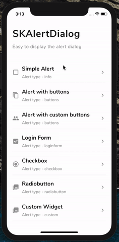
| SKAlertDialog | Basic Alert | Alert with buttons | Alert with custom buttons |
|---|---|---|---|
 |
 |
 |
 |
| Login Form | Checkbox | Radio button | Custom Dialog |
|---|---|---|---|
 |
 |
 |
 |
💻
Installation
You just need to add sk_alert_dialog as a dependency in your pubspec.yaml file.
dependencies:
sk_alert_dialog: ^1.0.0
Usage
Import this class
import 'package:sk_alert_dialog/sk_alert_dialog.dart';
Simple Alert
     SKAlertDialog.show(
        context: context,
        type: SKAlertType.info,
        title: 'Simple Alert',
        message: 'Hi! Welcome to SKALertDialog',
        onOkBtnTap: (value) {
          print('Okay Button Tapped');
        },
      );
Alert with buttons
    SKAlertDialog.show(
        context: context,
        type: SKAlertType.buttons,
        title: 'Alert with buttons',
        message: 'Shall we move to next alert?',
        onOkBtnTap: (value) {
          print('Okay Button Tapped');
        },
        onCancelBtnTap: (value) {
          print('Cancel Button Tapped');
        },
      );
Alert with custom buttons
   SKAlertDialog.show(
        context: context,
        type: SKAlertType.buttons,
        title: 'Alert with custom buttons',
        message: 'Do you like this package?',
        okBtnText: 'YES',
        okBtnTxtColor: Colors.white,
        okBtnColor: const Color(0xFF3BD459),
        cancelBtnText: 'NO',
        cancelBtnTxtColor: Colors.white,
        cancelBtnColor: const Color(0xFFFF4954),
        onOkBtnTap: (value) {
          print('Okay Button Tapped');
        },
        onCancelBtnTap: (value) {
          print('Cancel Button Tapped');
        },
      );
Login Form
  SKAlertDialog.show(
        context: context,
        type: SKAlertType.loginform,
        title: 'Login Form',
        okBtnText: 'LOGIN',
        onOkBtnTap: (value) {
          print('Okay Button Tapped');
        },
        onCancelBtnTap: (value) {
          print('Cancel Button Tapped');
        },
        onEmailTextFieldChanged: (value) {
          print('On Email Text Changed $value');
        },
        onPasswordTextFieldChanged: (value) {
          print('On Password Text Changed $value');
        },
      );
Checkbox
    SKAlertDialog.show(
        context: context,
        type: SKAlertType.checkbox,
        checkBoxAry: {'Choice One': true, 'Choice Two': false, 'Choice Three': true, 'Choice Four': false, 'Choice Five': false},
        title: 'Checkbox',
        onCancelBtnTap: (value) {
          print('Cancel Button Tapped');
        },
        onCheckBoxSelection: (value) {
          print('onCheckBoxSelection $value');
        },
      );
Radio button
    SKAlertDialog.show(
        context: context,
        type: SKAlertType.radiobutton,
        radioButtonAry: {'Choice One': 1, 'Choice Two': 2, 'Choice Three': 3, 'Choice Four': 4, 'Choice Five': 5},
        title: UtilsImporter().stringUtils.radio_button_alert_title,
        onCancelBtnTap: (value) {
          print('Cancel Button Tapped');
        },
        onRadioButtonSelection: (value) {
          print('onRadioButtonSelection $value');
        },
      );
Custom Dialog
    SKAlertDialog.show(
        context: context,
        type: SKAlertType.custom,
        customWidget: customWidget(),
      );
Create the custom widget
  Widget customWidget() {
     return new Padding(
        padding: EdgeInsets.only(left: 20, right: 20, top: 20, bottom: 20),
        child: Column(
          crossAxisAlignment: CrossAxisAlignment.start,
          children: <Widget>[
            Text(
              'Thank you for reviewing the package',
              style: TextStyle(
                  fontWeight: FontWeight.w400,
                  color: Theme.of(context).primaryColorDark.withOpacity(0.7),
                  fontSize: 20),
            ),
            SizedBox(height: 20),
            Row(
              mainAxisAlignment: MainAxisAlignment.center,
              children: <Widget>[
                FlatButton(
                  color: const Color(0xFF50A1FF),
                  onPressed: () {
                    Navigator.of(context).pop();
                  },
                  child: Text(
                    'The End !',
                    style: TextStyle(
                        fontWeight: FontWeight.w700,
                        color: Colors.white,
                        fontSize: 20),
                  ),
                )
              ],
            ),
          ],
        ));
  }


 73 Sep 7, 2022
 34 Jun 25, 2021
 6 Jun 7, 2022
 196 Dec 2, 2022
 21 Nov 4, 2022
 6 Jun 10, 2022
 108 Sep 11, 2022
 5 Dec 19, 2022
 1.7k Jan 7, 2023