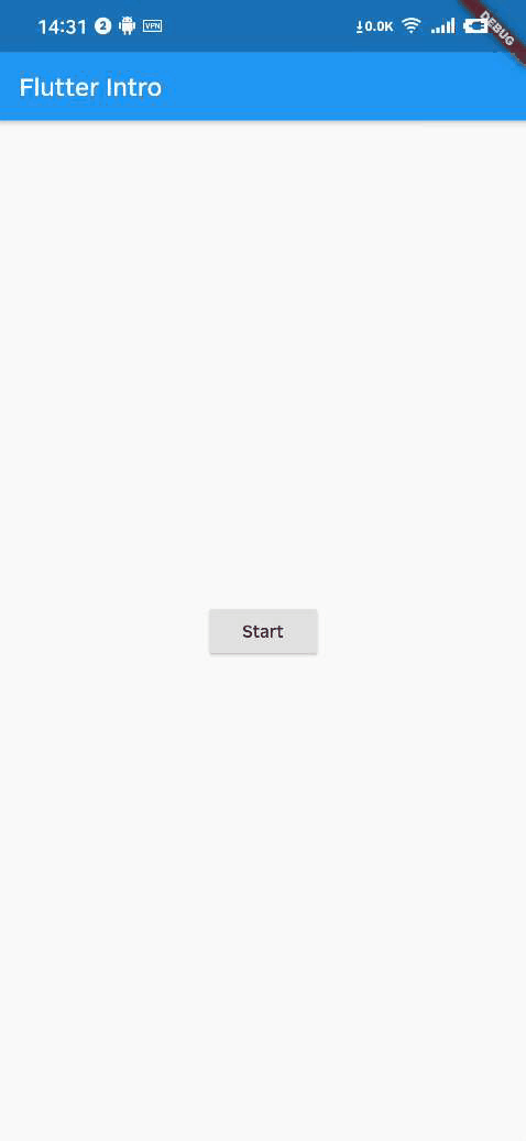
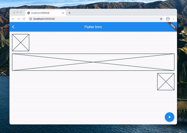
flutter_intro

A better way for new feature introduction and step-by-step users guide for your Flutter project.
Automatically adapt when the device screen orientation is switched.
Usage
To use this package, add flutter_intro as a dependency in your pubspec.yaml file.
Init
import 'package:flutter_intro/flutter_intro.dart';
Intro intro = Intro(
/// You can set it true to disable animation
noAnimation: false,
/// The total number of guide pages, must be passed
stepCount: 4,
/// Click on whether the mask is allowed to be closed.
maskClosable: true,
/// When highlight widget is tapped.
onHighlightWidgetTap: (introStatus) {
print(introStatus);
},
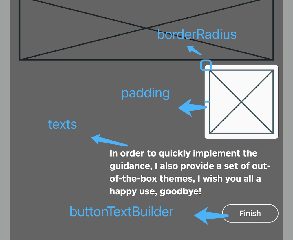
/// The padding of the highlighted area and the widget
padding: EdgeInsets.all(8),
/// Border radius of the highlighted area
borderRadius: BorderRadius.all(Radius.circular(4)),
/// Use the default useDefaultTheme provided by the library to quickly build a guide page
/// Need to customize the style and content of the guide page, implement the widgetBuilder method yourself
/// * Above version 2.3.0, you can use useAdvancedTheme to have more control over the style of the widget
/// * Please see https://github.com/tal-tech/flutter_intro/issues/26
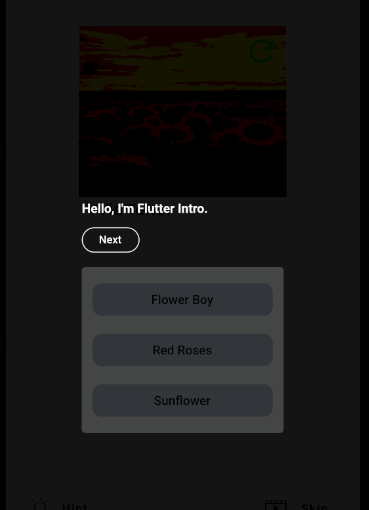
widgetBuilder: StepWidgetBuilder.useDefaultTheme(
/// Guide page text
texts: [
'Hello, I\'m Flutter Intro.',
'I can help you quickly implement the Step By Step guide in the Flutter project.',
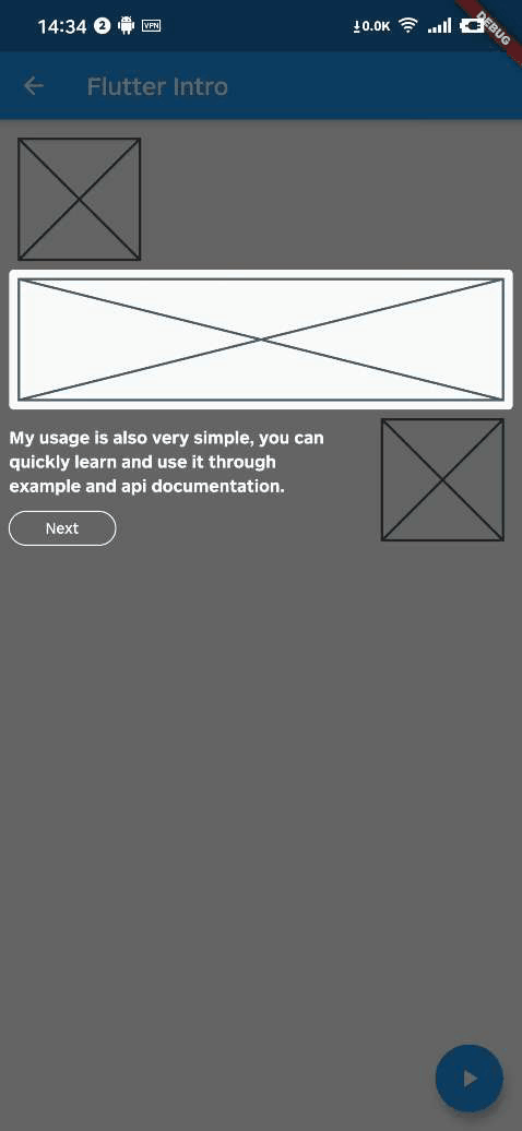
'My usage is also very simple, you can quickly learn and use it through example and api documentation.',
'In order to quickly implement the guidance, I also provide a set of out-of-the-box themes, I wish you all a happy use, goodbye!',
],
/// Button text
buttonTextBuilder: (curr, total) {
return curr < total - 1 ? 'Next' : 'Finish';
},
),
);
Bind globalKey to widgets that need to be guided
The intro object in the first step contains the keys property, and keys is a globalKey array of length stepCount. Just bind the globalKey in the array to the corresponding component.
Placeholder(
  /// the first guide page is the first item in the binding keys
  key: intro.keys[0]
)
Run
That's it!
intro.start(context);
Custom widgetBuilder method
If you need to completely customize the style and content of the guide page, you need to implement the widgetBuilder method yourself.
final Widget Function(StepWidgetParams params) widgetBuilder;
This method will be called internally by flutter_intro when the intro page appears, and will pass some data on the current page in the form of parameters StepWidgetParams, and finally render the component returned by this method on the screen.
class StepWidgetParams {
  /// Return to the previous guide page method, or null if there is none
  final VoidCallback onPrev;

  /// Enter the next guide page method, or null if there is no
  final VoidCallback onNext;

  /// End all guide page methods
  final VoidCallback onFinish;

  /// Which guide page is currently displayed, starting from 0
  final int currentStepIndex;

  /// Total number of guide pages
  final int stepCount;

  /// The width and height of the screen
  final Size screenSize;

  /// The width and height of the highlighted component
  final Size size;

  /// The coordinates of the upper left corner of the highlighted component
  final Offset offset;
}
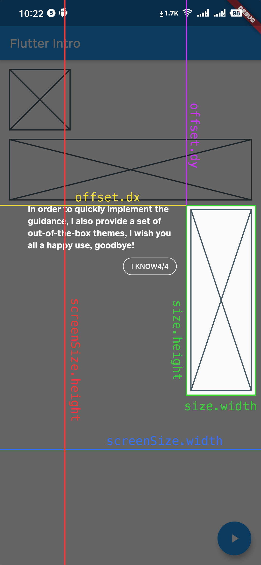
StepWidgetParams provides all the parameters needed to generate the guide page. The theme provided by default is also based on this parameter to generate the guide page.
Troubleshoot
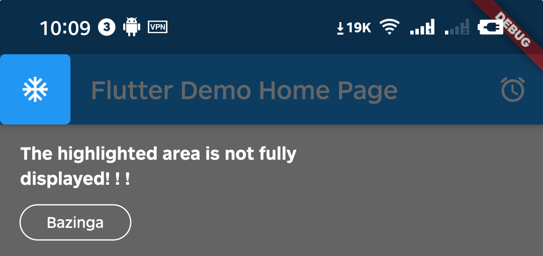
Q1. What if the highlighted area is not displayed completely?
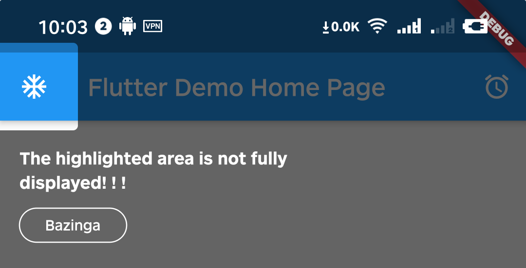
A1. That's because Intro provides 8px padding by default.
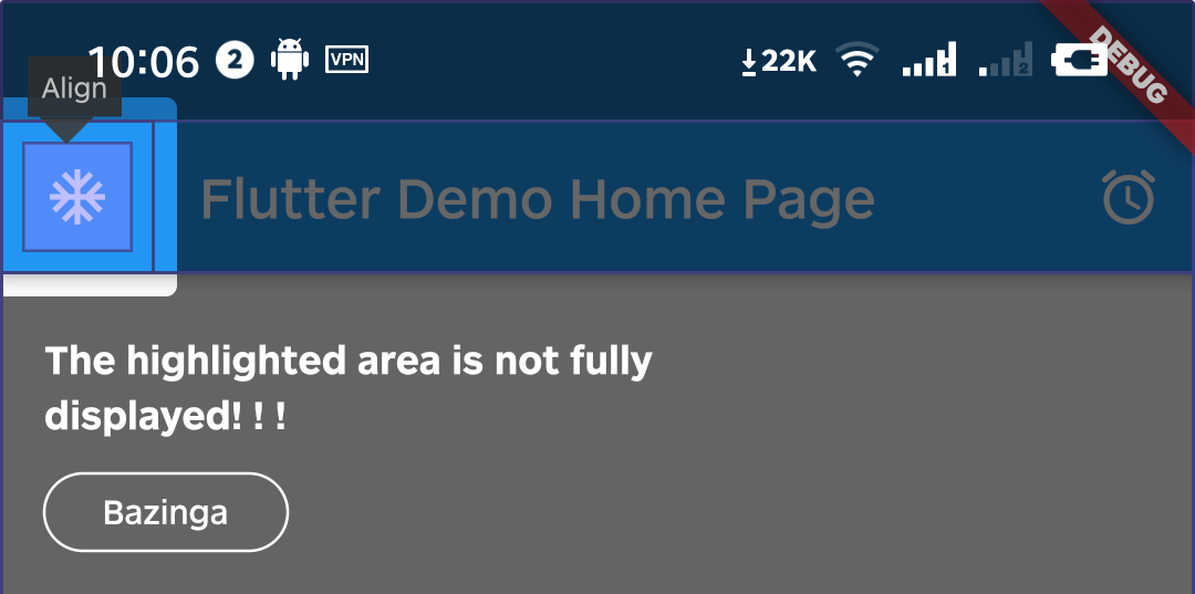
We can change it by setting the value of padding.
intro = Intro(
  ...,
  /// Set it to zero
  padding: EdgeInsets.zero,
);
Q2. Can I set different configurations for each step?
A2. Above version 0.4.x, you can set single or multiple step settings(padding & borderRadius) through setStepConfig and setStepsConfig.
intro.setStepConfig(
  1,
  padding: EdgeInsets.symmetric(
    vertical: -5,
    horizontal: -8,
  ),
);

intro.setStepsConfig(
  [0, 1],
  borderRadius: BorderRadius.all(
    Radius.circular(
      16,
    ),
  ),
);
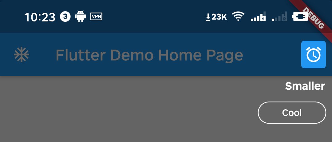
Q3. Can I make the highlight area smaller?
A3. You can do it by setting padding to a negative number.
intro.setStepConfig(
  1,
  padding: EdgeInsets.symmetric(
    vertical: -10,
    horizontal: -8,
  ),
);
Q4. How can I manually destroy the guide page, such as the user pressing the back button?
A4. Above version 0.5.x, you can call the dispose method of the intro instance.
Notice: You can call the getStatus method only above version 2.1.0.
WillPopScope(
  child: Scaffold(...),
  onWillPop: () async {
    // sometimes you need get current status to make some judgements
    IntroStatus introStatus = intro.getStatus();
    if (introStatus.isOpen) {
      // destroy guide page when tap back key
      intro.dispose();
      return false;
    }
    return true;
  },
)
Q5: How to use in the web environment?
A5: Due to this bug in Flutter, it is temporarily not supported for use on the Web.(Update: It works in Flutter 2.0+)
Example
Please check the example in example/lib/main.dart.


![[Bug] No dark background in web](https://avatars.githubusercontent.com/u/24619905?v=4)


![[Feature Request] Would be nice to have Skip/Close option in StepWidgetBuilder.useDefaultTheme](https://avatars.githubusercontent.com/u/1186833?v=4)


 44 Dec 6, 2022
 661 Jan 5, 2023
 35 Dec 2, 2022
 1 Mar 8, 2022
 32 Aug 2, 2022
 4 Nov 19, 2021
 1 May 24, 2022
 1 Feb 7, 2022
 23 Dec 4, 2022
 8 Oct 31, 2022
 9 Nov 8, 2022
 1 Nov 30, 2021
 1 Dec 2, 2021
 0 Jan 26, 2022
 1.2k Jan 8, 2023
 1 Mar 15, 2022
 10 Nov 22, 2022
 5 Dec 13, 2022
 0 Nov 26, 2021