Flutter DropdownButton2

Intro
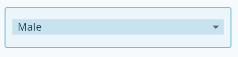
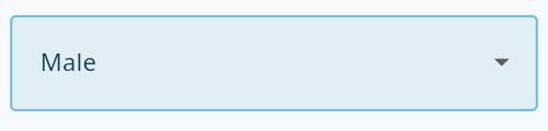
Flutter's core Dropdown Button widget with steady dropdown menu and many options you can customize to your needs.
Features
- Dropdown menu always open below the button and you can edit its position by using the offset parameter.
- You can make the menu open above the button by setting showAboveButton to true.
- You can edit (button, menu and menu items) height, width and decoration as you want.
- You can align hint or value and customize them.
- You can edit the scrollbar's radius,thickness and isAlwaysShow.
- You can specify max height for the dropdown menu & it'll become scrollable if there are more items.
- If you pass Null to dropdownMaxHeight parameter or didn't use it, the dropdown menu will take max height possible for the items and will become scrollable if there are more items.
- If you have long scrollable list, the dropdown menu will auto scroll to last selected item and show it at the middle of the menu if possible.
- Wrap the DropdownButton2 with DropdownButtonHideUnderline to hide the underline.
- A Custom widget of the DropdownButton2 below to make it more reusable. You can customize it to your needs and use it throughout all your app easily as shown in the examples.
- You can use DropdownButton2 as a popup menu button by using the parameter customButton. You can pass Icon,Image or anything you want and customize it as shown in the examples.
- You can make the popup menu open onLongPress instead of onTap by setting openWithLongPress parameter to true.
- You can Add dividers to the popup menu with different height by passing dividers indexes to customItemsIndexes and the height to customItemsHeight.
- You can also use DropdownButtonFormField2 the same way with all options above.
- Use decoration parameter for the DropdownButtonFormField2 to add labelText,fillColor and more.
- You can customize the DropdownButtonFormField2 width by wrapping it with SizedBox and give it the width you want.
Installation
add this line to pubspec.yaml
dependencies:

  dropdown_button2: ^1.0.0
import package
import 'package:dropdown_button2/dropdown_button2.dart';
Usage & Examples
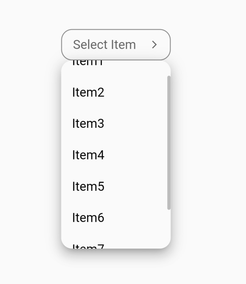
- Simple DropdownButton2 without too many specifications:

String? selectedValue;
List<String> items = [
  'Item1',
  'Item2',
  'Item3',
  'Item4',
];

@override
Widget build(BuildContext context) {
  return Scaffold(
    body: Center(
      child: DropdownButtonHideUnderline(
        child: DropdownButton2(
          hint: Text(
            'Select Item',
            style: TextStyle(
              fontSize: 14,
              color: Theme
                  .of(context)
                  .hintColor,
            ),
          ),
          items: items
              .map((item) =>
              DropdownMenuItem<String>(
                value: item,
                child: Text(
                  item,
                  style: const TextStyle(
                    fontSize: 14,
                  ),
                ),
              ))
              .toList(),
          value: selectedValue,
          onChanged: (value) {
            setState(() {
              selectedValue = value as String;
            });
          },
          buttonHeight: 40,
          buttonWidth: 140,
          itemHeight: 40,
          itemWidth: 140,
        ),
      ),
    ),
  );
}
- More customized DropdownButton2 using DropdownButton2 directly:

 String? selectedValue;
List<String> items = [
  'Item1',
  'Item2',
  'Item3',
  'Item4',
  'Item5',
  'Item6',
  'Item7',
  'Item8',
];

@override
Widget build(BuildContext context) {
  return Scaffold(
    body: Center(
      child: DropdownButtonHideUnderline(
        child: DropdownButton2(
          isExpanded: true,
          hint: Row(
            children: const [
              Icon(
                Icons.list,
                size: 16,
                color: Colors.yellow,
              ),
              SizedBox(
                width: 4,
              ),
              Expanded(
                child: Text(
                  'Select Item',
                  style: TextStyle(
                    fontSize: 14,
                    fontWeight: FontWeight.bold,
                    color: Colors.yellow,
                  ),
                  overflow: TextOverflow.ellipsis,
                ),
              ),
            ],
          ),
          items: items
              .map((item) =>
              DropdownMenuItem<String>(
                value: item,
                child: Text(
                  item,
                  style: const TextStyle(
                    fontSize: 14,
                    fontWeight: FontWeight.bold,
                    color: Colors.white,
                  ),
                  overflow: TextOverflow.ellipsis,
                ),
              ))
              .toList(),
          value: selectedValue,
          onChanged: (value) {
            setState(() {
              selectedValue = value as String;
            });
          },
          icon: const Icon(
            Icons.arrow_forward_ios_outlined,
          ),
          iconSize: 14,
          iconEnabledColor: Colors.yellow,
          iconDisabledColor: Colors.grey,
          buttonHeight: 50,
          buttonWidth: 160,
          buttonPadding: const EdgeInsets.only(left: 14, right: 14),
          buttonDecoration: BoxDecoration(
            borderRadius: BorderRadius.circular(14),
            border: Border.all(
              color: Colors.black26,
            ),
            color: Colors.redAccent,
          ).copyWith(
            boxShadow: kElevationToShadow[2],
          ),
          itemHeight: 40,
          itemWidth: 200,
          itemPadding: const EdgeInsets.only(left: 14, right: 14),
          dropdownMaxHeight: 200,
          dropdownPadding: null,
          dropdownBorderRadius: BorderRadius.circular(14),
          dropdownBorder: null,
          dropdownColor: Colors.redAccent,
          elevation: 8,
          scrollbarRadius: const Radius.circular(40),
          scrollbarThickness: 6,
          scrollbarAlwaysShow: true,
          offset: const Offset(-20, 0),
        ),
      ),
    ),
  );
}
- More customized DropdownButton2 using the reusable Custom widget attached below:
String? selectedValue;
List<String> items = [
  'Item1',
  'Item2',
  'Item3',
  'Item4',
  'Item5',
  'Item6',
  'Item7',
  'Item8',
];

@override
Widget build(BuildContext context) {
  return Scaffold(
    body: Center(
      child: CustomDropdownButton2(
        hint: 'Select Item',
        dropdownItems: items,
        value: selectedValue,
        onChanged: (value) {
          setState(() {
            selectedValue = value;
          });
        },
      ),
    ),
  );
}
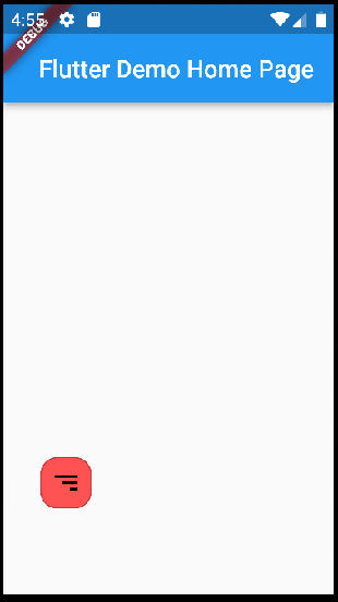
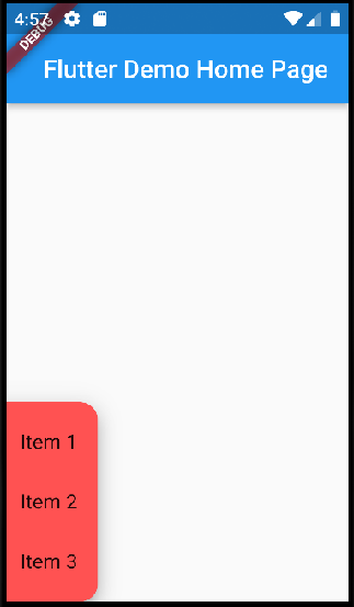
- DropdownButton2 as Popup menu button using customButton parameter and adding custom items with different height like dividers:
Example 1 using icon:

class CustomButtonTest extends StatefulWidget {
  const CustomButtonTest({Key? key}) : super(key: key);

  @override
  State<CustomButtonTest> createState() => _CustomButtonTestState();
}

class _CustomButtonTestState extends State<CustomButtonTest> {
  @override
  Widget build(BuildContext context) {
    return Scaffold(
      body: Center(
        child: DropdownButtonHideUnderline(
          child: DropdownButton2(
            customButton: const Icon(
              Icons.list,
              size: 46,
              color: Colors.red,
            ),
            customItemsIndexes: const [3],
            customItemsHeight: 8,
            items: [
              ...MenuItems.firstItems.map(
                    (item) =>
                    DropdownMenuItem<MenuItem>(
                      value: item,
                      child: MenuItems.buildItem(item),
                    ),
              ),
              const DropdownMenuItem<Divider>(enabled: false, child: Divider()),
              ...MenuItems.secondItems.map(
                    (item) =>
                    DropdownMenuItem<MenuItem>(
                      value: item,
                      child: MenuItems.buildItem(item),
                    ),
              ),
            ],
            onChanged: (value) {
              MenuItems.onChanged(context, value as MenuItem);
            },
            itemHeight: 48,
            itemWidth: 160,
            itemPadding: const EdgeInsets.only(left: 16, right: 16),
            dropdownPadding: const EdgeInsets.symmetric(vertical: 6),
            dropdownBorderRadius: BorderRadius.circular(4),
            dropdownBorder: null,
            dropdownColor: Colors.redAccent,
            elevation: 8,
            offset: const Offset(0, 8),
          ),
        ),
      ),
    );
  }
}

class MenuItem {
  final String text;
  final IconData icon;

  const MenuItem({
    required this.text,
    required this.icon,
  });
}

class MenuItems {
  static const List<MenuItem> firstItems = [home, share, settings];
  static const List<MenuItem> secondItems = [logout];

  static const home = MenuItem(text: 'Home', icon: Icons.home);
  static const share = MenuItem(text: 'Share', icon: Icons.share);
  static const settings = MenuItem(text: 'Settings', icon: Icons.settings);
  static const logout = MenuItem(text: 'Log Out', icon: Icons.logout);

  static Widget buildItem(MenuItem item) {
    return Row(
      children: [
        Icon(
            item.icon,
            color: Colors.white,
            size: 22
        ),
        const SizedBox(
          width: 10,
        ),
        Text(
          item.text,
          style: const TextStyle(
            color: Colors.white,
          ),
        ),
      ],
    );
  }

  static onChanged(BuildContext context, MenuItem item) {
    switch (item) {
      case MenuItems.home:
      //Do something
        break;
      case MenuItems.settings:
      //Do something
        break;
      case MenuItems.share:
      //Do something
        break;
      case MenuItems.logout:
      //Do something
        break;
    }
  }
}
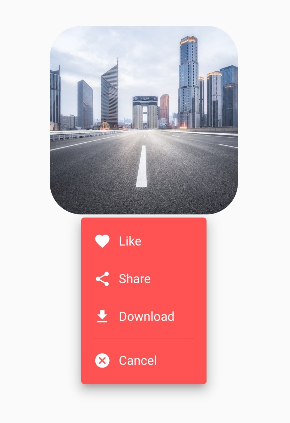
Example 2 using image and openWithLongPress parameter:
class CustomButtonTest extends StatefulWidget {
  const CustomButtonTest({Key? key}) : super(key: key);

  @override
  State<CustomButtonTest> createState() => _CustomButtonTestState();
}

class _CustomButtonTestState extends State<CustomButtonTest> {
  @override
  Widget build(BuildContext context) {
    return Scaffold(
      body: Center(
        child: DropdownButtonHideUnderline(
          child: DropdownButton2(
            customButton: Container(
              height: 240,
              width: 240,
              decoration: BoxDecoration(
                borderRadius: BorderRadius.circular(40),
                image: const DecorationImage(
                  image: NetworkImage(
                    'https://cdn.pixabay.com/photo/2020/05/11/06/20/city-5156636_960_720.jpg',
                  ),
                  fit: BoxFit.cover,
                ),
              ),
            ),
            openWithLongPress: true,
            customItemsIndexes: const [3],
            customItemsHeight: 8,
            items: [
              ...MenuItems.firstItems.map(
                        (item) =>
                        DropdownMenuItem<MenuItem>(
                          value: item,
                          child: MenuItems.buildItem(item),
                        ),
              ),
              const DropdownMenuItem<Divider>(enabled: false, child: Divider()),
              ...MenuItems.secondItems.map(
                        (item) =>
                        DropdownMenuItem<MenuItem>(
                          value: item,
                          child: MenuItems.buildItem(item),
                        ),
              ),
            ],
            onChanged: (value) {
              MenuItems.onChanged(context, value as MenuItem);
            },
            itemHeight: 48,
            itemWidth: 160,
            itemPadding: const EdgeInsets.only(left: 16, right: 16),
            dropdownPadding: const EdgeInsets.symmetric(vertical: 6),
            dropdownBorderRadius: BorderRadius.circular(4),
            dropdownBorder: null,
            dropdownColor: Colors.redAccent,
            elevation: 8,
            offset: const Offset(40, -4),
          ),
        ),
      ),
    );
  }
}

class MenuItem {
  final String text;
  final IconData icon;

  const MenuItem({
    required this.text,
    required this.icon,
  });
}

class MenuItems {
  static const List<MenuItem> firstItems = [like, share, download];
  static const List<MenuItem> secondItems = [cancel];

  static const like = MenuItem(text: 'Like', icon: Icons.favorite);
  static const share = MenuItem(text: 'Share', icon: Icons.share);
  static const download = MenuItem(text: 'Download', icon: Icons.download);
  static const cancel = MenuItem(text: 'Cancel', icon: Icons.cancel);

  static Widget buildItem(MenuItem item) {
    return Row(
      children: [
        Icon(
          item.icon,
          color: Colors.white,
          size: 22,
        ),
        const SizedBox(
          width: 10,
        ),
        Text(
          item.text,
          style: const TextStyle(
            color: Colors.white,
          ),
        ),
      ],
    );
  }

  static onChanged(BuildContext context, MenuItem item) {
    switch (item) {
      case MenuItems.like:
      //Do something
        break;
      case MenuItems.share:
      //Do something
        break;
      case MenuItems.download:
      //Do something
        break;
      case MenuItems.cancel:
      //Do something
        break;
    }
  }
}
Custom DropdownButton2 Widget
class CustomDropdownButton2 extends StatelessWidget {
  final String hint;
  final String? value;
  final List<String> dropdownItems;
  final ValueChanged<String?>? onChanged;
  final Alignment? hintAlignment;
  final Alignment? valueAlignment;
  final double? buttonHeight, buttonWidth;
  final EdgeInsetsGeometry? buttonPadding;
  final Decoration? buttonDecoration;
  final int? buttonElevation;
  final Widget? icon;
  final double? iconSize;
  final Color? iconEnabledColor;
  final Color? iconDisabledColor;
  final double? itemHeight, itemWidth;
  final EdgeInsetsGeometry? itemPadding;
  final double? dropdownHeight;
  final EdgeInsetsGeometry? dropdownPadding;
  final BorderRadius? dropdownBorderRadius;
  final BoxBorder? dropdownBorder;
  final int? dropdownElevation;
  final Color? dropdownColor;
  final Radius? scrollbarRadius;
  final double? scrollbarThickness;
  final bool? scrollbarAlwaysShow;
  final Offset? offset;

  const CustomDropdownButton2({
    required this.hint,
    required this.value,
    required this.dropdownItems,
    required this.onChanged,
    this.hintAlignment,
    this.valueAlignment,
    this.buttonHeight,
    this.buttonWidth,
    this.buttonPadding,
    this.buttonDecoration,
    this.buttonElevation,
    this.icon,
    this.iconSize,
    this.iconEnabledColor,
    this.iconDisabledColor,
    this.itemHeight,
    this.itemWidth,
    this.itemPadding,
    this.dropdownHeight,
    this.dropdownPadding,
    this.dropdownBorderRadius,
    this.dropdownBorder,
    this.dropdownElevation,
    this.dropdownColor,
    this.scrollbarRadius,
    this.scrollbarThickness,
    this.scrollbarAlwaysShow,
    this.offset,
    Key? key,
  }) : super(key: key);

  @override
  Widget build(BuildContext context) {
    return DropdownButtonHideUnderline(
      child: DropdownButton2(
        isExpanded: true,
        //To avoid long text overflowing.
        hint: Container(
          alignment: hintAlignment,
          child: Text(
            hint,
            overflow: TextOverflow.ellipsis,
            maxLines: 1,
            style: TextStyle(
              fontSize: 14,
              color: Theme
                      .of(context)
                      .hintColor,
            ),
          ),
        ),
        value: value,
        items: dropdownItems
                .map((item) =>
                DropdownMenuItem<String>(
                  value: item,
                  child: Container(
                    alignment: valueAlignment,
                    child: Text(
                      item,
                      overflow: TextOverflow.ellipsis,
                      maxLines: 1,
                      style: const TextStyle(
                        fontSize: 14,
                      ),
                    ),
                  ),
                ))
                .toList(),
        onChanged: onChanged,
        icon: icon ?? const Icon(Icons.arrow_forward_ios_outlined),
        iconSize: iconSize ?? 12,
        iconEnabledColor: iconEnabledColor,
        iconDisabledColor: iconDisabledColor,
        buttonHeight: buttonHeight ?? 40,
        buttonWidth: buttonWidth ?? 140,
        buttonPadding:
        buttonPadding ?? const EdgeInsets.only(left: 14, right: 14),
        buttonDecoration: buttonDecoration ??
                BoxDecoration(
                  borderRadius: BorderRadius.circular(14),
                  border: Border.all(
                    color: Colors.black45,
                  ),
                  color: Theme
                          .of(context)
                          .canvasColor,
                ).copyWith(
                  boxShadow: kElevationToShadow[buttonElevation ?? 0],
                ),
        itemHeight: itemHeight ?? 40,
        itemWidth: itemWidth ?? 140,
        itemPadding: itemPadding ?? const EdgeInsets.only(left: 14, right: 14),
        dropdownMaxHeight: dropdownHeight ?? 240,
        //Max height for the dropdown menu & becoming scrollable if there are more items. If you pass Null it will take max height possible for the items.
        dropdownPadding: dropdownPadding,
        dropdownBorderRadius: dropdownBorderRadius ?? BorderRadius.circular(14),
        dropdownBorder: dropdownBorder,
        //Default has no border.
        dropdownColor: dropdownColor ?? Theme
                .of(context)
                .canvasColor,
        elevation: dropdownElevation ?? 8,
        scrollbarRadius: scrollbarRadius ?? const Radius.circular(40),
        scrollbarThickness: scrollbarThickness,
        scrollbarAlwaysShow: scrollbarAlwaysShow,
        offset: offset,
        //Null or Offset(0, 0) will open just under the button. You can edit as you want.
        showAboveButton: false, //Default is false to show menu below button
      ),
    );
  }
}
Thanks
If something is missing or you want to add some feature, feel free to open a ticket or contribute!


![[Question] How can I minimize the button width by Icon only?](https://avatars.githubusercontent.com/u/13424257?v=4)


 As you can see image options list width not same as dropdown widget. I want to make options list same width as dropdown widget.


 139 Dec 1, 2022
 108 Dec 12, 2022
 11 Jul 26, 2022
 27 Sep 7, 2022
 20 Sep 13, 2021
 202 Dec 11, 2022
 5 Jan 31, 2022
 91 Dec 20, 2022
 4 Jul 18, 2022
 237 Nov 15, 2022
 97 Jan 6, 2023
 17 Nov 5, 2022
 5k Dec 31, 2022
 25 Apr 16, 2021
 314 Dec 31, 2022
 22 Dec 13, 2022
 0 Dec 8, 2022
 1k Jan 9, 2023
 427 Nov 26, 2022