Responsive Sizer
Responsive Sizer helps implement a responsive layout by providing helper widgets and extensions


Content
Installation
Add responsive_sizer to pubspec.yaml
dependencies:
  responsive_sizer: ^2.0.1
Parameters
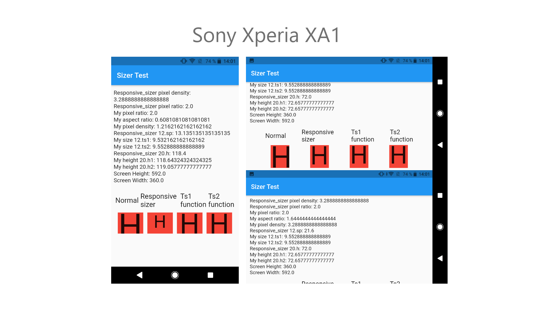
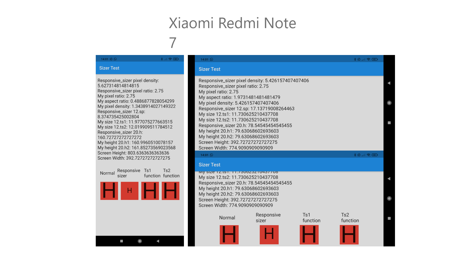
Adaptive.h()- Returns a calculated height based on the deviceAdaptive.w()- Returns a calculated width based on the deviceAdaptive.sp()- Returns a calculated sp based on the device.h- Returns a calculated height based on the device.w- Returns a calculated width based on the device.sp- Returns a calculated sp based on the deviceDevice.boxConstraints- Returns the Device's BoxConstraintsDevice.orientation- Returns the Screen Orientation (portrait or landscape)Device.screenType- Returns the Screen Type (mobile or tablet)
Usage
Import the Package
import 'package:responsive_sizer/responsive_sizer.dart';
Wrap MaterialApp with ResponsiveSizer widget
 ResponsiveSizer(
      builder: (context, orientation, screenType) {
        return MaterialApp();
      }
 )
Widget Size
Container(
  width: Adaptive.w(20),    // This will take 20% of the screen's width
  height: 30.5.h     // This will take 30.5% of the screen's height
)
Font size
Text(
  'Responsive Sizer',
  style: TextStyle(fontSize: 15.sp),
)
Orientation
If you want to support both portrait and landscape orientations
Device.orientation == Orientation.portrait
  ? Container(   // Widget for Portrait
      width: 100.w,
      height: 20.5.h,
   )
  : Container(   // Widget for Landscape
      width: 100.w,
      height: 12.5.h,
   )
DeviceType
If you want the same layout to look different in tablet and mobile, use the Device.screenType method:
Device.screenType == ScreenType.tablet
  ? Container(   // Widget for Tablet
      width: 100.w,
      height: 20.5.h,
   )
  : Container(   // Widget for Mobile
      width: 100.w,
      height: 12.5.h,
   )
Take Note
You need to import responsive_sizer package in order to access number.h, number.w, and number.sp
Auto import in VSCode and Android Studio doesn't work for dart extension methods. Typing 10.h would not bring up auto import suggestion for this package
One workaround is to type Device so that the auto import suggestion would show up:
import 'package:responsive_sizer/responsive_sizer.dart';
Community Support
If you have any suggestions or issues, feel free to open an issue
If you would like to contribute, feel free to create a PR


 Although there it says # 1 DeviceExt.w I have tried with all of them, 19.0.sp, 19.0.w, 19.0.h, 19.sp, 19.w, 19.h.
They all give those same mistakes.
I've been testing and I can't solve it, but the fact is that I was using the sizer package, the same one where you told me in response to my request to add ".sp" also in the "int" that this package of yours will use, but for now I will finish my app with that package and the next one I will start with yours, since it will be easier for me starting from scratch to find the errors.
Although there it says # 1 DeviceExt.w I have tried with all of them, 19.0.sp, 19.0.w, 19.0.h, 19.sp, 19.w, 19.h.
They all give those same mistakes.
I've been testing and I can't solve it, but the fact is that I was using the sizer package, the same one where you told me in response to my request to add ".sp" also in the "int" that this package of yours will use, but for now I will finish my app with that package and the next one I will start with yours, since it will be easier for me starting from scratch to find the errors.


 4 Dec 2, 2021
 6 Jun 30, 2022
 290 Dec 29, 2022
 44 Dec 6, 2022
 318 Jan 8, 2023
 9 Nov 8, 2022
 432 Dec 11, 2022
 4 Oct 28, 2021
 22 Sep 1, 2022
 2 Nov 14, 2022
 5.5k Dec 29, 2022
 191 Dec 29, 2022
 3 Jun 11, 2022
 6 Dec 27, 2022
 32 Nov 8, 2022
 18 Nov 29, 2022
 15 Dec 20, 2022
 37 Jul 25, 2022
 530 Dec 23, 2022