FButton
From then on, developers only need to master one Button component, which is enough.
Support corners, borders, icons, special effects, loading mode, high-quality Neumorphism style.
Author:Newton([email protected])

English | 简体中文
Like it? Please cast your Star
🥰 !
✨
Features
-
Rich corner effect
-
Exquisite border decoration
-
Gradient effect
-
Flexible icon support
-
Intimate Loading mode
-
Cool interaction Special effects
-
More sense of space Shadow
-
High-quality Neumorphism style
🛠
Guide
⚙️
Parameters
🔩
Basic parameters
| Param | Type | Necessary | Default | desc |
|---|---|---|---|---|
| onPressed | VoidCallback | true | null | Click callback. If null, FButton will enter an unavailable state |
| onPressedDown | VoidCallback | false | null | Callback when pressed |
| onPressedUp | VoidCallback | false | null | Callback when lifted |
| onPressedCancel | VoidCallback | false | null | Callback when cancel is pressed |
| height | double | false | null | height |
| width | double | false | null | width |
| style | TextStyle | false | null | text style |
| disableStyle | TextStyle | false | null | Unavailable text style |
| alignment | Alignment | false | null | alignment |
| text | String | false | null | button text |
| color | Color | false | null | Button color |
| disabledColor | Color | false | null | Color when FButton is unavailable |
| padding | EdgeInsetsGeometry | false | null | FButton internal spacing |
| corner | FCorner | false | null | Configure corners of Widget |
| cornerStyle | FCornerStyle | false | FCornerStyle.round | Configure the corner style of Widget. round-rounded corners, bevel-beveled |
| strokeColor | Color | false | Colors.black | Border color |
| strokeWidth | double | false | 0 | Border width. The border will appear when strokeWidth > 0 |
| gradient | Gradient | false | null | Configure gradient colors. Will override the color |
| activeMaskColor | Color | 否 | Colors.transparent | The color of the mask when pressed |
| surfaceStyle | FSurface | false | FSurface.Flat | Surface style. Default [FSurface.Flat]. See [FSurface] for details |
💫
Effect parameters
| Param | Type | Necessary | Default | desc |
|---|---|---|---|---|
| clickEffect | bool | false | false | Whether to enable click effects |
| hoverColor | Color | false | null | FButton color when hovering |
| onHover | ValueChanged | false | null | Callback when the mouse enters/exits the component range |
| highlightColor | Color | false | null | The color of the FButton when touched. effect:true required |
🔳
Shadow parameters
| Param | Type | Necessary | Default | desc |
|---|---|---|---|---|
| shadowColor | Color | false | Colors.grey | Shadow color |
| shadowOffset | Offset | false | Offset.zero | Shadow offset |
| shadowBlur | double | false | 1.0 | Shadow blur degree, the larger the value, the larger the shadow range |
🖼
Icon & Loading parameters
| Param | Type | Necessary | Default | desc |
|---|---|---|---|---|
| image | Widget | false | null | An icon can be configured for FButton |
| imageMargin | double | false | 6.0 | Spacing between icon and text |
| imageAlignment | ImageAlignment | false | ImageAlignment.left | Relative position of icon and text |
| loading | bool | false | false | Whether to enter the Loading state |
| loadingWidget | Widget | false | null | Loading widget in loading state. Will override the default Loading effect |
| clickLoading | bool | false | false | Whether to enter Loading state after clicking FButton |
| loadingColor | Color | false | null | Loading colors |
| loadingStrokeWidth | double | false | 4.0 | Loading width |
| hideTextOnLoading | bool | false | false | Whether to hide text in the loading state |
| loadingText | String | false | null | Loading text |
| loadingSize | double | false | 12 | Loading size |
🍭
Neumorphism Style
| Param | Type | Necessary | Default | desc |
|---|---|---|---|---|
| isSupportNeumorphism | bool | false | false | Whether to support the Neumorphism style. Open this item [highlightColor] will be invalid |
| lightOrientation | FLightOrientation | false | FLightOrientation.LeftTop | Valid when [isSupportNeumorphism] is true. The direction of the light source is divided into four directions: upper left, lower left, upper right, and lower right. Used to control the illumination direction of the light source, which will affect the highlight direction and shadow direction |
| highlightShadowColor | Color | false | null | After the Neumorphism style is turned on, the bright shadow color |
📺
Demo
🔩
Basic Demo
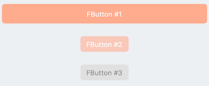
// FButton #1
FButton(
  height: 40,
  alignment: Alignment.center,
  text: "FButton #1",
  style: TextStyle(color: Colors.white),
  color: Color(0xffffab91),
  onPressed: () {},
)

// FButton #2
FButton(
  padding: const EdgeInsets.fromLTRB(12, 8, 12, 8),
  text: "FButton #2",
  style: TextStyle(color: Colors.white),
  color: Color(0xffffab91),
  corner: FCorner.all(6.0),
)

// FButton #3
FButton(
  padding: const EdgeInsets.fromLTRB(12, 8, 12, 8),
  text: "FButton #3",
  style: TextStyle(color: Colors.white),
  disableStyle: TextStyle(color: Colors.black38),
  color: Color(0xffF8AD36),

  /// set disable Color
  disabledColor: Colors.grey[300],
  corner: FCorner.all(6.0),
)
By simply configuring text and onPressed, you can construct an available FButton.
If onPressed is not set, FButton will be automatically recognized as not unavailable. At this time, ** FButton ** will have a default unavailable status style.
You can also freely configure the style of FButton when it is not available via the disabledXXX attribute.
🎈
Corner & Stroke
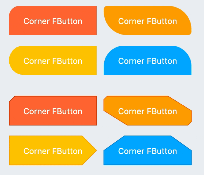
// #1
FButton(
  width: 130,
  text: "FButton #1",
  style: TextStyle(color: Colors.white),
  color: Color(0xffFF7043),
  onPressed: () {},
  clickEffect: true,

  /// 配置边角大小
  ///
  /// set corner size
  corner: FCorner.all(25),
),

// #2
FButton(
  width: 130,
  text: "FButton #2",
  style: TextStyle(color: Colors.white),
  color: Color(0xffFFA726),
  onPressed: () {},
  clickEffect: true,
  corner: FCorner(
    leftBottomCorner: 40,
    leftTopCorner: 6,
    rightTopCorner: 40,
    rightBottomCorner: 6,
  ),
),

// #3
FButton(
  width: 130,
  text: "FButton #3",
  style: TextStyle(color: Colors.white),
  color: Color(0xffFFc900),
  onPressed: () {},
  clickEffect: true,
  corner: FCorner(leftTopCorner: 10),

  /// 设置边角风格
  ///
  /// set corner style
  cornerStyle: FCornerStyle.bevel,
  strokeWidth: 0.5,
  strokeColor: Color(0xffF9A825),
),

// #4
FButton(
  width: 130,
  padding: EdgeInsets.fromLTRB(6, 16, 30, 16),
  text: "FButton #4",
  style: TextStyle(color: Colors.white),
  color: Color(0xff00B0FF),
  onPressed: () {},
  clickEffect: true,
  corner: FCorner(
      rightTopCorner: 25,
      rightBottomCorner: 25),
  cornerStyle: FCornerStyle.bevel,
  strokeWidth: 0.5,
  strokeColor: Color(0xff000000),
),
You can add rounded corners to FButton via the corner property. You can even control each fillet individually。
By default, the corners of FButton are rounded. By setting cornerStyle: FCornerStyle.bevel, you can get a bevel effect.
FButton supports control borders, provided that strokeWidth> 0 can get the effect
🌈
Gradient
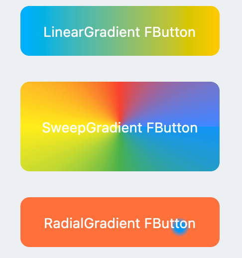
FButton(
  width: 100,
  height: 60,
  text: "#1",
  style: TextStyle(color: Colors.white),
  color: Color(0xffFFc900),

  /// 配置渐变色
  ///
  /// set gradient
  gradient: LinearGradient(colors: [
    Color(0xff00B0FF),
    Color(0xffFFc900),
  ]),
  onPressed: () {},
  clickEffect: true,
  corner: FCorner.all(8),
)
Through the gradient attribute, you can build FButton with gradient colors. You can freely build many types of gradient colors.
🍭
Icon
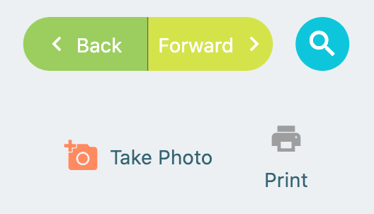
FButton(
  width: 88,
  height: 38,
  padding: EdgeInsets.all(0),
  text: "Back",
  style: TextStyle(color: Colors.white),
  color: Color(0xffffc900),
  onPressed: () {
    toast(context, "Back!");
  },
  clickEffect: true,
  corner: FCorner(
    leftTopCorner: 25,
    leftBottomCorner: 25,),

  /// 配置图标
  ///
  /// set icon
  image: Icon(
    Icons.arrow_back_ios,
    color: Colors.white,
    size: 12,
  ),

  /// 配置图标与文字的间距
  ///
  /// Configure the spacing between icon and text
  imageMargin: 8,
),

FButton(
  onPressed: () {},
  image: Icon(
    Icons.print,
    color: Colors.grey,
  ),
  imageMargin: 8,

  /// 配置图标与文字相对位置
  ///
  /// Configure the relative position of icons and text
  imageAlignment: ImageAlignment.top,
  text: "Print",
  style: TextStyle(color: textColor),
  color: Colors.transparent,
),
The image property can set an image for FButton and you can adjust the position of the image relative to the text, through imageAlignment.
If the button does not need a background, just set color: Colors.transparent.
🔥
Effect
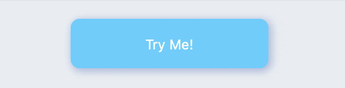
FButton(
  width: 200,
  text: "Try Me!",
  style: TextStyle(color: textColor),
  color: Color(0xffffc900),
  onPressed: () {},
  clickEffect: true,
  corner: FCorner.all(9),

  /// 配置按下时颜色
  ///
  /// set pressed color
  highlightColor: Color(0xffE65100).withOpacity(0.20),

  /// 配置 hover 状态时颜色
  ///
  /// set hover color
  hoverColor: Colors.redAccent.withOpacity(0.16),
),
The highlight color of FButton can be configured through the highlightColor property。
hoverColor can configure the color when the mouse moves to the range of FButton, which will be used during Web development.
🔆
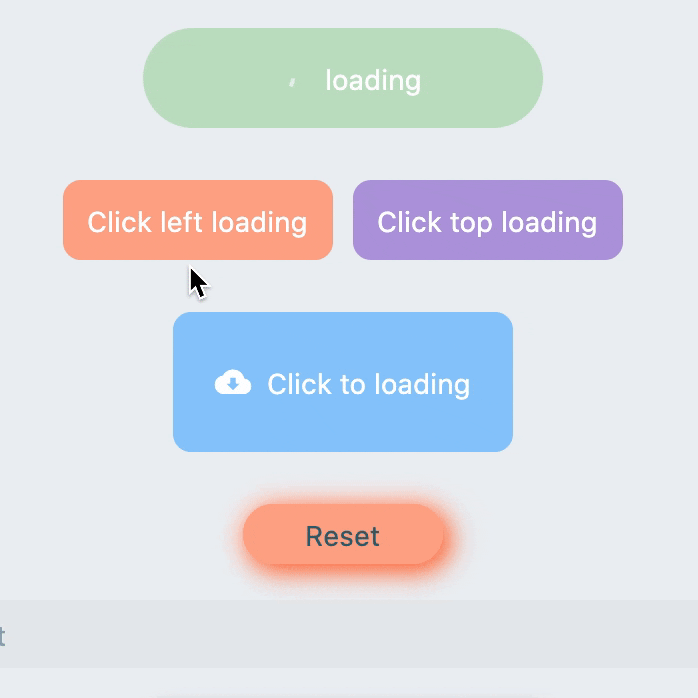
Loading
FButton(
  text: "Click top loading",
  style: TextStyle(color: textColor),
  color: Color(0xffffc900),
  ...

  /// 配置 loading 大小
  ///
  /// set loading size
  loadingSize: 15,

  /// 配置 loading 与文本的间距
  ///
  // Configure the spacing between loading and text
  imageMargin: 6,

  /// 配置 loading 的宽
  ///
  /// set loading width
  loadingStrokeWidth: 2,

  /// 是否支持点击自动开始 loading
  ///
  /// Whether to support automatic loading by clicking
  clickLoading: true,

  /// 配置 loading 的颜色
  ///
  /// set loading color
  loadingColor: Colors.white,

  /// 配置 loading 状态时的文本
  ///
  /// set loading text
  loadingText: "Loading...",

  /// 配置 loading 与文本的相对位置
  ///
  /// Configure the relative position of loading and text
  imageAlignment: ImageAlignment.top,
),

// #2
FButton(
  width: 170,
  height: 70,
  text: "Click to loading",
  style: TextStyle(color: textColor),
  color: Color(0xffffc900),
  onPressed: () { },
  ...
  imageMargin: 8,
  loadingSize: 15,
  loadingStrokeWidth: 2,
  clickLoading: true,
  loadingColor: Colors.white,
  loadingText: "Loading...",

  /// loading 时隐藏文本
  ///
  /// Hide text when loading
  hideTextOnLoading: true,
)


FButton(
  width: 170,
  height: 70,
  alignment: Alignment.center,
  text: "Click to loading",
  style: TextStyle(color: Colors.white),
  color: Color(0xff90caf9),
  ...
  imageMargin: 8,
  clickLoading: true,
  hideTextOnLoading: true,

  /// 配置自定义 loading 样式
  ///
  /// Configure custom loading style
  loadingWidget: CupertinoActivityIndicator(),
),
Through the loading attribute, you can configure Loading effects for ** FButton **.
When FButton is in Loading state, FButton will enter an unavailable state, onPress will no longer be triggered, and unavailable styles will also be applied.
At the same time loadingText will overwrite text if it is not null.
The click start Loading effect can be achieved through the clickLoading attribute.
The position of loading will be affected by the imageAlignment attribute.
When hideTextOnLoading: true, if FButton is in loading state, its text will be hidden.
Through loadingWidget, developers can set completely customized loading styles.
Shadow
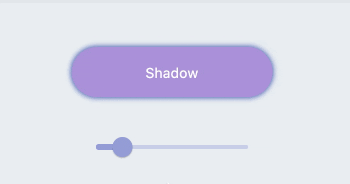
FButton(
  width: 200,
  text: "Shadow",
  textColor: Colors.white,
  color: Color(0xffffc900),
  onPressed: () {},
  clickEffect: true,
  corner: FCorner.all(28),

  /// 配置阴影颜色
  ///
  /// set shadow color
  shadowColor: Colors.black87,

  /// 设置组件高斯与阴影形状卷积的标准偏差。
  ///
  /// Sets the standard deviation of the component's Gaussian convolution with the shadow shape.
  shadowBlur: _shadowBlur,
),
FButton allows you to configure the color, size, and position of the shadow.
🍭
Neumorphism Style
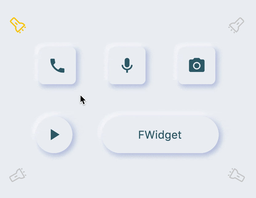
FButton(

  /// 开启 Neumorphism 支持
  ///
  /// Turn on Neumorphism support
  isSupportNeumorphism: true,

  /// 配置光源方向
  ///
  /// Configure light source direction
  lightOrientation: lightOrientation,

  /// 配置亮部阴影
  ///
  /// Configure highlight shadow
  highlightShadowColor: Colors.white,

  /// 配置暗部阴影
  ///
  /// Configure dark shadows
  shadowColor: mainShadowColor,
  strokeColor: mainBackgroundColor,
  strokeWidth: 3.0,
  width: 190,
  height: 60,
  text: "FWidget",
  style: TextStyle(
      color: mainTextTitleColor, fontSize: neumorphismSize_2_2),
  alignment: Alignment.center,
  color: mainBackgroundColor,
  ...
)
FButton brings an incredible, ultra-high texture Neumorphism style to developers.
Developers only need to configure the isSupportNeumorphism parameter to enable and disable the Neumorphism style.
If you want to adjust the style of Neumorphism, you can make subtle adjustments through several attributes related to Shadow, among which:
-
shadowColor: configure the shadow of the shadow
-
highlightShadowColor: configure highlight shadow
FButton also provides lightOrientation parameters, and even allows developers to adjust the care angle, and has obtained different Neumorphism effects.
😃
How to use?
Add dependencies in the project pubspec.yaml file:
🌐
pub dependency
dependencies:
  fbutton: ^<version number>
⚠️ Attention,please go to [pub] (https://pub.dev/packages/fbutton) to get the latest version number of FButton
🖥
git dependencies
dependencies:
  fbutton:
    git:
      url: '[email protected]:Fliggy-Mobile/fbutton.git'
      ref: '<Branch number or tag number>'
⚠️ Attention,please refer to [FButton] (https://github.com/Fliggy-Mobile/fbutton) official project for branch number or tag.
💡
License
Copyright 2020-present Fliggy Android Team <[email protected]>.

Licensed under the Apache License, Version 2.0 (the "License");
you may not use this file except in compliance with the License.
You may obtain a copy of the License at following link.

    http://www.apache.org/licenses/LICENSE-2.0

Unless required by applicable law or agreed to in writing, software
distributed under the License is distributed on an "AS IS" BASIS,
WITHOUT WARRANTIES OR CONDITIONS OF ANY KIND, either express or implied.
See the License for the specific language governing permissions and
limitations under the License.
Like it? Please cast your Star
🥰
!
How to run Demo project?
-
clone project to local
-
Enter the project
exampledirectory and run the following command
flutter create .
- Run the demo in
example


 1 Nov 17, 2021
 40 Mar 18, 2022
 7 Oct 2, 2022
 4 Jul 25, 2022
 149 Dec 10, 2022
 40 Apr 16, 2022
 3 Apr 22, 2022
 8 Sep 10, 2022
 25 Dec 14, 2022
 0 Jan 3, 2022
 3 Oct 4, 2022
 17 Nov 29, 2022
 69 Aug 27, 2022
 0 Dec 22, 2021
 45 Nov 3, 2022
 22 Nov 24, 2022
 3 Aug 2, 2022