An interesting and practical switch component.

Related tags

Templates fswitch
Overview

FSwitch

An interesting and practical switch component.

Supports setting tips, slider decorations, shadows, and good interaction.

Author:Newton([email protected])

English | 简体中文

Like it? Please cast your Star 🥰

Features

  • Support opening and closing tips

  • Support setting decoration for Slider

  • Support flexible configuration available state

  • More sense of space Shadow

  • Good switch interactive experience

🛠 Guide

⚙️ Parameters

Param Type Necessary Default desc
open bool false false Whether it is open. The default is false.
onChanged ValueChanged true null This function will be called back when the switch state changes.
width double false 59.23 width. Default 59.23, in line with aesthetics 😃
height double false null height. By default, it will be calculated according to [width], which is in line with aesthetics 😃
offset double false null Distance between slider and edge
openChild Widget false null Prompt style of open state
closeChild Widget false null Prompt style of closed state
childOffset double false null Tip to edge distance
color Color false null Background color when off
openColor Color false null Background color when open
sliderColor Color false null Slider color
enable bool false true it's usable or not
sliderChild Widget false null The component in the slider. Beyond the range will be cropped.
shadowColor Color false null Set component shadow color
shadowOffset Offset false null Set component shadow offset
shadowBlur double false 0.0 Set the standard deviation of the component Gaussian and shadow shape convolution

📺 Demo

🔩 Basic Demo

FSwitch(
  onChanged: (v) {},
)

FSwitch needs to always set onChanged in order to respond to the switch status.

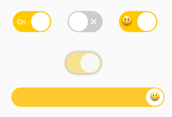
Available status & shadow

FSwitch(
  onChanged: (bool value) {
    value_1 = value;
  },
  open: value_1,
  enable: enable_1,
  shadowColor: Colors.black.withOpacity(0.5),
  shadowBlur: 3.0,
),

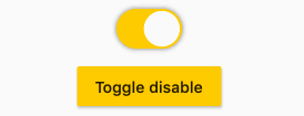
You can change the available status of FSwitch through enable. Once FSwitch becomes available, the switch state cannot be changed.

In addition, FSwitch provides flexible and convenient shadow configuration support.

🌝 Prompt

/// #1
FSwitch(
  width: 65.0,
  height: 35.538,
  onChanged: (v) {},
  closeChild: Text(
    "Off",
    style: TextStyle(
        color: Colors.white, fontSize: 11),
  ),
  openChild: Text(
    "On",
    style: TextStyle(
        color: Colors.white, fontSize: 11),
  ),
),

/// #2
FSwitch(
  open: true,
  onChanged: (v) {},
  closeChild: Icon(
    Icons.close,
    size: 16,
    color: Colors.white,
  ),
  openChild: Icon(
    Icons.check,
    size: 16,
    color: Colors.white,
  ),
),

/// #3
FSwitch(
  width: 65.0,
  height: 35.538,
  onChanged: (v) {},
  closeChild: Text(
    "😒",
    style: TextStyle(fontSize: 20),
  ),
  openChild: Text(
    "😃",
    style: TextStyle(fontSize: 20),
  ),
  childOffset: 3.0,
),

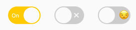
The open and closed status indicators can be set for FSwitch through openChild and closeChild, respectively.

👀 Slider decoration

FSwitch(
  width: 300,
  height: 38,
  onChanged: (bool value) {},
  sliderChild: Text(
    "😃",
    style: TextStyle(fontSize: 20),
  ),
)

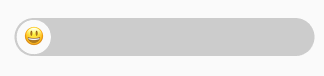
sliderChild will allow developers to set child decorations for Slider.

It's interesting!

😃 How to use?

Add dependencies in the project pubspec.yaml file:

🌐 pub dependency

dependencies:
  fswitch: ^<version number>

⚠️ Attention,please go to pub to get the latest version number of FSwitch

🖥 git dependencies

dependencies:
  fswitch:
    git:
      url: '[email protected]:Fliggy-Mobile/fswitch.git'
      ref: '<Branch number or tag number>'

⚠️ Attention,please refer to FSwitch official project for branch number or tag.

💡 License

Copyright 2020-present Fliggy Android Team <[email protected]>.

Licensed under the Apache License, Version 2.0 (the "License");
you may not use this file except in compliance with the License.
You may obtain a copy of the License at following link.

    http://www.apache.org/licenses/LICENSE-2.0

Unless required by applicable law or agreed to in writing, software
distributed under the License is distributed on an "AS IS" BASIS,
WITHOUT WARRANTIES OR CONDITIONS OF ANY KIND, either express or implied.
See the License for the specific language governing permissions and
limitations under the License.

Like it? Please cast your Star 🥰

You might also like...

A list component that refreshes and adds more data for Flutter.

Language: English | 中文简体 Dynamic List View A list component that can refreshes and adds more data for Flutter App. 🚀 github Installation Add this to

Sep 27, 2022

Call Kit is a prebuilt feature-rich call component, which enables you to build one-on-one and group voice/video calls into your app with only a few lines of code.

Call Kit is a prebuilt feature-rich call component, which enables you to build one-on-one and group voice/video calls into your app with only a few lines of code.

Call Kit (ZegoUIKitPrebuiltCall) Call Kit is a prebuilt feature-rich call component, which enables you to build one-on-one and group voice/video calls

Dec 26, 2022

A music player component for Flutter (i.e. Spotify, Apple Music, etc.) [AGPL/example/no longer maintaining]

A music player component for Flutter (i.e. Spotify, Apple Music, etc.) [AGPL/example/no longer maintaining]

This is an example I currently have no plans of putting this on Pub. Originally, I did, but I lost interest. However, I think this is a good example,

Dec 12, 2022

A radio component suitable for almost any radio scenario.

A radio component suitable for almost any radio scenario.

fradio A radio component suitable for almost any radio scenario. Supports excellent interactive special effects, as well as a simple multi-interactive

Nov 26, 2022

From then on, developers only need to master one Button component, which is enough.

From then on, developers only need to master one Button component, which is enough.

FButton From then on, developers only need to master one Button component, which is enough. Support corners, borders, icons, special effects, loading

Nov 22, 2022

The component created with Flutter using Dart programming language, inspired in Fluid Slider by Ramotion.

The component created with Flutter using Dart programming language, inspired in Fluid Slider by Ramotion.

Fluid Slider Flutter The component created with Flutter using Dart programming language, inspired in Fluid Slider by Ramotion. About The component was

Sep 30, 2022

Flutter component Gradient Progress Indicator

Gradient Progress Indicator Introduction This package shows a circular progress indicator with gradient colors, and it is possible insert texts inside

Dec 5, 2022

Flutter component concept created with Flutter using Dart programming language, inspired by Gooey Rab Bar.

Flutter component concept created with Flutter using Dart programming language, inspired by Gooey Rab Bar.

Gooey Tab Bar Flutter Flutter component concept created with Flutter using Dart programming language, inspired by Gooey Tab Bar. About This component

Dec 14, 2022

UI component for Niddler.

UI component for Niddler.

Niddler-ui Niddler is a network debugging utility for Android apps that caches network requests/responses, and exposes them over a websocket. It comes

Jan 8, 2022
Owner
Fliggy Mobile
We create legends
Fliggy Mobile
This is a practical guide to MVVM architecture in flutter with riverpod for state management.

flutter_mvvm This project is a practical guide to MVVM pattern in flutter with Riverpod. Install flutter Get your APIKEY from https://api.openweatherm

Augustine Victor 3 Jan 1, 2023
A beautiful switch made with Flutter

Crazy Switch Getting Started This project is a starting point for a Flutter application. A few resources to get you started if this is your first Flut

Pedro Massango 50 Nov 20, 2022
An easy to implement custom switch created for Flutter.

flutter_switch An easy to implement custom switch created for Flutter. Give it a custom height and width, border for the switch and toggle, border rad

Nickr 66 Dec 6, 2022
Beautiful Custom Switch package created with Flutter

custom_switch Beautiful Custom Switch package created with Flutter. The source code is 100% Dart, and everything resides in the /lib folder. Show some

Mohak Gupta 55 Sep 6, 2022
Flutter Xlive Switch

xlive_switch A Xlive Switcher plugin for Flutter Getting Started This plugin is based on Oleg Frolov's animation design which I found on Dribbble: htt

Châu Minh Phúc 15 Nov 4, 2022
Daynightswitch - A day night switch widget for Flutter.

DayNightSwitch A day night switch widget for Flutter. Installation Add to pubspec.yaml. dependencies: day_night_switch: Usage To use plugin, just i

Divyanshu Bhargava 103 Oct 25, 2022
Declaratively switch child widgets based on the current `Router` location.

Features Declaratively switch child widgets based on the current Router location. class SideBar extends StatelessWidget { Widget build(_){ re

gskinner team 7 Dec 12, 2022
Building a simple Flutter app * Switch Theme * for understanding the BLoC State Management including: Cubit Communications with StreamSubscription & Managing Route.

Building a simple Flutter app * Switch Theme * for understanding the BLoC State Management including: Cubit Communications with StreamSubscription & Managing Route.

TAD 1 Oct 3, 2022
A smart switch for you.

Features A smart switch for you.

Narendra Bhatt 2 Aug 26, 2022
Simple and fast Entity-Component-System (ECS) library written in Dart.

Fast ECS Simple and fast Entity-Component-System (ECS) library written in Dart. CPU Flame Chart Demonstration of performance for rotation of 1024 enti

Stanislav 8 Nov 16, 2022