

A flutter package which will help you to generate pin code fields with beautiful design and animations. Can be useful for OTP or pin code inputs
Features
💚
- Automatically focuses the next field on typing and focuses previous field on deletation
- Cursor support
⚡️ - Can be set to any length. (3-6 fields recommended)
- 3 different shapes for text fields
- Highly customizable
- 3 different types of animation for input texts
- Animated active, inactive, selected and disabled field color switching
- Autofocus option
- Otp-code pasting from clipboard
- iOS autofill support
- Error animation. Currently have shake animation only. Watch the example app for how to integrate.
- Works with Flutter's Form. You can use Form validator right off the bat.
- Get currently typed text and use your condition to validate it. (for example: if (currentText.length != 6 || currentText != "your desired code"))
- Haptic Feedback support
- Animated obscure widget support
- Single placeholder text
Getting Started
⚡️
Demo

Different Shapes


Notes
- To enable "Fill color" for each cells,
enableActiveFillmust be set totrue. The default value isfalse. - To change the keyboard type, for example to use only number keyboard, or only for email use
keyboardTypeparameter, default is [TextInputType.visiblePassword] FocosNodeandTextEditingControllerwill get disposed automatically. UseautoDisposeControllers = falseto disable it.- to use v5.0.0 or above, developers must have Flutter SDK 1.20.0 or above.
- to use v6.0.0 or above, developers must have Flutter SDK 1.22.0 or above.
Properties
🔖
/// The [BuildContext] of the application
  final BuildContext appContext;

  ///Box Shadow for Pincode
  final List<BoxShadow>? boxShadows;

  /// length of how many cells there should be. 3-8 is recommended by me
  final int length;

  /// you already know what it does i guess :P default is false
  final bool obscureText;

  /// Character used for obscuring text if obscureText is true.
  ///
  /// Must not be empty. Single character is recommended.
  ///
  /// Default is ● - 'Black Circle' (U+25CF)
  final String obscuringCharacter;

  /// Widget used to obscure text
  ///
  /// it overrides the obscuringCharacter
  final Widget? obscuringWidget;

  /// Whether to use haptic feedback or not
  ///
  ///
  final bool useHapticFeedback;

  /// Haptic Feedback Types
  ///
  /// heavy, medium, light links to respective impacts
  /// selection - selectionClick, vibrate - vibrate
  /// check [HapticFeedback] for more
  final HapticFeedbackTypes hapticFeedbackTypes;

  /// Decides whether typed character should be
  /// briefly shown before being obscured
  final bool blinkWhenObscuring;

  /// Blink Duration if blinkWhenObscuring is set to true
  final Duration blinkDuration;

  /// returns the current typed text in the fields
  final ValueChanged<String> onChanged;

  /// returns the typed text when all pins are set
  final ValueChanged<String>? onCompleted;

  /// returns the typed text when user presses done/next action on the keyboard
  final ValueChanged<String>? onSubmitted;

  /// the style of the text, default is [ fontSize: 20, fontWeight: FontWeight.bold]
  final TextStyle? textStyle;

  /// the style of the pasted text, default is [fontWeight: FontWeight.bold] while
  /// [TextStyle.color] is [ThemeData.accentColor]
  final TextStyle? pastedTextStyle;

  /// background color for the whole row of pin code fields.
  final Color? backgroundColor;

  /// This defines how the elements in the pin code field align. Default to [MainAxisAlignment.spaceBetween]
  final MainAxisAlignment mainAxisAlignment;

  /// [AnimationType] for the text to appear in the pin code field. Default is [AnimationType.slide]
  final AnimationType animationType;

  /// Duration for the animation. Default is [Duration(milliseconds: 150)]
  final Duration animationDuration;

  /// [Curve] for the animation. Default is [Curves.easeInOut]
  final Curve animationCurve;

  /// [TextInputType] for the pin code fields. default is [TextInputType.visiblePassword]
  final TextInputType keyboardType;

  /// If the pin code field should be autofocused or not. Default is [false]
  final bool autoFocus;

  /// Should pass a [FocusNode] to manage it from the parent
  final FocusNode? focusNode;

  /// A list of [TextInputFormatter] that goes to the TextField
  final List<TextInputFormatter> inputFormatters;

  /// Enable or disable the Field. Default is [true]
  final bool enabled;

  /// [TextEditingController] to control the text manually. Sets a default [TextEditingController()] object if none given
  final TextEditingController? controller;

  /// Enabled Color fill for individual pin fields, default is [false]
  final bool enableActiveFill;

  /// Auto dismiss the keyboard upon inputting the value for the last field. Default is [true]
  final bool autoDismissKeyboard;

  /// Auto dispose the [controller] and [FocusNode] upon the destruction of widget from the widget tree. Default is [true]
  final bool autoDisposeControllers;

  /// Configures how the platform keyboard will select an uppercase or lowercase keyboard.
  /// Only supports text keyboards, other keyboard types will ignore this configuration. Capitalization is locale-aware.
  /// - Copied from 'https://api.flutter.dev/flutter/services/TextCapitalization-class.html'
  /// Default is [TextCapitalization.none]
  final TextCapitalization textCapitalization;

  final TextInputAction textInputAction;

  /// Triggers the error animation
  final StreamController<ErrorAnimationType>? errorAnimationController;

  /// Callback method to validate if text can be pasted. This is helpful when we need to validate text before pasting.
  /// e.g. validate if text is number. Default will be pasted as received.
  final bool Function(String? text)? beforeTextPaste;

  /// Method for detecting a pin_code form tap
  /// work with all form windows
  final Function? onTap;

  /// Configuration for paste dialog. Read more [DialogConfig]
  final DialogConfig? dialogConfig;

  /// Theme for the pin cells. Read more [PinTheme]
  final PinTheme pinTheme;

  /// Brightness dark or light choices for iOS keyboard.
  final Brightness? keyboardAppearance;

  /// Validator for the [TextFormField]
  final FormFieldValidator<String>? validator;

  /// An optional method to call with the final value when the form is saved via
  /// [FormState.save].
  final FormFieldSetter<String>? onSaved;

  /// enables auto validation for the [TextFormField]
  /// Default is false
  final AutovalidateMode autovalidateMode;

  /// The vertical padding from the [PinCodeTextField] to the error text
  /// Default is 16.
  final double errorTextSpace;

  /// Enables pin autofill for TextFormField.
  /// Default is true
  final bool enablePinAutofill;

  /// Error animation duration
  final int errorAnimationDuration;

  /// Whether to show cursor or not
  final bool showCursor;

  /// The color of the cursor, default to Theme.of(context).accentColor
  final Color? cursorColor;

  /// width of the cursor, default to 2
  final double cursorWidth;

  /// Height of the cursor, default to FontSize + 8;
  final double? cursorHeight;

  /// Autofill cleanup action
  final AutofillContextAction onAutoFillDisposeAction;

  /// Use external [AutoFillGroup]
  final bool useExternalAutoFillGroup;

  /// Displays a hint or placeholder in the field if it's value is empty.
  /// It only appears if it's not null. Single character is recommended.
  final String? hintCharacter;

  /// the style of the [hintCharacter], default is [fontSize: 20, fontWeight: FontWeight.bold]
  /// and it also uses the [textStyle]'s properties
  /// [TextStyle.color] is [Colors.grey]
  final TextStyle? hintStyle;

<<<<<<< HEAD
  /// ScrollPadding for the text field. Same as [TextFormField]'s scrollPadding
  final EdgeInsets scrollPadding;

=======
  /// ScrollPadding follows the same property as TextField's ScrollPadding, default to
  /// const EdgeInsets.all(20),
  final EdgeInsets scrollPadding;
>>>>>>> 8272cbfd8a1dab43b2b4f4f1107752dda1d9d230
PinTheme
/// Colors of the input fields which have inputs. Default is [Colors.green]
  final Color activeColor;

  /// Color of the input field which is currently selected. Default is [Colors.blue]
  final Color selectedColor;

  /// Colors of the input fields which don't have inputs. Default is [Colors.red]
  final Color inactiveColor;

  /// Colors of the input fields if the [PinCodeTextField] is disabled. Default is [Colors.grey]
  final Color disabledColor;

  /// Colors of the input fields which have inputs. Default is [Colors.green]
  final Color activeFillColor;

  /// Color of the input field which is currently selected. Default is [Colors.blue]
  final Color selectedFillColor;

  /// Colors of the input fields which don't have inputs. Default is [Colors.red]
  final Color inactiveFillColor;

  /// Color of the input field when in error mode. Default is [Colors.redAccent]
  final Color errorBorderColor;

  /// Border radius of each pin code field
  final BorderRadius borderRadius;

  /// [height] for the pin code field. default is [50.0]
  final double fieldHeight;

  /// [width] for the pin code field. default is [40.0]
  final double fieldWidth;

  /// Border width for the each input fields. Default is [2.0]
  final double borderWidth;

  /// this defines the shape of the input fields. Default is underlined
  final PinCodeFieldShape shape;
DialogConfig
/// title of the [AlertDialog] while pasting the code. Default to [Paste Code]
  final String dialogTitle;

  /// content of the [AlertDialog] while pasting the code. Default to ["Do you want to paste this code "]
  final String dialogContent;

  /// Affirmative action text for the [AlertDialog]. Default to "Paste"
  final String affirmativeText;

  /// Negative action text for the [AlertDialog]. Default to "Cancel"
  final String negativeText;

  /// The default dialog theme, should it be iOS or other(including web and Android)
  final Platform platform; //enum Platform { iOS, other } other indicates for web and android
Contributors
✨
Thanks to everyone whoever suggested their thoughts to improve this package. And special thanks goes to these people:
<<<<<<< HEAD ======= >>>>>>> 8272cbfd8a1dab43b2b4f4f1107752dda1d9d230


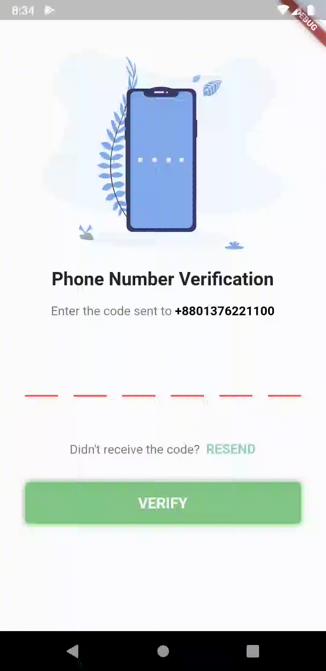
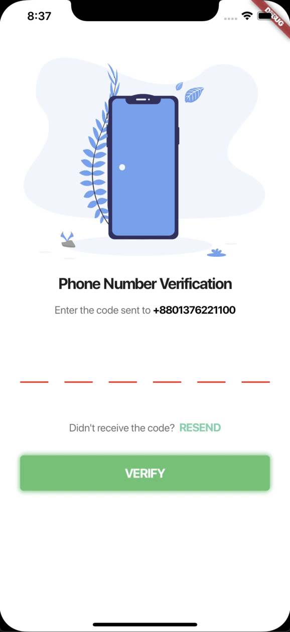
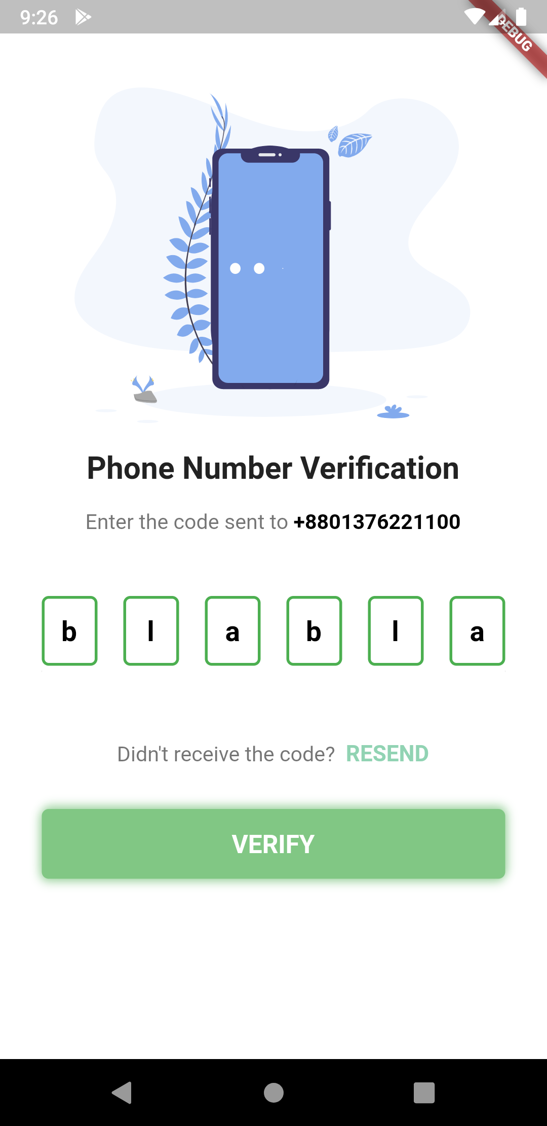
The pin code text field widget example
PinCodeTextField(
  length: 6,
  obscureText: false,
  animationType: AnimationType.fade,
  pinTheme: PinTheme(
    shape: PinCodeFieldShape.box,
    borderRadius: BorderRadius.circular(5),
    fieldHeight: 50,
    fieldWidth: 40,
    activeFillColor: Colors.white,
  ),
  animationDuration: Duration(milliseconds: 300),
  backgroundColor: Colors.blue.shade50,
  enableActiveFill: true,
  errorAnimationController: errorController,
  controller: textEditingController,
  onCompleted: (v) {
    print("Completed");
  },
  onChanged: (value) {
    print(value);
    setState(() {
      currentText = value;
    });
  },
  beforeTextPaste: (text) {
    print("Allowing to paste $text");
    //if you return true then it will show the paste confirmation dialog. Otherwise if false, then nothing will happen.
    //but you can show anything you want here, like your pop up saying wrong paste format or etc
    return true;
  },
)
Shape can be among these 3 types
enum PinCodeFieldShape { box, underline, circle }
Animations can be among these 3 types
enum AnimationType { scale, slide, fade, none }
Haptic Feedbacks can be among these 5 types
enum HapticFeedbackTypes {
  heavy,
  light,
  medium,
  selection,
  vibrate,
}
Trigger Error animation
- Create a StreamController
StreamController<ErrorAnimationType> errorController = StreamController<ErrorAnimationType>();
- And pass the controller like this.
PinCodeTextField(
  length: 6,
  obscureText: false,
  animationType: AnimationType.fade,
  animationDuration: Duration(milliseconds: 300),
  errorAnimationController: errorController, // Pass it here
  onChanged: (value) {
    setState(() {
      currentText = value;
    });
  },
)
- Then you can trigger the animation just by writing this:
errorController.add(ErrorAnimationType.shake); // This will shake the pin code field
This full code is from the example folder. You can run the example to see.
_PinCodeVerificationScreenState(); } class _PinCodeVerificationScreenState extends State
{ var onTapRecognizer; TextEditingController textEditingController = TextEditingController(); // ..text = "123456"; StreamController
errorController; bool hasError = false; String currentText = ""; final GlobalKey
scaffoldKey = GlobalKey
(); final formKey = GlobalKey
(); @override void initState() { onTapRecognizer = TapGestureRecognizer() ..onTap = () { Navigator.pop(context); }; errorController = StreamController
(); super.initState(); } @override void dispose() { errorController.close(); super.dispose(); } @override Widget build(BuildContext context) { return Scaffold( backgroundColor: Colors.blue.shade50, key: scaffoldKey, body: GestureDetector( onTap: () {}, child: Container( height: MediaQuery.of(context).size.height, width: MediaQuery.of(context).size.width, child: ListView( children:
[ SizedBox(height: 30), Container( height: MediaQuery.of(context).size.height / 3, child: FlareActor( "assets/otp.flr", animation: "otp", fit: BoxFit.fitHeight, alignment: Alignment.center, ), ), SizedBox(height: 8), Padding( padding: const EdgeInsets.symmetric(vertical: 8.0), child: Text( 'Phone Number Verification', style: TextStyle(fontWeight: FontWeight.bold, fontSize: 22), textAlign: TextAlign.center, ), ), Padding( padding: const EdgeInsets.symmetric(horizontal: 30.0, vertical: 8), child: RichText( text: TextSpan( text: "Enter the code sent to ", children: [ TextSpan( text: widget.phoneNumber, style: TextStyle( color: Colors.black, fontWeight: FontWeight.bold, fontSize: 15)), ], style: TextStyle(color: Colors.black54, fontSize: 15)), textAlign: TextAlign.center, ), ), SizedBox( height: 20, ), Form( key: formKey, child: Padding( padding: const EdgeInsets.symmetric( vertical: 8.0, horizontal: 30), child: PinCodeTextField( appContext: context, pastedTextStyle: TextStyle( color: Colors.green.shade600, fontWeight: FontWeight.bold, ), length: 6, obscureText: false, obscuringCharacter: '*', animationType: AnimationType.fade, validator: (v) { if (v.length < 3) { return "I'm from validator"; } else { return null; } }, pinTheme: PinTheme( shape: PinCodeFieldShape.box, borderRadius: BorderRadius.circular(5), fieldHeight: 60, fieldWidth: 50, activeFillColor: hasError ? Colors.orange : Colors.white, ), cursorColor: Colors.black, animationDuration: Duration(milliseconds: 300), textStyle: TextStyle(fontSize: 20, height: 1.6), backgroundColor: Colors.blue.shade50, enableActiveFill: true, errorAnimationController: errorController, controller: textEditingController, keyboardType: TextInputType.number, boxShadows: [ BoxShadow( offset: Offset(0, 1), color: Colors.black12, blurRadius: 10, ) ], onCompleted: (v) { print("Completed"); }, // onTap: () { // print("Pressed"); // }, onChanged: (value) { print(value); setState(() { currentText = value; }); }, beforeTextPaste: (text) { print("Allowing to paste $text"); //if you return true then it will show the paste confirmation dialog. Otherwise if false, then nothing will happen. //but you can show anything you want here, like your pop up saying wrong paste format or etc return true; }, )), ), Padding( padding: const EdgeInsets.symmetric(horizontal: 30.0), child: Text( hasError ? "*Please fill up all the cells properly" : "", style: TextStyle( color: Colors.red, fontSize: 12, fontWeight: FontWeight.w400), ), ), SizedBox( height: 20, ), RichText( textAlign: TextAlign.center, text: TextSpan( text: "Didn't receive the code? ", style: TextStyle(color: Colors.black54, fontSize: 15), children: [ TextSpan( text: " RESEND", recognizer: onTapRecognizer, style: TextStyle( color: Color(0xFF91D3B3), fontWeight: FontWeight.bold, fontSize: 16)) ]), ), SizedBox( height: 14, ), Container( margin: const EdgeInsets.symmetric(vertical: 16.0, horizontal: 30), child: ButtonTheme( height: 50, child: FlatButton( onPressed: () { formKey.currentState.validate(); // conditions for validating if (currentText.length != 6 || currentText != "towtow") { errorController.add(ErrorAnimationType .shake); // Triggering error shake animation setState(() { hasError = true; }); } else { setState(() { hasError = false; scaffoldKey.currentState.showSnackBar(SnackBar( content: Text("Aye!!"), duration: Duration(seconds: 2), )); }); } }, child: Center( child: Text( "VERIFY".toUpperCase(), style: TextStyle( color: Colors.white, fontSize: 18, fontWeight: FontWeight.bold), )), ), ), decoration: BoxDecoration( color: Colors.green.shade300, borderRadius: BorderRadius.circular(5), boxShadow: [ BoxShadow( color: Colors.green.shade200, offset: Offset(1, -2), blurRadius: 5), BoxShadow( color: Colors.green.shade200, offset: Offset(-1, 2), blurRadius: 5) ]), ), SizedBox( height: 16, ), Row( mainAxisAlignment: MainAxisAlignment.center, children:
[ FlatButton( child: Text("Clear"), onPressed: () { textEditingController.clear(); }, ), FlatButton( child: Text("Set Text"), onPressed: () { textEditingController.text = "123456"; }, ), ], ) ], ), ), ), ); } } ">
class MyApp extends StatelessWidget {
  // This widget is the root of your application.
  @override
  Widget build(BuildContext context) {
    return MaterialApp(
      title: 'Flutter Demo',
      theme: ThemeData(
        primarySwatch: Colors.blue,
      ),
      home: PinCodeVerificationScreen(
          "+8801376221100"), // a random number, please don't call xD
    );
  }
}

class PinCodeVerificationScreen extends StatefulWidget {
  final String phoneNumber;

  PinCodeVerificationScreen(this.phoneNumber);

  @override
  _PinCodeVerificationScreenState createState() =>
      _PinCodeVerificationScreenState();
}

class _PinCodeVerificationScreenState extends State<PinCodeVerificationScreen> {
  var onTapRecognizer;

  TextEditingController textEditingController = TextEditingController();
  // ..text = "123456";

  StreamController<ErrorAnimationType> errorController;

  bool hasError = false;
  String currentText = "";
  final GlobalKey<ScaffoldState> scaffoldKey = GlobalKey<ScaffoldState>();
  final formKey = GlobalKey<FormState>();

  @override
  void initState() {
    onTapRecognizer = TapGestureRecognizer()
      ..onTap = () {
        Navigator.pop(context);
      };
    errorController = StreamController<ErrorAnimationType>();
    super.initState();
  }

  @override
  void dispose() {
    errorController.close();

    super.dispose();
  }

  @override
  Widget build(BuildContext context) {
    return Scaffold(
      backgroundColor: Colors.blue.shade50,
      key: scaffoldKey,
      body: GestureDetector(
        onTap: () {},
        child: Container(
          height: MediaQuery.of(context).size.height,
          width: MediaQuery.of(context).size.width,
          child: ListView(
            children: <Widget>[
              SizedBox(height: 30),
              Container(
                height: MediaQuery.of(context).size.height / 3,
                child: FlareActor(
                  "assets/otp.flr",
                  animation: "otp",
                  fit: BoxFit.fitHeight,
                  alignment: Alignment.center,
                ),
              ),
              SizedBox(height: 8),
              Padding(
                padding: const EdgeInsets.symmetric(vertical: 8.0),
                child: Text(
                  'Phone Number Verification',
                  style: TextStyle(fontWeight: FontWeight.bold, fontSize: 22),
                  textAlign: TextAlign.center,
                ),
              ),
              Padding(
                padding:
                    const EdgeInsets.symmetric(horizontal: 30.0, vertical: 8),
                child: RichText(
                  text: TextSpan(
                      text: "Enter the code sent to ",
                      children: [
                        TextSpan(
                            text: widget.phoneNumber,
                            style: TextStyle(
                                color: Colors.black,
                                fontWeight: FontWeight.bold,
                                fontSize: 15)),
                      ],
                      style: TextStyle(color: Colors.black54, fontSize: 15)),
                  textAlign: TextAlign.center,
                ),
              ),
              SizedBox(
                height: 20,
              ),
              Form(
                key: formKey,
                child: Padding(
                    padding: const EdgeInsets.symmetric(
                        vertical: 8.0, horizontal: 30),
                    child: PinCodeTextField(
                      appContext: context,
                      pastedTextStyle: TextStyle(
                        color: Colors.green.shade600,
                        fontWeight: FontWeight.bold,
                      ),
                      length: 6,
                      obscureText: false,
                      obscuringCharacter: '*',
                      animationType: AnimationType.fade,
                      validator: (v) {
                        if (v.length < 3) {
                          return "I'm from validator";
                        } else {
                          return null;
                        }
                      },
                      pinTheme: PinTheme(
                        shape: PinCodeFieldShape.box,
                        borderRadius: BorderRadius.circular(5),
                        fieldHeight: 60,
                        fieldWidth: 50,
                        activeFillColor:
                            hasError ? Colors.orange : Colors.white,
                      ),
                      cursorColor: Colors.black,
                      animationDuration: Duration(milliseconds: 300),
                      textStyle: TextStyle(fontSize: 20, height: 1.6),
                      backgroundColor: Colors.blue.shade50,
                      enableActiveFill: true,
                      errorAnimationController: errorController,
                      controller: textEditingController,
                      keyboardType: TextInputType.number,
                      boxShadows: [
                        BoxShadow(
                          offset: Offset(0, 1),
                          color: Colors.black12,
                          blurRadius: 10,
                        )
                      ],
                      onCompleted: (v) {
                        print("Completed");
                      },
                      // onTap: () {
                      //   print("Pressed");
                      // },
                      onChanged: (value) {
                        print(value);
                        setState(() {
                          currentText = value;
                        });
                      },
                      beforeTextPaste: (text) {
                        print("Allowing to paste $text");
                        //if you return true then it will show the paste confirmation dialog. Otherwise if false, then nothing will happen.
                        //but you can show anything you want here, like your pop up saying wrong paste format or etc
                        return true;
                      },
                    )),
              ),
              Padding(
                padding: const EdgeInsets.symmetric(horizontal: 30.0),
                child: Text(
                  hasError ? "*Please fill up all the cells properly" : "",
                  style: TextStyle(
                      color: Colors.red,
                      fontSize: 12,
                      fontWeight: FontWeight.w400),
                ),
              ),
              SizedBox(
                height: 20,
              ),
              RichText(
                textAlign: TextAlign.center,
                text: TextSpan(
                    text: "Didn't receive the code? ",
                    style: TextStyle(color: Colors.black54, fontSize: 15),
                    children: [
                      TextSpan(
                          text: " RESEND",
                          recognizer: onTapRecognizer,
                          style: TextStyle(
                              color: Color(0xFF91D3B3),
                              fontWeight: FontWeight.bold,
                              fontSize: 16))
                    ]),
              ),
              SizedBox(
                height: 14,
              ),
              Container(
                margin:
                    const EdgeInsets.symmetric(vertical: 16.0, horizontal: 30),
                child: ButtonTheme(
                  height: 50,
                  child: FlatButton(
                    onPressed: () {
                      formKey.currentState.validate();
                      // conditions for validating
                      if (currentText.length != 6 || currentText != "towtow") {
                        errorController.add(ErrorAnimationType
                            .shake); // Triggering error shake animation
                        setState(() {
                          hasError = true;
                        });
                      } else {
                        setState(() {
                          hasError = false;
                          scaffoldKey.currentState.showSnackBar(SnackBar(
                            content: Text("Aye!!"),
                            duration: Duration(seconds: 2),
                          ));
                        });
                      }
                    },
                    child: Center(
                        child: Text(
                      "VERIFY".toUpperCase(),
                      style: TextStyle(
                          color: Colors.white,
                          fontSize: 18,
                          fontWeight: FontWeight.bold),
                    )),
                  ),
                ),
                decoration: BoxDecoration(
                    color: Colors.green.shade300,
                    borderRadius: BorderRadius.circular(5),
                    boxShadow: [
                      BoxShadow(
                          color: Colors.green.shade200,
                          offset: Offset(1, -2),
                          blurRadius: 5),
                      BoxShadow(
                          color: Colors.green.shade200,
                          offset: Offset(-1, 2),
                          blurRadius: 5)
                    ]),
              ),
              SizedBox(
                height: 16,
              ),
              Row(
                mainAxisAlignment: MainAxisAlignment.center,
                children: <Widget>[
                  FlatButton(
                    child: Text("Clear"),
                    onPressed: () {
                      textEditingController.clear();
                    },
                  ),
                  FlatButton(
                    child: Text("Set Text"),
                    onPressed: () {
                      textEditingController.text = "123456";
                    },
                  ),
                ],
              )
            ],
          ),
        ),
      ),
    );
  }
}


![[Feature]: Add LastPin](https://avatars.githubusercontent.com/u/18512224?v=4)


 1.4k Jan 6, 2023
 97 Jan 6, 2023
 3 Dec 11, 2021
 10 Nov 3, 2022
 3 Sep 6, 2021
 33 Dec 29, 2020
 462 Jan 3, 2023
 237 Nov 15, 2022
 10 Nov 28, 2022
 879 Dec 31, 2022
 6 Apr 26, 2022
 171 Sep 23, 2022
 894 Jan 2, 2023
 17 Oct 13, 2022
 427 Nov 26, 2022
 19 Nov 18, 2022
 65 Nov 10, 2022
 25 Apr 16, 2021