Flutter percent indicator library

Overview

Percent Indicator

pub package

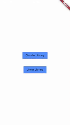
Circular and Linear percent indicators

drawing drawing

Features

  • Circle percent indicator
  • Linear percent indicator
  • Toggle animation
  • Custom duration of the animation
  • Progress based on a percentage value
  • Progress and background color
  • Custom size
  • Left , right or center child for Linear percent indicator
  • Top, bottom or center child for Circular percent indicator
  • Progress Color using gradients

Getting started

You should ensure that you add the router as a dependency in your flutter project.

dependencies:
 percent_indicator: "^2.1.7+2"

You should then run flutter packages upgrade or update your packages in IntelliJ.

Example Project

There is a example project in the example folder. Check it out. Otherwise, keep reading to get up and running.

Usage

Need to include the import the package to the dart file where it will be used, use the below command,

import 'package:percent_indicator/percent_indicator.dart';

Circular percent indicator

Basic Widget

new CircularPercentIndicator(
                  radius: 60.0,
                  lineWidth: 5.0,
                  percent: 1.0,
                  center: new Text("100%"),
                  progressColor: Colors.green,
                )

Complete example

  @override
  Widget build(BuildContext context) {
    return Scaffold(
      appBar: new AppBar(
        title: new Text("Circular Percent Indicators"),
      ),
          body: Center(
        child: ListView(
            children: <Widget>[
              new CircularPercentIndicator(
                radius: 100.0,
                lineWidth: 10.0,
                percent: 0.8,
                header: new Text("Icon header"),
                center: new Icon(
                  Icons.person_pin,
                  size: 50.0,
                  color: Colors.blue,
                ),
                backgroundColor: Colors.grey,
                progressColor: Colors.blue,
              ),
              new CircularPercentIndicator(
                radius: 130.0,
                animation: true,
                animationDuration: 1200,
                lineWidth: 15.0,
                percent: 0.4,
                center: new Text(
                  "40 hours",
                  style:
                      new TextStyle(fontWeight: FontWeight.bold, fontSize: 20.0),
                ),
                circularStrokeCap: CircularStrokeCap.butt,
                backgroundColor: Colors.yellow,
                progressColor: Colors.red,
              ),
              new CircularPercentIndicator(
                radius: 120.0,
                lineWidth: 13.0,
                animation: true,
                percent: 0.7,
                center: new Text(
                  "70.0%",
                  style:
                      new TextStyle(fontWeight: FontWeight.bold, fontSize: 20.0),
                ),
                footer: new Text(
                  "Sales this week",
                  style:
                      new TextStyle(fontWeight: FontWeight.bold, fontSize: 17.0),
                ),
                circularStrokeCap: CircularStrokeCap.round,
                progressColor: Colors.purple,
              ),
              Padding(
                padding: EdgeInsets.all(15.0),
                child: new CircularPercentIndicator(
                  radius: 60.0,
                  lineWidth: 5.0,
                  percent: 1.0,
                  center: new Text("100%"),
                  progressColor: Colors.green,
                ),
              ),
              Container(
                padding: EdgeInsets.all(15.0),
                child: new Row(
                  mainAxisAlignment: MainAxisAlignment.center,
                  children: <Widget>[
                    new CircularPercentIndicator(
                      radius: 45.0,
                      lineWidth: 4.0,
                      percent: 0.10,
                      center: new Text("10%"),
                      progressColor: Colors.red,
                    ),
                    new Padding(
                      padding: EdgeInsets.symmetric(horizontal: 10.0),
                    ),
                    new CircularPercentIndicator(
                      radius: 45.0,
                      lineWidth: 4.0,
                      percent: 0.30,
                      center: new Text("30%"),
                      progressColor: Colors.orange,
                    ),
                    new Padding(
                      padding: EdgeInsets.symmetric(horizontal: 10.0),
                    ),
                    new CircularPercentIndicator(
                      radius: 45.0,
                      lineWidth: 4.0,
                      percent: 0.60,
                      center: new Text("60%"),
                      progressColor: Colors.yellow,
                    ),
                    new Padding(
                      padding: EdgeInsets.symmetric(horizontal: 10.0),
                    ),
                    new CircularPercentIndicator(
                      radius: 45.0,
                      lineWidth: 4.0,
                      percent: 0.90,
                      center: new Text("90%"),
                      progressColor: Colors.green,
                    )
                  ],
                ),
              )
            ]),
      ),
    );
  }

Linear percent indicator

Basic Widget

new LinearPercentIndicator(
                width: 140.0,
                lineHeight: 14.0,
                percent: 0.5,
                backgroundColor: Colors.grey,
                progressColor: Colors.blue,
              ),

Complete example

@override
  Widget build(BuildContext context) {
    return Scaffold(
      appBar: new AppBar(
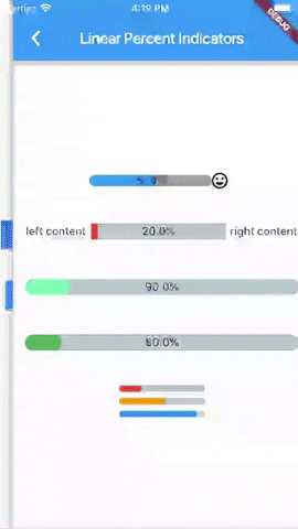
        title: new Text("Linear Percent Indicators"),
      ),
      body: Center(
        child: Column(
          mainAxisAlignment: MainAxisAlignment.center,
          children: <Widget>[
            Padding(
              padding: EdgeInsets.all(15.0),
              child: new LinearPercentIndicator(
                width: 140.0,
                lineHeight: 14.0,
                percent: 0.5,
                center: Text(
                  "50.0%",
                  style: new TextStyle(fontSize: 12.0),
                ),
                trailing: Icon(Icons.mood),
                linearStrokeCap: LinearStrokeCap.roundAll,
                backgroundColor: Colors.grey,
                progressColor: Colors.blue,
              ),
            ),
            Padding(
              padding: EdgeInsets.all(15.0),
              child: new LinearPercentIndicator(
                width: 170.0,
                animation: true,
                animationDuration: 1000,
                lineHeight: 20.0,
                leading: new Text("left content"),
                trailing: new Text("right content"),
                percent: 0.2,
                center: Text("20.0%"),
                linearStrokeCap: LinearStrokeCap.butt,
                progressColor: Colors.red,
              ),
            ),
            Padding(
              padding: EdgeInsets.all(15.0),
              child: new LinearPercentIndicator(
                width: MediaQuery.of(context).size.width - 50,
                animation: true,
                lineHeight: 20.0,
                animationDuration: 2000,
                percent: 0.9,
                center: Text("90.0%"),
                linearStrokeCap: LinearStrokeCap.roundAll,
                progressColor: Colors.greenAccent,
              ),
            ),
            Padding(
              padding: EdgeInsets.all(15.0),
              child: new LinearPercentIndicator(
                width: MediaQuery.of(context).size.width - 50,
                animation: true,
                lineHeight: 20.0,
                animationDuration: 2500,
                percent: 0.8,
                center: Text("80.0%"),
                linearStrokeCap: LinearStrokeCap.roundAll,
                progressColor: Colors.green,
              ),
            ),
            Padding(
              padding: EdgeInsets.all(15.0),
              child: Column(
                children: <Widget>[
                  new LinearPercentIndicator(
                    width: 100.0,
                    lineHeight: 8.0,
                    percent: 0.2,
                    progressColor: Colors.red,
                  ),
                  new LinearPercentIndicator(
                    width: 100.0,
                    lineHeight: 8.0,
                    percent: 0.5,
                    progressColor: Colors.orange,
                  ),
                  new LinearPercentIndicator(
                    width: 100.0,
                    lineHeight: 8.0,
                    percent: 0.9,
                    progressColor: Colors.blue,
                  )
                ],
              ),
            ),
          ],
        ),
      ),
    );
  }

You can follow me on twitter @diegoveloper

Comments
  • Animation does not work for ongoing tasks

    Animation does not work for ongoing tasks

    Hey! First of all thanks for such great library. I use it a lot! But one issue I have is to show a ongoing task progress indication, like a download progress. If I set the animation to true, it always animate from 0 to the current progress, instead of animating the latest progress value to the current.

    Thanks a lot!

    opened by shinayser 21
  • Feature Request: Attach widget to percentage bar

    Feature Request: Attach widget to percentage bar

    Hello. I think this is not yet possible, but it would probably be a nice addition to the package.

    I created an example image of what could be the result:

    Imgur

    It doesn't necessarily have to be an icon, but it's the idea I had in mind. Ideally the widget attached should be able to pass over the bar limits (as shown in the image) to create a better effect.

    I'm not sure if this would be possible/trickier for the circular progress indicator, as there might be a need (option?) to rotate the widget as it moves.

    opened by Manuito83 19
  • how to do the background of the circle

    how to do the background of the circle

    Hi,

    your library is very good, I do have a question.

    now I'm doing this (see image)

    ` CircularPercentIndicator( radius: 200.0, lineWidth: 10.0, percent: _percent, animation: true, fillColor: UIConstant.backgroundColor, animateFromLastPercent: true, center: SizedBox( child: Stack( children: [

                ],
              ),
              height: 180,
              width: 200,
            ),
            backgroundColor: UIConstant.darkColor,
            progressColor: UIConstant.lightColor,
          ),
    

    `

    I only want fillcolor to be the background of the circle.

    how can I achieve that ?

    also Container is creating a square instead of clipping should we use ClipRRect to the container

    Screenshot_1589713193

    Thanks

    opened by superciccio 18
  • [Bug] [Regression] Cannot get size from a render object that has not been through layout.

    [Bug] [Regression] Cannot get size from a render object that has not been through layout.

    Exception
    ════════ Exception caught by scheduler library ═════════════════════════════════════════════════════
    The following assertion was thrown during a scheduler callback:
    Cannot get size from a render object that has not been through layout.
    
    
    The size of this render object has not yet been determined because this render object has not yet been through layout, which typically means that the size getter was called too early in the pipeline (e.g., during the build phase) before the framework has determined the size and position of the render objects during layout.
    
    The size getter was called for the following element: CustomPaint-[GlobalKey#e3044]
      renderObject: RenderCustomPaint#3698b NEEDS-LAYOUT NEEDS-PAINT
    The render object from which the size was to be obtained was: RenderCustomPaint#3698b NEEDS-LAYOUT NEEDS-PAINT
    ...  parentData: not positioned; offset=Offset(0.0, 0.0)
    ...  constraints: MISSING
    ...  size: MISSING
    When the exception was thrown, this was the stack: 
    #0      Element.size.<anonymous closure> (package:flutter/src/widgets/framework.dart:3861:9)
    #1      Element.size (package:flutter/src/widgets/framework.dart:3893:6)
    #2      _LinearPercentIndicatorState.initState.<anonymous closure>.<anonymous closure> (package:percent_indicator/linear_percent_indicator.dart:149:58)
    #3      State.setState (package:flutter/src/widgets/framework.dart:1244:30)
    #4      _LinearPercentIndicatorState.initState.<anonymous closure> (package:percent_indicator/linear_percent_indicator.dart:148:9)
    ...
    
    Stacktrace from my real app
    I/flutter (31953): ════════════════════════════════════════════════════════════════════════════════════════════════════
    I/flutter (31953): ══╡ EXCEPTION CAUGHT BY SCHEDULER LIBRARY ╞═════════════════════════════════════════════════════════
    I/flutter (31953): The following assertion was thrown during a scheduler callback:
    I/flutter (31953): Cannot get size from a render object that has not been through layout.
    I/flutter (31953): The size of this render object has not yet been determined because this render object has not yet
    I/flutter (31953): been through layout, which typically means that the size getter was called too early in the pipeline
    I/flutter (31953): (e.g., during the build phase) before the framework has determined the size and position of the
    I/flutter (31953): render objects during layout.
    I/flutter (31953): The size getter was called for the following element:
    I/flutter (31953):   CustomPaint-[GlobalKey#ee9a4]
    I/flutter (31953): The render object from which the size was to be obtained was: RenderCustomPaint#0356a NEEDS-LAYOUT NEEDS-PAINT:
    I/flutter (31953):   creator: CustomPaint-[GlobalKey#ee9a4] ← Stack ← Padding ← ConstrainedBox ← Container ← Expanded ←
    I/flutter (31953):     Row ← ColoredBox ← Container ← DefaultTextStyle ← AnimatedDefaultTextStyle ←
    I/flutter (31953):     _InkFeatures-[GlobalKey#86c62 ink renderer] ← ⋯
    I/flutter (31953):   parentData: not positioned; offset=Offset(0.0, 0.0)
    I/flutter (31953):   constraints: MISSING
    I/flutter (31953):   size: MISSING
    I/flutter (31953): 
    I/flutter (31953): When the exception was thrown, this was the stack:
    I/flutter (31953): #0      Element.size.<anonymous closure> (package:flutter/src/widgets/framework.dart:3861:9)
    I/flutter (31953): #1      Element.size (package:flutter/src/widgets/framework.dart:3893:6)
    I/flutter (31953): #2      _LinearPercentIndicatorState.initState.<anonymous closure>.<anonymous closure> (package:percent_indicator/linear_percent_indicator.dart:149:58)
    I/flutter (31953): #3      State.setState (package:flutter/src/widgets/framework.dart:1244:30)
    I/flutter (31953): #4      _LinearPercentIndicatorState.initState.<anonymous closure> (package:percent_indicator/linear_percent_indicator.dart:148:9)
    I/flutter (31953): #5      SchedulerBinding._invokeFrameCallback (package:flutter/src/scheduler/binding.dart:1117:15)
    I/flutter (31953): #6      SchedulerBinding.handleDrawFrame (package:flutter/src/scheduler/binding.dart:1063:9)
    I/flutter (31953): #7      SchedulerBinding._handleDrawFrame (package:flutter/src/scheduler/binding.dart:971:5)
    I/flutter (31953): #11     _invoke (dart:ui/hooks.dart:251:10)
    I/flutter (31953): #12     _drawFrame (dart:ui/hooks.dart:209:3)
    I/flutter (31953): (elided 3 frames from dart:async)
    I/flutter (31953): ════════════════════════════════════════════════════════════════════════════════════════════════════
    

    Steps to reproduce:

    1. Open Pixel emulator (I was able to consistently reproduce it on Pixel 1)
    2. Run https://github.com/BaranMichal25/percent_indicator_crash
    3. Click PercentIndicator (shows a dialog)
    4. Rotate device
    5. Close the dialog by clicking somewhere around it
    6. Exception is thrown

    Is this a regression? Yes - doesn't happen on version 2.1.6

    Does it crash app? No, just throwing exception

    Comment: Took me a half-day to create this example and I realise code might look a bit weird, but it's a minified version of a real, legitimate app. I noticed it also happened to other people here: https://github.com/diegoveloper/flutter_percent_indicator/issues/73 so thought I will share this example.

    opened by PawlikMichal25 16
  • Reversing progress start animation from 0.0%

    Reversing progress start animation from 0.0%

    When you increase the percentage with animateFromLastPercent = true the animation starts from the last value and ends at the new value. However when reducing the value the animation starts from 0 and ends at the new value.

    For example: 50% -> 75% animates from 50% to 75% 50% -> 25% animates from 0% to 25%

    Is there support for reversing animation if newValue < currentValue?

    opened by joelbrostrom 15
  • RTL orientation

    RTL orientation

    Hi Thanks very much for this package. My problem is that I want the tape to appear from right to left. Although I use Directionality widget It did not work isuss

    opened by ahmednet0001 13
  • Version 4.2.2 not Compatible with Flutter version 2.10.3 (Dart version	2.16.1)

    Version 4.2.2 not Compatible with Flutter version 2.10.3 (Dart version 2.16.1)

    Hello I have the 2.10.3 flutter version in my code. Screenshot 2022-10-31 at 12 04 27

    And when I try to upgrade my version to use the 4.2.2 I receive that the Flutter version is insufficient to upgrade your package. displays the following message

    Screenshot 2022-10-31 at 12 01 06

    According to the package page you support Dart sdk 2.12.0. Which according to Flutter documentation my version is 2.16.1 as shown below.

    Screenshot 2022-10-31 at 12 09 17

    Screenshot 2022-10-31 at 12 11 05 Screenshot 2022-10-31 at 12 11 18

    Please help me understand this issue Thank you for your attention

    opened by Rui-Trindade406 9
  • widgetIndicator issues

    widgetIndicator issues

    Hello,

    I am trying to add my widget as widgetIndicator in the LinearPercentIndicator widget but I see two issues:

    1- In the first load after running the app it won't show my widgetIndicator and it just shown the animated line.

    2- After loading the page for second time it will display my widgetIndicator but with wrong alignment, vertical alignment is not centered aligned with the line.

    Note: my widgetIndicator is a statelessWidget including a Stack of three Image.asset .

    Please advise. Thanks

    opened by sefidgaran 9
  • Android: When used on a stack on top of a circle-shape container, the CirclePercentIndicator widget is not rendered properly.

    Android: When used on a stack on top of a circle-shape container, the CirclePercentIndicator widget is not rendered properly.

    It works completely fine on the iOS simulator, but there is something weird happening while using the Circle Percent Indicator in a Stack widget on top of a container also made to look like a circle using BoxShape.

    What is even weirder is that when Debug Paint is on, it looks properly rendered.

    I think the images make it clear.

    image

    image

    Stack(
      alignment: AlignmentDirectional.center,
      children: <Widget>[
        Container(
          width: 44.0,
          height: 40.0,
          color: Colors.grey[700],
        ),
        Container(
          width: 36.0,
          height: 36.0,
          decoration: BoxDecoration(
            color: Colors.black,
            borderRadius: BorderRadius.circular(18),
          ),
        ),
        Container(
          alignment: Alignment.center,
          //color: Colors.transparent,
          height: 34.0,
          width: 34.0,
          child: CircularPercentIndicator(
            radius: 30.0,
            lineWidth: 4.0,
            animation: true,
            animationDuration: 1000,
            percent: movies[index].voteAverage / 10,
            center: Row(
              crossAxisAlignment:
                  CrossAxisAlignment.center,
              mainAxisAlignment:
                  MainAxisAlignment.center,
              children: <Widget>[
                Text(
                  (((movies[index].voteAverage) * 10)
                      .toStringAsFixed(0)),
                  style: TextStyle(
                      fontSize: 11.0,
                      color: Colors.white,
                      fontWeight: FontWeight.bold),
                ),
                Text(
                  "%",
                  style: TextStyle(
                      color: Colors.white,
                      fontWeight: FontWeight.bold,
                      fontSize: 6.0),
                )
              ],
            ),
            circularStrokeCap:
                CircularStrokeCap.round,
            progressColor: progressColor,
            backgroundColor: progressColor.shade900,
          ),
        ),
      ],
    )
    opened by nebooz 8
  • Using fillColor creates a rectangular fill not circular

    Using fillColor creates a rectangular fill not circular

    Sample code

    CircularPercentIndicator(
            radius: 25.0,
            lineWidth: 3,
            center: Icon(
              Icons
                  .workspace_premium_outlined,
              color: Colors.white,
            ),
            progressColor: Colors.white,
            backgroundColor:
                Colors.deepPurple.shade400,
            fillColor: Colors.green,
            percent: 1.0,
          ),
    

    Screenshot image

    The last green filled corresponds to the above code. Same as https://github.com/diegoveloper/flutter_percent_indicator/issues/125

    opened by aneeskA 7
  • Radius parameter is actually a diameter

    Radius parameter is actually a diameter

    CircularPercentIndicator has a property final double radius; but in implementation, it is used as a diameter:

    Container(
            height: widget.radius + widget.lineWidth,
            width: widget.radius,
    

    Here we get the real radius by dividing by two

    CirclePainter(
                  radius: (widget.radius / 2) - widget.lineWidth / 2,
    

    Please read more info at link https://www.mathlearnit.com/circle-circumference.html circle-circumference-radius-diameter

    opened by shorben07 7
  • Feature query - Conditional color gradient

    Feature query - Conditional color gradient

    Is there any possible way to implement such gradient in circular percent indicator? The feature that I want to implement is that up until 100%, there should be a single color. But as the data crosses 100%, the gradient should appear.

    Screenshot 2022-12-14 at 4 48 03 PM
    opened by pratik97179 0
  • Features missing

    Features missing

    How can I make this linear percent indicator, where there is circle in the middle and above it progress value. I could not do this with your package, so I just used positioned widget inside a stack for the text, but it's hard to get it to be super accurate image

    opened by Nedimko123 2
  • Merge example logic in one single file #152

    Merge example logic in one single file #152

    As we talked on this issue

    https://github.com/diegoveloper/flutter_percent_indicator/issues/152

    The objective of this pull request is that the pub.dev can show in the website the complete example of how to use this package, the single file example may look harder to read in an IDE but easier on the example page.

    https://pub.dev/packages/percent_indicator/example

    Hope it helps :)

    opened by ivofernandes 2
  • Cannot get size in LinearPercentIndicator's initState

    Cannot get size in LinearPercentIndicator's initState

    We are using flutter_percent_indicator version 4.2.2, Flutter SDK version 3.0.5

    Here is our exception stack trace:

    Non-fatal Exception: io.flutter.plugins.firebase.crashlytics.FlutterError: Null check operator used on a null value. Error thrown Instance of 'ErrorDescription'.
           at RenderBox.size(box.dart:2001)
           at Element.size(framework.dart:4175)
           at _LinearPercentIndicatorState.initState.<fn>.<fn>(linear_percent_indicator.dart:165)
           at State.setState(framework.dart:1109)
           at _LinearPercentIndicatorState.initState.<fn>(linear_percent_indicator.dart:164)
           at SchedulerBinding._invokeFrameCallback(binding.dart:1146)
           at SchedulerBinding.handleDrawFrame(binding.dart:1091)
           at SchedulerBinding._handleDrawFrame(binding.dart:997)
    

    Sadly we cannot reproduce this on our local machine. I think this issue is similar to this so maybe this is a regression bug?

    opened by TheVinhLuongFossil 5
Owner
Diego Velásquez López
Mobile Software Architect
Diego Velásquez López
Page indicator for flutter, with multiple build-in layouts.

flutter_page_indicators Page indicator for flutter, with multiple build-in layouts. NOTE:This project is forked from flutter_page_indicator, because t

OpenFlutter 12 Jun 29, 2022
A Flutter PageView Indicator has Worm animation

Worm Indicator A Flutter PageView indicator insprired by worm animation. It can be easily integrated with any Flutter PageView. Pull requests are welc

Phuc Huynh 11 May 3, 2022
Add an indicator for a progression. You can customize indicators (shape, color, ..)

dots_indicator Widget to display dots indicator to show a position (for a PageView for example). Installation You just need to add dots_indicator as a

Jean-Charles Moussé 139 Dec 1, 2022
A simple custom loading indicator package.

custom_loading_indicator A Flutter package to customise the loading indicators with your organisation's logo. Let's say you're a dentist and your app

Harshad Manglani 3 Aug 10, 2020
A Flutter library for gradually painting SVG path objects on canvas (drawing line animation).

drawing_animation From static SVG assets See more examples in the showcasing app. Dynamically created from Path objects which are animated over time m

null 442 Dec 27, 2022
A beautiful animated flutter widget package library. The tab bar will attempt to use your current theme out of the box, however you may want to theme it.

Motion Tab Bar A beautiful animated widget for your Flutter apps Preview: | | Getting Started Add the plugin: dependencies: motion_tab_bar: ^0.1.5 B

Rezaul Islam 237 Nov 15, 2022
A Flutter library that makes animation easer. It allows for separation of animation setup from the User Interface.

animator This library is an animation library for Flutter that: makes animation as simple as the simplest widget in Flutter with the help of Animator

MELLATI Fatah 225 Dec 22, 2022
A Flutter library for loading skeletons

TODO: Put a short description of the package here that helps potential users know whether this package might be useful for them. Features TODO: List w

Daniel 0 Jan 6, 2022
Load and get full control of your Rive files in a Flutter project using this library.

⚠️ Please migrate to the new Rive Flutter runtime. This runtime is for the old Rive (formerly Flare) and will only receive updates for breaking issues

2D, Inc 2.6k Dec 31, 2022
Like Button is a flutter library that allows you to create a button with animation effects similar to Twitter's heart when you like something and animation effects to increase like count.

like_button Language: English | 中文简体 Like Button is a flutter library that allows you to create a button with animation effects similar to Twitter's h

FlutterCandies 357 Dec 27, 2022
A flutter package which display the library collapse according to the number of images associated with hero animation

?? Gallery Collapse A flutter package which display the library collapse accordi

null 6 Sep 12, 2022
A library for handling animation warmup generically

This solution is not very scalable for applications with many animations to warm up and is meant mostly as an example of an approach applications could take to warmup their animations until a more permanent solution is available.

Dan Reynolds 42 Nov 19, 2022
A small library for creating snapping lists.

snaplist A small cozy library that allows you to make snappable list views. Issues and Pull Requests are really appreciated! Snaplist supports differe

David Leibovych 415 Dec 21, 2022
A library for pretty shadows.

shine.js A library for pretty shadows. See the working demo at http://bigspaceship.github.io/shine.js/. Get Started Install using bower: bower install

Big Spaceship 2.2k Dec 23, 2022
A light weight library to easily manage a progress dialog with simple steps whenever you need to do it. You can easily show and hide it.

progress_dialog A light weight package to show progress dialog. As it is a stateful widget, you can change the text shown on the dialog dynamically. T

Mohammad Fayaz 202 Dec 11, 2022
🔔 A flutter package to create cool and beautiful text animations. [Flutter Favorite Package]

Animated Text Kit A flutter package which contains a collection of some cool and awesome text animations. Recommended package for text animations in C

Ayush Agarwal 1.4k Jan 6, 2023
This repository demonstrates use of various widgets in flutter and tricks to create beautiful UI elements in flutter for Android and IOS

AwesomeFlutterUI The purpose of this repository is to demonstrate the use of different widgets and tricks in flutter and how to use them in your proje

Subir Chakraborty 132 Nov 13, 2022
This is a Flutter URL preview plugin for Flutter that previews the content of a URL

flutter_link_preview This is a URL preview plugin that previews the content of a URL Language: English | 中文简体 Special feature Use multi-processing to

yung 67 Nov 2, 2022
Flutter liquid swipe - Liquid Swipe Animation Built With Flutter

Flutter Liquid Swipe liquid Swipe animation is amazing and its Created for iOS P

Jahongir Anvarov 6 Dec 1, 2022