ff_navigation_bar
A highly configurable navigation bar with emphasis for the selected item. 
Add dependency
dependencies:
  ff_navigation_bar: ^0.1.5
Basic use
import 'package:flutter/material.dart';
import 'package:ff_navigation_bar/ff_navigation_bar.dart';
...
return Scaffold(
appBar: AppBar(
title: Text(widget.title),
),
body: Center(
child: Column(
mainAxisAlignment: MainAxisAlignment.center,
children: <Widget>[
Text(
'Demonstration',
),
],
),
),
bottomNavigationBar: FFNavigationBar(
theme: FFNavigationBarTheme(
barBackgroundColor: Colors.white,
selectedItemBorderColor: Colors.yellow,
selectedItemBackgroundColor: Colors.green,
selectedItemIconColor: Colors.white,
selectedItemLabelColor: Colors.black,
),
selectedIndex: selectedIndex,
onSelectTab: (index) {
setState(() {
selectedIndex = index;
});
},
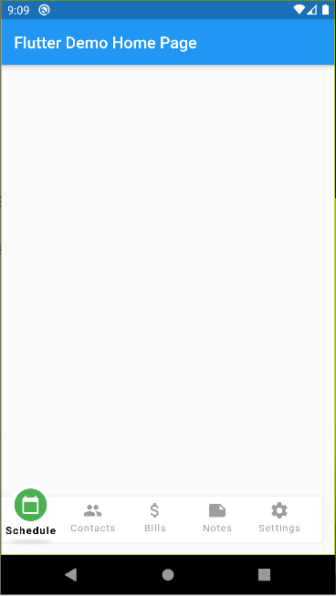
items: [
FFNavigationBarItem(
iconData: Icons.calendar_today,
label: 'Schedule',
),
FFNavigationBarItem(
iconData: Icons.people,
label: 'Contacts',
),
FFNavigationBarItem(
iconData: Icons.attach_money,
label: 'Bills',
),
FFNavigationBarItem(
iconData: Icons.note,
label: 'Notes',
),
FFNavigationBarItem(
iconData: Icons.settings,
label: 'Settings',
),
],
),
);
Theme
The navbar has a Theme class which can be used to define the majority of appearance settings for the navbar and its items.
- barBackgroundColor: The background color for the entire bar (default = white)
- selectedItemBackgroundColor: The background color for the CircleAvatar widget used to display the selected item's icon (default = blueAccent)
- selectedItemIconColor: The color for the selected item's icon (default = white)
- selectedItemLabelColor: The color for the selected item's label (default = black)
- selectedItemBorderColor: The color for the selected item's border (default = white)
- unselectedItemBackgroundColor: The background color for unselected items (default = transparent)
- unselectedItemIconColor: The color for unselected items' icons (default = grey)
- unselectedItemLabelColor: The color for unselected items' icons (default = grey)
- selectedItemTextStyle: The text style to use for the selected item's label. The selectedItemLabelColor takes priority over any color attribute of the style (defaults to size = 13.0, weight = Bold)
- unselectedItemTextStyle: The text style to use for the unselected items' labels (defaults to size = 12.0, weight = Normal)
- barHeight: The height for the bar (which is automatically included within a SafeArea widget)
- itemWidth: The width to use for the selected item CircleAvater (default = 48.0)
- showSelectedItemShadow: Indicates if the drop shadow below the selected item should be displayed (default = true)
FFNavigationBar Attributes
- selectedIndex: The item number (zero indexed) which should be marked as selected
- onSelectTab: Callback function to receive tap notifications using the typedef
Function(int selectedIndex) - items: List of FFNavigationBarItem objects to be displayed as the bar's items
- theme: A FFNavigationBarTheme theme object
FFNavigationBarItem
- label: The String to display as the item's label
- iconData: The IconData to use in the item's Icon
- animationDuration: A Duration object which can be used to tweak the AnimatedContainer behaviour of the navigation bar item.
- selectedBackgroundColor: A Color value which can override the theme's selectedItemBackgroundColor value for a specific navigation bar item (used to create different colors for each item)
- selectedForegroundColor: A Color value which can override the theme's selectedItemIconColor value
- selectedLabelColor: A Color value which can override the theme's selectedItemLabelColor value


 Something like this


 2 Oct 25, 2022
 23 Dec 30, 2022
 16 Oct 13, 2022
 1 Feb 15, 2022
 15 Jul 7, 2021
 18 Dec 28, 2022
 112 Nov 11, 2022
 1 Apr 20, 2022
 4 Jan 26, 2020
 9 Nov 27, 2022
 1 Jul 31, 2022
 10 Oct 26, 2022
 79 Dec 22, 2022
 21 Oct 8, 2022
 258 Nov 19, 2022
 117 Dec 22, 2022
 194 Jan 2, 2023
 3 Oct 17, 2022
 5 May 6, 2022