Toggle Switch
A simple toggle switch widget. It can be fully customized with desired icons, width, colors, text, corner radius, animation etc. It also maintains selection state.
Getting Started
In the pubspec.yaml of your flutter project, add the following dependency:
dependencies:
  ...
  toggle_switch: ^1.3.0
Import it:
import 'package:toggle_switch/toggle_switch.dart';
Usage Examples
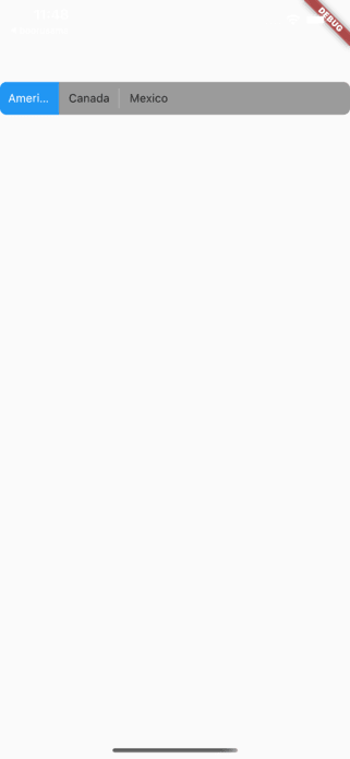
Basic toggle switch
// Here, default theme colors are used for activeBgColor, activeFgColor, inactiveBgColor and inactiveFgColor
ToggleSwitch(
  initialLabelIndex: 0,
  totalSwitches: 3,
  labels: ['America', 'Canada', 'Mexico'],
  onToggle: (index) {
    print('switched to: $index');
  },
),

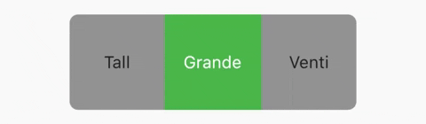
Basic toggle switch with custom height and font size
ToggleSwitch(
  minWidth: 90.0,
  minHeight: 90.0,
  fontSize: 16.0,
  initialLabelIndex: 1,
  activeBgColor: [Colors.green],
  activeFgColor: Colors.white,
  inactiveBgColor: Colors.grey,
  inactiveFgColor: Colors.grey[900],
  totalSwitches: 3,
  labels: ['Tall', 'Grande', 'Venti'],
  onToggle: (index) {
    print('switched to: $index');
  },
),
With text or icon
ToggleSwitch(
  minWidth: 90.0,
  cornerRadius: 20.0,
  activeBgColors: [[Colors.cyan], [Colors.redAccent]],
  activeFgColor: Colors.white,
  inactiveBgColor: Colors.grey,
  inactiveFgColor: Colors.white,
  totalSwitches: 2,
  labels: ['YES', ''],
  icons: [null, FontAwesomeIcons.times],
  onToggle: (index) {
    print('switched to: $index');
  },
),

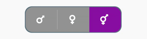
With icons, text and different active background colors
ToggleSwitch(
  minWidth: 90.0,
  initialLabelIndex: 1,
  cornerRadius: 20.0,
  activeFgColor: Colors.white,
  inactiveBgColor: Colors.grey,
  inactiveFgColor: Colors.white,
  totalSwitches: 2,
  labels: ['Male', 'Female'],
  icons: [FontAwesomeIcons.mars, FontAwesomeIcons.venus],
  activeBgColors: [[Colors.blue],[Colors.pink]],
  onToggle: (index) {
    print('switched to: $index');
  },
),

With border color, border width, icons, custom height and different active background colors
ToggleSwitch(
  minWidth: 90.0,
  minHeight: 70.0,
  initialLabelIndex: 2,
  cornerRadius: 20.0,
  activeFgColor: Colors.white,
  inactiveBgColor: Colors.grey,
  inactiveFgColor: Colors.white,
  totalSwitches: 3,
  icons: [
    FontAwesomeIcons.mars,
    FontAwesomeIcons.venus,
    FontAwesomeIcons.transgender
  ],
  iconSize: 30.0,
  borderWidth: 2.0,
  borderColor: [Colors.blueGrey],
  activeBgColors: [[Colors.blue], [Colors.pink], [Colors.purple]],
  onToggle: (index) {
    print('switched to: $index');
  },
),
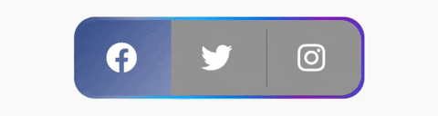
With gradient border color, divider color and gradient active background colors
ToggleSwitch(
  minWidth: 90.0,
  minHeight: 70.0,
  initialLabelIndex: 0,
  cornerRadius: 20.0,
  activeFgColor: Colors.white,
  inactiveBgColor: Colors.grey,
  inactiveFgColor: Colors.white,
  totalSwitches: 3,
  icons: [
    FontAwesomeIcons.facebook,
    FontAwesomeIcons.twitter,
    FontAwesomeIcons.instagram
  ],
  iconSize: 30.0,
  borderColor: [Color(0xff3b5998), Color(0xff8b9dc3), Color(0xff00aeff), Color(0xff0077f2), Color(0xff962fbf), Color(0xff4f5bd5)],
  dividerColor: Colors.blueGrey,
  activeBgColors: [[Color(0xff3b5998), Color(0xff8b9dc3)], [Color(0xff00aeff), Color(0xff0077f2)], [Color(0xfffeda75), Color(0xfffa7e1e), Color(0xffd62976), Color(0xff962fbf), Color(0xff4f5bd5)]],
  onToggle: (index) {
    print('switched to: $index');
  },
),
With bounceInOut animation
ToggleSwitch(
  minWidth: 90.0,
  minHeight: 70.0,
  initialLabelIndex: 0,
  cornerRadius: 20.0,
  activeFgColor: Colors.white,
  inactiveBgColor: Colors.grey,
  inactiveFgColor: Colors.white,
  totalSwitches: 2,
  icons: [
    FontAwesomeIcons.lightbulb,
    FontAwesomeIcons.solidLightbulb,
  ],
  iconSize: 30.0,
  activeBgColors: [[Colors.black45, Colors.black26], [Colors.yellow, Colors.orange]],
  animate: true, // with just animate set to true, default curve = Curves.easeIn
  curve: Curves.bounceInOut, // animate must be set to true when using custom curve
  onToggle: (index) {
    print('switched to: $index');
  },
),

With radius style
ToggleSwitch(
  minWidth: 90.0,
  cornerRadius: 20.0,
  activeBgColors: [[Colors.green[800]!], [Colors.red[800]!]],
  activeFgColor: Colors.white,
  inactiveBgColor: Colors.grey,
  inactiveFgColor: Colors.white,
  initialLabelIndex: 1,
  totalSwitches: 2,
  labels: ['True', 'False'],
  radiusStyle: true,
  onToggle: (index) {
    print('switched to: $index');
  },
),

With custom text styles
ToggleSwitch(
  minWidth: 90.0,
  cornerRadius: 20.0,
  inactiveFgColor: Colors.white,
  initialLabelIndex: 1,
  totalSwitches: 3,
  labels: ['Normal', 'Bold', 'Italic'],
  customTextStyles: [
    null,
    TextStyle(
        color: Colors.brown,
        fontSize: 18.0,
        fontWeight: FontWeight.w900),
    TextStyle(
        color: Colors.black,
        fontSize: 16.0,
        fontStyle: FontStyle.italic)
  ],
  onToggle: (index) {
    print('switched to: $index');
  },
),

With custom icons
ToggleSwitch(
    minWidth: 90.0,
    minHeight: 90.0,
    cornerRadius: 20.0,
    activeBgColors: [
        [Color(0xfffdbb0a)],
        [Colors.black54],
        [Colors.white54]
    ],
    inactiveFgColor: Colors.white,
    initialLabelIndex: 2,
    totalSwitches: 3,
    customIcons: [
        Icon(
            FontAwesomeIcons.ccVisa,
            color: Color(0xff1a1f71),
            size: 55.0,
        ),
        Icon(
            FontAwesomeIcons.ccMastercard,
            color: Color(0xffF79E1B),
            size: 55.0,
        ),
        Icon(
            FontAwesomeIcons.ccAmex,
            color: Color(0xff27AEE3),
            size: 55.0,
        )
    ],
    onToggle: (index) {
        print('switched to: $index');
    },
),


 314 Dec 31, 2022
 22 Dec 13, 2022
 135 Jan 5, 2023
 1.2k Jan 7, 2023
 48 Aug 15, 2022
 250 Dec 22, 2022
 1k Jan 9, 2023
 237 Nov 15, 2022
 2.5k Jan 5, 2023
 1.5k Jan 7, 2023
 57 Dec 30, 2022
 9 Dec 12, 2022
 0 Nov 27, 2021
 27 Sep 7, 2022
 125 Jan 4, 2023
 4 Jan 6, 2022
 2 Feb 18, 2022
 13 Nov 25, 2020
 97 Jan 6, 2023