Segment display widget


Segment display widget for Flutter. Supports multiple types of segment displays and segment customization.
Contents
Features
- 7-segment display
- 14-segment display
- 16-segment display
- Customizable segment shapes (segment styles)
- Supports
.(decimal point) and:(colon) characters
See WEB DEMO.
Installation
- Depend on it
Add this to your package's pubspec.yaml file:
dependencies:
  segment_display: ^0.5.0
- Install it
You can install packages from the command line:
$ flutter packages get
Alternatively, your editor might support flutter packages get. Check the docs for your editor to learn more.
- Import it
Now in your Dart code, you can use:
import 'package:segment_display/segment_display.dart';
Usage
Seven-segment display
Example:
SevenSegmentDisplay(
  value: "123",
  size: 12.0,
)

Fourteen-segment display
Example:
FourteenSegmentDisplay(
  value: "123",
  size: 12.0,
)

Sixteen-segment display
Example:
SixteenSegmentDisplay(
  value: "123",
  size: 12.0,
)

Styles and customization
You can customize segment display with:
characterSpacing- space between individual charactersbackgroundColor- display background colorsegmentStyle- style for segments (shape, color,...), see segment style
Example:
SevenSegmentDisplay(
  text: "123",
  textSize: 12.0,
  characterSpacing: 10.0,
  backgroundColor: Colors.transparent,
  segmentStyle: HexSegmentStyle(
    enabledColor: Colors.red,
    disabledColor: Colors.red.withOpacity(0.15),
  ),
)
Segment style
To change segment color, size or shape, use segment style.
There are following segment styles:
- DefaultSegmentStyle

- HexSegmentStyle

- RectSegmentStyle

and you can also create or own style (shape) - see custom segment styles
Example:
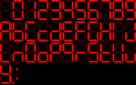
SevenSegmentDisplay(
  value: "13:37",
  size: 12.0,
  segmentStyle: HexSegmentStyle(
    enabledColor: const Color(0xFF00FF00),
    disabledColor: const Color(0xFF00FF00).withOpacity(0.15),
    segmentBaseSize: const Size(1.0, 2.0),
  ),
)

enabledColor- color of enabled segmentsdisabledColor- color of disabled segmentssegmentBaseSize- size ratio for segments;Size(1.0, 2.0)basically means that ratio will be 1:2 (width:length)
NOTE:
SegmentStyle.segmentBaseSize*SegmentDisplay.textSize= segmentSize
Custom segment styles
To create your own segment style (shape), extends SegmentStyle class and implement methods createHorizontalPath, createVerticalPath, createDiagonalBackwardPath and createDiagonalForwardPath.
class CustomSegmentStyle extends SegmentStyle {

  const CustomSegmentStyle({
    Size segmentBaseSize,
    Color enabledColor,
    Color disabledColor,
  }) : super(
          segmentBaseSize: segmentBaseSize,
          enabledColor: enabledColor,
          disabledColor: disabledColor,
        );
  @override
  Path createHorizontalPath(SegmentPosition position, Size segmentSize) {
    // ...
  }

  @override
  Path createVerticalPath(SegmentPosition position, Size segmentSize) {
    // ...
  }

  @override
  Path createDiagonalBackwardPath(SegmentPosition position, Size segmentSize) {
    // ...
  }

  @override
  Path createDiagonalForwardPath(SegmentPosition position, Size segmentSize) {
    // ...
  }
}
You can also customize shape for individual segments by overriding createPath** methods. For 7-segment display, there are createPath7* methods, for 14-segment display createPath14* and so on.
Example: if you want to change the shape of the top segment in 7-segment display, you just have to override createPath7A method.
class CustomSegmentStyle extends SegmentStyle {

  // ..

  @override
  Path createPath7A(Size segmentSize, double padding) {
    // ...
  }

  // ...

}
NOTE:
createPath**methods usecreateHorizontalPath/createVerticalPath/createDiagonalBackwardPath/createDiagonalForwardPathby default so you don't have to override allcreatePath7*methods.
Features and bugs
Please file feature requests and bugs at the issue tracker.


 40 Aug 13, 2022
 1 Jan 29, 2022
 63 Sep 27, 2022
 28 Nov 4, 2022
 17 Jan 18, 2022
 2 Feb 9, 2022
 20 Dec 30, 2022
 7 Apr 27, 2022
 4 Aug 1, 2022