Flutter package: Define a theme (colors, text styles etc.) as static const values which can be changed dynamically.

Related tags

Widgets themed
Overview

pub package

themed

The Themed package:

  • Lets you define a theme with const values, but change them dynamically anyway.
  • Color extension methods: Colors.blue.decolorize() and more.
  • TextStyle extension methods: var myStyle = TextStyle(fontSize: 15) + Colors.blue and more.

Const values that you can change

As we all know, using const variables is the easiest way to create and use themes:

static const myColor = Colors.white;
static const myStyle = TextStyle(fontSize: 16);

Container(
  color: myColor,
  child: const Text('Hi', style: myStyle)))

However, if you do it like that you can't later change the theme dynamically. By using the Themed package you can:

static const myColor = ColorRef(Colors.white); 
static const myStyle = TextStyleRef(TextStyle(fontSize: 16)); 

Container(
   color: myColor,
   child: const Text('Hello', style: myStyle)))
   
// Later, change the theme dynamically.
Themed.currentTheme = {
   myColor: Colors.blue,
   myStyle: TextStyle(fontSize: 20);
}      

There is no need to use Theme.of(context) anymore:

// So old-fashioned. 
Container(
   color: Theme.of(context).primary,
   child: Text('Hello', style: TextStyle(color: Theme.of(context).secondary)))

Also, since Theme.of needs the context and is not constant, you can't use it in constructors. However, the Themed package has no such limitations:

// The const color is the default value of an optional parameter.
MyWidget({
    this.color = myColor,
  });

Setup

Wrap your widget tree with the Themed widget, above the MaterialApp:

@override
Widget build(BuildContext context) {
   return Themed(
      child: MaterialApp(
        ...      

Compatibility

The Themed package is a competitor to writing Theme.of(context).xxx in your build methods, but it’s NOT a competitor to Flutter’s native theme system and the Theme widget. It’s there to solve a different problem, and it’s usually used together with the Theme widget. For example, if you want to set a global default color for all buttons, you’ll use the Theme widget. You may use it together with the Themed package however, meaning that Themed colors and styles may be used inside a ThemeData widget:

static const myColor1 = ColorRef(Colors.red);
static const myColor2 = ColorRef(Colors.blue);
...

child: MaterialApp(
   theme: ThemeData(
      primaryColor: MyTheme.color2,
      elevatedButtonTheme: 
         ElevatedButtonThemeData(
            style: ElevatedButton.styleFrom(primary: MyTheme.color2),
      ),
   ),

How to define a theme map

Each theme should be a Map , where the keys are your ColorRef and TextStyleRef const values, and the values are the colors and styles you want to use on that theme. For example:

Map
   
     theme1 = {
  MyTheme.color1: Colors.yellow,
  MyTheme.color2: Colors.pink,
  MyTheme.color3: Colors.purple,
  MyTheme.mainStyle: const TextStyle(fontSize: 22, fontWeight: FontWeight.w900, color: MyTheme.color1),
};


At any point in your app you can just change the current theme by doing:

// Setting a theme:
Themed.currentTheme = theme1;

// Setting another theme:
Themed.currentTheme = theme2;

// Removing the current theme (and falling back to the default theme):
Themed.clearCurrentTheme();

// This would also remove the current theme:
Themed.currentTheme = null;

Organization

You can also organize your theme in a class:

class MyTheme {
   static const myColor = ColorRef(Colors.white); 
   static const myStyle = TextStyleRef(TextStyle(fontSize: 16, color: Colors.red)); 
}

Container(
   color: MyTheme.myColor,
   child: const Text('Hello', style: MyTheme.myStyle)))    
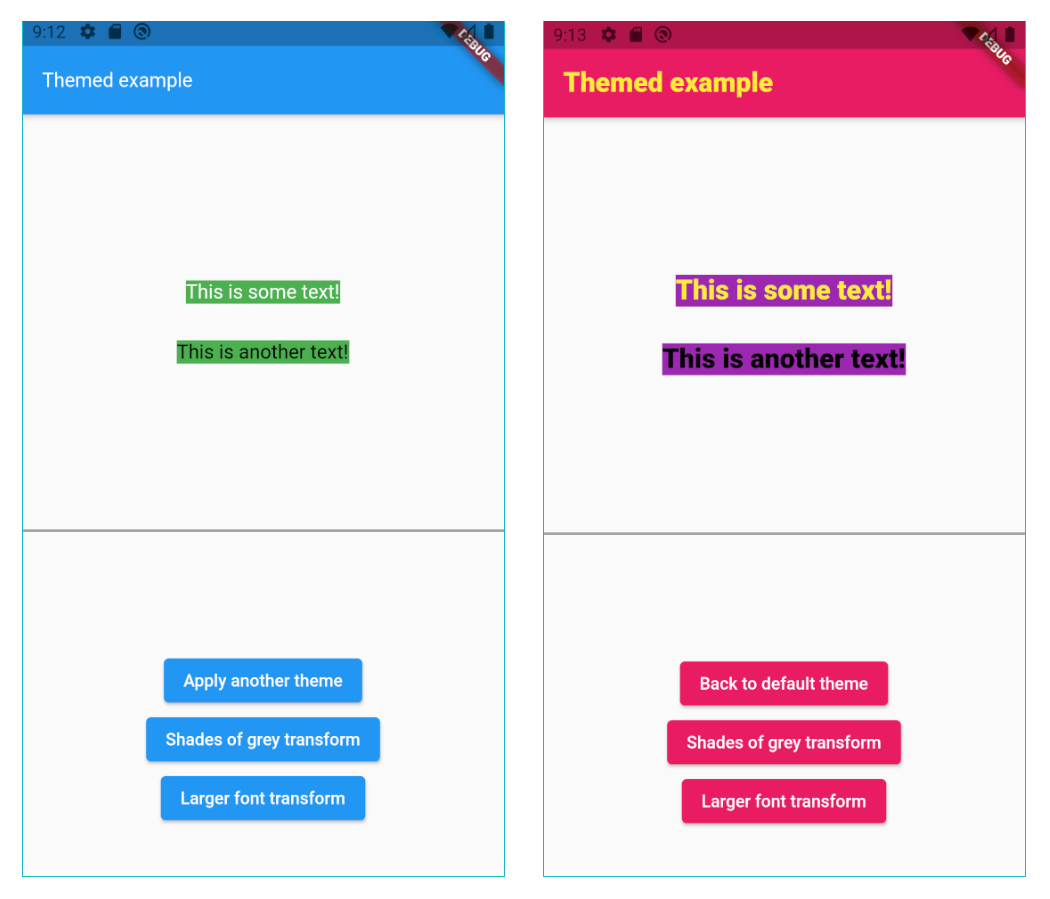
Color transform

Instead of changing the current theme you can create a color transformation. For example, this will turn your theme into shades of grey:

static Color shadesOfGreyTransform(Color color) {
  int average = (color.red + color.green + color.blue) ~/ 3;
  return Color.fromARGB(color.alpha, average, average, average);
}

Note you can create your own function to process colors, but shadesOfGreyTransform is already provided:

// Turn it on:
Themed.transformColor = ColorRef.shadesOfGreyTransform;

// Then, later, turn it off:
Themed.clearTransformColor();

Color extension

The lighter method makes the color lighter (more white). Example:

// 20% more white.
Colors.blue.lighter(0.2); 

The darker method makes the color darker (more black). Example:

// 20% more black.
Colors.blue.darker(0.2); 

The average method makes the current color more similar to the given color. Example:

// 50% blue and 50% red.
Colors.blue.average(Colors.red); 

// 20% blue and 80% red.
Colors.blue.average(Colors.red, 0.8);

The decolorize method makes the current color more grey. Example:

// Grey, with luminance similar to the original blue.
Colors.blue.decolorize(); 

// Blue with 20% less color.
Colors.blue.decolorize(0.2);

The addOpacity method makes the current color more transparent than it already is, by the given amount. This is different from the withOpacity method, as you can see below.

// 50% transparent blue.
Colors.blue.addOpacity(0.5); 

// Also 50% transparent blue.
Colors.withOpacity(0.5); 

// 75% transparent blue, because we add 50% and then more 50%.
Colors.blue.addOpacity(0.5).addOpacity(0.5);

// This is 50% transparent blue, because the opacity is replaced, not added.
Colors.withOpacity(0.5).withOpacity(0.5);

There are also two methods for advanced color representation conversion: The rgbaToArgb method converts the RGBA color representation to ARGB. The abgrToArgb method converts the ABGR color representation to ARGB.

TextStyle transform

You can also create a style transformation. For example, this will make your fonts larger:

static TextStyle largerText(TextStyle textStyle) =>
      textStyle.copyWith(fontSize: textStyle.fontSize! * 1.5);

// Turn it on:
Themed.transformTextStyle = largerText;

// Then, later, turn it off:
Themed.clearTransformTextStyle();

TextStyle extension

With the provided extension, you can make your code more clean-code by creating new text styles by adding colors and other values to a TextStyle. For example:

const myStyle = TextStyle(...);

// Using some style:
Text('Hello', style: myStyle);

// Making text black:
Text('Hello', style: myStyle + Colors.black);

// Changing some other stuff:
Text('Hello', style: myStyle + FontWeight.w900 + FontSize(20.0) + TextHeight(1.2));

Beware not to define the same constant

Please remember Dart constants point to the same memory space. In this example, colorA, colorB and colorC represent the same variable:

class MyTheme {
  static const colorA = ColorRef(Colors.white);
  static const colorB = ColorRef(Colors.white);
  static const colorC = colorA;    
}

If you later change the color of colorA, you are also automatically changing the color of colorB and colorB.

If you want to create 3 independent colors, and be able to change them independently, you have to create different constants. You can provide an id string, just to differentiate them. For example:

class MyTheme {
  static const colorA = ColorRef(Colors.white, id:'A');
  static const colorB = ColorRef(Colors.white, id:'B');
  static const colorB = ColorRef(colorA, id:'C');
}

Avoid circular dependencies

The following will lead to a StackOverflowError error:

Map
   
     anotherTheme = {
   MyTheme.color1: MyTheme.color2,
   MyTheme.color2: MyTheme.color1,
};


You can have references which depend on other references, no problem. But both direct and indirect circular references must be avoided.

Other ways to use it

If you want, you may also define a default theme, and a current theme for your app:

@override
Widget build(BuildContext context) {
   return Themed(
      defaultTheme: { ... },
      currentTheme: { ... },
      child: MaterialApp(
        ...      

The defaultTheme and currentTheme are both optional. They are simply theme maps, as explained below.

When a color/style is used, it will first search it inside the currentTheme.

If it's not found there, it searches inside of defaultTheme.

If it's still not found there, it uses the default color/style which was defined in the constructor. For example, here the default color is white: ColorRef(Colors.white).

Please note: If you define all your colors in the defaultTheme, then you don't need to provide default values in the constructor. You can then use the fromId constructor:

class MyTheme {
  static const color1 = ColorRef.fromId('c1');
  static const color2 = ColorRef.fromId('c2');
  static const color3 = ColorRef.fromId('c3');
  static const mainStyle = TextStyleRef.fromId('mainStyle');  
}

Saving and setting Themes by key

You can save themes with keys, and then later use the keys to set the theme. The keys can be anything (Strings, enums etc.):

// Save some themes using keys.
enum Keys {light, dark};
Themed.save(key: Keys.light, theme: { ... })
Themed.save(key: Keys.dark, theme: { ... })

// Then set the theme.
Themed.setThemeByKey(Keys.light);

It also works the other way around: If you use the key first, and only save a theme with that key later:

// Set the theme with a key, even before saving the theme.
Themed.setThemeByKey(Keys.light);

// The theme will change as soon as you save a theme with that key.
Themed.save(key: Keys.light, theme: { ... })

Note: You can also use the methods saveAll to save many themes by key at the same time, and clearSavedThemeByKey to remove saved themes.

Important: When I say "save" above, I mean it's saved in memory, not in the device disk.


Copyright

This package is copyrighted and brought to you by Parkside Technologies, a company which is simplifying global access to US stocks.

This package is published here with permission.

Please, see the license page for more information.


Authored by Marcelo Glasberg

Other Flutter packages I've authored:

You might also like...

Global loading widget, which can be used through simple configuration.

Global loading widget, which can be used through simple configuration.

load Global loading widget, which can be used through simple configuration. Pure flutter library, not use native code. It is similar to OKToast in use

Nov 4, 2022

A Flutter Text widget support word break for CJK

A Flutter Text widget support word break for CJK

word_break_text Text widget with word break support for CJK sentence. Installation Add flutter_map to your pubspec: dependencies: word_break_text:

Nov 11, 2022

Flutter widget to show text in popup or overlay container

Flutter widget to show text in popup or overlay container

flutter_show_more_text_popup Flutter widget to show text in popup or overlay container Installation Add this to your package's pubspec.yaml file depen

Jul 5, 2022

A Flutter widget to show a text form field to display a date or clock dialog

A Flutter widget to show a text form field to display a date or clock dialog

A Flutter widget to show a text form field to display a date or clock dialog. This widget extend TextField and has a similar behavior as TextFormField.

Jan 6, 2023

A Flutter widget that scrolls text infinitely

⏩ A Flutter widget that scrolls text infinitely. Provides many customizations including custom scroll directions, durations, curves as well as pauses after every round.

Dec 29, 2022

A button that looks like a Cupertino text button

A button that looks like a Cupertino text button

Cupertino Text Button A button that looks like a Cupertino text button! Text Button A simple text button can be created like this: CupertinoTextButton

Nov 24, 2022

Experimental solution for web-like text selection across widgets

Experimental solution for web-like text selection across widgets

Better Selection Experimental solution for web-like text selection across widgets (text, images, et cetera). Better selection is dependent on, and is

Oct 12, 2022

Listview builder with image and text

listview_builder_with_image_and_text A new Flutter project. Getting Started This project is a starting point for a Flutter application. A few resource

May 4, 2022

A Flutter package which provides helper widgets for selecting single or multiple account/user from the given list.

A Flutter package which provides helper widgets for selecting single or multiple account/user from the given list.

account_selector A Flutter package which provides helper widgets for selecting single or multiple account/user from a list Supported Dart Versions Dar

Oct 7, 2021
Comments
  • Maximum stack exceed when running on WEB....(runned your example code in web)

    Maximum stack exceed when running on WEB....(runned your example code in web)

    The following JSRangeError was thrown building MyApp(dirty): Invalid argument: Maximum call stack size exceeded

    The relevant error-causing widget was MyApp lib/main.dart:30 When the exception was thrown, this was the stack dart-sdk/lib/_internal/js_dev_runtime/private/ddc_runtime/operations.dart 829:8 get

    opened by KaushickSArgekar 8
  • firstPage não. Mas, secondPage sim.

    firstPage não. Mas, secondPage sim.

    Olá Marcelo, Parabens mais uma vez pela sua fantástica contribuição no desenvolvimento deste package, Themed. Desde que conheci seu trabalho com o async_redux, o qual utilizo muito, mais admiro seu trabalho e desejo seu sucesso e crescimento pessoal e profissional. Deus sabe o quanto tenho orado por vc e sua familia. Mas vamos a minha duvida, talvez uma issue. Decida por favor. Considere estes temas do seu exemplo:

    MyTheme
      static const primary = ColorRef(Colors.orange);
      static const onPrimary = ColorRef(Colors.black);
    anotherTheme
    Map<ThemeRef, Object> anotherTheme = {
      MyTheme.primary: Colors.grey,
      MyTheme.onPrimary: Colors.yellow,
    

    No exemplo deste package acrescentei apenas este código para alterar a cor do appBar e ele tem executado corretamente a mudança da cor (a cor do background da appBar muda alternadamente com a cor de seu texto):

     appBarTheme: const AppBarTheme(
                backgroundColor: MyTheme.primary,
                foregroundColor: MyTheme.onPrimary,
              ),
    

    Aplicando este mesmo código a meu projeto ele NÃO tem mudado a cor do texto da appBar alternadamente com o background na appBar, na HomePage de onde parte o click no action para mudar a cor, MAS corretamente nas demais telas. Este é o código do meu main.dart.

        return StoreProvider<AppState>(
          store: store,
          child: Themed(
            defaultTheme: myThemeOrange,
            child: MaterialApp(
              debugShowCheckedModeBanner: false,
              scrollBehavior: MyCustomScrollBehavior(),
              title: 'ClassFrase',
              navigatorKey: navigatorKey,
              routes: Routes.routes,
              initialRoute: '/',
              theme: ThemeData(
                primaryColor: MyTheme.primary,
                appBarTheme: const AppBarTheme(
                  backgroundColor: MyTheme.primary,
                  foregroundColor: MyTheme.onPrimary,
                ),
               ...
    

    O fluxo do initialRoute segue: SplashConnector -> HomePageConnector -> HomePage. Onde contem o botão no action para mudança de cor. A HomePage muda apenas o background e nao a cor do texto. Mas a SecondPage sim muda conforme seu exemplo.

    Você tem alguma sugestão com tão pouca informação que eu dei ? Pois os demais passos são iguais aos que vc orienta no exemplo.

    opened by catalunha 3
  • '_fontFamily' method not found Receiver: Instance of 'TextStyleRef' Arguments: []

    '_fontFamily' method not found Receiver: Instance of 'TextStyleRef' Arguments: []

    Upgrading to Flutter 2.8.0 causes the following error. You can reproduce it running the example app.

    ======== Exception caught by widgets library =======================================================
    The following NoSuchMethodError was thrown building Text("This is some text!", inherit: true
    , color: ColorRef(0xffffffff), size: 16.0, weight: 400, dirty, dependencies: [DefaultTextStyle]):
    '_fontFamily'
    method not found
    Receiver: Instance of 'TextStyleRef'
    Arguments: []
    
    The relevant error-causing widget was: 
      Text Text:file:///home/doug/IdeaProjects/themed/example/lib/main.dart:80:34
    When the exception was thrown, this was the stack: 
    dart-sdk/lib/_internal/js_dev_runtime/private/ddc_runtime/errors.dart 251:49     throw_
    dart-sdk/lib/_internal/js_dev_runtime/private/ddc_runtime/operations.dart 735:3  defaultNoSuchMethod
    dart-sdk/lib/_internal/js_dev_runtime/patch/core_patch.dart 60:17                noSuchMethod
    packages/themed/src/themed.dart 838:3                                            get [_fontFamily]
    packages/flutter/src/painting/text_style.dart 1026:24                            merge
    

    After digging around a bit I tried changing the following and extending instead of implementing, that fixed it but I'm not sure of what further issues that may cause.


    //class TextStyleRef implements TextStyle, ThemeRef {
    
    class TextStyleRef extends TextStyle with ThemeRef {
    ...
    
    opened by nullrocket 1
  • Themed aplicado ao brightness

    Themed aplicado ao brightness

    Olá Marcelo, Parabens mais uma vez pela sua fantástica contribuição no desenvolvimento deste package, Themed.
    Desde que conheci seu trabalho com o async_redux, o qual utilizo muito, mais admiro sua genealidade em programar e desejo seu sucesso e crescimento pessoal e profissional. Deus sabe o quanto tenho orado por vc e sua familia. Mas vamos a minha duvida, talvez uma issue. Decida por favor.

    Mudanças de parametros como brightness para dark / light e MaterialColor no primarySwatch não podem ser utilizados no Themed. Assim eu poderia usar uma base ja estabelecida e mudar apenas algumas cores no theme:...

    Para uma mudança mais simples como esta entre dark / light eu deveria seguir que abordagem ? Seria reconstruir o ColorScheme completo para cada tipo deste ? Mas ele também requer o brightness.

    Eu deveria mudar a cor de cada widget como vc fez com o elevatedButtonTheme aplicando assim mudanças especificas para appBarTheme, buttonTheme, floatingActionButtonTheme, etc ?

    opened by catalunha 1
Owner
Marcelo Glasberg
Marcelo Glasberg
A Flutter plugin for persisting and dynamically changing the theme.

A Flutter plugin for persisting and dynamically changing the theme.

Flutter Community 66 Sep 29, 2022
A custom Slider which accepts a list of ordered values.

MultiSlider A custom Slider which accepts a list of ordered values. It's meant to be as simple as the original Slider! UI with it Usages Continuous sl

Sthefano Schiavon 7 Dec 3, 2022
Flutter widget form select a date in horizontal timeline with customizable styles.

Flutter widget form select a date in horizontal timeline with customizable styles. Getting Started You can use this package when you need to add a dat

Jose Manuel Márquez 158 Dec 2, 2022
Widget, that can make any static located widget hidable

Installing See the official installing guidline from hidable/install Usage & Overview To start using Hidable widget, we have to create a ScrollControl

Anon 18 Dec 16, 2022
Pick colors from pixels of everything visible in your Flutter apps

pixel_color_picker A widget that extracts colors from its childs. This package lets you basically extract colors from everything in your screen.

Eleandro Duzentos 14 Oct 17, 2022
An advanced switch widget, that can be fully customized with size, text, color, radius of corners.

flutter_advanced_switch An advanced switch widget, that can be fully customized with size, text, color, radius of corners. Switch Light Switch Dark Ge

Alex Melnyk 13 Dec 15, 2022
A basic Flutter app that includes some native Widgets like alerts, cards, avatars, animated container, inputs, etc.

Flutter components This project was created with Flutter and some native Widgets like alerts, cards, avatars, animated container, inputs, etc. Getting

Paúl 4 Nov 15, 2021
Flutter Custom, Text, 3D, Social media button's package

Flutter Button flutter_button, which is a flutter package, contains animated, cool and awesome buttons. That you may like, thanks to this package you

Ismael Shakverdiev 15 Dec 29, 2022
Flutter Color Picker Wheel - an easy to use widget which can be heavily customized

Flutter Color Picker Wheel Flutter Color Picker Wheel is an easy to use widget which can be heavily customized. You can use the WheelColorPicker direc

Kexin Lu 35 Oct 4, 2022
A sliding up panel widget which can be used to show or hide content, beautiful and simple.

flutter_sliding_up_panel A sliding up panel widget which can be used to show or hide content, beautiful and simple. demo Getting Started dependencies:

null 25 Dec 12, 2022